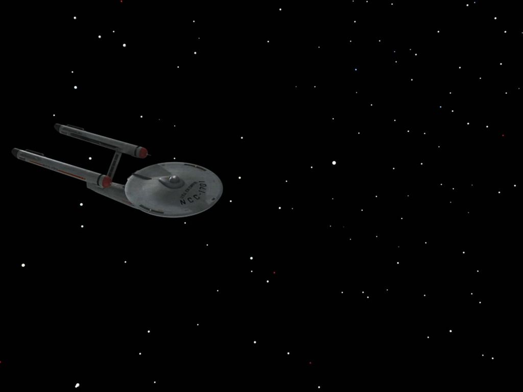
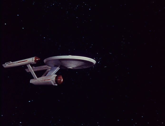
The remastering of TOS was one huge, inconsistant mess, and the viewers are partially to blame for that. Looking at it now, the first few episodes, like Miri and Balance of Terror were done pretty well. Very few changes and a ship that was lit and detailed very closely to the model. If the whole series had been done like this I would have been OK with it. But people complained about the nacelle caps and demanded more new shots - even though the worst part of BoT is that Romulan top shot. So they used that as an excuse to switch out the model to something dull grey, low polly, and with plating all over it and started doing crazy stuff animation wise. And the nacelle domes still look bad.
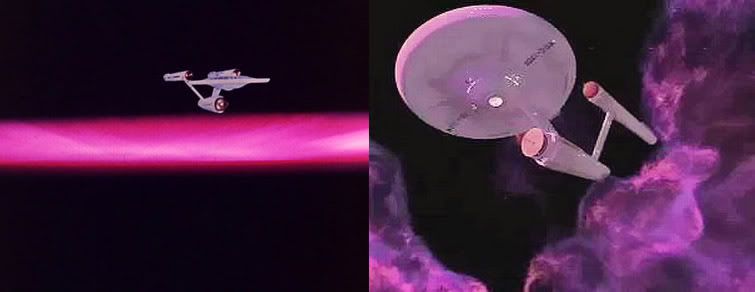
First of all, none of the external shots match the internals as far as feel anymore. The Klingon D7 used to be aqua and purple. Now it's just grey. The Botany Bay was red. Now it's just grey. The Tholian ships used to be lit with many oranges, purples, and greens. Now they look like the ships from Enterprise. All the planets were turned into earth type worlds with different colored clouds on top of them. Its just homogeneous, dull, blandness all over.
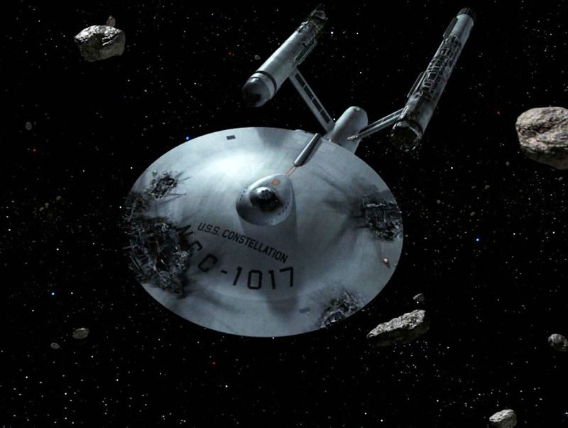
There are a lot of compositional mistakes like the entire top of the D7 being cut off in Elaan of Troyius or the E taking up half the shot when the Fesarrius shows up in Corbomite Maneuver when she was incredibly small in the original or Andromeda being way too big in By Any Other Name. They shot those scales in the 60s, not because of a limitation, but because they were trying to get across a specific feeling. A feeling lost in the Remaster.
Next, the animations are horrendous. Ships often teeter like they have no mass and are hanging on a string, ex. the E in her first shot in Tomorrow is Yesterday or the D7 in Elaan of Troyius or the Tholians bumping butts in The Tholian Web. Often times the ship and the camera move in bizarre, incompatible ways, like the approach to the K7 station in Tribbles or the E breaking in Tomorrow is Yesterday.
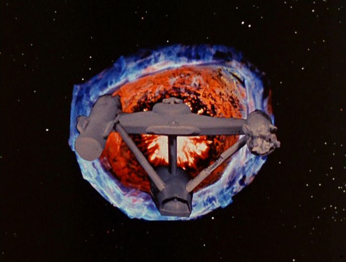
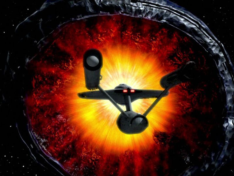
And, lastly, nothing is properly lit. Everything is mid-tone grey. Special effects like phasers, the planet killer's mouth, the sun, a super nova, the barrier - they're all super, super dull. None of them "blow out" the "film". None of them have any kind of blinding power to them because they are literally grey.
Now, I don't hate everything. I approve of nearly all the surface shots. They really do add to the scope of the landing environments without being incompatible. They also break up mattes that were over used. Honestly, thumbs up on creating some really well done, hard to do, bright daylight scenes. Unfortunately they make the space stuff look even more amateurish.

 We are never going to agree here.
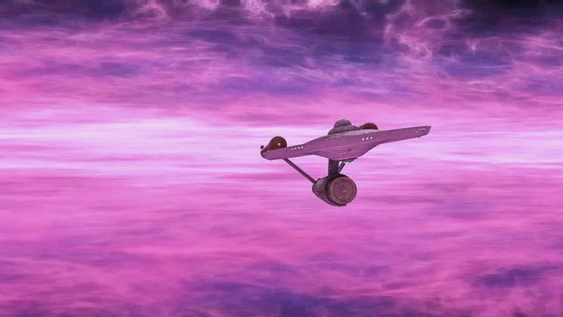


")