... yeah I'm gunna go with same ship, bigger budget.
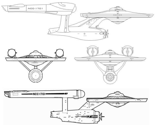
Except, of course, that it's NOT the "same ship" and there's nothing about the "new and improved" design that in any fashion whatsoever implies a "bigger budget."
The issues of "design" and of "production values" are not the same thing. Not remotely similar, in fact.
You could EASILY do a low-production-values version of the "new" ship and have it look like utter and complete crap, and you can also do a high-production-values version of the original design and have it look absolutely fantastic, without changing the design one iota.
The "new" version is NOT the same design. It is a new design which has a few surface-level things in common with the original but is notably different in every way. Not one single detail is "the same" between the two designs. NOT ONE.
If this were being presented as, say, a "Mirror-universe" version of the ship... or as a TNG-era new design which was made to pay homage to the classic Constitution-class design... it would be acceptable. If, at the end of this movie, we see the original design restored, and this is a "variation" which is only seen in the "wrong" timeline, I'd be fine with that too (though I can easily imagine the audience throwing a fit if they pulled that sort of "fast-one" on them!).
But it's NOT the same ship, any more than a contemporary car is the same as a 1960s car, even when the design is "paying homage" to that car.
The main difference between the "car" analogy and this one is that with cars, style is central to the design in both cases, where in the Enterprise issue, the original is a "pseudo-functional naval-vessel" in appearance, while the new one is just conglomeration of nonsensical "style" features that neither form a coherent whole nor make any logical sense to the technically-minded.
In other words... the original works because it looks more real. The new one looks like someone who doesn't understand science or engineering... who's never built anything real in his or her life... went nuts with a CG program in a pointless attempt to "kewlify" the design.
")
 :rolleyes:")