• Welcome! The TrekBBS is the number one place to chat about Star Trek with like-minded fans.
    If you are not already a member then please register an account and join in the discussion!

Do you like the *NEW* NCC-1701? Simple Yes or No.

Do you like the *NEW* NCC-1701?

  • YES

    Votes: 314 57.6%
  • NO

    Votes: 231 42.4%

  • Total voters
    545
I hear Berman and Braga are doing it and everyone will be "very pleased". :lol:

Imagine what a team consisted of Berman, Braga and George Lucas redoing Star Wars or a Star Trek movie would do to fans....:lol:

Oh how I wish it would happen just for the laughs
 
ST isn't Bond or Batman where you can just plain restart whenever you want.

Oh? Why not?

It's not how it's been so far, why start now?

I also think it's a kind of cop out to throw decades of story down the toilet just for one more movie, we don't know for sure if it's a reboot it seems, but if it is it's a serious cop out.
Backing up a second: this sort of thing puzzles me.

What causes you to conclude that decades of story are being thrown down the toilet, or anywhere else, for that matter? Do you infer that simply from the fact that the appearance of the ship is different? Why should an updated ship design cause decades of story to go anywhere at all?
 
It's not set in 2009.
New designs and tech can be available all the time, why not redesign the D every season? This isn't an upgrade tho like the D bridge in Generations or the TMP refit, it's going back in time and changing what it used to look like, so I'm curious what made them decide to do that.
J.J. Abrams said in Entertainment Weekly (October 24, 2008 issue), "We weren't making a movie for fans of Star Trek. We were making a movie for fans of movies."

Many Trekkies would prefer an Enterprise more like the one in Deep Space Nine: Trials and Tribble-ations (1993), but young moviegoers (who spend millions more than us older moviegoers) who know nothing about the original series wouldn't. They would think that the controls were primitive and looked like a Lite-Brite, and that the movie was a parody of the 1960s TV series--similar to how The Brady Bunch Movie (1995) was a parody of the 1970s TV series.

1701k7ua0.jpg


20080307tribbleationsei4.jpg

 
Why would it not "work" in the big screen?

Too plain, not really a lot of sophistication or functionality to it. It's mostly buttons with more random blinking lights and static images of space above.
That could be fixed without changing the overall design.

Make the entire "overhead region" on each station a huge flat-panel display, the purpose of which is mainly for the captain, or other bridge crewmen, to see what's going on with that station at a glance. The operator can pop one "window," or two, or multiple, or one huge display, up there, as needed.

Make the button area far more interactive. Say, use standard keyboard keys like we use today, but in translucent plastic, with 3-color-LEDs under them. The button can be dark, can be lit as "white," or as any color... and can be lit steadily or can flash in some sequence... depending on the mode of user input in place at the time.

Wouldn't really LOOK different, 'til you got up-close, but it would make sense and would actually WORK.

Maybe make the "ring of small displays" a little larger, and make them all be programmable live video displays. Sure, have some of the graphics designed to be "what the original displays REALLY looked like," but they don't have to be static with blinkies.

Do these things, and it's still the same bridge, but BETTER, more believable to today's audiences, while not actually contradicting anything.
Sleeker designs these days so the bridge would be more circular.
Why? The tendency to have CONSUMER PRODUCTS done with blobby-curvy shapes is based more upon the availability of design tools which allow this than it is upon any technical justification. It used to be almost impossible to design, detail, and draw... much less manufacture and INSPECT... that sort of shape. Today, it's now much more practical.

But it's sort of like the use of "lens-flares" in early CGI... it's a new toy for the designers, but it's been overused and has become almost a cliche in the design community. Today, if you produce a design with curves where none is required, you're gonna get MOCKED over it, not lauded for it.

Excessively organic shapes is "so 1990s."

There's nothing functionally wrong with faceted structures. In fact, given a structure with a FRAMEWORK underlying it, the faceted structure is generally more robust. Which, to me, would be a concern in the design of a space vessel pressure-volume. External shapes, under internal pressure, would tend to be round (not "complex" but rather either spherical or cylindrical) but internal shapes, subject primarily to mechanical loading, would be linear.
Some different color schemes that are more relevant today.
Well, there are two main "color schemes" that are used in modern computer hardware design... I'll call them the "mac" scheme and the "PC" scheme. Today, Macs are mostly white and clear. PCs are mostly black, grey, and silver (often with various unnecessary colored lights).

The TOS bridge was a 2008 PC. The '09-Trek bridge is a 2008 Mac.

Personally, I find the "dark room" environment to be a far better environment to work in, while the "glaringly bright white place" gives me headaches.
The bridge also needs a second turbolift...
The bridge needs a second means of entrance/egress... but it doesn't have to be a second "elevator door." In fact, since the bridge is the most secure location on the ship (or rather, SHOULD be the most secure!) I think that one "easy-access" point is more than enough, personally. They just need a "backup exit" in case, say, Khan locks them in and cuts of the air. (in which case they really need portable oxygen masks as well!)
The original ship was a death trap.
Not really... the only real problem with the TOS ship was the lack of a backup accessway to the bridge.
Not a lot of believable sense of scale to it to project on the big screen IMHO.
Plenty of potential for sense of scale. Just never presented in that way.

You watch the later Trek movies (ST-V, ST-VI) and the Enterprise looks a lot smaller than it did in TMP, doesn't it? Same model... just different photography (and an altered paint job). It looked HUGE in TMP, though, didn't it?

It's not the design, its the presentation. A quality presentation of the TOS design would have every bit as much "scale" as anything else we'll ever see... probably more so (because the TOS ship had a "naval" feel that's been largely absent ever since).
Same as why they changed it in "The Motion Picture."
But in TMP, it MET all those requirements, and then lost them later on.

Presentation is more about choices of lighting, of lens, of film stock, and of the quality of the model... not the quality of the DESIGN. The TOS design, treated "right," would be absolutely breathtaking on-screen. And maybe SOMEDAY we'll get to see that. Or... maybe every couple of years some "hot new guy" will redesign to make even more changes, til nothing's recognizable anymore, and it's become...just an excuse for a new set of cheap toys.
 
Many Trekkies would prefer an Enterprise more like the one in Deep Space Nine: Trials and Tribble-ations (1993), but young moviegoers (who spend millions more than us older moviegoers) who know nothing about the original series wouldn't. They would think that the controls were primitive and looked like a Lite-Brite, and that the movie was a parody of the 1960s TV series--similar to how The Brady Bunch Movie (1995) was a parody of the 1970s TV series.

Funny how the US military didn't have that problem when they came to the set to study how the controls were laid out.

Yes, in 1966.

They'll never understand. It seems though the majority likes it. ;)
 
No, but that's not really a surprise. I think more people balked at the changed appearance of the Enterprise than at anything else we've seen so far.
 
The 1966 ship appealed to me in the way a classic car would. It was sharp and designed for purpose largely. I mean, Matt Jefferies was a pilot, I'm sure he knew something about form and function not always necessarily meaning 'pretty'.

Is that screen necessary, is that button necessary...those were questions the original designers considered.

Which is why I find the earlier comment laughable. Jefferies is on RECORD as saying he did not design the bridge haphazardly.

I just hope the same thought and effort went into this ship as went into the original is all.
 
The new ship is growing on me, but I'm still not quite there. I think my problem is where the neck joins the main hull, it just looks too far back and not quite balanced enough. There are many other angles where the basic shape seems unchanged.

I don't dislike it.
 
In fact, since the bridge is the most secure location on the ship (or rather, SHOULD be the most secure!)

Well, that hasn't been an option since about 30 seconds into "The Cage." What super-genius decided to put a big window on the top of the bridge when they do everything with the viewscreen anyway?
Um... that would be "Gene Roddenberry."

Who, despite his own self-promotion, wasn't "the one person behind Star Trek," he was more like "Star Trek's overprotective mother."

If we were starting off from scratch, I think we all acknowledge that it would make more sense for the bridge to be more internally. And F.J, who was pretty good from a technical standpoint, did abandon the "big window on top" which was never mentioned again 'til Roddenberry started giving instructions on how the 1701-D needed to be designed.
 
i dont like it! the saucer section is too big as are the nacelles and the secondary hull looks kinda like a blending of tos ship and the enterprise d! not pretty at all!
 
I'm no fan, but its what we have to settle for.(*Sighs*) At least Abrams is guaranteeing the story isn't a fresh reboot...we hope.
 
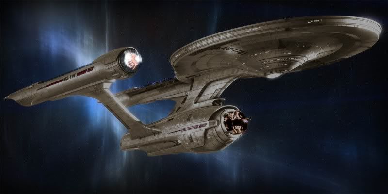
I think they should have just paid the guy who came up with this and used it:

re-imagined_ent1.jpg


MUCH BETTER.

And beautiful. THIS is what slightly tweaking visual canon should be about.:bolian:

This version has much more in common with the new Enterprise than with the TOS-Enterprise.


  • the neck
  • the deflector area
  • the 'foreskin' on the secondary hull (only upside-down)
  • the much sturdier pylons
  • the nacelle 'foreskins'
 
If you are not already a member then please register an account and join in the discussion!

Sign up / Register


Back
Top