• Welcome! The TrekBBS is the number one place to chat about Star Trek with like-minded fans.
    If you are not already a member then please register an account and join in the discussion!

Do you like the *NEW* NCC-1701? Simple Yes or No.

Do you like the *NEW* NCC-1701?

  • YES

    Votes: 314 57.6%
  • NO

    Votes: 231 42.4%

  • Total voters
    545
But it DOES look more like the classic Enterprise than what Abrams is giving us.

Possibly. But if it's unattractive its resemblance to the original isn't very important.

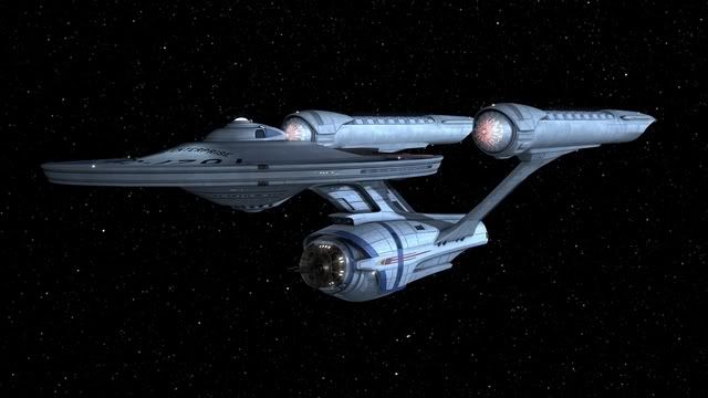
Maybe if Gabe's version were less metallic/silver-grey and smoother in texture? Not as much "aztec" featuring and surface detailing?
That's definitely my problem with it.

Yes, the shape is a lot more faithful to the original design, but the texture kills it for me. It's like someone took the original ship and tried to turn it into a Transformer.
 
Here it is from another angle:

re-imagined_ent2.jpg
That's not just "from another angle," though. This is a later revision of Gabe's design. He posted a lot of this stuff here, and we gave him an ongoing set of critiques (some polite, some fawning, some pretty critical but in a constructive fashion, and a few just downright nasty).

The thing is... he MADE CHANGES. And by the time he'd gotten to this point, I really liked most of what I was seeing (though not as "the TOS Enterprise," it works beautifully for me, as seen above, as another Federation ship which may have been in-service at the same time!)

The thing is this... the closer he got to having it look like the TOS ship, the more we tended to like it... and according to his own comments, the more HE seemed to be liking it as well.
 
Well, there are particular things - some of the shapes, for example. What is the cross section shape of the engineering hull elements? It's not a circle, or quite an elipse - it's kind of a shape with big curves on the sides blending into small curves at the "corners" or something and to me it just looks lumpy and misshapen. It's not pleasing.

There are a number of things like that about it that really bug me (people talk about the lines of the interconnecting dorsal on the Abramsprise, for example - well, what's all of that stuff going on there in Gabe's version? What sense does any of it make?) but everyone is going to have their own response to it.

Yeah, the subD-modelling method is pretty obvious on the secondary hull and also on some of the details on the nacelles.

But it's a very nice model and also an interesting take on the design.
 
Here it is from another angle:

re-imagined_ent2.jpg
That's not just "from another angle," though. This is a later revision of Gabe's design. He posted a lot of this stuff here, and we gave him an ongoing set of critiques (some polite, some fawning, some pretty critical but in a constructive fashion, and a few just downright nasty).

The thing is... he MADE CHANGES. And by the time he'd gotten to this point, I really liked most of what I was seeing (though not as "the TOS Enterprise," it works beautifully for me, as seen above, as another Federation ship which may have been in-service at the same time!)

The thing is this... the closer he got to having it look like the TOS ship, the more we tended to like it... and according to his own comments, the more HE seemed to be liking it as well.


Get rid of the stark blue lines in the hull plating, and you've got a winner much superior to the Abrams movie version. Its the STAR WARS Clone Trooper armor/Transformer-like coloration that messes it up.
 
No. The bridge is too Apple iPod-esque. The bridge should have retained the old lines, but have more advanced features, like multi-touch displays on the overhead monitors. The stations strewn about as they look so far in the preview aren't really as functional as they appeared in the original.

The bigger viewscreen is good, but if the underbelly of the ship is like a factory like reported, and not the interior of a ship of the line, that will be very disappointing, especially for the flagship of the fleet. I'd hate to see JJ get his hands on the Enterprise D in twenty years....

James
 
I like this version of the Enterprise at least 5 times more than the JJ Abrams. The secondary hull is much more meaningful here :) I don't agree with placing the photorp launchers at the neck *before* the refit, but I can deal with it - you got essentially everything else right. Good work here; bad work JJ.

Here it is from another angle:

re-imagined_ent2.jpg
That's not just "from another angle," though. This is a later revision of Gabe's design. He posted a lot of this stuff here, and we gave him an ongoing set of critiques (some polite, some fawning, some pretty critical but in a constructive fashion, and a few just downright nasty).

The thing is... he MADE CHANGES. And by the time he'd gotten to this point, I really liked most of what I was seeing (though not as "the TOS Enterprise," it works beautifully for me, as seen above, as another Federation ship which may have been in-service at the same time!)

The thing is this... the closer he got to having it look like the TOS ship, the more we tended to like it... and according to his own comments, the more HE seemed to be liking it as well.


Get rid of the stark blue lines in the hull plating, and you've got a winner much superior to the Abrams movie version. Its the STAR WARS Clone Trooper armor/Transformer-like coloration that messes it up.
 
By now we have all seen the Big E. The question remains though, do you like it? No reason needs to be given for your choice, but you are more than welcome to do so. Just an unscientific poll to see if the majority likes it or not.

I don't like the nacelles. Too bulky at the front. So it's neither a yes or a no.
 
In short, yes. It's a really nice design.

The only problem I have with it, is that it looks slightly squashed together, I mean the main saucer is in the right place, but the "neck" of the Enterprise looks just a tad too far back.
 
Here it is from another angle:

re-imagined_ent2.jpg
That's not just "from another angle," though. This is a later revision of Gabe's design. He posted a lot of this stuff here, and we gave him an ongoing set of critiques (some polite, some fawning, some pretty critical but in a constructive fashion, and a few just downright nasty).

The thing is... he MADE CHANGES. And by the time he'd gotten to this point, I really liked most of what I was seeing (though not as "the TOS Enterprise," it works beautifully for me, as seen above, as another Federation ship which may have been in-service at the same time!)

The thing is this... the closer he got to having it look like the TOS ship, the more we tended to like it... and according to his own comments, the more HE seemed to be liking it as well.

I would have been happy with this. Although, I would have been happy if the proportions and positioning on the new Enterprise had been adjusted.
 
God, no. The way the engineering hull is moved forward will never, ever feel right to me.
And don't get me started on the Apple Store bridge.

To quote ex-astris-scientia.org:
Bernd Schneider said:
While I think the idea to redesign the ship was wrong in the first place, the obvious good craftsmanship in the CGI creation of the new Enterprise NCC-1701 will allow scenes with stunning realism. But the same could have been achieved with a ship design closely resembling the original Enterprise. It would have even been a much more interesting challenge to get its look right. There are some fan-made examples of slightly refined TOS Enterprises, of which I like Vektor's subtle approach best. This one would have been perfect for the movie.
There is a reason they didn't want to copy the original design - it's too 60's They needed to update the design.
 
If you are not already a member then please register an account and join in the discussion!

Sign up / Register


Back
Top