Lt. Commander-Command
Enlisted-Science/Medical
Commander-Operations-Space Suit

Enlisted-Science/Medical
Commander-Operations-Space Suit

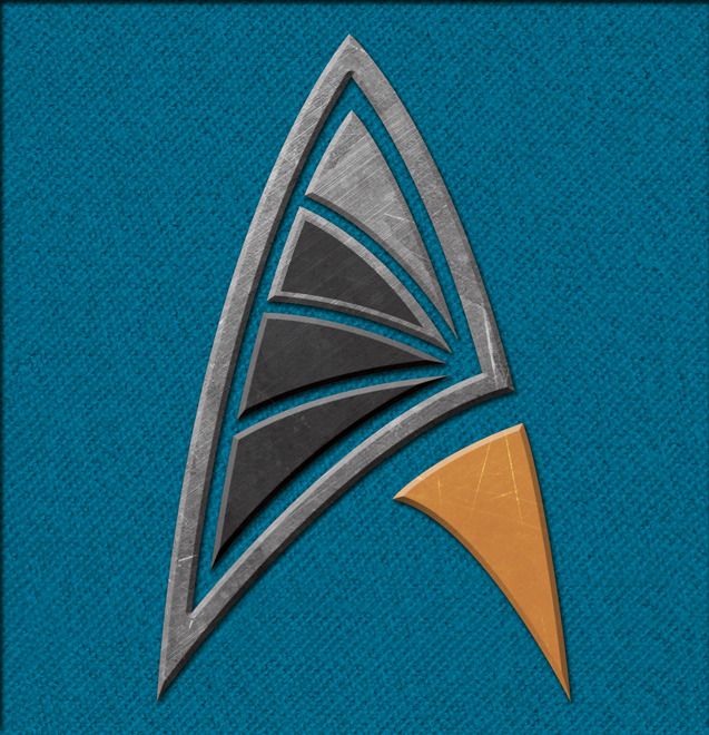


Eh, the more I look at these, the more they just seem too busy to me. There's just a lot happening in there. And it seems impractical for all these little parts. A single piece badge would be preferable.
--Alex
We use essential cookies to make this site work, and optional cookies to enhance your experience.