Characters. You’re doing goldarned animated characters. @?#!
-
Welcome! The TrekBBS is the number one place to chat about Star Trek with like-minded fans.
If you are not already a member then please register an account and join in the discussion!
You are using an out of date browser. It may not display this or other websites correctly.
You should upgrade or use an alternative browser.
You should upgrade or use an alternative browser.
AndyP's Trek building thread
- Thread starter batboy853
- Start date
Oh wow, lots of very cool updates! Regarding the exterior shots, I love them but I think you went too far with the number of workbees, they make the shots overly noisy IMO.
Amazing work on the characters! That's one frontier I never dared to cross.
Great progress on the engineering set, the LCARS look great. I agree regarding the pool table or something there, the room's large enough to need it IMO. Great stuff!
Amazing work on the characters! That's one frontier I never dared to cross.
Great progress on the engineering set, the LCARS look great. I agree regarding the pool table or something there, the room's large enough to need it IMO. Great stuff!
@Professor Moriarty I originally wanted to go into animation for a career, but then decided to go with IT a month before I started college.
@Rekkert You are absolutely right head notes I have for that scene was to remove 50% of the workbees, then put a few shuttles in.
As far as pool tables, I am going to start brainstorming some ideas. With these sets I have been trying to keep the consoles rounded like how the helm console appears on the bridge, which was why I modeled the engineering console / tactical console after the voyager engineering console since they had similar detailing.
I could even do something similar to the orville's piano table in it's engine room, but not as long.
Last edited:
Behold the almighty pool table!

Loosely based the design off of the Ent-E pool table, however it's smaller in size, the Ent-E pool table is around 8ft long, this one is 7. The nova graphic on top is temporary for the general idea. Next will be to make the LCARs for the table and consoles, the two stations are smaller than the helm stations so I won't be able to get away with reusing the same graphic there.
Loosely based the design off of the Ent-E pool table, however it's smaller in size, the Ent-E pool table is around 8ft long, this one is 7. The nova graphic on top is temporary for the general idea. Next will be to make the LCARs for the table and consoles, the two stations are smaller than the helm stations so I won't be able to get away with reusing the same graphic there.
Over the weekend worked on the graphics for the pool table. For the keyboards I based it off of something that has already been seen on screen. Luckily the dimensions for this panel matched to the console that I modeled.
For the pool table graphic while pretty straight forward I have struggled with, in terms of reference material. I studied a few things, notably a graphic from an unknown artist, and then the pool table for the Enterprise-E. I am still calling it a WIP because it just feels unfinished, but probably going to leave it as this until I can think of how I want to do it. I want to add more detailing on the overhead view of the nova class, similar to the design on the Ent-D pool table. But I wish I understood the logic of how that pattern was conceived in the first place.

On another note, a friend reminded me that my new 3080 could also be used for gaming, so I decided to check out STO once more. This time around I am playing as a Klingon, since it's the year of the Klingon. I'm pretty impressed with some of the updates they have been making, the characters now talk, and the ships look pretty darn close to how they appeared in the shows and movies.
For the pool table graphic while pretty straight forward I have struggled with, in terms of reference material. I studied a few things, notably a graphic from an unknown artist, and then the pool table for the Enterprise-E. I am still calling it a WIP because it just feels unfinished, but probably going to leave it as this until I can think of how I want to do it. I want to add more detailing on the overhead view of the nova class, similar to the design on the Ent-D pool table. But I wish I understood the logic of how that pattern was conceived in the first place.
On another note, a friend reminded me that my new 3080 could also be used for gaming, so I decided to check out STO once more. This time around I am playing as a Klingon, since it's the year of the Klingon. I'm pretty impressed with some of the updates they have been making, the characters now talk, and the ships look pretty darn close to how they appeared in the shows and movies.
Last edited:
Not the biggest fan of those large geometric elements around the ship schematic, IMO they're too big and a waste of space. On the Ent-E pool table (and on the fan-made Nova graphic you posted) they're far smaller with more cuts between them, and they usually have some sort of text or random numbers to break up all the color. I would suggest something similar. The rest of it is looking great!
Mid month update:
I spent the first week of March some what focused on the pool table graphic, but ultimately not charging it. I agree it's current state doesn't go well, however I did not want to be stuck on it. I do plan to go back to the graphic eventually, I was thinking about the table's we have seen in canon sources, Ent-D, Ent-E, but then Nemesis also had another pool table in their astrometics lab. (The scene where Data explains that they are about to enter a nebula and lose communications. (Because if you are fleeing an enemy ship you definitely want go near those)) I need to set some time aside and re-watch the scene to see how much of the table you can see.
The Second week of March I wanted to get back into animation, completed another roughly 16.5 seconds worth of animation keyframed, using mocap sources from Mixamo, and facial mocap I recorded using Facecap. I am really starting to get a good understanding of blender's NLA editor. I was also able to get it rendered out, which I am totally willing to re-render down the line for any changes that I end up making. Each frame rendered in 1 minute 15 seconds thanks to Optix.
Some stills:


This week I was feeling the itch to do some interior modeling. A few ago blueprints to parts of the Nemesis set were posted for auction with legible measurements for the set, which gave me the perfect opportunity to make an updated quarters set which will serve as the base for several sets I will use down the line: Quarters, mess hall, ready room, conference room.
One of the measurements not listed was the radius measurement for the window itself, as such I guestimated a radius of 4 inches (if anyone knows the proper radius from the set please let me know). Another thing worth noting, apparently the doors in nemesis were 42" wide instead of what we saw on stage 9, either 36" or 48".
One thing to keep in mind this set was made for a cinema aspect ratio, so I have modified the set to move the light panels to locations closer to that of how the set appeared for TNG / Voy (even though that was a different set, except for the windows?)
I did make a few other differences such as the colors and did not include the bars that appear on the Ent-E windows since this is intended for the Nova class for which is where the settings have been on my previous interiors. Also as I am typing this I am re-looking at the screencaps for Nemesis, the panels opposite of the windows (corridor side of the room) extrude inwards into the room, I extruded them outwards. I think I like them outwards more.


I spent the first week of March some what focused on the pool table graphic, but ultimately not charging it. I agree it's current state doesn't go well, however I did not want to be stuck on it. I do plan to go back to the graphic eventually, I was thinking about the table's we have seen in canon sources, Ent-D, Ent-E, but then Nemesis also had another pool table in their astrometics lab. (The scene where Data explains that they are about to enter a nebula and lose communications. (Because if you are fleeing an enemy ship you definitely want go near those)) I need to set some time aside and re-watch the scene to see how much of the table you can see.
The Second week of March I wanted to get back into animation, completed another roughly 16.5 seconds worth of animation keyframed, using mocap sources from Mixamo, and facial mocap I recorded using Facecap. I am really starting to get a good understanding of blender's NLA editor. I was also able to get it rendered out, which I am totally willing to re-render down the line for any changes that I end up making. Each frame rendered in 1 minute 15 seconds thanks to Optix.
Some stills:
This week I was feeling the itch to do some interior modeling. A few ago blueprints to parts of the Nemesis set were posted for auction with legible measurements for the set, which gave me the perfect opportunity to make an updated quarters set which will serve as the base for several sets I will use down the line: Quarters, mess hall, ready room, conference room.
One of the measurements not listed was the radius measurement for the window itself, as such I guestimated a radius of 4 inches (if anyone knows the proper radius from the set please let me know). Another thing worth noting, apparently the doors in nemesis were 42" wide instead of what we saw on stage 9, either 36" or 48".
One thing to keep in mind this set was made for a cinema aspect ratio, so I have modified the set to move the light panels to locations closer to that of how the set appeared for TNG / Voy (even though that was a different set, except for the windows?)
I did make a few other differences such as the colors and did not include the bars that appear on the Ent-E windows since this is intended for the Nova class for which is where the settings have been on my previous interiors. Also as I am typing this I am re-looking at the screencaps for Nemesis, the panels opposite of the windows (corridor side of the room) extrude inwards into the room, I extruded them outwards. I think I like them outwards more.
Last edited:

Continued working on the set a bit more. I plan on redressing the base quarters for other rooms similar to how the sets were modified on the shows. The base set has 4 windows with an added section on each side that has no window, so six sections. (the nemesis set had 4 windows + 1 additional section with no window.)
I got the basic setup for the mess hall completed. For this I setup the room dividers so that the room has the length of the 4 windows, and I ended up expanding the room bringing it closer in size / shape as the quarters on Voyager / TNG. (Except those rooms had 5 window sections). Eventually I will be going back to add additional details such as artwork on the walls, and details on the tables such as plates. For now I have modeled the Voyager Mess Hall tables and chairs (I might have gotten the dimensions wrong on the chairs). The Replicators are based off of Voyager's Ready room's replicator, I actually modeled this last summer for the first version of the ready room. (I have not posted photos of my ready room v1 yet) I *might* down the line update the panel so that it's the food service LCARS display.


I got the basic setup for the mess hall completed. For this I setup the room dividers so that the room has the length of the 4 windows, and I ended up expanding the room bringing it closer in size / shape as the quarters on Voyager / TNG. (Except those rooms had 5 window sections). Eventually I will be going back to add additional details such as artwork on the walls, and details on the tables such as plates. For now I have modeled the Voyager Mess Hall tables and chairs (I might have gotten the dimensions wrong on the chairs). The Replicators are based off of Voyager's Ready room's replicator, I actually modeled this last summer for the first version of the ready room. (I have not posted photos of my ready room v1 yet) I *might* down the line update the panel so that it's the food service LCARS display.
Last edited:
Love the layout! The one thing I'm not sold on is the ceiling, it's too segmented IMO, maybe with one less line going from door to door it would look better? ")
As for the chairs, they do seem somewhat thin to me. Here are the measurements for the taller Ten Forward chair, the width and depth should be identical to that version.
As for the chairs, they do seem somewhat thin to me. Here are the measurements for the taller Ten Forward chair, the width and depth should be identical to that version.
@Warped9 Thanks! It also helps that I am using cycles as the render engine, as well as modeling using the actual dimensions of the props as they appear from auctions or from the blueprints
@Rekkert, Thanks for that!!! so if I am understanding it correctly the seats are 21 inches wide by 28 inches front to back, and the version of the seat I am making is 33 inches tall. I actually was not far off. I modeled the chair with this as the main reference, and got the height from here.
I also removed a segment like you suggested, it really brightens up the room. To accommodate the larger segment I updated the door size to the standard 48" wide door as seen on voyager vs the 42" seen on the Nemesis set plans that I was going off of. I was almost considering modeling the 10 forward / mess hall doors, but then I noticed that the door height is taller than the ceiling for this room, so I'm not going to do that.
I think I might need to add some light sconces, dim the overhead lights a bit.
Last edited:
Here is another mid month update:
At this point I have completed all of the shots for a "rough cut" of the short I was wanting to make, it's 2 Minutes 40ish seconds long. While watching it I noticed that there were a number of things in terms of character animation that I learned with the later shots. I am now going back and making improvements as I go along, things that make the characters seem more alive.
The nice thing about this is that I should only need to re-render the shots that I have changed, unless I change something such as to the set, at which point I'd basically need to re-render the entire project.
It is time though for some input.
Originally I was using Standard for my color management settings. Filmic is what most people use, so I have started a re-render with filmic as the color space. I am also using this time to make some composited touches to the scene. I've added a glare node applied to an emission pass to give a bloom effect to the the displays (and anything else emitting light), I've also added a lens distortion effect similar to what you would see if the shot was being recorded with a camera. Wanting to see if it looks good, or is over done.
Standard

Filmic

The thing is with this project is that as I am getting better with certain aspects of blender, character animation, heck even with doing 2d lcars graphics, I am seeing so many things I wish to re-do but having to resist the urge so that I don't add more work to what I am already doing. Lately I want to re-do some of the layouts of the LCARS at all of the stations, even more so after seeing @Donny 's Ent-E thread.
Additionally with re-rendering I am noticing some changes that I made at to my bridge scene that did not carry over between blend files. My Bridge scene kept crashing during rendering, so I needed to create a second file which I used for the last 600 frames. I will need to go back to the previous version, and bake the actions into NLA strips so that I can transfer between blend files.
Additionally today early access for Epic's Meta-human creator came out meaning that I could also get some better looking characters for my scene, however Meta-humans licensing states that you can only render them with-in Unreal engine, which means that I would need to add that to the list of things for me to learn, including Marvelous Designer for better uniforms. I'm likely going to take on that task once I have a finalized version of my short out there, and for future projects use characters created with Meta-human Creator.
At this point I have completed all of the shots for a "rough cut" of the short I was wanting to make, it's 2 Minutes 40ish seconds long. While watching it I noticed that there were a number of things in terms of character animation that I learned with the later shots. I am now going back and making improvements as I go along, things that make the characters seem more alive.
The nice thing about this is that I should only need to re-render the shots that I have changed, unless I change something such as to the set, at which point I'd basically need to re-render the entire project.
It is time though for some input.
Originally I was using Standard for my color management settings. Filmic is what most people use, so I have started a re-render with filmic as the color space. I am also using this time to make some composited touches to the scene. I've added a glare node applied to an emission pass to give a bloom effect to the the displays (and anything else emitting light), I've also added a lens distortion effect similar to what you would see if the shot was being recorded with a camera. Wanting to see if it looks good, or is over done.
Standard
Filmic
The thing is with this project is that as I am getting better with certain aspects of blender, character animation, heck even with doing 2d lcars graphics, I am seeing so many things I wish to re-do but having to resist the urge so that I don't add more work to what I am already doing. Lately I want to re-do some of the layouts of the LCARS at all of the stations, even more so after seeing @Donny 's Ent-E thread.
Additionally with re-rendering I am noticing some changes that I made at to my bridge scene that did not carry over between blend files. My Bridge scene kept crashing during rendering, so I needed to create a second file which I used for the last 600 frames. I will need to go back to the previous version, and bake the actions into NLA strips so that I can transfer between blend files.
Additionally today early access for Epic's Meta-human creator came out meaning that I could also get some better looking characters for my scene, however Meta-humans licensing states that you can only render them with-in Unreal engine, which means that I would need to add that to the list of things for me to learn, including Marvelous Designer for better uniforms. I'm likely going to take on that task once I have a finalized version of my short out there, and for future projects use characters created with Meta-human Creator.
Last edited:
Overall I'd say it's a clear improvement but it could be a bigger one with some tweaks. Filmic by default is very low on contrast so I'd suggest turning that up a notch, I usually set it in Medium High. This would also help further differentiate all the various elements on the screen, right now there are a lot of very similar greys very evenly lit. More contrast would highlight shadows a bit better and provide more depth to the set.
As for the compositing, I think it's a huge plus and I do the same stuff you added (glare and lens distortion). However the LCARS now look a bit too bright IMO, that poor operations officer on the left is gonna go blind looking at those bright yellow screens. Changing the post processing always leads to a cascading effect of having to tweak other aspects as well, be it lighting, colors or materials. In this case I'd suggest either you lower the intensity of the LCARS themselves (I have them emit light at .75 in my interiors, for example) or change some of the colors somewhat so that they aren't so blindingly shiny now. I think the glare intensity itself is fine, it's just that the glare exacerbated the issue of those bright LCARS IMO.
Also, another suggestion I would add after looking at that shot a long while, is that you might want to add a fresnel node to the LCARS material, so that when a panel is seen from a shallow angle it isn't as bright as when seen head-on. Right now the keyboard used by the officer on the left of the shot is just as bright as the panels overhead, when in reality less of its light would reach the camera.
So right now I am using a basic Principled BSDF node for the LCARS materials (since I am still learning I try to do everything PBR) I have the image texture for the LCARS going to the base color, emission, and emission strength. I can post a screenshot of my material settings once I get home (I'm prepping the office for eventual corporate return to the office life)
I feel like I know what the Fresnel node does, just not fully sure where I would put it in my node setup
I feel like I know what the Fresnel node does, just not fully sure where I would put it in my node setup
Ah, you're using the texture image on the 'emission strength' entry socket, that's why those yellows are so blindingly bright. That socket essentially converts the entry data into a black/white scale, the more white a pixel, the more it illuminates it. You're thus illuminating more those lighter elements, while illuminating very dimly the darker ones.
If you're using a Principled BSDF for the LCARS, you'd only need to add the texture image on the 'emission' socket. That way by manually adjusting the emission strength you can get the LCARS "off-line" without the need of adding other nodes. Adding said texture image on the 'color' socket doesn't change anything with the LCARS online, but makes it so that if you take the emission away you'd be left with LCARS that look painted on top of the panels. Look at it as it was on the show, the panels themselves are black, not the color of the LCARS. It is only due to the illumination from behind the panel that the LCARS come through.
Here's my LCARS node setup. As you can see I don't even have the texture image on the BSDF, but rather I add them together. This means that then when I add fresnel to the material I don't need to have another essentially identical BSDF node. Plus controlling the LCARS intensity on the single emission node makes it far easier to find and change if necessary.
Also, those aren't really the full textures I use, but rather one corner of the sheet. I cut it in order for it to be easier to read here. And yes usually my LCARS textures have a lot of empty space, that's because all the elements for all my interiors are at the same scale, that way I can mix and match when making new rooms without having to worry about scale. Everything gets exported into 8k sheets and keeps the same size, both in terms of world scale and pixel count.
Hope this is all useful, though keep in mind this is all bits I learned as I went about working with Blender these past 4 years which I added on top of each other, so don't take any of it as gospel. This could be a wrong or inefficient way to do things.
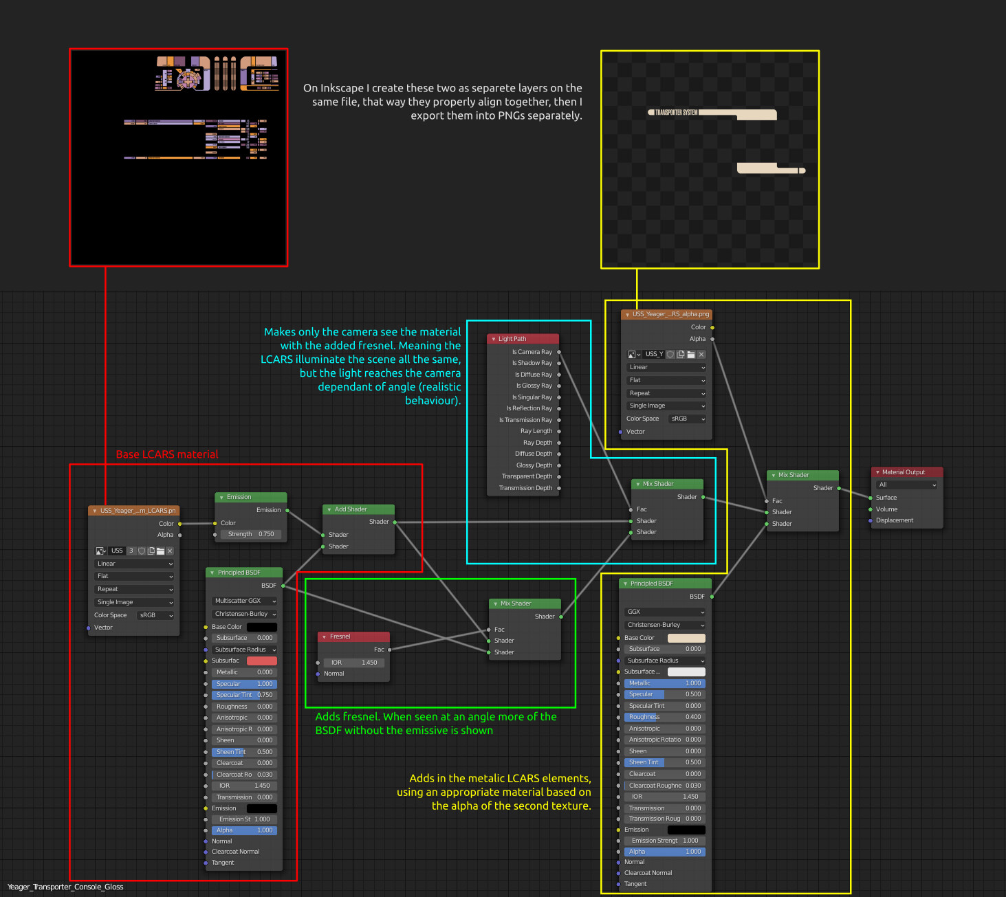
Last edited:
So updated materials, it looks like I did not have it going into the emission strength. I have updated my lcars materials to match the node setup @Rekkert provided. I actually set the emission strength to .5
I also tweaked the lighting in the scene a bit.

Right now each screen is it's own material since they are animated, with the exception of the elements around the lcars. I basically modeled in where they would have put the monitors in the set. I also used this time to make a few changes: Originally when I modeled the bridge I duplicated the consoles Alt + D, and then to get the screens that I wanted I set the drop down for "Link material to object or the object's data" set to object. I have taken the time to make each console it's own unique object, then reused materials and cleaned up the extra data that was floating around. I am hoping this will help with some of the stability issues I have been seeing when rendering animations.
With my 3080 and rendering with Optix, being limited to 10 GB VRAM has been something I have needed to work around. It would be nice if the next line of RTX GPUs will have more VRAM. I could get a 3090, but I don't think it would work in my eGPU setup.
What is so annoying is that my scene literally keeps crashing. Or like I will work in a different application and then go back to blender and then crash. Or I will start to render an animation and then blender will randomly call it quits.
I also tweaked the lighting in the scene a bit.
Right now each screen is it's own material since they are animated, with the exception of the elements around the lcars. I basically modeled in where they would have put the monitors in the set. I also used this time to make a few changes: Originally when I modeled the bridge I duplicated the consoles Alt + D, and then to get the screens that I wanted I set the drop down for "Link material to object or the object's data" set to object. I have taken the time to make each console it's own unique object, then reused materials and cleaned up the extra data that was floating around. I am hoping this will help with some of the stability issues I have been seeing when rendering animations.
With my 3080 and rendering with Optix, being limited to 10 GB VRAM has been something I have needed to work around. It would be nice if the next line of RTX GPUs will have more VRAM. I could get a 3090, but I don't think it would work in my eGPU setup.
What is so annoying is that my scene literally keeps crashing. Or like I will work in a different application and then go back to blender and then crash. Or I will start to render an animation and then blender will randomly call it quits.
Last edited:
The tweaked lighting and higher contrast setup did wonders for the look (at least in my crappy old monitor)! The uniforms and skin tones as well now look more accurate/realistic due to the higher contrast, when before they were a lot more samey in comparison. Overall looking a lot better, at least to me.
Similar threads
- Replies
- 39
- Views
- 1K
- Replies
- 20
- Views
- 701
If you are not already a member then please register an account and join in the discussion!