• Welcome! The TrekBBS is the number one place to chat about Star Trek with like-minded fans.
    If you are not already a member then please register an account and join in the discussion!

The OFFICIAL STNG-R general discussion thread!

Status
Not open for further replies.
Well we might not know exactly what happens with the 4-ft model shots for years yet, because we have to get through seasons 1 and 2 first!

There is a shot of the 2ft model from the underside where it passes by the camera, I will find a cap in a bit.... I think its going to look like shi* in HD.
 
Just looking at the screencaps posted at Trekcore. Funny how "EaF" looks better than the later season episodes included on the preview disc. Contrast and colour are far bolder. Interesting.
 
To me the best change isn't so much the added detail, but the fact they finally got rid of that awful pink tint the show had.
 
To me the best change isn't so much the added detail, but the fact they finally got rid of that awful pink tint the show had.

Yes!! That pink tint was AWFUL, and permeated pretty much every episode in the first season. My eyes are totally adjusted to it after watching the episodes so many times, so seeing the HD masters without the tint is bizarre!

Just looking at the screencaps posted at Trekcore. Funny how "EaF" looks better than the later season episodes included on the preview disc. Contrast and colour are far bolder. Interesting.

Ha, yes!! I noticed this too - although I'm sure this is primarily down to the change in the lighting on the show after the 2nd season.
 
They fattened her up to account for the Ten Forward set and the resulting two deck rim on the saucer and secondary hull.

Oh yeah, forgot about Ten Forward. And then they had to fatten up the other hull to remain consistent.

I know I'm in the minority, but looking over screenshots of both models.... I have to say I slightly prefer the 4-footer. I always thought the thicker aztec panels were a huge improvement, and the fatter hull thing doesn't really bother me all that much.

Of course the ideal would obviously be putting the aztecking on the thinner hull.
 
What I find amazing about the warp shot is that the warp stars are exactly the same. Just like Q's energy grid, I'm wondering how they did that. Shouldn't the resolution be extremely bad since it's a CG element from the 80s?

No, because it's slit-scan photography, not CG... just like in Star Trek: The Motion Picture. The film is exposed as it moves through a slit-shaped aperture:

[yt]http://www.youtube.com/watch?v=G-1kkB_qF28&feature=related[/yt]

or even:

http://tng.trekcore.com/gallery/albums/s1/1x06/wherenoone053.jpg
 
The Enterprise-D jumping to warp just ahead of the Amargosa shockwave is possibly the best they've ever done.

Chekov jumping the Enterprise-A to warp to dodge that Klingon torpedo is possibly the worst.
 
Just looking at the screencaps posted at Trekcore. Funny how "EaF" looks better than the later season episodes included on the preview disc. Contrast and colour are far bolder. Interesting.

Ha, yes!! I noticed this too - although I'm sure this is primarily down to the change in the lighting on the show after the 2nd season.

Yeah, when Marvin Rush took over for Ed Brown as Director of Photography, the style he used had more fill lighting in the shadows. Jonathan West in seasons 6 & 7 used even more! Especially the bridge. It just gets brighter and brighter and brighter as the show goes on. Then in Generations it's dramatically lit again! That was Chinatown DP John Alonzo, by the way.

http://en.wikipedia.org/wiki/Fill_light

As I am watching season 1 all the way through, I am noticing how much more cinematic the show was back in 87 as opposed to the early 90's. The show had a very unique feel in terms of direction, sound and style. Interesting that it lost that along its way.
 
I much prefer re-watching seasons 1 and 2 over 5,6 and 7 nowadays, whereas years ago I would have thought the opposite. After season 4 ended the show became much more talky/soapy and filled with too much technobabble whilst abandoning its action/adventure/scifi beginnings.
 
The twinkle-wall or star field (it moved by season 2) was made up of thousands of tiny reflective mirrors glued to black Duvateen.

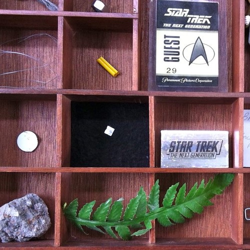
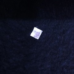
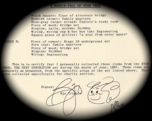
I own a single "star" from the set of "Encounter at Farpoint". Bjo Trimble packaged up objects she collected for a charity auction.

It's rectangular mylar. I shall add a pic!


Closeup of star by Therin of Andor, on Flickr


Star by Therin of Andor, on Flickr


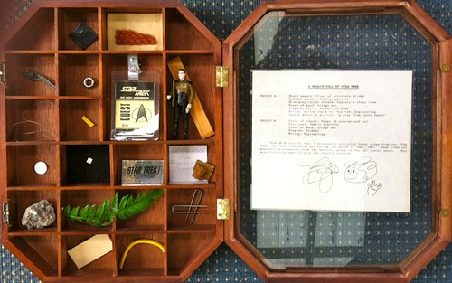
Baggie full of Star Trek by Therin of Andor, on Flickr


Bjo certificate by Therin of Andor, on Flickr

I have added a few items to the display box: the Galoob Data figure, which gives a good sense of scale to the other items, the mylar-sticker plastic badge with early TNG logo (from Lincoln Enterprise's TNG Fan Club), the little clay cottage from the "Old Bandi City" tabletop miniature shown in "Encounter at Farpoint" and an official studio visitor's pass, bought in separate charity auctions.
 
Last edited:
Yeah, when Marvin Rush took over for Ed Brown as Director of Photography, the style he used had more fill lighting in the shadows. Jonathan West in seasons 6 & 7 used even more! Especially the bridge. It just gets brighter and brighter and brighter as the show goes on. Then in Generations it's dramatically lit again! That was Chinatown DP John Alonzo, by the way.

It's ironic that pretty much the same thing happened with TOS. The first season had all these interesting camera angles and shadows everywhere, and by the end everything was completely flat and washed out.

Shame that both series had to go in that direction.
 
I much prefer re-watching seasons 1 and 2 over 5,6 and 7 nowadays, whereas years ago I would have thought the opposite. After season 4 ended the show became much more talky/soapy and filled with too much technobabble whilst abandoning its action/adventure/scifi beginnings.

I still think seasons 3-6 are the strongest, but yeah, it's mostly the first two that I'm really looking forward to revisiting in HD-- just because they were so much more visually dynamic and experimental.

The storytelling might have improved later on, but it also got a lot more safe and formulaic.
 
^ Agreed. I think the stories were there in the first 2 seasons, just let down by some less than stellar scripts and acting. But there was a sense of adventure and wonder that was lost towards the end, IMHO of course.
 
Using one of the Blu-ray screenshots (the only one I could use, annoyingly!), I've made a 1080p desktop wallpaper, cloned outwards on one side to make it widescreen, then flipped.

http://img32.imageshack.us/img32/9457/tnghd.jpg

Slightly iffy planet edge aside, it's quite nice. I might try cropping one instead of extending, but then you don't get the full resolution out of it.

EDIT:
A couple more widescreen wallpapers. These ones are cropped, so they lost a bit of detail (and I reduced the grain a little)...

http://img51.imageshack.us/img51/4448/tnghd1.jpg
http://img338.imageshack.us/img338/6307/tnghd2.jpg
 
Last edited:
The fly-along shot of the Enterprise and Excelsior-Class looks good, though the Excelsior-class looks maybe a bit out of scale to the -D.
 
Episodes I can think of right away that needed better staged shots are "Yesterday's Enterprise", "Q Who", "Redemption" (this one in particular. We are told the blockade was a total of 30 Federation ships, and we got to see, 3 kitbashes on screen? Is is really acceptable from a "purist" point of view? Wouldn't you rather see the 30 ships on screen since it would be so easy to recreate them in CGI?)
Redemption is a really bad example since it would make no sense to see all the ships in the shot because they're spread out over light years to secure the border.

As for the Warbirds, they do lack presence, but that's because they never actually do anything in TNG.

Redemption is a good example, because at the beginning of the trip to the Neutral Zone, all the ships are together in a convoy. I'd like to see more than 3, not all 30 are necessary, but they have a chance to CGI in at least 10-12 or more ships.

The Warbirds were always shown as confrontational, and this is only because of the budget they had (couldn't keep showing battles, too much money to keep blowing up models).

And this really is my biggest gripe with the whole concept of keeping it "true to the original".

It was only "original" because they didn't have the budget do massively upscaled battle sequences. A good example would be "The Survivors". They actually did a great job with the battle sequences there, but only because I understand that for the time, this was a huge undertaking! and I was happy to get that much on screen. That battle would be more kick ass if they actually have the ships do more on screen.

I still have my hopes that they will. Keeping it "true to the original" can mean true to the original intent.

Think of TOS-R's "The Doomsday Machine". I know the casual viewer who remembers the original episode was blown away by the remake. I know my dad was, he loves TOS, but now he adores it. I believe TOS-R stayed true to the series, as the same scenes were kept but updated (like the more realistic matte paintings, etc). When the episode needed it though, like in Doomsday Machine, they freakin' delivered! Why can't they do the same with TNG. I'd be happy if they keep everything the same, but enhance the scenes with the Borg Battles, key scenes with Romulans, and the last fight with the Klingons in AGT.

From what I've seen so far, the remastering is worth buying the Blu-ray sets when they come out, so they already got me hooked. I'm a beggar and I can complain, but I'll take anything better than what's there now.
 
Here's the Season 5 title card. Interestingly enough, it looks like they kept the original starfield, but the streak photography element (reminiscent of the kind used in the credits of Superman: The Movie, Superman II, etc.) doesn't match or the timing is off for this frame. They also composited it too bright, so the series title is more difficult to read:

http://screenshotcomparison.com/comparison/104549

And the blue glow on the left is gone, so we can assume it's gone on the end credits too.
 
Using one of the Blu-ray screenshots (the only one I could use, annoyingly!), I've made a 1080p desktop wallpaper, cloned outwards on one side to make it widescreen, then flipped.

http://img32.imageshack.us/img32/9457/tnghd.jpg

Slightly iffy planet edge aside, it's quite nice. I might try cropping one instead of extending, but then you don't get the full resolution out of it.
Nice, thank you. For my own use, I fixed up the flipped shuttlebays (anal, I know) so that they are back in the right spot. If you want my slightly altered version...


Status
Not open for further replies.
If you are not already a member then please register an account and join in the discussion!

Sign up / Register


Back
Top