Thanks for all the suggestions.Hi Madman,
The project is really coming along. Very impressive!
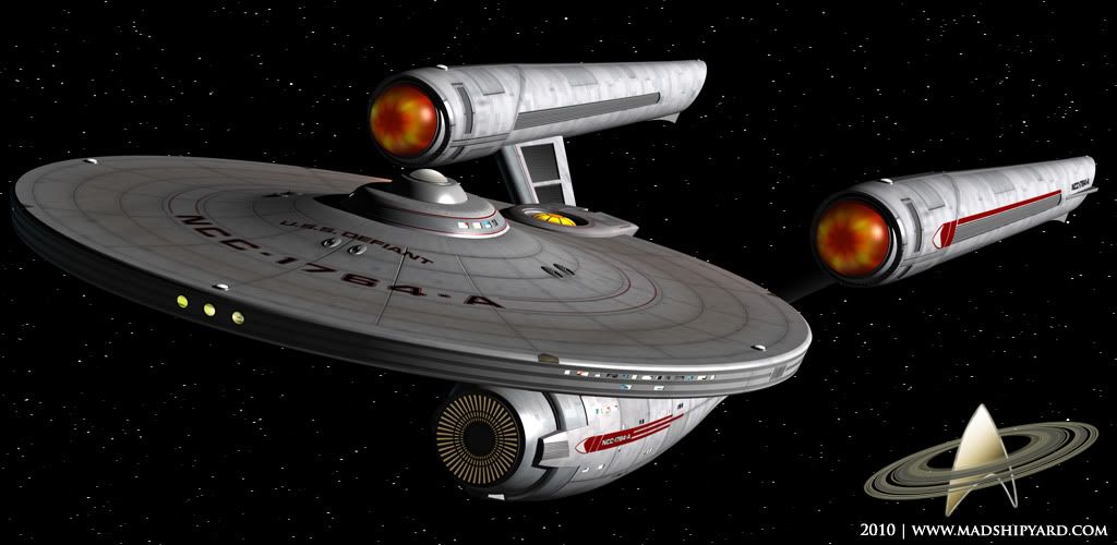
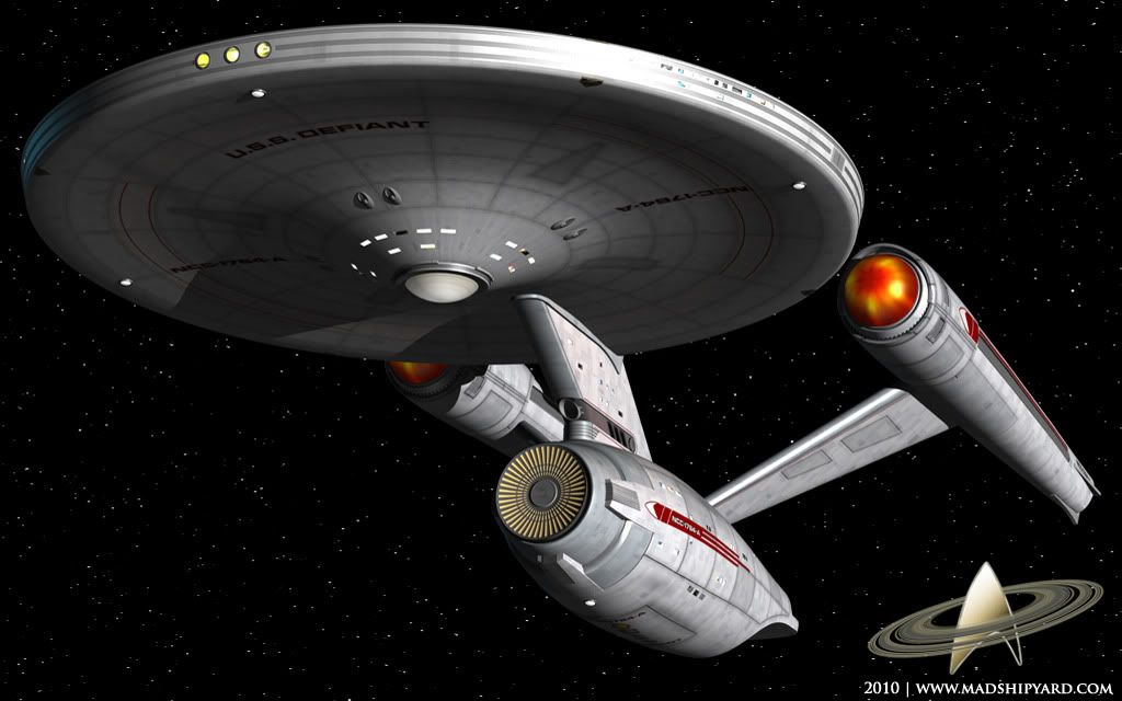
About the textures on the nacelles and saucer - if you're going for a worn look then it's got some of the right elements. However I think the grid lines on the saucer and nacelles are too thick and blurred. This may simply be down to the resolution of the texture maps. I'd clean them up so they are less obvious.
The worn look is likely to comes from two causes:
1. Cosmic weathering - atoms striking the ship from the front as it travels at speed. So the leading edges would look different to sheltered areas of the hull.
2. Newer replacement panels - probably old panels replaced due to damage.
To elaborate on (1) you need to decide what the ship is constructed from. Let's say metal, in which case the leading edges would look "sandblasted". That would probably make them slightly more silver, less light diffusion and reflective. Protected areas might be more corroded - very slight yellow/brown, more light diffusion and less reflective. There would also be areas where particles are channelled around the hull. For example particles would flow around deck 2 so the weathering might cause a slight scorching teardrop pattern on the top of the saucer.
To elaborate on (2) new panels would be whiter with a thin layer of "white rust". Not as yellow as old panels, yet not as shiny as weathered ones.
On the nacelle domes - it needs a different approach, but I can't quite picture it. At the moment it almost looks like a flame texture painted onto the surface of the dome. It might be better to make them semi-transparent and place a volumetric light in there at the back with the fan blades casting shadows through the "gaseous fluid" onto the domes. Alternatively use a volumetric light with a texture gel (the texture being the fan blades).
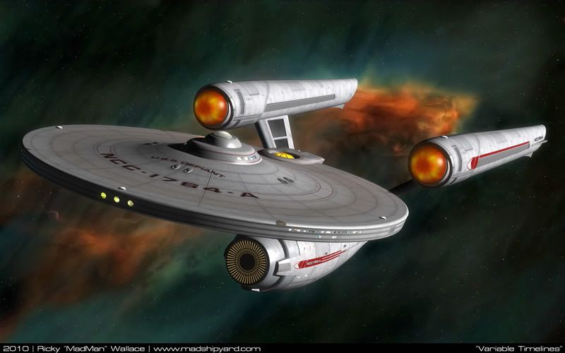
You're also at a stage where you might work out the textures better if the ship was seen in its natural environment. Single light source against space or a planet. It helps me a lot.
Keep up the great work.
Regards,
S.O.

I'll address the grid lines, first... These will be much less obvious in "normal" light. the blurry part you are seeing is shading that is meant to compliment the bump map, which isn't visible yet, because of the multiple light sources. I promise it will look better in the final renders.

About the Nacelle Domes, I am doing almost what you suggested. There are 2 domes, an inner one, behind the blades, which has a light in it. I can't do a volume light, but I do have an "Area" light shining outward towards the front, through the blades. The outside domes has a texture on it that is being lit up from that light. Blender (with the default renderer, anyway) doesn't have very good lighting.

BIG updates soon...


