• Welcome! The TrekBBS is the number one place to chat about Star Trek with like-minded fans.
    If you are not already a member then please register an account and join in the discussion!

USS Defiant, NCC-1764-A

Hi Madman,

The project is really coming along. Very impressive!

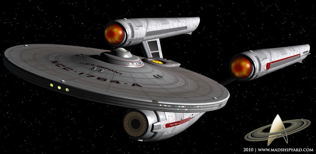
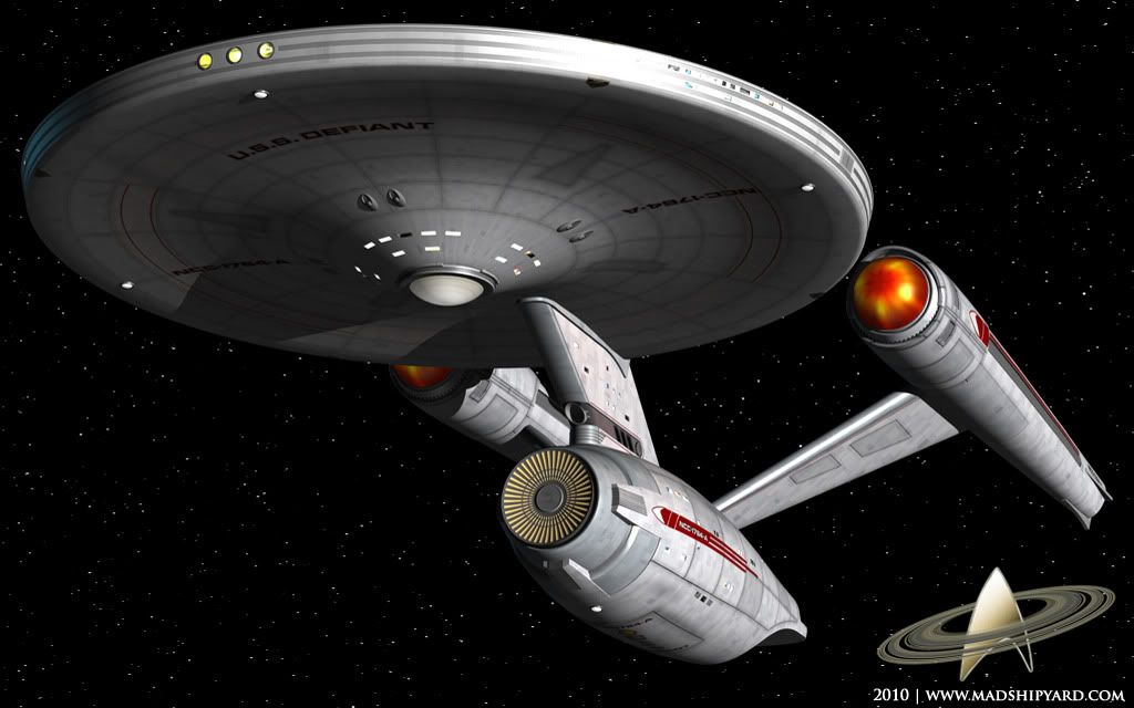
About the textures on the nacelles and saucer - if you're going for a worn look then it's got some of the right elements. However I think the grid lines on the saucer and nacelles are too thick and blurred. This may simply be down to the resolution of the texture maps. I'd clean them up so they are less obvious.

The worn look is likely to comes from two causes:

1. Cosmic weathering - atoms striking the ship from the front as it travels at speed. So the leading edges would look different to sheltered areas of the hull.
2. Newer replacement panels - probably old panels replaced due to damage.

To elaborate on (1) you need to decide what the ship is constructed from. Let's say metal, in which case the leading edges would look "sandblasted". That would probably make them slightly more silver, less light diffusion and reflective. Protected areas might be more corroded - very slight yellow/brown, more light diffusion and less reflective. There would also be areas where particles are channelled around the hull. For example particles would flow around deck 2 so the weathering might cause a slight scorching teardrop pattern on the top of the saucer.

To elaborate on (2) new panels would be whiter with a thin layer of "white rust". Not as yellow as old panels, yet not as shiny as weathered ones.

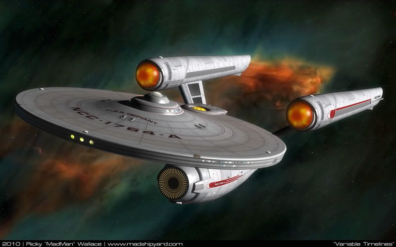
On the nacelle domes - it needs a different approach, but I can't quite picture it. At the moment it almost looks like a flame texture painted onto the surface of the dome. It might be better to make them semi-transparent and place a volumetric light in there at the back with the fan blades casting shadows through the "gaseous fluid" onto the domes. Alternatively use a volumetric light with a texture gel (the texture being the fan blades).

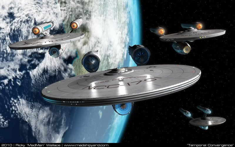
You're also at a stage where you might work out the textures better if the ship was seen in its natural environment. Single light source against space or a planet. It helps me a lot.

Keep up the great work.

Regards,

S.O.
Thanks for all the suggestions. :)

I'll address the grid lines, first... These will be much less obvious in "normal" light. the blurry part you are seeing is shading that is meant to compliment the bump map, which isn't visible yet, because of the multiple light sources. I promise it will look better in the final renders. :)

About the Nacelle Domes, I am doing almost what you suggested. There are 2 domes, an inner one, behind the blades, which has a light in it. I can't do a volume light, but I do have an "Area" light shining outward towards the front, through the blades. The outside domes has a texture on it that is being lit up from that light. Blender (with the default renderer, anyway) doesn't have very good lighting. :)

BIG updates soon...
 
Thanks. :) That last image you mentioned, is definitely going to appear, when this is done. :)

:drool:
OK, guys, this thing is 99% done... I'm sure I'll look back at it later, and find something I missed.

Here's the ship, in some "real" lighting.....

Defiant_Front_1.jpg


Defiant_Front_2.jpg


And, a quick wallpaper... ( I had to have one for my work computer :) )

VariableTimelines_Small.jpg

1680x1050: http://i5.photobucket.com/albums/y200/MadMan1701A/Wallpapers/VariableTimelines_1680.jpg
 
Last edited:
Beautiful. This ship really gets everything right. Love how, finished, those subtle cowlings look so cool. How the markings play into the shapes, those phaser "moldings"...(I could go on and on, but I'll keep it short :))
And I have to say from now on, I like the single torp better than the TMP version...just a cleaner look.
She needs a set of blueprints for the kit modders and scratch builders.

Awesome.
 
Thanks. :)

If someone were to build me a scratchbuilt model of this guy, I would freak out. :) That would be amazing, to have one of these on my desk alongside my other models here.

Hopefully I'll have more images up soon.
 
Beautiful. This ship really gets everything right. Love how, finished, those subtle cowlings look so cool. How the markings play into the shapes, those phaser "moldings"...(I could go on and on, but I'll keep it short :))
And I have to say from now on, I like the single torp better than the TMP version...just a cleaner look.
She needs a set of blueprints for the kit modders and scratch builders.

Awesome.
So, since it was your idea, how do you feel about drawing up a set of blueprints for this? I can get you all the orthos you need. :)
 
Well, shit. Now I want one.

Form an orderly queue... ;)

Loving it. Might just be my favourite of all the ships you've done (and that's saying something, considering how much the Metaluna knocked me for six)! Looks fantastic with the scenic lighting (or whatever it's called in 3D modelling parlance!) - really sets off the colours, which are spot-on for bridging the gap betwen TOS and TMP.

Out of curiosity, I dug around for that comparison pic of the TOS/TMP/JJ Enterprises to see how it looks in context. For my money, it looks right at home up there with the 'Big "E"s'...


...and the Abramsprise. ;) (set phasers to 'snark'!)

Hell, I keep scrolling this thing up and down, just enjoying watching it 'morph' from ship to ship, and taking in all those little transition that are so subtle, they'd go unnoticed otherwise. Try it - it's (to quote the man himself) ..."fascinating". :vulcan:


Comparison images
[embedded images changed to link - please see board rules re: embedding images from other websites - Ptrope]

Defiant_Front_2.jpg


Just curious, how does it look with a blue impulse deflection crystal á la the TMP, and white for the 3 circly-things on the primary hull rim? (What the heck are those things, exactly?!?)? Would it work, or would the blue be too much of a clash with the red decals?


Lastly, I really, REALLY like the deflector, particularly because it scratches an itch I've had ever since seeing First Contact; the Sovereign class deflector dish is a similar gold-ish, radiated set-up, which frankly comes out of nowhere in terms of the design lineage. It looks cool, to be sure (and how else would we have had that great "Assimilate THIS!" moment? ;) ), but I'd like it a whole lot better if we'd seen some kind of precursor to it on an older ship. Thanks to the Defiant-A, that hole has been plugged, and that OCD-ish part of my brain that preoccupies itself with things like that can sleep easy! :bolian:

On that note, I really must be off to bed, since it's just gone 4am - yikes...
 
Last edited by a moderator:
I'm really glad you like it. :) The deflector crystal started out blue, but nothing else on this ship is, so it looked kind of funny. Yellow to match the deflector seemed like a good idea. Speaking of the deflector, I always liked it, along with the Nacelles, from the Enteprise E. It seemed like they were really trying to bring in memories of the Original E with that one. I mentioned it earlier on in the thread, about those 3 big windows in front... that's where I moved the rec-deck/arboretum... thought it would be cool to have a big two-story open space there to hang out, after hours, and look out at space while being in the park. :)

Here's what I was working on tonight... It's similar to your idea about comparing the styles, so here it is...

TemporalConvergenceSmall.jpg


1680x1050: http://i5.photobucket.com/albums/y200/MadMan1701A/Wallpapers/TemporalConvergence1680.jpg

The Constellation, Enterprise, Defiant, and Metaluna join forces in Star Trek XII:The Search For More Money, to fix the broken timeline by blowing up lots of Klingon Warbirds. :)

Seriously, though, I am trying to find another arrangement to fit all these ships on screen at once, from a different angle. Any ideas?

Have fun, guys...
 
Seriously, though, I am trying to find another arrangement to fit all these ships on screen at once, from a different angle. Any ideas?

Yes. Design a fleet of Klingon ships, and have the two fleets coming at each other!

And then make another scene of them blowing each other up!

Seriously, you guys need to start posting more battle pictures! :p
 
I'm really glad you like it. :) The deflector crystal started out blue, but nothing else on this ship is, so it looked kind of funny. Yellow to match the deflector seemed like a good idea. Speaking of the deflector, I always liked it, along with the Nacelles, from the Enteprise E. It seemed like they were really trying to bring in memories of the Original E with that one. I mentioned it earlier on in the thread, about those 3 big windows in front... that's where I moved the rec-deck/arboretum... thought it would be cool to have a big two-story open space there to hang out, after hours, and look out at space while being in the park. :)

Here's what I was working on tonight... It's similar to your idea about comparing the styles, so here it is...

TemporalConvergenceSmall.jpg


1680x1050: http://i5.photobucket.com/albums/y200/MadMan1701A/Wallpapers/TemporalConvergence1680.jpg

The Constellation, Enterprise, Defiant, and Metaluna join forces in Star Trek XII:The Search For More Money, to fix the broken timeline by blowing up lots of Klingon Warbirds. :)

Seriously, though, I am trying to find another arrangement to fit all these ships on screen at once, from a different angle. Any ideas?

Have fun, guys...

I found my new desktop backround thank you :) :techman:
 
Beautiful. This ship really gets everything right. Love how, finished, those subtle cowlings look so cool. How the markings play into the shapes, those phaser "moldings"...(I could go on and on, but I'll keep it short :))
And I have to say from now on, I like the single torp better than the TMP version...just a cleaner look.
She needs a set of blueprints for the kit modders and scratch builders.

Awesome.
So, since it was your idea, how do you feel about drawing up a set of blueprints for this? I can get you all the orthos you need. :)

LOL. Me and my big mouth.
Well, you know I always love those ortho views...
Yeah, I'll give it a shot.
Man I'm tempted to get one of those 1:1000 kits now.
 
Well love how the design of the Defiant came about. Love the nice wallypaper with all 4 ships in it too. Would love to see more battle pics as well.
 
I'm really glad you like it. :) The deflector crystal started out blue, but nothing else on this ship is, so it looked kind of funny. Yellow to match the deflector seemed like a good idea. Speaking of the deflector, I always liked it, along with the Nacelles, from the Enteprise E. It seemed like they were really trying to bring in memories of the Original E with that one. I mentioned it earlier on in the thread, about those 3 big windows in front... that's where I moved the rec-deck/arboretum... thought it would be cool to have a big two-story open space there to hang out, after hours, and look out at space while being in the park. :)

Cool idea - shame on me for skipping past the text in the previous pages to get straight to the piccies! ;)

Actually, that's another good 'continuity plug', similar to the deflector configuration - 'in-universe', one could say that such an idea tested in the Defiant would be the inspiration for the Enterprise-D's Ten Forward. Couple that with the deflector, and the Galaxy class-esque torpedo launcher, and it's not beyond imagination to suggest that some of the innovations pioneered on the Defiant-A would later be revived in 24th-century Starfleet vessels. Indeed, that's not an unprecedented concept; there's a great deal of similarity between the refit Constitution and the Galaxy-class ships (corridors, engineering room configuration, etc.), so the idea of reviving older design axioms in such a fashion makes a lot of sense.

(Christ, I desperately need to stop over-thinking these things... ;) )

Digging that group shot (particularly seeing the contrast between the Constellation and the Defiant, which is cool), although I'm going to risk obliterating what little of my street cred that remains by pointing out how cute the little Metaluna is in the corner! ^_^

Awesome work, sir - can't wait to see the official orthos/wallpapers go up on your site!


[EDIT] Just noticed something - another nit-pick, admittedly, but one you'd probably spot too. Running lights! I noticed they're on the ship, but in white, not red and green. Thought it worth pointing out in case you'd missed it, although if this is in fact a deliberate thing, I'll go shut up again... ;)
 
Last edited:
If you are not already a member then please register an account and join in the discussion!

Sign up / Register


Back
Top