• Welcome! The TrekBBS is the number one place to chat about Star Trek with like-minded fans.
    If you are not already a member then please register an account and join in the discussion!

Contest: VOTE Favorite Star Trek Anniversary Logo (w/ pics + poll)

What’s you favorite Star Trek anniversary logo?

  • 20th anniversary

  • 25th anniversary

  • 30th anniversary

  • 35th anniversary

  • 40th anniversary

  • 45th anniversary

  • 50th anniversary

  • 55th anniversary

  • 60th anniversary


Results are only viewable after voting.

Michael

A good bad influence
Moderator
A few months ago they revealed the official logo for the 60th anniversary Star Trek celebrations next year. Star Trek has a tradition of these special logos going back all the way to the first official anniversary in 1986. Typically you’ll find these adorned on stickers, shirts and other official merch products that are coming out around that year. They always include the Starfleet delta in some form, some will show the Enterprise, and most of them use the classic font of the original series (curiously, the 40th anniversary logo is the only one which uses a custom font).

I suppose this is a bit of a graphic design nerd topic, but I was wondering which anniversary logo fans preferred and/or which they have the fondest memories of. While I don’t hate the newest one, I feel it is maybe a bit simple and doesn’t look as interesting and colorful as some of the earlier ones. Personally I have a soft spot for the 25th and 30th anniversary ones, since they were the ones that came out when I was a kid and when Trek was at the height of its popularity. The 30th anniversary emblem in particular I can remember being on almost every piece of merch I owned as a child. My least favorite one would be the 35th anniversary logo, which I could swear I had never even seen before researching this. :lol:

What about you? Which one’s your favorite? 5oivNsY.gif
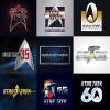
Star_Trek_Anniversary_logos.png

EDIT to add: Who remembers this early teaser for Star Trek: First Contact, which features the 30th anniversary logo rendered as a Borg ship.

To view this content we will need your consent to set third party cookies.
For more detailed information, see our cookies page.
 
Last edited:
The 30th was also heavily used to promote GEN

hRd1BBW.png


vXqwhCO.png


T7crE0p.png


EA1bQIY.png


It was also the logo for STTE
ZCO7HLX.png


u2PPOgs.png


RmfDDRd.jpeg


And maybe you remember this :D
Ul3jaXt.png
 
Last edited:
30th. But I love that logo in general since it's tied to movies and the Star Trek Experience. I think it would have made for an awesome com badge.

Anyway, the first 3 logos are great. Anything after the 30th is just lazy and shows how paramount just doesn't give a flip anymore.
 
30th. Like others have said, it was kind of used just as an overall Star Trek brand, bridging all of the properties at the time: TOS, TNG, DS9, and VOY. And as others have also said, it has the basis for the GEN poster which is the only non-painted Star Trek poster that I like. (Love, actually.)

50th got a reasonable second place for me. IMHO those are the only two good ones.

That's the 60th? Hmmm.
 
There was also a Star Trektennial logo in 1976, celebrating the 10th anniversary. It was a riff on the USA Bicentennial logo of the same year. I'm not finding it, but I know it appeared on the Lincoln enterprises catalog that year.

There was also an earlier 20th anniversary logo, which Memory Alpha calls "unofficial" but it was on books and bookstore displays throughout 1986, so I'm skeptical about how "unofficial" it was.

Of the ones pictured, I like the 20th anniversary logo. I have that as a pin somewhere.
 
I like the retro charm of the 20th, although none of them hold any particular resonance for me.

They all do the job I suppose, but from the 35th onwards they are all spectacularly bland IMO.
 
Apparently I'm going against the grain in saying I did *not* like the 30th anniversary logo, even though I'm very nostalgic for that era. The rounded top to the delta just looks very wrong to me.

I went with 35th, mostly because it's simple and not overdone.
 
The 30th logo was also used in teasers for the ST: TNG finale. Took me like an hour, but I found a good quality one on Youtube and used it fora video I did:

To view this content we will need your consent to set third party cookies.
For more detailed information, see our cookies page.
 
Personally I have a soft spot for the 25th and 30th anniversary ones, since they were the ones that came out when I was a kid and when Trek was at the height of its popularity. The 30th anniversary emblem in particular I can remember being on almost every piece of merch I owned as a child.
~ I have the fondest memories of the 25th and 30th too, and for the same reasons as you.

Half of these I was unaware of or have no recollection of - I was too young for the 20th, and the 35th, 40th and 45th passed me by. I quite like the 50th and remember seeing it around which is more than I can say about the 55th, although I do remember the flash of colour behind the delta (it's still around now, isn't it?). I think the 60th looks awkward, amateurish, and dated - like something off a cheapo/knockoff CD or DVD from the 90s.
Design-wise, I'm drawn to the 20th* and 45th, but like others have said, I do like how the 30th's oval was used in loads of promotional posters, signs, and logos.

* The weird, blocky, overlapping font is fascinating!
 
If you are not already a member then please register an account and join in the discussion!

Sign up / Register


Back
Top