Yeah it's only recent news thanks to a preview page from one of the Hero collector books.but the first one is new to me!
-
Welcome! The TrekBBS is the number one place to chat about Star Trek with like-minded fans.
If you are not already a member then please register an account and join in the discussion!
You are using an out of date browser. It may not display this or other websites correctly.
You should upgrade or use an alternative browser.
You should upgrade or use an alternative browser.
Spoilers NO SPOILERS FOR CODA - A Lit-verse Grand Finale...What We Know (Spoilers for Entire Lit-verse)
- Thread starter ryan123450
- Start date
Yeah it's only recent news thanks to a preview page from one of the Hero collector books.
Indeed!
Memory Beta link: https://memory-beta.fandom.com/wiki/USS_Curie_(NCC-81890-J)
Image link: https://memory-beta.fandom.com/wiki/USS_Curie_(NCC-81890-J)
We haven't seen the cover of the third book yet, have we?
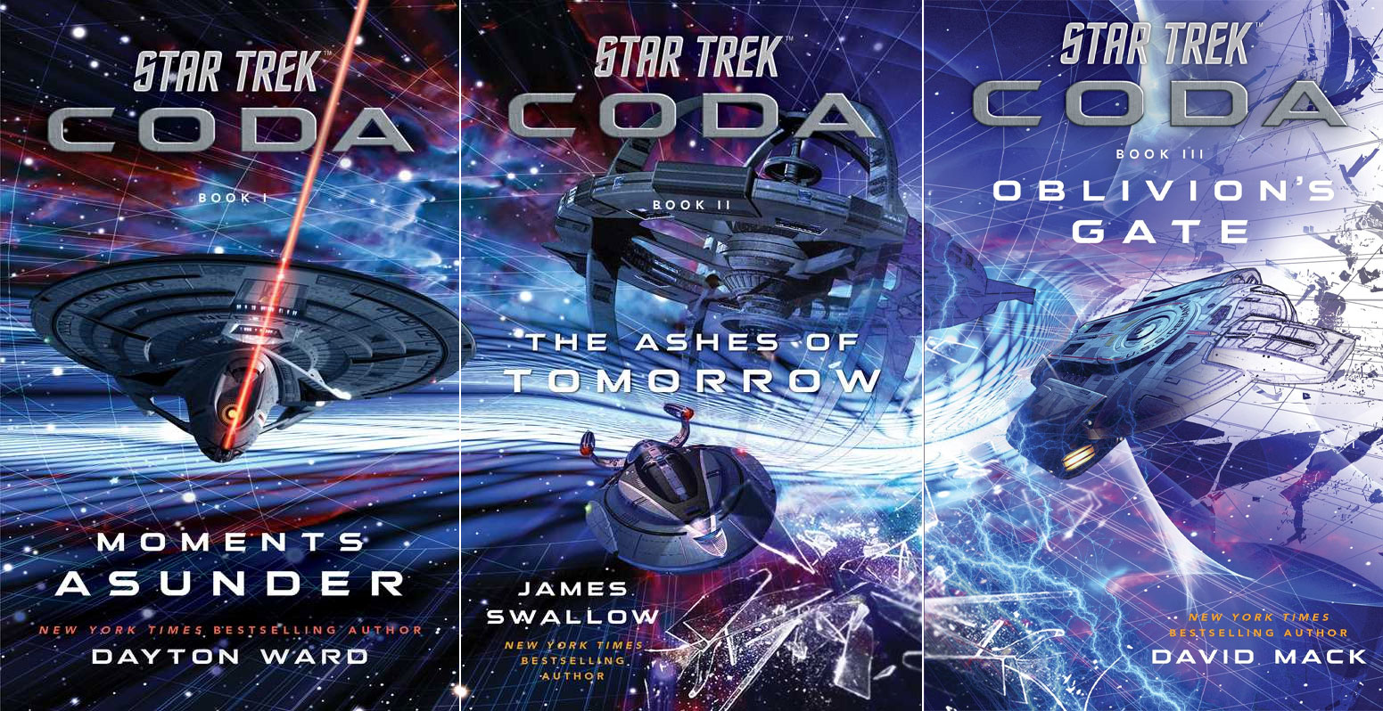
Book 1 was Enterprise-E, which is not as famous as Ent-D but we can't have Ent-D because of the timing. Same with nu-DS9 - it's not the screen-famous DS9 but it's still identifiable as something DS9-like for the uninitiated.
The third book could follow the pattern - it could be Titan (which is marginally better known now than it was due to appearing on screen in Lower Decks, so could still be considered a draw) or it could be Voyager (which itself has been redesigned if I recall). All of them would be not the famous version of what they are, but still recognisable.
.
WWWHHHAAATTT
https://twitter.com/TrekCore/status/1426202481550372866
There goes the Defiant getting all incursion'd.
For covers with just the ships and no people, the graphics themselves are pretty cool! I love me movie poster style character covers, but this is satisfactory.
For covers with just the ships and no people, the graphics themselves are pretty cool! I love me movie poster style character covers, but this is satisfactory.
Those are great covers!
If the story is that good we have nothing to worry about
")
There goes the Defiant getting all incursion'd.
For covers with just the ships and no people, the graphics themselves are pretty cool! I love me movie poster style character covers, but this is satisfactory.
As I quoted myself, I was expecting the third cover to be Voyager or Titan, given that we'd already had nu-DS9 and Aventine on book 2. But now we've got Defiant, that implies 2 out of the 3 books are DS9 heavy (whether they actually are or not is another matter of course, but you are supposed to be able to judge a book by its cover) which obviously makes me very happy.
And yes, I notice that both DS9 and Defiant blend from photo-realistic to obviously drawn and outlined at the edges, yet the Enterprise-E doesn't. Artistic license or a hint to the storyline? Benny Russell reference maybe?
.
And yes, I notice that both DS9 and Defiant blend from photo-realistic to obviously drawn and outlined at the edges, yet the Enterprise-E doesn't. Artistic license or a hint to the storyline? Benny Russell reference maybe?
It seems to me to imply a chronological progression from left to right, the effect getting more extreme with each book. It's not just the station and the Defiant, but the entire background, as if space itself is coming apart. And it seems to be spreading out from the white streak that's behind the Enterprise on the first cover.
I'd expected the breaking glass to be a much bigger component of the third cover, since its placement on the second cover implied it was leading into something bigger. But instead of reality "shattering," it's more like reality being undrawn.
As I quoted myself, I was expecting the third cover to be Voyager or Titan, given that we'd already had nu-DS9 and Aventine on book 2. But now we've got Defiant, that implies 2 out of the 3 books are DS9 heavy (whether they actually are or not is another matter of course, but you are supposed to be able to judge a book by its cover) which obviously makes me very happy.
And yes, I notice that both DS9 and Defiant blend from photo-realistic to obviously drawn and outlined at the edges, yet the Enterprise-E doesn't. Artistic license or a hint to the storyline? Benny Russell reference maybe?
.
Photoshop nerd here! That is the 'find edges' filter to make that effect on the Defiant. As for artistic license, I believe the overall piece to be saying that reality is being pulled away to its basic parts (realistic to hand-drawn-looking) until there is nothing left and then to be rewritten. Obviously, knowing what the story is kind of about colors that interpretation. We could see this as the events in the third book wiping out time and moving backwards to DS9-II and eventually the E-E. If this were an animated set of covers, after all the ships/station are rendered hand-drawn, they just turn into sketches, then when the background anomaly has done its work, the covers would be replaced with the ships from the Prime timeline. This would probably not be that dramatic looking though since its likely only DS9 would make a big visual shift.
Photoshop nerd here! That is the 'find edges' filter to make that effect on the Defiant.
Oh, I assumed it was just rendering the image as a wireframe or something like it, but I guess if it's a stock 2D still rather than a 3D model, that would make sense.
My thought was the whole image is transitioning into the style of the Discovery title sequence.
Oh, I assumed it was just rendering the image as a wireframe or something like it, but I guess if it's a stock 2D still rather than a 3D model, that would make sense.
The image they used for the cover is a standard publicity image of the Defiant that we commonly see on things like model kit boxes, Netflix thumbnails, magazines, etc. For 'existing' ships, I think its generally much more sensible and efficient to grab one of the zillions of readily available 2d images from the library of Star Trek. I probably would have tried to at least find a different picture of the Defiant, tho. It stood out right away when I looked at it and was a little distracting.
My thought was the whole image is transitioning into the style of the Discovery title sequence.
I dunno... It's Picard that's done the most to overwrite the novel continuity.
Oh no, I can't unsee it nowMy thought was the whole image is transitioning into the style of the Discovery title sequence.
 But also, the splintering on the second cover reminds me of the shard of the sky that "breaks away" at the start of the Picard intro. Probably neither is intended as a reference to the title sequences, but pretty cool anyway.
So incredible! Love this so much!
The U.S.S. Aventine.That is great. What's the ship under DS9?
Left. Right. Forward. Backward.
Don't be so linear.

Don't be so linear.
Yes - in fact it’s the first published photo of the Defiant from its unveiling in TV Guide ahead of the season 3 premiere. The while forward portions of the warp engines are the giveaway.The image they used for the cover is a standard publicity image of the Defiant that we commonly see on things like model kit boxes, Netflix thumbnails, magazines, etc. For 'existing' ships, I think its generally much more sensible and efficient to grab one of the zillions of readily available 2d images from the library of Star Trek. I probably would have tried to at least find a different picture of the Defiant, tho. It stood out right away when I looked at it and was a little distracting.
Left. Right. Forward. Backward.
Don't be so linear.
Solid advice in particular when referencing elements of DS9.

Similar threads
- Replies
- 11
- Views
- 11K
- Replies
- 6
- Views
- 888
- Replies
- 2
- Views
- 479
- Replies
- 34
- Views
- 3K
- Replies
- 18
- Views
- 2K
If you are not already a member then please register an account and join in the discussion!