I always thought that was just an Armstrong with the nacelle domes recolored blue.
-
Welcome! The TrekBBS is the number one place to chat about Star Trek with like-minded fans.
If you are not already a member then please register an account and join in the discussion!
You are using an out of date browser. It may not display this or other websites correctly.
You should upgrade or use an alternative browser.
You should upgrade or use an alternative browser.
Star Trek: Starships Model/Magazine Subscription
- Thread starter trekker670
- Start date
I'd assumed it was from somewhere in STO, since they've said they're going to do ships from there.
Then, I found this: https://artisgl.com/star-trek-uss-saratoga-nx-2501
Then, I found this: https://artisgl.com/star-trek-uss-saratoga-nx-2501
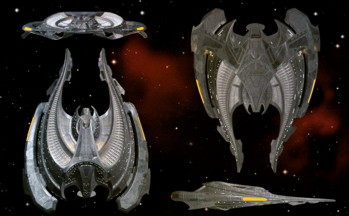
yet another example of ships i was excited about before eaglemoss gave it the bland treatment, here are some new pics of the son'a command ship from BBTS:


that was my assumption too. in fact, i'm the one who put that into memory alpha. could've been wrong tho.I always thought that was just an Armstrong with the nacelle domes recolored blue.
Not a bad treatment from having to start over from zero. They probably used the many hand-drawn orthos that have been in art books for years as a starting point for the mesh, and looked at HD screencaps from the movie to texture it. All eyeballed from second-hand sources. Seeing as how I personally couldn't give much more than two rat turds in a rainbarrel over the Son'a in general, I'd give it a B+ for what little they had to go on.
Then, I found this: https://artisgl.com/star-trek-uss-saratoga-nx-2501
Wooooooooow.
Is it bad my first reaction is “I didn’t think EM were the type to rip off fan art,” but my second reaction was, “What, my fan art isn’t good enough for you to rip off?”?
My original thought too, although there are extra pylons connecting the middle nacelle/hull to the saucer. But it's possible it's something more unique.I always thought that was just an Armstrong with the nacelle domes recolored blue.
Fan art? Dibs on Gabe Koerner's reboot Enterprise concept and the one on Anson Mount's FB page.I'd assumed it was from somewhere in STO, since they've said they're going to do ships from there.
Then, I found this: https://artisgl.com/star-trek-uss-saratoga-nx-2501
They probably used the many hand-drawn orthos that have been in art books for years as a starting point for the mesh, and looked at HD screencaps from the movie to texture it.
But Ben mentioned that they have "perfect reference", presumably referring to the Fact Files renders of the original SBS model, which clearly show that the hull shouldn't look that bland.
Oh.. Well, I guess they were just being lazy. 
The big difference in the orthos mostly seem to be more dramatic lighting and brighter specular highlights. The EM model looks a lot like an early-2000s CG model that looks cheap in flat lighting and fine on-screen. As far as I can tell, all the bevels and bumps are there on the model, they just aren't being emphasized.
it could be the thing hasn't been photographed well by EM too. i feel like the scimitar looked just as bland in early photos, but looks great in person. you can see molded details on the son'a ship if you look closely, those will likely look better when they catch the light, cast shadow, etc.As far as I can tell, all the bevels and bumps are there on the model, they just aren't being emphasized.
still, if they weren't going to include the contrasting hull paneling, they could've used a metallic finish like the scimitar and NX-01. it almost looks like they based their version on the STO model:

we've been waiting a long time for the son'a ships, this first one is looking pretty disappointing. we'll see.
Looks okay to me. I just wish it was one of the standard issues, since I have neither the money, nor the space, for the bigger ships. It'd be nice to see this and the regular Son'a ship in the regular set.
Speaking of standard vs. specials, I wonder why the Excelsior concepts were part of the numbered set but the Voyager, Enterprise-C, and Phase II concepts weren't.
Speaking of standard vs. specials, I wonder why the Excelsior concepts were part of the numbered set but the Voyager, Enterprise-C, and Phase II concepts weren't.
Speaking of standard vs. specials, I wonder why the Excelsior concepts were part of the numbered set but the Voyager, Enterprise-C, and Phase II concepts weren't.
Because the concept Excelsiors were seen in TNG.
I'm disappointed they labelled one of them as USS Excelsior NCC-2000 and not USS Alka Selsior NCC-1404 as the actual model was.

I hope the pylons of the XL DS9 won't be bent inwards as much as on the smaller model. From this angle I can't really tell yet...
Bent inwards? Mine is more curved in to allow the model to stay upright better without an additional stand.
more curved in to allow the model to stay upright better without an additional stand.
I don't think I understand; how is this change supposed to help? It just makes the contact area with the ground even smaller than necessary.


They’re running out of shuttle ideas, which is fine with me. These sets are expensive A.F.
Similar threads
- Replies
- 43
- Views
- 11K
- Replies
- 0
- Views
- 813
- Replies
- 6
- Views
- 579
If you are not already a member then please register an account and join in the discussion!