-
Welcome! The TrekBBS is the number one place to chat about Star Trek with like-minded fans.
If you are not already a member then please register an account and join in the discussion!
You are using an out of date browser. It may not display this or other websites correctly.
You should upgrade or use an alternative browser.
You should upgrade or use an alternative browser.
Reactions to the Kelvinverse Enterprise
- Thread starter Admiral Archer
- Start date
Oh, yeah my comments were exclusive to the Big E, which looked like a great visual update while staying fully within the design aesthetic of the original. Just the turbolift scene, and the vastly empty space it depicts, makes no sense. Plus wanting the ship to also be a massive shuttle/drone carrier...
The Disco herself is pretty fugly in about every way, inside and out. The other ships weren't a ton better, none of it really worked for me.
Whereas KelvinPrise looks nice on the exterior (ignoring scale issues) while not being as slavish to the original as DIS decided to be. I can live with that, though, it's fine. The Apple Store inside, though, is kinda silly. Hard to tell with all of the lens fares though, they've gotta fix all of the rouge light sources in that ship! And the engineering section is just stupid. Even for imaginary space magic.
i...The Apple Store inside, though, is kinda silly.


...don't see it.
nope still don't see it.Everything is white plastic
this talking point has been floating around since before the film was even released and i never got it. apple stores are all light wood tables and concrete or faux brushed aluminum walls. even the products themselves were aluminum back in 2009. so idk.
Is that what an apple-store looks like inside now? I... when did I get this old?
Yep - never understood the description myself - I think it’s over attributing intent by the fact that there’s some white on the bridge, and some blue lights.
Otherwise - it’s an inaccurate description that gets bandied around a lot, but doesn’t hold stock.
Otherwise - it’s an inaccurate description that gets bandied around a lot, but doesn’t hold stock.
It's the stupidest description that is absolutely meaningless and seems to be only meant to take a shot at something people don't like. If individuals don't care for the bridge that's fine-say so. But, inaccurate drivel just misses the point. It doesn't look like an Apple store. It looks functional, while an Apple store looks difficult to navigate, overpriced and painful.nope still don't see it.
this talking point has been floating around since before the film was even released and i never got it. apple stores are all light wood tables and concrete or faux brushed aluminum walls. even the products themselves were aluminum back in 2009. so idk.
How does it look functional with largely arbitrary graphics and buttons thrown together for effect, not at all like the carefully considered TMP bridge (which even came with a button-pushing manual by Rick Sternbach and Lee Cole), or the TNG bridge (where consoles were also specific to a point, the remainder being 4077-style buttons)?
And I don’t know where the Apple comparison comes from either; you’d pretty much have to take an iOS screen and fill it up with a bunch of useless but colorful apps, but that’s a user problem inconsistent with Apple’s principles of maximum automation and surface simplicity (which remind me most of TNG style).
And I don’t know where the Apple comparison comes from either; you’d pretty much have to take an iOS screen and fill it up with a bunch of useless but colorful apps, but that’s a user problem inconsistent with Apple’s principles of maximum automation and surface simplicity (which remind me most of TNG style).
I could follow it...How does it look functional with largely arbitrary graphics and buttons thrown together for effect

Me too. Seems fine to meI could follow it...
It looks as functional as a modern phone, which are incredibly functional.How does it look functional with largely arbitrary graphics and buttons thrown together for effect,
But @fireproof78 used a real-world Apple store for comparison, a business serving paying and complaining customers, which means that if I or anyone else were to walk onto that bridge set, we should be able to figure out the best sequence of buttons and levers to set course to 323 mark 15 and engage at warp 5 (even if the bridge set will obviously stay put). If we can’t, then an Apple store is more functional even where it didn’t have to be, simply because JJ Abrams wasn’t trying to be Stanley Kubrick.
Unless you'd read the manual for the Phase II/Motion Picture sets you'd never know what any of the buttons did or that the button acting was any more "correct" than TOS, Kelvin or any other Trek (and that presumes the actors actually pressed the correct buttons which I seriously doubt many people ever checked).But @fireproof78 used a real-world Apple store for comparison, a business serving paying and complaining customers, which means that if I or anyone else were to walk onto that bridge set, we should be able to figure out the best sequence of buttons and levers to set course to 323 mark 15 and engage at warp 5 (even if the bridge set will obviously stay put). If we can’t, then an Apple store is more functional even where it didn’t have to be, simply because JJ Abrams wasn’t trying to be Stanley Kubrick.
TOS never had any rhyme or reason to their button acting and they started the whole thing. TNG's helm console had different buttons for "engage" on the occasions we got close-ups. Star Trek VI used a button labelled "mode select" to fire photon torpedoes.
It's not a functional bridge. It's the actors doing button acting to create the illusion of a functional bridge. Nowadays on Kelvin and especially Discovery, they use interactive animated displays which hammer home what's happening under the actor's fingers far more effectively than any Trek before.
But @fireproof78 claimed that an Apple store is less functional than that bridge design, yet you don’t even want to compare user interaction regardless of possible vs impossible results (jumping to warp)? If so, how can we test which is more functional? Creative, artistic, arbitrary console-dancing just… feels more functional than testing and buying an iPhone?
The design grew on me.
Didn't hate it at first, but, I DID hate the nacelle portion being so close to the saucer. Feels weird to say, but, it felt like the ship needed to breathe a bit. Loved the minor redesign for Star Trek Beyond; such as the nacelle struts being pushed back. The nacelles, themselves, needed more space between them to make the ship a little more symmetrical. I did appreciate the fact that Beyond poked fun at the Enterprise by exposing its vulnerable spots.
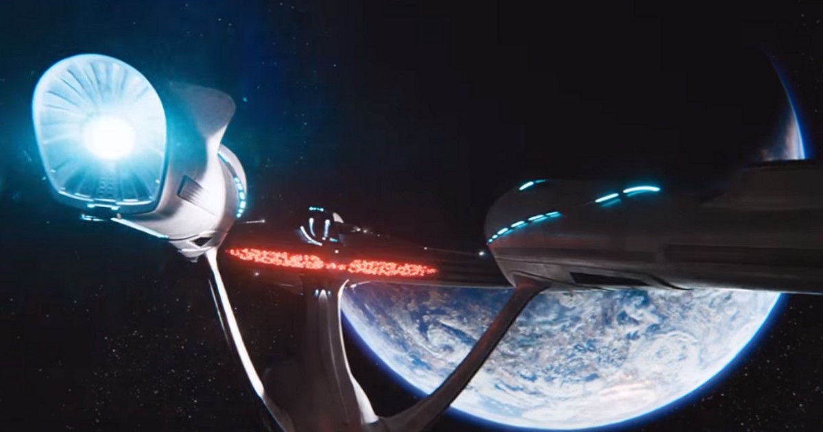
Unlike the original 1701 and its refit, the Kelvin Enterprise only looks good at certain angles. The one below, as an example.
As far as the interior goes, I thought the bridge needed more color. Discovery's Enterprise bridge was the perfect blending of the original design while also being modernized and yet still recognizable as the bridge of the Enterprise.
Didn't hate it at first, but, I DID hate the nacelle portion being so close to the saucer. Feels weird to say, but, it felt like the ship needed to breathe a bit. Loved the minor redesign for Star Trek Beyond; such as the nacelle struts being pushed back. The nacelles, themselves, needed more space between them to make the ship a little more symmetrical. I did appreciate the fact that Beyond poked fun at the Enterprise by exposing its vulnerable spots.
Unlike the original 1701 and its refit, the Kelvin Enterprise only looks good at certain angles. The one below, as an example.
As far as the interior goes, I thought the bridge needed more color. Discovery's Enterprise bridge was the perfect blending of the original design while also being modernized and yet still recognizable as the bridge of the Enterprise.
Last edited:
i...
...don't see it.
I honestly think the reason folks said that is purely because of the color scheme. Less so now, but, Apple used to be all about having its devices pretty much uniform in color - pure white and aluminum. I . think it'd be more accurate to say it's what the Enterprise bridge MIGHT look like if designed by Apple in 2008.
I think that I can.But @fireproof78 used a real-world Apple store for comparison, a business serving paying and complaining customers, which means that if I or anyone else were to walk onto that bridge set, we should be able to figure out the best sequence of buttons and levers to set course to 323 mark 15 and engage at warp 5 (even if the bridge set will obviously stay put). If we can’t, then an Apple store is more functional even where it didn’t have to be, simply because JJ Abrams wasn’t trying to be Stanley Kubrick.
And I don't want Abrams to be Kubrick.
Yes, actually, for me. I personally do not find the Apple experience to be that intuitive. Nor do I find an Apple store that helpful.But @fireproof78 claimed that an Apple store is less functional than that bridge design, yet you don’t even want to compare user interaction regardless of possible vs impossible results (jumping to warp)? If so, how can we test which is more functional? Creative, artistic, arbitrary console-dancing just… feels more functional than testing and buying an iPhone?
For me, the comparison is simple. Can I walk in and figure out what I need to do? I feel like I can on that Bridge. I don't feel that way walking in to the Apple store (or any electronic retailer now).
YMMV and probably does.
I don't really care about the buttons being "real" or "functional". I was perfectly fine with TOS' jelly beans, or TNG's absolute static Okudagrams. As long as it feels like a real console. And JJTrek did that right - some of the keyboards looked weird, but I loved the old-school knobs and levers.
That being said - as much as I absolute love Ryan Church's starship design - I never really cared for the inside of it. Like - this bridge has all the right things - a centerpiece console, Captain's chair, lots of graphics - and yet, I think it feels remarkably... lifeless? Like, something about the shapes and props just makes it seem "not right". Maybe it's the mix of styles of having very hard angles for some things (like the supporting pillars and doors), and othertimes fluid designs (like the centerpiece console). Somehow it just doesn't feel like a coherent design, but a mix of various things that do or do not work, like that weird lit floor shapes in the front.
Mind you - this is a case of "the opposite of love isn't hate - it's indifference". I really don't hate this bridge. Not at all. But after all these years, and dozens of different briges to compare it to - the only thing I can say about this particular bridge set is that the lense flares were annoying...
Similar threads
- Replies
- 85
- Views
- 5K
- Replies
- 12
- Views
- 8K
- Replies
- 6
- Views
- 593
- Replies
- 4
- Views
- 2K
If you are not already a member then please register an account and join in the discussion!