-
Welcome! The TrekBBS is the number one place to chat about Star Trek with like-minded fans.
If you are not already a member then please register an account and join in the discussion!
You are using an out of date browser. It may not display this or other websites correctly.
You should upgrade or use an alternative browser.
You should upgrade or use an alternative browser.
Refit/1701-A - 3D Model, Full Interior
- Thread starter DanGovier
- Start date
The turbocar doesn't go up to meet the height of the rear deck, and in fact it can't really do so because of the vertical space available.
Yep. That's what I figured, but wanted to toss that in there because that aft docking port deck in an early version of your deck 1 render (a couple of years back according to the timestamps) seemed to show it on the same level as the bridge deck line, and not up to the travel pod/shuttle interior deck line. On a side note, I also own the travel pod interior set blueprints as well that I picked up last year at auction. Though have not posted the high-rez images of it yet on my website. Hope to in the not too distant future along with a clean digital recreation of that drawing.
You'll also notice from the camera angle on screen that the camera is set very low down, so I think my steps solution fits what we see on screen rather well:
Nice solution!
While I am somewhat averse to putting in steps if it can be avoided, sometimes you have to do what you have to do to make it work. As you already ran into trying to somehow come up with workable rec. room in the main saucer.
While that rec. room set looked neat, Harold Michaelson really messed up in that it simply would not fit inside the saucer due to the saucer undercut. That he didn't think the Trek audience (at least a vocal OCD contingent of us) wouldn't notice speaks to his naiveté in not knowing the Trek fans. Particularly us rivet counters. (wry grin)
The hanger level docking port depth and angles are an issue as well, though I have a worked out solution for those (both the exterior docking plane, as well as the interior catwalk deck level).
The funny thing about that issue is that both Richard Taylor and Andrew Probert admitted in separate conversations with me (years apart) how that was a minor goof/oversight which I had brought to their attention after the fact. The being that the docking port is about 157.54 cm (in-universe) too high on the waistline of the secondary hull to correctly reconcile with the interior hanger deck/catwalk plane. Furthermore the docking port door is too deep to work with the travel pod filming miniature if kept at a perfect horizontal plane vs. the slightly inward curvature/angle of around 11.2º at that point of the hull.
Anyway, as a side note about Big Jim's plans, those drawings are pretty damn good, but there are some inaccuracies in them (some intentional, some not). In addition there is some "questionable" back story issues on how allegedly he made those drawings. But for 99.9% of what most people's needs are, they are great.
That said, I don't want to jam up your excellent work, but if you are open to any collaborative efforts and/or feedback, I can get you a little more accurate specs on the saucer rim thickness, and some info on the bridge exterior sizes and contours. The latter is from a source who has a original silicone mold that was pulled off the original re-fabricated bridge dome that Mark Stetson made over a 48 hour period after the original filming miniature had water damage over the 4th of July weekend in 1979 as VFX filming was underway at EEG (Trumbull's company).
I don't yet have the full specs on that bridge, but I have 100% rock solid base dimensions and base outline shape (plan view) from the mold itself. Slade's and pretty much everyone's drawings I have seen are just slightly off compared to the actual piece.
Again, not looking to horn in on your project, but if you are open to it, and/or would find it useful, I am more than willing to share/collaborate.
A few years back I ran into that docking port discrepancy on the waistline of the secondary hull with the catwalk plane while building that section out in 3D. Mr Probert was very kind to comment on this and said, "As for the deck-level discrepancy between the Engineering docking port and Landing Bay level,... there is a ramp leading down from one to the other within that transition corridor." I hope that might help you guys out on that.
As far as the actual docking port door, thanks for the info (I never got that far) so it's good to know")
As far as the actual docking port door, thanks for the info (I never got that far) so it's good to know
The funny thing about that issue is that both Richard Taylor and Andrew Probert admitted in separate conversations with me (years apart) how that was a minor goof/oversight which I had brought to their attention after the fact. The being that the docking port is about 157.54 cm (in-universe) too high on the waistline of the secondary hull to correctly reconcile with the interior hanger deck/catwalk plane. Furthermore the docking port door is too deep to work with the travel pod filming miniature if kept at a perfect horizontal plane vs. the slightly inward curvature/angle of around 11.2º at that point of the hull.
"As for the deck-level discrepancy between the Engineering docking port and Landing Bay level,... there is a ramp leading down from one to the other within that transition corridor."
Interesting in that was actually the same solution I came up with to deal with the issue back when I discovered the problem as well. The conversation I had with Mr. Probert was around 2006 when I was in an exchange about working out cargo area/hanger deck area color matching to Federal Standard paint colors off of DVD color sampling of frame grabs.
Can't say for certain he later suggesting a ramp was due to me, but when I broached that docking port issue with him he seemed to not be aware of it (at least stated he was surprised by me pointing it out) at that time and flat-0out admitted they goofed on that docking port placement (belie a little too high).
So interesting that he says the ramp was the solution (which is what I suggested at the time).
Hi, Dan! I'm the guy that commented on your YouTube video: I've built a SketchUp of the Enterprise bridge that you are welcome to use. I have a bridge in need of a Starship...you have a Starship in need of a bridge! First, though, a little background...
I'm a lifelong Trekker that has always had an affinity for the technical side of things--had the old FJ Tech manual and blueprints in the '70s, etc. When TMP came out, the level of detail was geektastic for me! I quickly learned everything I could about the new 1701 at the time, (and memorized every word of the script and every shot and camera angle of the movie.) With the coming of the Internet, the confluence of modeling programs like SketchUp, resources like CygnusX-1, and high-def digital uploads of TMP led to a natural conclusion: make a full-size, fully-detailed virtual model of the refit 1701.
I quickly learned, as you did, that the studio sets fudged the volume of the ship in several areas; and outside of canon there was not a lot of hard data as to internal layout. I didn't like some of the non-canon blueprints' solutions to that, either, so I had to come up with some 'conceits' to my model. One of the reasons I'm so excited about sharing my constructions with you is that you apparently share those conceits and are using the same logic to construction as I have.
I started with the supposition that the Enterprise is a working, real Starship, and everything shown on screen is a faithful representation of what things "look like." However, as with any movie, physical constraints make filming on-site difficult, so stage sets were built that replicate what is "really" on the ship--sets such as the rec deck and torpedo room are examples of this. Bridge control surfaces are from the 1978 "Flight Manual" by Jennings/Cole/Splittberger/Stokes/Sternback. Some amalgams of controls are necessary that utilize elements of TMP and Phase II design, but any minor deviation of on-screen canon is in favor of logical operation of all controls. In those instances where controls were script-dictated or vaguely described in the "Flight Manual," they have been assigned a logical function. In other words, the Enterprise can actually be controlled from this bridge unit.
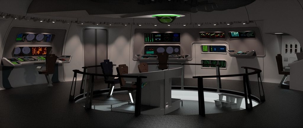
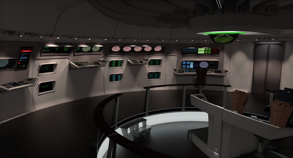
<a href="http://s92.photobucket.com/user/W_J_Thompson/media/Enterprise renders/stage20px20left_1.jpg.html" target="_blank"><img src="http://i92.photobucket.com/albums/l39/W_J_Thompson/Enterprise renders/stage20px20left_1.jpg" border="0" alt=" photo stage20px20left_1.jpg"/></a>
<a href="http://s92.photobucket.com/user/W_J_Thompson/media/Enterprise renders/bridge203.jpg.html" target="_blank"><img src="http://i92.photobucket.com/albums/l39/W_J_Thompson/Enterprise renders/bridge203.jpg" border="0" alt=" photo bridge203.jpg"/></a>
I also have a turbolift construction you may be interested in.")
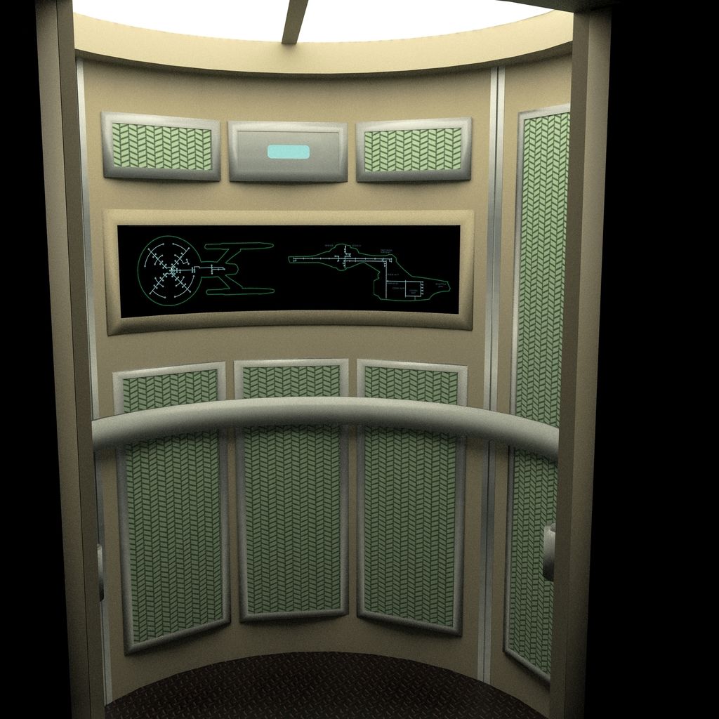
<a href="http://s92.photobucket.com/user/W_J_Thompson/media/Enterprise renders/turbolift20cab.jpg.html" target="_blank"><img src="http://i92.photobucket.com/albums/l39/W_J_Thompson/Enterprise renders/turbolift20cab.jpg" border="0" alt=" photo turbolift20cab.jpg"/></a>
Cheers!
--Bill Thompson
I'm a lifelong Trekker that has always had an affinity for the technical side of things--had the old FJ Tech manual and blueprints in the '70s, etc. When TMP came out, the level of detail was geektastic for me! I quickly learned everything I could about the new 1701 at the time, (and memorized every word of the script and every shot and camera angle of the movie.) With the coming of the Internet, the confluence of modeling programs like SketchUp, resources like CygnusX-1, and high-def digital uploads of TMP led to a natural conclusion: make a full-size, fully-detailed virtual model of the refit 1701.
I quickly learned, as you did, that the studio sets fudged the volume of the ship in several areas; and outside of canon there was not a lot of hard data as to internal layout. I didn't like some of the non-canon blueprints' solutions to that, either, so I had to come up with some 'conceits' to my model. One of the reasons I'm so excited about sharing my constructions with you is that you apparently share those conceits and are using the same logic to construction as I have.
I started with the supposition that the Enterprise is a working, real Starship, and everything shown on screen is a faithful representation of what things "look like." However, as with any movie, physical constraints make filming on-site difficult, so stage sets were built that replicate what is "really" on the ship--sets such as the rec deck and torpedo room are examples of this. Bridge control surfaces are from the 1978 "Flight Manual" by Jennings/Cole/Splittberger/Stokes/Sternback. Some amalgams of controls are necessary that utilize elements of TMP and Phase II design, but any minor deviation of on-screen canon is in favor of logical operation of all controls. In those instances where controls were script-dictated or vaguely described in the "Flight Manual," they have been assigned a logical function. In other words, the Enterprise can actually be controlled from this bridge unit.
<a href="http://s92.photobucket.com/user/W_J_Thompson/media/Enterprise renders/stage20px20left_1.jpg.html" target="_blank"><img src="http://i92.photobucket.com/albums/l39/W_J_Thompson/Enterprise renders/stage20px20left_1.jpg" border="0" alt=" photo stage20px20left_1.jpg"/></a>
<a href="http://s92.photobucket.com/user/W_J_Thompson/media/Enterprise renders/bridge203.jpg.html" target="_blank"><img src="http://i92.photobucket.com/albums/l39/W_J_Thompson/Enterprise renders/bridge203.jpg" border="0" alt=" photo bridge203.jpg"/></a>
I also have a turbolift construction you may be interested in.
<a href="http://s92.photobucket.com/user/W_J_Thompson/media/Enterprise renders/turbolift20cab.jpg.html" target="_blank"><img src="http://i92.photobucket.com/albums/l39/W_J_Thompson/Enterprise renders/turbolift20cab.jpg" border="0" alt=" photo turbolift20cab.jpg"/></a>
Cheers!
--Bill Thompson
Apologies...I apparently haven't uploaded pics to a message board in many, many years. Here are the images referred to above:
Cheers again,
--Bill
Cheers again,
--Bill
Apologies...I apparently haven't uploaded pics to a message board in many, many years. Here are the images referred to above:
Cheers again,
--Bill
Not to hijack this thread, but you did this in Sketchup?!?
Much respect. Great work!
Not to hijack this thread, but you did this in Sketchup?!?
Much respect. Great work!
Yessir, every single lil' face and vertex is done on SketchUp Make 2016, and the renders are done with Twilight Render V2. I'm glad you like it--you guys are the first and only to see these renders outside of my immediate family!
I'll second those sentiments; your work is fantastic.
It's also great to see that turbolift diagram again, in all it's crazy glory!
Did no-one actually walk anywhere on the refit Enterprise?
I never did get a good enough reference for that map at the time when I did my bridge (or most of it, anyway). The DVD caps were just not good enough. Time to bring up TMP on Amazon. I'm far too much of a perfectionist.
I have a great bump map I created for the carpet foam, though. Could be turned into a normal map...
http://scifi.zone/images/Green_Lumps_sm.jpg (Tiny version in color--should've been tiled)
@DanGovier: sorry, I'm done now. I've been following but not really commenting other than the neck bit. Sorry.

Excellent work so far, though!
First off, great work Bill. I too would love to see some of your actual SketchUp models and, with your permission of course, leverage them into some of the the things I am working on where applicable.
One thing I kind of stumbled upon when digging into, and began doing my deep-dive analysis of the TMP sets, the filming miniature(s) etc. was how the Enterprise workstation design and configurations of Phase II—TMP seemed to be influenced by usable human factors and to the work of Henry Dreyfuss:

Dreyfuss was an American industrial designer and his work and contributions to human factor analysis and consumer research were huge, and he made significant contributions to the underlying fields of ergonomics, anthropometrics and human form factors.
Needless to say I am heartened to come across other Trekkers doing this stuff, and with an appreciation for trying to follow the dictum of "form follows function".
It is great to see others utlyizing that thought process and make the underlying extrapolations of TMP sets, design, etc. in order to have them "make sense" as an "in-unverse" design rationale.
I have been working up foundational human form factor drawings for use at scale in my drawings and 3D designs, with my take of the Dreyfuss/Vitruvian Man approach:


I have even went so far as to begin working on a standardized color system for "Starfleet" colors along the lines of the Federal Standard color system used by the United States Federal Government (particular in its Department of Defense and OSHAapplications).
The numbering system is actually a code derived from the HSB color model within the Adobe Creative Suite software. The HSB color model (also called HSV or HSL models) is based on the human perception of color. It describes three fundamental characteristics of color in the visible spectrum:

The convention I came up with works out as the first three digits representing the hue value (000-360). The second two digits representing the saturation value (00-99) and finally the last two digits representing the brightness value (00-99).
There is also a Pantone Matching System (PMS) number with the swatches for actual print/press reproduction color matching purposes. Pantone is the print industry standard for color matching.
I intend to add another two-digit code after a hyphen to represent the reflectivity or sheen of the color in paint or coating applications where it will range between (00-10) to represent flat (00) to satin (05) to gloss (07) to chrome/mirror (10).
Bridge control surfaces are from the 1978 "Flight Manual" by Jennings/Cole/Splittberger/Stokes/Sternback. Some amalgams of controls are necessary that utilize elements of TMP and Phase II design, but any minor deviation of on-screen canon is in favor of logical operation of all controls.
One thing I kind of stumbled upon when digging into, and began doing my deep-dive analysis of the TMP sets, the filming miniature(s) etc. was how the Enterprise workstation design and configurations of Phase II—TMP seemed to be influenced by usable human factors and to the work of Henry Dreyfuss:
Dreyfuss was an American industrial designer and his work and contributions to human factor analysis and consumer research were huge, and he made significant contributions to the underlying fields of ergonomics, anthropometrics and human form factors.
Needless to say I am heartened to come across other Trekkers doing this stuff, and with an appreciation for trying to follow the dictum of "form follows function".
It is great to see others utlyizing that thought process and make the underlying extrapolations of TMP sets, design, etc. in order to have them "make sense" as an "in-unverse" design rationale.
I have been working up foundational human form factor drawings for use at scale in my drawings and 3D designs, with my take of the Dreyfuss/Vitruvian Man approach:
I have even went so far as to begin working on a standardized color system for "Starfleet" colors along the lines of the Federal Standard color system used by the United States Federal Government (particular in its Department of Defense and OSHAapplications).
The numbering system is actually a code derived from the HSB color model within the Adobe Creative Suite software. The HSB color model (also called HSV or HSL models) is based on the human perception of color. It describes three fundamental characteristics of color in the visible spectrum:
The convention I came up with works out as the first three digits representing the hue value (000-360). The second two digits representing the saturation value (00-99) and finally the last two digits representing the brightness value (00-99).
There is also a Pantone Matching System (PMS) number with the swatches for actual print/press reproduction color matching purposes. Pantone is the print industry standard for color matching.
I intend to add another two-digit code after a hyphen to represent the reflectivity or sheen of the color in paint or coating applications where it will range between (00-10) to represent flat (00) to satin (05) to gloss (07) to chrome/mirror (10).
I never did get a good enough reference for that map at the time when I did my bridge
IIRC I remember reading somewhere that Rick Sternbach—who was a relative newbie at the time working under Lee Cole—was actually repsonbile for the turbo lift system diagram. And that he simply made it look interesting and busy without a huge amount of thought put into the turbo car system itself and how it could or should fit and work within the ship. And that they simply had a cutout slot behind the transparency that they could move a handheld pen light along a path to show the car in motion in the scene where Kirk is taking it for the cargo bay to the bridge in an early TMP scene.
Would love to see a really clear image of the graphic itself (above just what's possible to pull digitally for a blue-ray screen grab.
Ooooh, that's pretty...well done!Apologies...I apparently haven't uploaded pics to a message board in many, many years. Here are the images referred to above:
Cheers again,
--Bill
IIRC I remember reading somewhere that Rick Sternbach—who was a relative newbie at the time working under Lee Cole—was actually responsible for the turbo lift system diagram. And that he simply made it look interesting and busy without a huge amount of thought put into the turbo car system itself and how it could or should fit and work within the ship. And that they simply had a cutout slot behind the transparency that they could move a handheld pen light along a path to show the car in motion in the scene where Kirk is taking it for the cargo bay to the bridge in an early TMP scene.
Would love to see a really clear image of the graphic itself (above just what's possible to pull digitally for a blue-ray screen grab.
I read the same thing as you: the internals of the refit had not been finalized before Sternbach made the transparency. The actual graphic is, if you study it, an awful tangle of shafts that make no sense at all, have far too many decks, and don't take the shuttle/cargo bay or rec deck into account at all. (Here's a still from the scene we're talking about. (c) Paramount, used pursuant to Fair Use copyright law for reasons of research, etc. etc.)
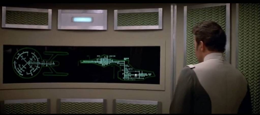
For my version, I decluttered the shafts, limiting the ship to 4 symmetric radials across the crew quarters in the saucer, and three verticals in the secondary, which seemed the most logical setup with what we know of 1701's "real" internal space. Of course, as our Chief Engineer continues his build, I (or he: my displays are done with OpenOffice Draw and are easily altered) can match his layout accordingly.
First off, great work Bill. I too would love to see some of your actual SketchUp models and, with your permission of course, leverage them into some of the the things I am working on where applicable.
One thing I kind of stumbled upon when digging into, and began doing my deep-dive analysis of the TMP sets, the filming miniature(s) etc. was how the Enterprise workstation design and configurations of Phase II—TMP seemed to be influenced by usable human factors and to the work of Henry Dreyfuss:
Dreyfuss was an American industrial designer and his work and contributions to human factor analysis and consumer research were huge, and he made significant contributions to the underlying fields of ergonomics, anthropometrics and human form factors.
Needless to say I am heartened to come across other Trekkers doing this stuff, and with an appreciation for trying to follow the dictum of "form follows function".
It is great to see others utlyizing that thought process and make the underlying extrapolations of TMP sets, design, etc. in order to have them "make sense" as an "in-unverse" design rationale.
I have been working up foundational human form factor drawings for use at scale in my drawings and 3D designs, with my take of the Dreyfuss/Vitruvian Man approach:
I have even went so far as to begin working on a standardized color system for "Starfleet" colors along the lines of the Federal Standard color system used by the United States Federal Government (particular in its Department of Defense and OSHAapplications).
The numbering system is actually a code derived from the HSB color model within the Adobe Creative Suite software. The HSB color model (also called HSV or HSL models) is based on the human perception of color. It describes three fundamental characteristics of color in the visible spectrum:
The convention I came up with works out as the first three digits representing the hue value (000-360). The second two digits representing the saturation value (00-99) and finally the last two digits representing the brightness value (00-99).
There is also a Pantone Matching System (PMS) number with the swatches for actual print/press reproduction color matching purposes. Pantone is the print industry standard for color matching.
I intend to add another two-digit code after a hyphen to represent the reflectivity or sheen of the color in paint or coating applications where it will range between (00-10) to represent flat (00) to satin (05) to gloss (07) to chrome/mirror (10).
Nice! Glad to see I'm not the only one who yearned for some logic to the uniform colours.
Nice! Glad to see I'm not the only one who yearned for some logic to the uniform colours.
Thanks.
To be clear, the color system wasn't just for uniforms but all of Starfleet. So the same color system would be for signage, shipboard materials, fabricated objects, etc.
I have a great bump map I created for the carpet foam, though.
Would love to see a high-res of a section of that at 1:1 scale.
I actually spent hours last winter trying to find a screen match tot he exact type of carpet padding that was used, such is my mania.
Found some that were close, not not exact.
That explains why your turboshaft diagram looked slightly different that I remembered; the presence of the 2 Rec Deck turbolift stops really stood out to me as something I didn't recall seeing before!I read the same thing as you: the internals of the refit had not been finalized before Sternbach made the transparency. The actual graphic is, if you study it, an awful tangle of shafts that make no sense at all, have far too many decks, and don't take the shuttle/cargo bay or rec deck into account at all. (Here's a still from the scene we're talking about. (c) Paramount, used pursuant to Fair Use copyright law for reasons of research, etc. etc.)
For my version, I decluttered the shafts, limiting the ship to 4 symmetric radials across the crew quarters in the saucer, and three verticals in the secondary, which seemed the most logical setup with what we know of 1701's "real" internal space. Of course, as our Chief Engineer continues his build, I (or he: my displays are done with OpenOffice Draw and are easily altered) can match his layout accordingly.

Needless to say, a marked improvement on the original when compared to the eventually established deck layout
In-universe, perhaps the display had been set to a power distribution diagram by the previous occupant?
That explains why your turboshaft diagram looked slightly different that I remembered; the presence of the 2 Rec Deck turbolift stops really stood out to me as something I didn't recall seeing before!I read the same thing as you: the internals of the refit had not been finalized before Sternbach made the transparency. The actual graphic is, if you study it, an awful tangle of shafts that make no sense at all, have far too many decks, and don't take the shuttle/cargo bay or rec deck into account at all. (Here's a still from the scene we're talking about. (c) Paramount, used pursuant to Fair Use copyright law for reasons of research, etc. etc.)
For my version, I decluttered the shafts, limiting the ship to 4 symmetric radials across the crew quarters in the saucer, and three verticals in the secondary, which seemed the most logical setup with what we know of 1701's "real" internal space. Of course, as our Chief Engineer continues his build, I (or he: my displays are done with OpenOffice Draw and are easily altered) can match his layout accordingly.
Needless to say, yours is a marked improvement on the original in terms of logic (compared to the eventually established deck layout)
In-universe, perhaps the wall display had been set to show a power distribution diagram by the previous occupant? The conduits might follow the turboshaft a part of the way and would certainly need to spread out across the saucer as depicted
Similar threads
- Replies
- 3
- Views
- 320
- Replies
- 482
- Views
- 63K
If you are not already a member then please register an account and join in the discussion!