• Welcome! The TrekBBS is the number one place to chat about Star Trek with like-minded fans.
    If you are not already a member then please register an account and join in the discussion!

Discovery at STLV. The massive info dump

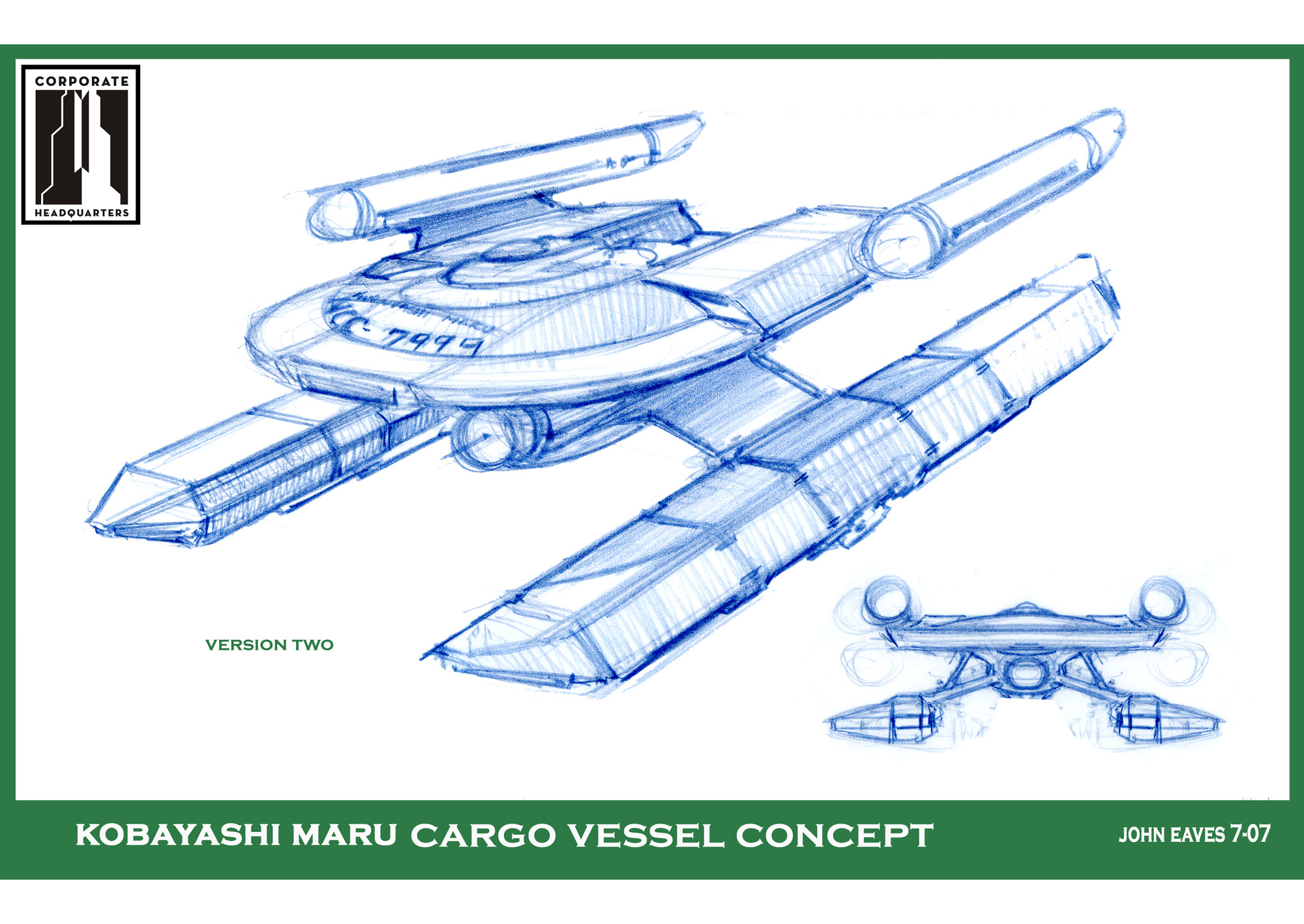
It was designed for the 24th century. Here's the original, made by Eaves for a Trek fan club:
1xmeDpn.jpg

When they decided to reboot the visuals, anything was fair game.

I have to disagree - it was not designed for a fan club.

Both this and the Shenzhou match several other designs by Eaves. Some of which are closer to what Shenzhou became.

This is just his preferred configuration that carries similar elements to most of his designs.
 
Eaves is good designer, but he really loves his sharp angular engines and puts them on every ship, from any race or era. I think Shenzhou looks good, but it would instantly feel more era appropriate with round engines.
 
This has very little in common with the ship we see. It has a saucer,pointed nacelles( which are something he does all the time) and a vague kinda pylon structure on the saucer that almost kinda( because its square) looks like the squad section on the Walker. But they are not the same shape or style.


The form styles are just not the same at all.
Looks the same to me...? Maybe with the back section a little taller and modified details.
 Love this ship
1501879750.png
1xmeDpn.jpg
 
There are similarities, but it's a bit more integrated and certainly different. MY impression from the trailer is a Syd Mead-like design from the front, smooth and sleek with a layered rear. One of my recent favorites!
dsc2-1068xd628.png

RAMA

Looks the same to me...? Maybe with the back section a little taller and modified details.

1xmeDpn.jpg
 
Last edited:
Eaves was the wrong person to design the Walker Class. He has a very distinct style that apparently doesn't change with the era he is designing for. It looks like it belongs in the 24th century.

I tend to agree. I like the Discovery, but the Shenzhou just looks like a generic 24th century ship.

Eaves is good designer, but he really loves his sharp angular engines and puts them on every ship, from any race or era. I think Shenzhou looks good, but it would instantly feel more era appropriate with round engines.

These were my feelings too - I love the 70s design of the Discovery, but the Shenzhou looks very genetic in terms of having features of every other Eaves design, from Ent to DS9.

If we accept the NX-01 is a product of its time, and it is of course canon that it is, then the Shenzhou makes perfect sense. In fact, it supports the theory developed during ENT that the 'Akira-like' catamaran design lineage runs parallel to the 'secondary hull' lineage which led to the Constitution.

I have no problem at all with the catamaran shape - its more the tendency of Eaves, like UssGlenn says, to just keep designing the same look for every era - jaggy features, pointed nacelles, ribbed hulls - without any mind for how different Starfleet seems in different eras - for example, this is one thing the Kelvin timeline got gloriously right when the USS Kelvin appeared on screen - it looked like something plausibly reminiscient of TOS and TMP.

mEOgaty.jpg


By contast the Eaves look:

SW4IsjS.jpg


It's something that we will obviously learn to overlook - not that important compared to the substance of the show, but it would be nice if designers accepted some of the more sensible things from fanon, such as inventing a new 'era look' for a new era, or tying it into an existing one - Star Trek is after all a collaborative work of 50 years, and not one designers property.
 
Last edited:
My favorite part about people complaining about John Eaves is when they only show his 24th Century works and designs... Yet they seem to forget he was one of the many artists brought on for ST09 before it was handed over to Ryan Church. He's fully capable of doing TOS/TMP designs. People seem to forget that producers are also a big part of art direction and what they want and don't want on screen. Ala all of these Eaves examples below:
kobayashi-maru-21.jpg

iowa-11.jpg

kobayashi-1.jpg
 
I partially agree with the assessments here. To me, its the nacelle shape. TOS ships, up to the TMP refit, always had cylindrical nacelles. The NX-01 did as well, as do the Abrams-verse ships. I think thats why the Kelvin worked so well. I would have loved to have seen the Shenzhou with the same hull design, but more TOS looking nacelles, in terms of shape, not even detailing. That being said, in a vacuum, its a nice design and I like how it breaks some laws about Starfleet design with the underslung bridge.
 
@Fandango831 - the top image is something I wasn't aware of, and is a neat break - but again the battlecruiser has the same hallmarks. I am aware that the only canon TOS ship we saw was the Constitution class, but I think the idea that nacelle shapes broadly followed a certain pattern in a certain era is pretty good fanon tbh - the USS Kelvin as I say was great to look at.
 
@Fandango831 - the top image is something I wasn't aware of, and is a neat break - but again the battlecruiser has the same hallmarks. I am aware that the only canon TOS ship we saw was the Constitution class, but I think the idea that nacelle shapes broadly followed a certain pattern in a certain era is pretty good fanon tbh - the USS Kelvin as I say was great to look at.

I can see why fanon would feel that way about TOS design, but if we stepped back for a moment and just took overall design into consideration in general it would only make sense to see variety from various systems applications across the many roles ships need to fulfill in Starfleet in any time frame including TOS. A patrol ship won't share the same design as a cruiser because the roles are overall different ala the Oberth v. Miranda v. Constitution. Sure overall design cues may carry across various ships and engineers designing said ships but all in all it only makes sense to see variety. I'd like to think Starfleet in the mid to late 23rd Century had more than just one design for a ship in their pockets (God bless if they didn't).
 
My favorite part about people complaining about John Eaves is when they only show his 24th Century works and designs... Yet they seem to forget he was one of the many artists brought on for ST09 before it was handed over to Ryan Church. He's fully capable of doing TOS/TMP designs. People seem to forget that producers are also a big part of art direction and what they want and don't want on screen. Ala all of these Eaves examples below:
kobayashi-maru-21.jpg

iowa-11.jpg

kobayashi-1.jpg
Wasn't John Eaves the one who designed a TOS-style communicator for the TNG movies post-Generations, and was laughed at because they said he didn't know what they were going for?
 
@Fandango831 - I've argued the same thing myself before, i.e. pointing out that in fan creations there is a tendency to see design as a lineage of one thing morphing into another, when in reality, engineering breakthroughs and different design paths can result in radically different looks existing side by side.

The following image is an example of the worst excesses of this kind of fanon:

FPl5CjW.png


In truth, designs don't "bridge" together like this; they just follow what is practical.

But the problem I have with the Shenzhou is even accounting for this - i.e. that I wouldn't mind a different looking ship to the Connie - its still looking a bit too much like Eaves other designs from over the years. What might have made it look a lot better was say, if it did just have somewhat round nacelles, just as a nod to the accepted features that people have been associating with TOS ships for decades, or if the saucer was more unadorned, or if it just went for a whole new look along the lines of the 70's Atari USS Discovery - but like I say, no point crying over spilt milk, it's done now, and we will learn to like it.
 
I partially agree with the assessments here. To me, its the nacelle shape. TOS ships, up to the TMP refit, always had cylindrical nacelles. The NX-01 did as well, as do the Abrams-verse ships. I think thats why the Kelvin worked so well. I would have loved to have seen the Shenzhou with the same hull design, but more TOS looking nacelles, in terms of shape, not even detailing. That being said, in a vacuum, its a nice design and I like how it breaks some laws about Starfleet design with the underslung bridge.

Other than the Connies what other TOS ships did we see with cylindrical nacelles,
 
He means decades of fan designs, and callbacks like making the Phoenix and NX-01/Intrepid/Delta/Franklin/Kelvin all cylindrical. I'm aware we never saw another TOS era ship in TOS - but the look is so established and makes so much sense, that I don't think anyone would object to the interpretation - even the monitors in TMP and WOK had Franz Joseph designs with the same nacelles.

g2RtO6c.jpg


3wLHDwQ.jpg
 
The jaggy shapes say more of post 24th century design to me. But I alse wonder about all the crazy hull shapes and greeblies. That would just make the ship more expensive to build, both in universe and out.

If we accept the NX-01 is a product of its time, and it is of course canon that it is...

:guffaw:
 
Yeah, in addition to the shuttle, there was the Romulan Pird of Prey, which according to early ideas was meant to have round nacelles as a nod to Romulan espionage and reverse engineering of Starfleet tech - and the remastered TOS Medusan ship which was also meant to be Starfleet tech - but we never saw another Federation starship alone the lines of the Ptolomy or Saladin, so didn't want to push the evidence too far. EDIT: also the USS Horizon.

I think the reason I immediatly loved the Discovery so much is that by consciously going back to a 70s paradigm in terms of design, they immediatly make the ship look more like something from 'an era of it's own':

s9BkzLr.jpg


gVLewl9.jpg


What these bulky industrial designs do is serve to ground the show in a different technological era from the flowing organic curves of TNG - and also from the less blocky TOS and TMP era - it's purely symbolic, as by the 23rd century if tech progresses as it is doing now, I doubt we will have any constraints on shaping things - but the symbolism is strong - the design looks like something more primal like the Nostromo from Alien or the Sulaco from Aliens or the Discovery from 2001 - a ship of exploration, a platform, a space rig.
 
If you are not already a member then please register an account and join in the discussion!

Sign up / Register


Back
Top