Considering that eaglemoss seems to delving into concept ships never seen on screen before or rejected for other designs I'd say that's highly likely to happen.I love the triangular secondary hull!
I think the design they have is perfectly fine for the hero ship of this series - and looks great in the pantheon of trek hero ships that have come before it.
I soooooo desperately want a model / diecast version of this!!!
-
Welcome! The TrekBBS is the number one place to chat about Star Trek with like-minded fans.
If you are not already a member then please register an account and join in the discussion!
You are using an out of date browser. It may not display this or other websites correctly.
You should upgrade or use an alternative browser.
You should upgrade or use an alternative browser.
Production Starts video
- Thread starter Khan 2.0
- Start date

Thanks. I passed this on
Actually according to the screenshot of the CGI ship
It is the same monitor overlay as the Arri Alexa camera.
see other shots from other productions using the industry-standard Arri Alexa (XT or Classic) camera . Here:1 & 2.
The first link says "A look through the Alexa 65 EVF" which looks almost identical.
We see the Monitor is displaying LOG-C Gamma setting and the Electronic Viewfinder is using a Rec.709 LUT (Look-up Table) .
They are shooting at the industry-standard cinematic frame rate of 23.976 fps and we are looking at Camera "A" and it is recording.
They are filming in UHD [Ultra-high-definition television also known as Ultra HD]
which is 3.2k SYS which would be Apple ProRes codec. Since we saw the clapper slate of the Visual FX at the start of the video this may be a Visual FX-only camera shooting footage for use in monitors on the bridge to be used in-frame of actors while they are actually shooting a scene.
I'd like to see a behind-the-scenes monitor-shot of live-action actors to confirm all is being shot at 3.2k UHD resolution.
So it is safe to say all cameras are probably shooting in the same resolution for a UHD deliverable. I do wonder if they will use some an Arri ALEXA 65 a large format camera with 6.5K resolution which is what Rogue One: A Star Wars Story was shot on for some Trek DSC Visual FX work?
Frankly, the best thing about that and the screenshots is the photograph of Brent Spiner photobombing Patrick Stewart and Jeri Taylor. Wonderful image.High-quality screencaps courtesy of Trekcore: http://discovery.trekcore.com/gallery/thumbnails.php?album=9&page=1
Hugo - suddenly got all nostalgic
There is a bridge layout plan on the left to the images of the ship. I tried to enhance it a bit:
 We got a normal round base shape..no stations directly behind the captains chair..but an area that seems like it houses the turbolift and maybe a door to a ready room or similar. Multiple stations to the left and right of the chair. Two stations in front.

They may, indeed, be deliberately hiding the current incarnation of the ship so as to reveal it later.
It's highly likely they would. Or else they would give us something more...
That second ship - very, VERY Eaves-esque.
They stole the Ares from Axanar!
And then Eavesized it.
Timo Saloniemi
There is a bridge layout plan on the left to the images of the ship. I tried to enhance it a bit:
We got a normal round base shape..no stations directly behind the captains chair..but an area that seems like it houses the turbolift and maybe a door to a ready room or similar. Multiple stations to the left and right of the chair. Two stations in front.
![discovery-launch-trailer-jan2016-084[1].jpeg](https://www.trekbbs.com/data/attachments/1/1417-573bf772a7e72b5a58db9b2469c1822f.jpg "discovery-launch-trailer-jan2016-084[1].jpeg")
FreddyE's excellent find is the bridge of the USS Shenzhou - it's pretty clearly "ZHOU" up top before "BRIDGE". But that image is intriguing... The upper white blob sure looks like a plan view, but the lower blob could be a side elevation - in which case the area to the right could be an office or ready room. The odd part is that the windows in this aft section are curving up instead of down... Could this mean that the bridge is actually on the UNDERSIDE of the saucer..?!
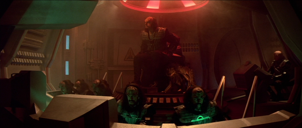
And Serveaux's image is not of the same set. My bet is that this is actually the Klingon bridge set, given its similarities to Kruge's BoP in Star Trek III (central raised dias for the CO chair, surrounded by outward-facing stations, single rear door). This latter picture also has a length of corridor outside of it, suggesting that it is built more permanently than a ship-of-the-week and to have people conversing in the corridor while going to the bridge. Intriguing.
Mark
Yeah. I know. It's literally in every thread about the ship here.
Still. They specifically showed us the old design. The crappy one. And it weren't stills from the original teaser either, it was specifically crafted angles of the crappy design. Not "final". But the current interation. It's not set in stone. But how much they will actually change it is still up in the air. If this new video is any indication, they didn't change it too much. Which is a shame. Because again: this current design (of which we have now multiple sources) sucks. Hard. And they need to rework it. Not the basic shape itself. But pretty much everything around it. And even the basic shape when it comes to it's 'under-belly'.
They don't NEED to do anything. There's plenty of being who think the ship is cool. Or even more, don't care. It's not about the ship, but good storytelling.
I'm gonna just wait and see what happens.
You can Argue that Kruge's BoP doens't look at all Klingon either, from above. And they'd be right, since in early drafts of that movie's script the BoP was a stolen Romulan vessel (hence the name and presence of a cloaking device). Still, when I see that picture above, I see this in oblique view:
Mark
Mark
Far more dramatic than characters standing still talking in a turbolift before entering the bridge!and to have people conversing in the corridor while going to the bridge. Intriguing.
We did get a group of Klingons announced with the Discovery crew, so it seems likely they will be either regulars or major recurring cast members. Either way, it makes sense that their ship would be a fairly permanent set, rather than just a one and done.And Serveaux's image is not of the same set. My bet is that this is actually the Klingon bridge set, given its similarities to Kruge's BoP in Star Trek III (central raised dias for the CO chair, surrounded by outward-facing stations, single rear door). This latter picture also has a length of corridor outside of it, suggesting that it is built more permanently than a ship-of-the-week and to have people conversing in the corridor while going to the bridge. Intriguing.
Mark
Ditto for the ShenZhou. I suspect that we've got at least three groups at work here in the overall story and while Discovery will certianly be the focus, we'll have lots of action elsewhere. Sorta like how we had more than just one-shot sets in concurrent use on DS9 for the Defiant, a Klingon ship, and the station itself.
One does wonder what that brightly-lit set was, that we see from the outside... That seems to be a relatively simple setup, while the big terraced set is obviously more detailed and made to last more than a single episode.
Mark
One does wonder what that brightly-lit set was, that we see from the outside... That seems to be a relatively simple setup, while the big terraced set is obviously more detailed and made to last more than a single episode.
Mark
They don't NEED to do anything. There's plenty of being who think the ship is cool. Or even more, don't care. It's not about the ship, but good storytelling.
I'm gonna just wait and see what happens.
Yeah, they do.
"plenty of being" wasn't enough to save 'Beyond' at the box office. This new series needs to compete with Game of Thrones and the best Netflix has to offer if it wants to keep it's own pay-channel alive. CGI that looks embarrasing compared to "Enterprise"-era CGI won't do it. The old series had a lot more leeway for cheesy sets and bad make-up, because tv-screens were smaller and everything wasn't HD. This new show needs to look cinematic if people are expected to take it seriously.
And they know that. That little picture of the new uniform, and the alien suits, have already more texture and detail than any television- (and most movie-) Trek costumes before. And the new ship needs to have as well.
That being said, I'm pretty comfortable with what they are doing. This video already looked a lot more professional than the comic-con teaser. And I'm optimistic they will revamp the starship accordingly. And yes, even in it's current form, it has character. That's a good thing.
As I posted at https://www.trekbbs.com/posts/11906149/:Hold everything!!! That's a blue uniform but an engineering badge!!! In honor of Gene's vision we must boycott this show for it is already a disaster.
Sulu wore a blue shirt with the spiral insignia in "Where No Man has Gone Before." So did Dehner and the other blue shirts.
http://tos.trekcore.com/hd/albums/1x03hd/wherenomanhasgonebeforehd065.jpg
http://tos.trekcore.com/hd/albums/1x03hd/wherenomanhasgonebeforehd368.jpg
As you can see in both images, Scotty wore the sphere-with-the-equator (planet symbol?) insignia with his tan shirt.
http://tos.trekcore.com/hd/albums/1x03hd/wherenomanhasgonebeforehd065.jpg
http://tos.trekcore.com/hd/albums/1x03hd/wherenomanhasgonebeforehd368.jpg
As you can see in both images, Scotty wore the sphere-with-the-equator (planet symbol?) insignia with his tan shirt.
Yeah, they do.
"plenty of being" wasn't enough to save 'Beyond' at the box office. This new series needs to compete with Game of Thrones and the best Netflix has to offer if it wants to keep it's own pay-channel alive. CGI that looks embarrasing compared to "Enterprise"-era CGI won't do it. The old series had a lot more leeway for cheesy sets and bad make-up, because tv-screens were smaller and everything wasn't HD. This new show needs to look cinematic if people are expected to take it seriously.
And they know that. That little picture of the new uniform, and the alien suits, have already more texture and detail than any television- (and most movie-) Trek costumes before. And the new ship needs to have as well.
That being said, I'm pretty comfortable with what they are doing. This video already looked a lot more professional than the comic-con teaser. And I'm optimistic they will revamp the starship accordingly. And yes, even in it's current form, it has character. That's a good thing.
First off, I should have said plenty of people, not being, but my mind was at warpspeed.
Second off, no, they really really don't NEED to do anything, just because some fans are disappointed in some early artwork. Just because we saw something very similair in this video again, doesn't mean it's exactly like that. For all you know, the final design and mesh are so highly detailed and high in polycount that it's gonna blow the Enterprise from the new movies away. So please, stop demanding they need to do anything just to put some fans' minds at ease.
And really, only you NEED all of this. You and a few people who care more for the look of the show than the stories it tells us. There is no need for them to change something, just because of small percentage of fans are screaming from the top of their lungs online after some conceptdesigns.....
I wonder then if they're doing away with redshirts. Obviously it could just be a mistake, but considering that neither the Kelvin nor the first two pilots had red uniforms it's a possibility.As I posted at https://www.trekbbs.com/posts/11906149/:
Sulu wore a blue shirt with the spiral insignia in "Where No Man has Gone Before." So did Dehner and the other blue shirts.
http://tos.trekcore.com/hd/albums/1x03hd/wherenomanhasgonebeforehd065.jpg
http://tos.trekcore.com/hd/albums/1x03hd/wherenomanhasgonebeforehd368.jpg
As you can see in both images, Scotty wore the sphere-with-the-equator (planet symbol?) insignia with his tan shirt.
First off, I should have said plenty of people, not being, but my mind was at warpspeed.
Second off, no, they really really don't NEED to do anything, just because some fans are disappointed in some early artwork. Just because we saw something very similair in this video again, doesn't mean it's exactly like that. For all you know, the final design and mesh are so highly detailed and high in polycount that it's gonna blow the Enterprise from the new movies away. So please, stop demanding they need to do anything just to put some fans' minds at ease.
And really, only you NEED all of this. You and a few people who care more for the look of the show than the stories it tells us. There is no need for them to change something, just because of small percentage of fans are screaming from the top of their lungs online after some conceptdesigns.....
You kind of contradict yourself there. First you said they don't need to change anything. Then you say they probably already have changed it from the current version (because it sucks).
Secondly, I'm not a "small percentage of fans" screaming about "concept designs". The basic desing is fine. The graphics and the CGI model sucks. You can't have a modern television show with Babylon 5-era cgi. Period. Anywhere online where you look people complain about the ugly model and the poor CGI. Now, in a perfect world production value takes a step back to story and characters. But shitty effects destroy the suspension of disbelieve. Today more so than ever. And vievers don't take your show seriously if it looks like Sharknado. And that can turn viewers away, especially in the early phase where a show needs to find itself.
General audiences couldn't care less wether the design of 'Enterprise' was reused from a previous model (the Akira) from a later era, or wether the Discovery is based on old concept art. But they DO care if it looks cheap and shitty. This is something that should be tackled. And I'm almost certain it WILL be tackled.
Really, there's not much conflict here. I'm just eager to see the improved model. And this video didn't do that. Which is somewhat disappointing. But the rest of the video made up for it. It's still something dangling around that needs to be adressed before it airs though.
Similar threads
- Replies
- 1
- Views
- 107
- Replies
- 1
- Views
- 167
- Replies
- 1
- Views
- 341
If you are not already a member then please register an account and join in the discussion!