This is the best added-detail Enterprise I've ever seen. Truly lovely and it brings out the timelessness of the design. No silly "hot rod" aesthetics here, just a beautiful space ship.
-
Welcome! The TrekBBS is the number one place to chat about Star Trek with like-minded fans.
If you are not already a member then please register an account and join in the discussion!
You are using an out of date browser. It may not display this or other websites correctly.
You should upgrade or use an alternative browser.
You should upgrade or use an alternative browser.
What's this...? TOS.5.2
- Thread starter deg3D
- Start date
Thanks, guys.
And sure the first one is nice as well, DiSiLLUSiON.
However, the new one is much more accurate lighting-wise, which I prefer. But you are welcome to choose the one you prefer. Out of all the .5 to .5.2 updates, I feel this .5 still holds up best, even if it is slightly stylized lighting-wise.
deg
It goes without mention that the more realistic .5.2 shot is still very, very beautiful, deg3D.
")
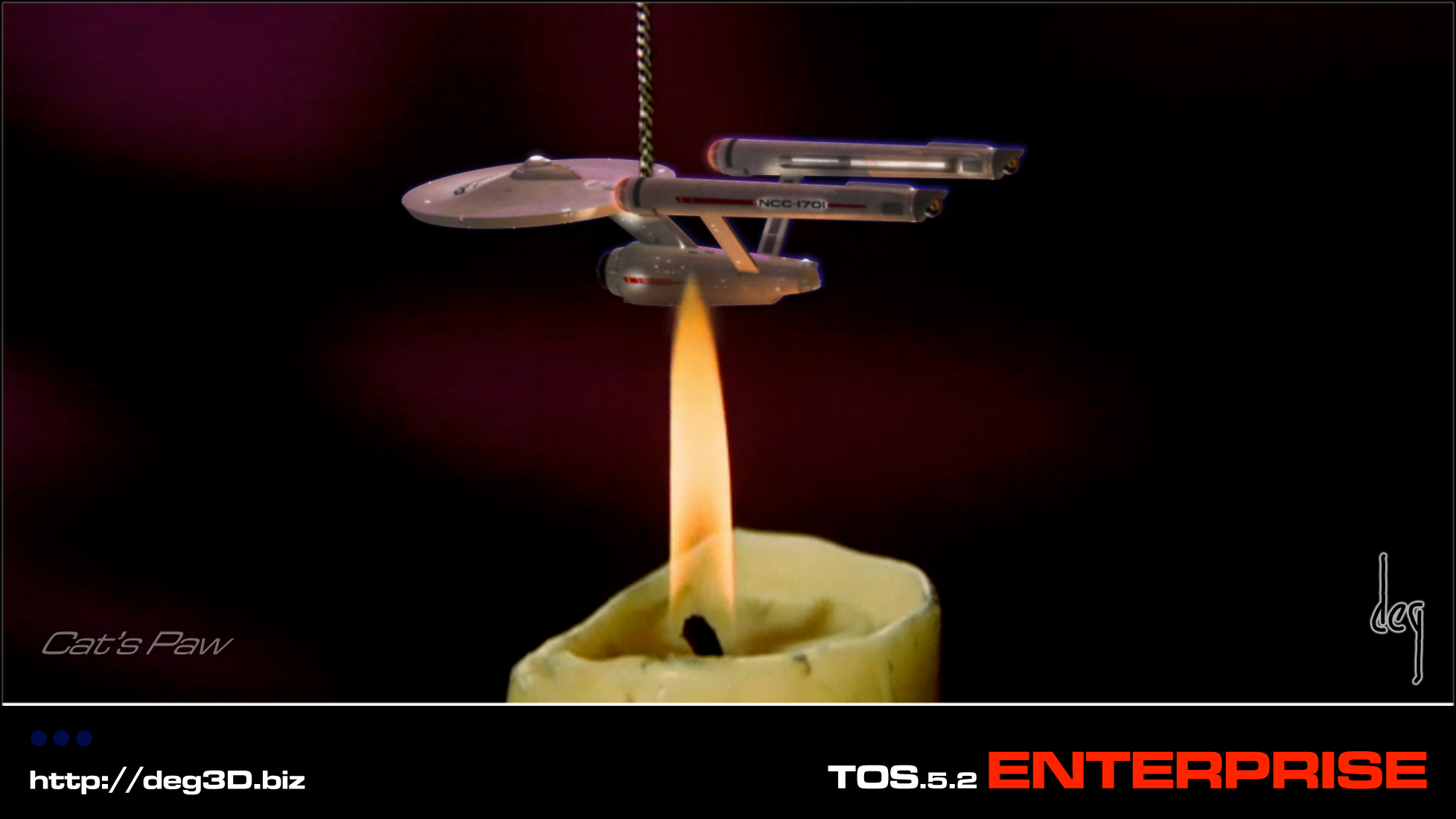

I want one of those... where can I buy that on a chain?
Thanks guys! ")
That's actually not blue-screen leak, ST-One. I believe it's blue fringe chromatic aberration, caused by (I assume) the reflective properties of the shiny plated E-mini prop (I faked the effect in nonetheless as I liked it). They actually made that lil' E prop. No-one knows what became of it. No-one telling anywho. It was sealed in a block of plastic last seen, as Sylvia did so in the eps. I want one too, Cary.
Oh, to have the original prop! Man, that would be beyond coolness.
deg
The mismatched comp (the visible glow of the blue-screen) is a nice touch.
That's actually not blue-screen leak, ST-One. I believe it's blue fringe chromatic aberration, caused by (I assume) the reflective properties of the shiny plated E-mini prop (I faked the effect in nonetheless as I liked it). They actually made that lil' E prop. No-one knows what became of it. No-one telling anywho. It was sealed in a block of plastic last seen, as Sylvia did so in the eps. I want one too, Cary.
Oh, to have the original prop! Man, that would be beyond coolness.
deg
Happy Halloween!
Any TOS Trekker worth their salt vampire knows why I am posting this 'round this time o' year.
deg
It's only a model. - Patsy, Monty Python and the Holy Grail
I know why and Happy Halloween. Great work Deg!

Oh. now that's just mean. I thought deg might have been inspired by Vektor's revivified Enterprise project and was gracing us with new videos or sump'un. Harrrumph.
Thanks, JJohnson! Glad you like her, eh.
And Prof and AnyStar, trust me, I'm workin' one it, eh. I'm always workin' on it, eh.
The D4 is at the head of the line right now for scenography renders. I am working out learning how to do break-out rendering, reading the exrTrader User Manual and ProEXR manual, and the http://www.openexr.com/ website now, as I want to take my CG work to the "next level," that I have always wanted it to go to. Now I understand what I have to do compositing-wise to get there, just have to read up on the tech-side (of these new plugs) to be able to implement my composing chops all the better, working with the augmented control of seperate layers for all aspects of the renders. Good modeling and painting only gets you so far (and a long way if done properly and competently), but one needs the VFX next phase of knowledge/know-how to get to the top of the photo-real VFX mountain.
More in time, not too long...
deg
Ps. "clicky-ed" (chimpy chortle)
Last edited:
Ah, excellent. Rendering the components of a scene (specularity, diffusion, etc.) to separate files or to a format that allows tweaking each discrete channel gives you so much post-process flexibility to fiddle with the look of renders without having to actually re-render. Saved my bacon several times already since I started learning how to do it.
Similar threads
- Replies
- 53
- Views
- 9K
- Replies
- 16
- Views
- 695
- Replies
- 104
- Views
- 14K
- Replies
- 32
- Views
- 2K
If you are not already a member then please register an account and join in the discussion!