• Welcome! The TrekBBS is the number one place to chat about Star Trek with like-minded fans.
    If you are not already a member then please register an account and join in the discussion!

Warped9's Concept Shuttle

Rather than post new images with only moderate change I just updated the previous above image.

The next update will show the warp nacelle details. Presently I'm working on the warp nacelles separately so that there will be exact detail in all views to facilitate rendering in 3D. When they're done then I'll add them to the overall schematics.
 
Here is the major elements of the space warp nacelle. This is the port side unit and so, obviously, the starboard unit will just be reversed. I still have some surface details to add.

Nacelle1sm.jpg
 
Nice... thanks for posting these... I'm glad to see that you've got some new inspiration for this shuttle. :) The nacelle details looks nice... I'm beginning to see this more as a real craft now, and not so much just a line sketch.
 
Maybe I just needed a little prodding. :) Anyway I'm still debating with myself as to whether I'll continue on to do an interior for it. And at some point we'll have to discuss colours for the exterior. Possibly the aft hatch as well in case someone wants to try animating it.

I still want to do the version that evokes the TAS design more closely...well somewhat more closely. This version hews more to what might have been possible for TOS production as opposed to adapted TAS designs that look more "real world" but likely couldn't have been built for TOS production.
 
Well, in regards to exterior colors... personally, I was going to go with the standard TOS shuttle color system, because I'd like to keep consistent with what we saw on TOS. The only real deviation I can see, that's kinda giving me issues, is the fact that there is no place for the "big" NCC number, like on the Galileo... the only place to put it is on the nacelle, and that seems a bit redundant on this shuttle in particular, because the nacelle is so much closer to the Starfleet pennant on the side.
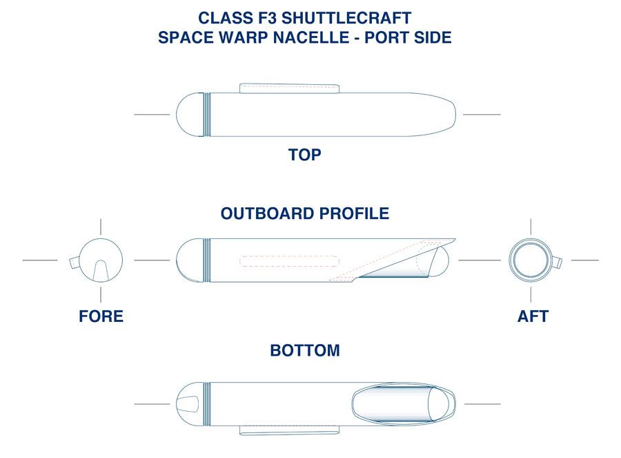
 
Well if I'm not mistaken the small "flying" miniature shuttlecraft and the full size mockup were not painted the same way. For myself I'd lean towards the way the full size mockup was painted. The main hull overall would be a very light grey as would the nacelles except (in this case) the corrugated cylindrical elements of the nacelles as well as the spheres at the aft end which would look like burnished metal. I was also thinking of making the spars attached to the landing struts/stabilizers as metallic looking as well.

If I'm not mistaken the small filming miniature had its lower hull painted a darker grey. I wouldn't go that way except perhaps as a compromise of having the lower hull a moderately darker shade of light grey from the rest of the hull. There is ample room for the Starfleet pennant and the name of the origin ship or base along the main hull. The larger NCC registry could be put on the nacelles or the outboard stabilizers without the pennant. The pennant on the nacelles of the TOS shuttlecraft is rather redundant along with the smaller version of NCC and serves primarily as a visual filler to give the nacelles more detail. And note that the TMP Enterprise only has one pennant on each side of the secondary hull and none on the nacelles or elsewhere, so we can assume a different standard for signage was coming into play. This simply gives us a little flexibility in terms of finding what looks best.

I'm thinking of working up a Photoshop "photograph" of the vehicle to illustrate more closely what I have in mind.
 
If you are not already a member then please register an account and join in the discussion!

Sign up / Register


Back
Top