Feels like an older style naval uniform.
-
Welcome! The TrekBBS is the number one place to chat about Star Trek with like-minded fans.
If you are not already a member then please register an account and join in the discussion!
You are using an out of date browser. It may not display this or other websites correctly.
You should upgrade or use an alternative browser.
You should upgrade or use an alternative browser.
US Space Force Ranks? [Speculation]
- Thread starter Chaos Descending
- Start date
Looks like a costume for an SciFi TV show.The proposed uniforms,
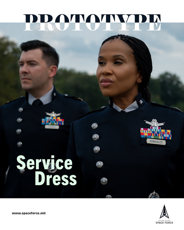
I love, love the rank insignia, still processing the prototype uniform. They said they started with the Women's design first than adapted it for Men. Thats fantastic to hear, consider they have mostly ignored women in uniform development.
Do they come in maroon?The proposed uniforms,
I love, love the rank insignia, still processing the prototype uniform. They said they started with the Women's design first than adapted it for Men. Thats fantastic to hear, consider they have mostly ignored women in uniform development.
<<------------ Kinda partial to non-parallel latitude lines myself.
Curved latitude lines, a straight equator and curved lines in the other direction in the other hemisphere... offends my sense of perspective.
Looks like a costume for an SciFi TV show.
About a space marching band.
There are no straight lines on a curved surface.Curved latitude lines, a straight equator and curved lines in the other direction in the other hemisphere... offends my sense of perspective.
")
I agree:About a space marching band.
https://www.airforcetimes.com/news/...ew-service-dress-and-pt-uniforms-have-landed/
Yeah another link on this.
https://thehill.com/policy/defense/...comparisons-to-star-trek-battlestar-galactica
https://thehill.com/policy/defense/...comparisons-to-star-trek-battlestar-galactica
Meh, typical blather.
More curious how functional they will end up being.
More curious how functional they will end up being.
In space? Not very.Meh, typical blather.
More curious how functional they will end up being.
The proposed uniforms,
I love, love the rank insignia, still processing the prototype uniform. They said they started with the Women's design first than adapted it for Men. Thats fantastic to hear, consider they have mostly ignored women in uniform development.


"You know, I think those stars would better on a green shirt. Did I ever tell you about the time I designed a uniform for tank crewmen? It was, uh, green leather, had red stripes, and sort of, uh, a row of brass buttons down across here, and topped off by a gold football helmet.All it really needs is a football helmet.

The Army rejected it, of course. Goddamn, it was beautiful." --- George C. Scott as Patton.
And all this time I thought the tank uniform was a Francis Ford Coppola fever dream meant to exemplify Patton’s grandiosity. The internet. I love it. God help me, I do love it so."You know, I think those stars would better on a green shirt. Did I ever tell you about the time I designed a uniform for tank crewmen? It was, uh, green leather, had red stripes, and sort of, uh, a row of brass buttons down across here, and topped off by a gold football helmet.
The Army rejected it, of course. Goddamn, it was beautiful." --- George C. Scott as Patton.
Everyone is comparing them to either the Monster Maroons or Enterprise and they are wrong, the uniform really only compares to the new Battlestar Galactica. I kinda wish it was in black but the dark navy with the lighter blue pants are nice. The one thing I hate, is the placement of the badge. It's kinda weird where it is, but okay. Overall I like it, better than the retro uniforms the Air Force showed off a few years back.

No, I've definitely see the Battlestar comparison, which is a little more fitting with the color, and the color. Though, personally, I think the Space Force uniforms look potentially a little more comfortable. The badge placement is strange and I am curious as to the sleeve stripes. That strikes me as rather odd and wonder if that will have any variation.Everyone is comparing them to either the Monster Maroons or Enterprise and they are wrong, the uniform really only compares to the new Battlestar Galactica. I kinda wish it was in black but the dark navy with the lighter blue pants are nice. The one thing I hate, is the placement of the badge. It's kinda weird where it is, but okay. Overall I like it, better than the retro uniforms the Air Force showed off a few years back.
You want to know what those Space Force unis look like?
The ones from Season 2 of ST:Picard, which apparently takes place in an alternate timeline where Starfleet is a totalitarian dictatorship.
Which in turn looks like the Atredies uniforms.You want to know what those Space Force unis look like?
The ones from Season 2 of ST:Picard, which apparently takes place in an alternate timeline where Starfleet is a totalitarian dictatorship.
Last edited:
Without seeing the regulation for the Dress jacket, I’m going to say either combat or time in service stripe. That’s totally a guess, probably wrong.No, I've definitely see the Battlestar comparison, which is a little more fitting with the color, and the color. Though, personally, I think the Space Force uniforms look potentially a little more comfortable. The badge placement is strange and I am curious as to the sleeve stripes. That strikes me as rather odd and wonder if that will have any variation.
The badge placement is strange and I am curious as to the sleeve stripes. That strikes me as rather odd and wonder if that will have any variation.
The cuff stripe is probably to designate officers, something the Air Force inherited from the Army. The Army used to have a wider cuff stripe for generals on the old green uniform, but now with the retro uniforms I think all officers use the same half-inch width. USAF generals have a wider dark blue cuff stripe on the service dress, 1½ inch vs ½ inch for other officers, and on the mess jacket USAF generals wear a ¾ inch silver stripe and all other officers ½ inch.
Similar threads
- Replies
- 2
- Views
- 274
- Replies
- 34
- Views
- 2K
- Replies
- 23
- Views
- 12K
If you are not already a member then please register an account and join in the discussion!