Are there any photos of the tng actors in the costumes before Roddenberry chose to switch the colors (red for command, blue for science etc)?
-
Welcome! The TrekBBS is the number one place to chat about Star Trek with like-minded fans.
If you are not already a member then please register an account and join in the discussion!
You are using an out of date browser. It may not display this or other websites correctly.
You should upgrade or use an alternative browser.
You should upgrade or use an alternative browser.
Tng early production photos
- Thread starter Russell Oviatt
- Start date
Are there any photos of the tng actors in the costumes before Roddenberry chose to switch the colors (red for command, blue for science etc)?
When was there a switch? First time I’ve heard of that.
When was there a switch? First time I’ve heard of that.
I have heard that before; as I recall (though I may admittedly be misremembering this bit) they decided Stewart and Frakes looked better in red... I've heard the one about Data originally being in blue also, though I've no idea as to its veracity. Tbh I'm kinda glad he was put in as Ops manager anyway - if they'd put him blue I can only imagine he'd be perpetually stuck at the back of the bridge!

Likewise for the command color switch - not only does it tie in a little better with the prior Monster Maroons imo, but the gold I feel doesn't work so well against the tan/beige background of the TNG command seating.
The mustard yellow for the Berman era uniforms always looked so bad. Easily the worst of the uniforms. I get why they didn't think Stewart looked good in them because no one does.I'd like to see Data in blue for Science. Surely they tried it and it just didn't work with the makeup. So instead they mixed Oily White with Puke Gold and decided that looks good.
As a side note I love the darker blue they used for the uniforms in early TNG before they went to the more turquoise look
The following image was done quicker and dirtier than my ex, but Data's make-up and blue shirt don't make the color wheel vomit, and almost-Captain-Pulaski looks fantastic. Sorry that I didn't get a chance to add a few pips on to make her Captain, or doubling up on that to get all camptacular on the image...

That's awesome! Though now I wonder if they axed the blue simply because the original spandex made Spiner's nipples too obvious...The following image was done quicker and dirtier than my ex, but Data's make-up and blue shirt don't make the color wheel vomit, and almost-Captain-Pulaski looks fantastic. Sorry that I didn't get a chance to add a few pips on to make her Captain, or doubling up on that to get all camptacular on the image...

I'm not a fan of how they looked during TNG, but imo the change brought in with the DS9/VOY uniforms (the gold looks warmer to my eye) was a vast improvement.The mustard yellow for the Berman era uniforms always looked so bad. Easily the worst of the uniforms. I get why they didn't think Stewart looked good in them because no one does.
As a side note I love the darker blue they used for the uniforms in early TNG before they went to the more turquoise look
Looks better than the goldThe following image was done quicker and dirtier than my ex, but Data's make-up and blue shirt don't make the color wheel vomit, and almost-Captain-Pulaski looks fantastic. Sorry that I didn't get a chance to add a few pips on to make her Captain, or doubling up on that to get all camptacular on the image...
That's awesome! Though now I wonder if they axed the blue simply because the original spandex made Spiner's nipples too obvious...
Bwahahaha, thanks!
The obviousness is possible. Mustard beige did hide more than I'd noticed. (I was literally rushing to do a basic mockup to see if Data would have looked puketacular in blue... now it's hypnotic. )
Looks better than the gold
Thanks!
I also did Data's tunic first to make it as close to Pulaski's blue as possible. Changing hers to red came mostly from memory. And accidental, but I had an 8.30 appointment so otherwise I would have taken that pic to the next level, so to speak...
The mustard yellow for the Berman era uniforms always looked so bad. Easily the worst of the uniforms. I get why they didn't think Stewart looked good in them because no one does.


The image on left I did not do as I'd aim to match the color more precisely and not from taking a snapshot on the TV either. The image on right is generic Trekcore screencap resized as a more standard hue for TNG tunics.
Picard's yellow feels more like TOS yellow, despite being a little more saturated. TOS's is more bolder a yellow and definitely is more mustard-like rather than baby food/baby puke/baby etc looking yellow. Depending on lighting, this yellow can look just a teensy bit different:


(Same shirts, different day. Coffee may have been involved, but I wasn't there at the time...)
TOS Trekcore screencaps whittled down, exterior lighting and reflectiveness of fabric material can also yield a false image and, being the 1960s, it's amazing they didn't shine bright psychedelia on all the actors in the way they did for background lighting as well. Then we'd all be looking like Chekov in the 2nd pic there...
For another example of lighting, scroll down to the pic of Chekov, Sulu and Kirk here: https://www.slashfilm.com/1461152/star-trek-the-original-series-walter-koenig-predicted-end/
As a side note I love the darker blue they used for the uniforms in early TNG before they went to the more turquoise look
Seconded. Spandex material aside, the overall look is cooler as well. The collars and padding grew on me, but I missed the extra angled striping above the shoulders. External lighting could also affect the visuals, if they used a 2700k bulb instead of 5500k or 6000k bulb, then a blue outfit would look more turquoise from that alone. More on that, the scale is usually between 1000k to 10000k. 5500k is close to pure white, before the temperature wavers between red and blue So 2700k would be a very warm, near-orange color cast and 8500k would be a gorgeous shade of blue complementing all the bridge's beige. 1000k would be flaming orange. 10000k would have robins looking in awe and envy over how well it blends in with their eggs.
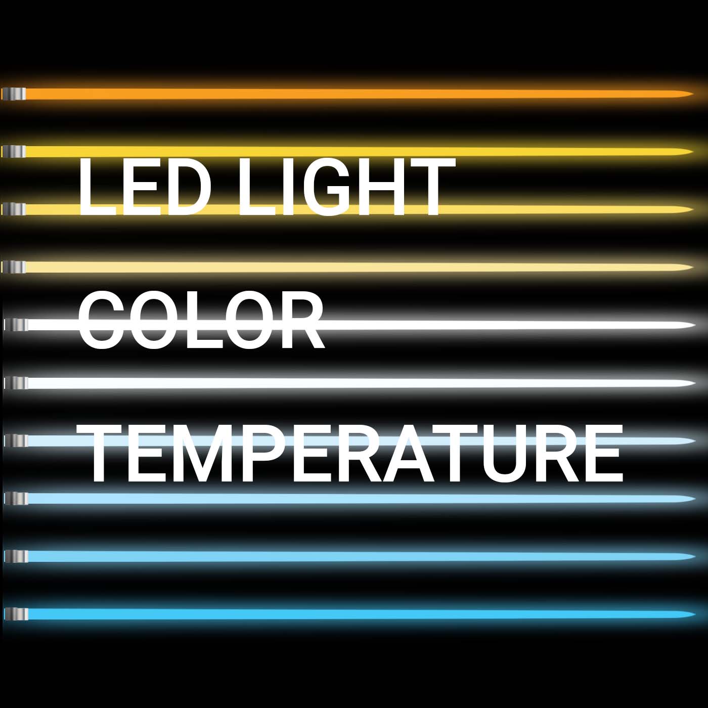
LED Light Color Temperature: 5 common misconceptions
To bust the common misconceptions, it is crucial to understand the LED color temperature and the role it plays in illuminating your surrounding space.
 www.redgrasscreative.com
LOL though to the Roddenberry quote in the following article on that page:For another example of lighting, scroll down to the pic of Chekov, Sulu and Kirk here: https://www.slashfilm.com/1461152/star-trek-the-original-series-walter-koenig-predicted-end/
"The mistake I made with Rand, and I've regretted it many times, was the network said to me, 'We've been meeting on this and we think what you should do is get a different, exciting young lady every week, rather than the same one.' And I had said 'no' so many times to the network that I thought I maybe should give them a 'yes' this time. But looking back now, I would've kept Rand on the show and I'm sorry I didn't. I know what a disappointment it was to Grace Lee Whitney ..."
Read More: https://www.slashfilm.com/1359850/star-trek-cut-character-gene-roddenberry-regret/
I can just picture the NBC meeting calendar filling up with "Yeoman Rand" discussions...
Similar threads
- Replies
- 30
- Views
- 3K
- Replies
- 12
- Views
- 539
- Replies
- 23
- Views
- 1K
If you are not already a member then please register an account and join in the discussion!