• Welcome! The TrekBBS is the number one place to chat about Star Trek with like-minded fans.
    If you are not already a member then please register an account and join in the discussion!

Thoughts on the USS Shenzhou (Trailer Edition)

It's only a problem if you try to fit it into the TOS universe, which the showrunners very clearly and deliberately aren't. It's like trying to fit Ben Affleck's Batmobile into a chronology of the Adam West Batman universe.
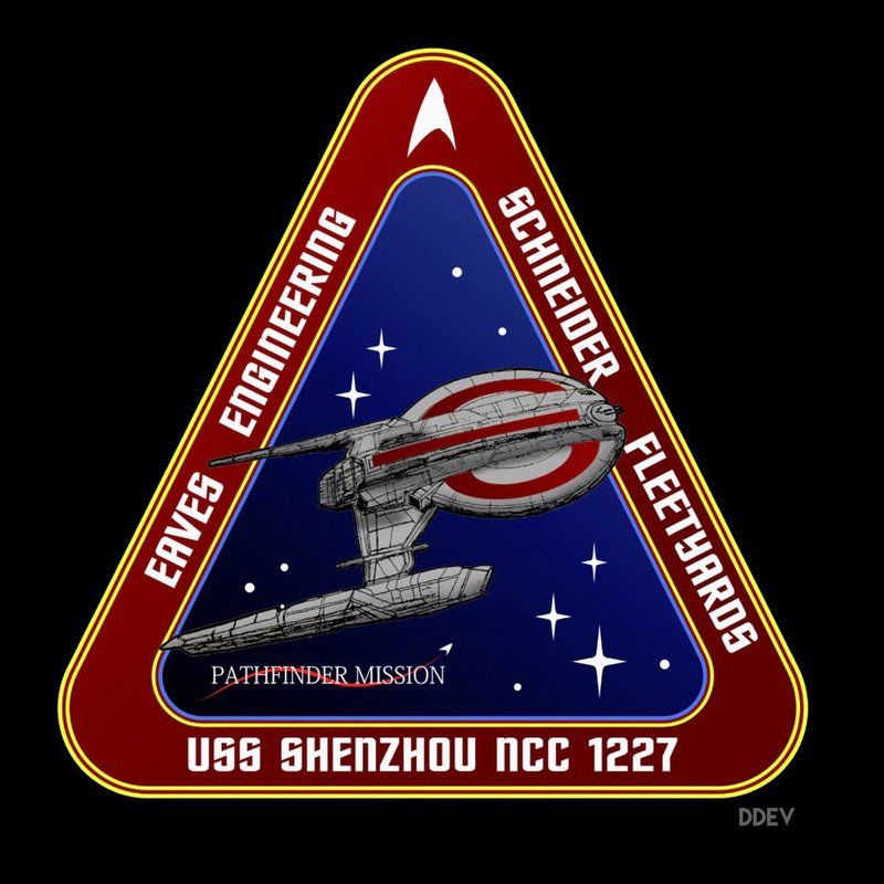
Supposedly it's this TNG-era design that Eaves' made for a fan club that was the basis for the Shenzhou.

In other words you're agreeing that it is and it looks like a TNG ship which is exactly what I said in the first place. It's the Akiraprise all over again.
 
I love it. The way it comes out of the clouds is great. I love the differences. Put the bridge on the bottom, why not?

She's a tough lookin' little ship, and it's unfortunate we probably won't know her very long. I hope Eaglemoss makes a mini of her.
 
Honestly, I do not see what the big deal with the Nacelles are. The ship is clearly NX derived, and the round Nacelles from TOs are the oddballs of trek. The Phase II Constitutions onward lacked them, and its not odd for ships to have their own design, and we no longer need to kitbash models.

So why would they not experiment with shape and style? You can still have round ones out there, we know the discovery has a whole other style as well. There is no need any more to place the same ones on every new ship because these are the model kits we can buy from Target.
 
Everything we've seen before TMP, from the Phoenix to TOS, had essentially the TOS style tubular nacelles, which suggests that they're the norm of that time period. Even ships in the TNG era have round bussard collectors, as seen in cross sections like this one:
https://s-media-cache-ak0.pinimg.com/originals/07/20/b4/0720b475a172ac0f35c2a9ad6ccbe134.jpg
I don't hate the Shenzhou's nacelles, but I would have preferred ones more like those of the NX-01.
 
David Combe's 3D print
18581712_10155146668956147_548201669835531720_n_zpswwrmztj8.jpg
 
Everything we've seen before TMP, from the Phoenix to TOS, had essentially the TOS style tubular nacelles, which suggests that they're the norm of that time period. Even ships in the TNG era have round bussard collectors, as seen in cross sections like this one:
https://s-media-cache-ak0.pinimg.com/originals/07/20/b4/0720b475a172ac0f35c2a9ad6ccbe134.jpg
I don't hate the Shenzhou's nacelles, but I would have preferred ones more like those of the NX-01.

Why must we stick to the TOS ship"rules" when we have thrown the whole TOS look out the window? There are 4 year between TOS and TMP, 4 years. And you don't even bat an eye at the massive change in how everything changed its style in just 4 years? Gene threw TOS style out totally, it was gone so why do some of you guys insist we stick with a style used for 3 years out of last 51 years? Canon that look lasted what 12 years at most? And only 12 years if you include "The cage".

So the fact they don't match the TOS, is not really an issue. The TOS look was dead when TMP rewrote it and its last nail was ENT

In universe, they lasted 200 years, and there's definitely room for some variation. The Phoenix, Franklin, and NX - 01 all look plenty modern without straying too far from the TOS style.
 
In universe, they lasted 200 years, and there's definitely room for some variation. The Phoenix, Franklin, and NX - 01 all look plenty modern without straying too far from the TOS style.


You are not gonna see the 1960's style. Gene himself killed it. We know why so many ships shard parts and that is just no longer needed. Why should all Nacells be the same? We have seen at lest two shapes in this series and its not even launched. In ENT which was at lest a 100 years back, we see a few designs, based off ENT, which has at lest one older ship with Nacelles pretty close to the old TOS look, why would they look like 1960's TOS Nacelles?
 
You are not gonna see the 1960's style. Gene himself killed it. We know why so many ships shard parts and that is just no longer needed. Why should all Nacells be the same? We have seen at lest two shapes in this series and its not even launched. In ENT which was at lest a 100 years back, we see a few designs, based off ENT, which has at lest one older ship with Nacelles pretty close to the old TOS look, why would they look like 1960's TOS Nacelles?
All Earth Starfleet ships in Enterprise have cylindrical nacelles. It's not just the 60's style. It's the style Starfleet consistently had prior to TMP. Within the obviously fictional universe of Star Trek. Honestly, the TMP nacelles are the odd ones out. Virtually everything before and since has had glowing red or orange bussard collectors. I won't argue that "Discovery is non-canon because the nacelles are wrong," but it is the first ship we've seen that doesn't fit the established style. The truth is, I have bigger issues with other aspects of the ship, namely the bridge.
 
That makes a lot of sense. Same goes for the uniforms. Not having primary colored shirts makes Discovery stand out.

Thats why I like the style. They've made a nice retro-ish feel in the uniforms much like they had with the Kelvin. Even the bridge which honestly reminds me of the saucer interior sketches from Planet of the Titans in the 70s, the ship gives me a weird 70s vibe as well for some reason (texturing maybe?).

But it really does stand apart from the updated 60's style while offering a familer Trek vibe. I was expecting the department coded shirts, but this way both iterations really do stand apart - even in the sets and lighting and more rugged ship styles.
 
Honestly, I do not see what the big deal with the Nacelles are.
:cardie: They're only, like, the most important things ever. They seem to cause more arguments than almost any other element of starship design. People have a chronology of warp nacelle design in their head that is very rigid and it tends to be what people pick up on when 'dating' a ship design. The nod to the TOS nacelle caps on the Phoenix in ST:FC is probably at least partly to blame, it set in stone for some people that nacelles had round caps like that from the dawn of warp drive up until TMP.

It's the Akiraprise all over again.

Not even close. The issue with the NX-01 was that it wasn't even a new design, it was the Akira class, but upside down. There were even a host of hull details replicated on both but at totally different sizes and with different functions. The NX-01 was a lazy kitbash design for a hero ship, the Shenzhou is at least new, whatever one may think of the design itself.
 
For what it's worth, I think the Shenzhou is stupidly intriguing. I love new ships and crews. I have no ill will towards those who desire to see TOS aesthetics... but at some point those folks need to realize that particular style is literally in the past. In every sense. It's nostalgia.

If I was the production designer on STD and the best I could come up with is a TOS remake... I should be fired, haha.
 
While I don;t think it's the Akiraprise drama all over again, isn't the Shenzhou just the one-off cameo ship USS Centaur from DS9 again?

It's the closest comparison from Trek of old. In truth, Eaves just seems to have a liking for that style -many of his sketches and designs that were posted on his Eavesdropping blog followed the same lineage. His Mawson design has been brought up, but there were loads of others that matched this kind of layout.

Becaue of that I knew it was an Eaves design straight away. And thats not a bad thing - people can tell my 'artwork' (can PR materials be art? :p
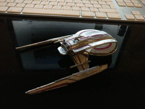
) because of my visual cues. This nis just Eaves style to me.
 
If you are not already a member then please register an account and join in the discussion!

Sign up / Register


Back
Top