-
Welcome! The TrekBBS is the number one place to chat about Star Trek with like-minded fans.
If you are not already a member then please register an account and join in the discussion!
You are using an out of date browser. It may not display this or other websites correctly.
You should upgrade or use an alternative browser.
You should upgrade or use an alternative browser.
The USS Enterprise NCC-1701/1701-A appreciation thread
- Thread starter TheSubCommander
- Start date
I think the best way to illustrate the original idea of this thread, which was the fact that low rent Digital effects do not mix well with the very Analog look of TOS, is to make a video.
So I made one.
First of all lets get something out of the way.
Greg Jein's model has several inaccuracies that all we Trek nerds acknowledge but so did CBS Digital's Enterprise so let's just focus on how much less jarring it is to use real models instead of mediocre CGI with the original series.
") Spockboy
Spockboy
So I made one.
First of all lets get something out of the way.
Greg Jein's model has several inaccuracies that all we Trek nerds acknowledge but so did CBS Digital's Enterprise so let's just focus on how much less jarring it is to use real models instead of mediocre CGI with the original series.
SpockboyIt would be a better comparison if they were lit identically. The heavy shadows are better as per the first image because they feel more real. The second suffers from too much fill, which is a common problem in CGI, where it seems like the artists are afraid of the high and low ends so everything ends up in murky bland midtones.The 2 cgi models created for the TOS-R project. The first when they were trying to stay too close to the less detailed original and the new one.


It would be a better comparison if they were lit identically. The heavy shadows are better as per the first image because they feel more real. The second suffers from too much fill, which is a common problem in CGI, where it seems like the artists are afraid of the high and low ends so everything ends up in murky bland midtones.
I have to say I agree with you. I prefer the look of the original CGI; less "murky" as you put it. But neither compares favorably to an actual physical model in terms of realism in my opinion.

Here's one of my favorite depictions of the "refit" Enterprise; it was painted by Robert McCall. I had a chance to buy one of these posters a couple years back, and missed out. Been looking for one ever since.
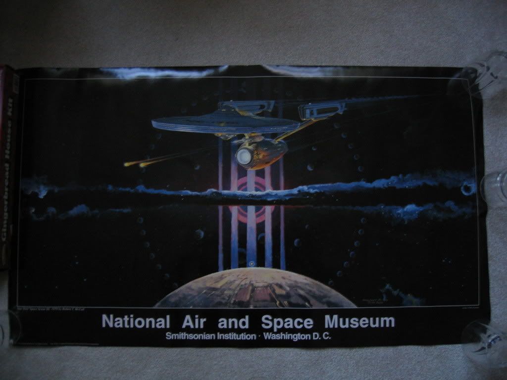
I just found one of these for sale and am very excited about it. I was even more fortunate to purchase a fine art print depicting part of The Space Mural: A Cosmic View, signed by Robert McCall. I will plan to display it above / behind my 1/350 scale Round2 TOS model to approximate the upcoming NASM display of the 11 footer.

Last edited:
Her'e another one, a depiction of the Enterprise from "The Immunity Syndrome". I have owned this since the mid 80s, bought it at a garage sale. It was said to be painted in the 70s, and based on the frame I don't doubt it. It is signed: "Lang".

Thanks. Here is my PL 1/350 Enterprise model displayed along with the framed Space Mural print.

Is that black velvet?Her'e another one, a depiction of the Enterprise from "The Immunity Syndrome". I have owned this since the mid 80s, bought it at a garage sale. It was said to be painted in the 70s, and based on the frame I don't doubt it. It is signed: "Lang".

Kor
No, it is canvas, but the frame sure looks like the type used on velvet Elvis paintings back in the day. My wife won't let me display it outside of my utility room (she already gives me a LOT of "leeway", so I can't complain).

Yes, the Refit/A is a beautiful ship, and her fans are legion, but I'll take the original's sexy bussard domes any day!
Nice to see someone proved my hypothesis that those were all one shot. Thanks for posting this.
Bill, I have enjoyed your catalog of TOS Enterprise shots for some time!
By the way, the animated series used the same shot, as I am sure you know...

By the way, the animated series used the same shot, as I am sure you know...
Note the top of the saucer pylon. It sweeps back just a tad.
The TOS Ent is just perfect to me.
I tried drawing improvements--even swept back the nacele supports pre TMP.
I tried making the nacelles wider at the ends--increased the slant of the aft nacelle caps.
Some things looked better in my minds eye than in reality.
But I knew it was perfect all along. To me--this shape is what the ancients thought the dodecahedron was:
https://en.wikipedia.org/wiki/Regular_dodecahedron#History_and_uses
Last edited:
I think the best way to illustrate the original idea of this thread, which was the fact that low rent Digital effects do not mix well with the very Analog look of TOS, is to make a video.
So I made one.
Your Vimeo link is showing up as a Private Video and asking for a log in.
Sorry about that.Your Vimeo link is showing up as a Private Video and asking for a log in.
Fixed.
SpockboyI think the best way to illustrate the original idea of this thread, which was the fact that low rent Digital effects do not mix well with the very Analog look of TOS, is to make a video.
So I made one.
First of all lets get something out of the way.
Greg Jein's model has several inaccuracies that all we Trek nerds acknowledge but so did CBS Digital's Enterprise so let's just focus on how much less jarring it is to use real models instead of mediocre CGI with the original series.
You are correct, spockboy. I've always said the CBS effects were terrible--no better than most video games, and lack any feel of weight or substance. As you point out, the Jein models were not perfect, but certainly appear not only more realistic than the bargain-basement CG for TOS-R, and blend with the original footage at a near-seamless level.
Though I have always loved the Original 1701, I really liked the concept ship USS Metaluna designed by Brad "Judexavier" McClintock. To me, it is like the original design perfected.
I think I had a portable CD player that looked exactly like that saucer. like EXACTLY. lmao!
That thing looks even worse the second time.
Similar threads
- Poll
- Replies
- 26
- Views
- 5K
- Replies
- 209
- Views
- 20K
- Replies
- 6
- Views
- 627
If you are not already a member then please register an account and join in the discussion!