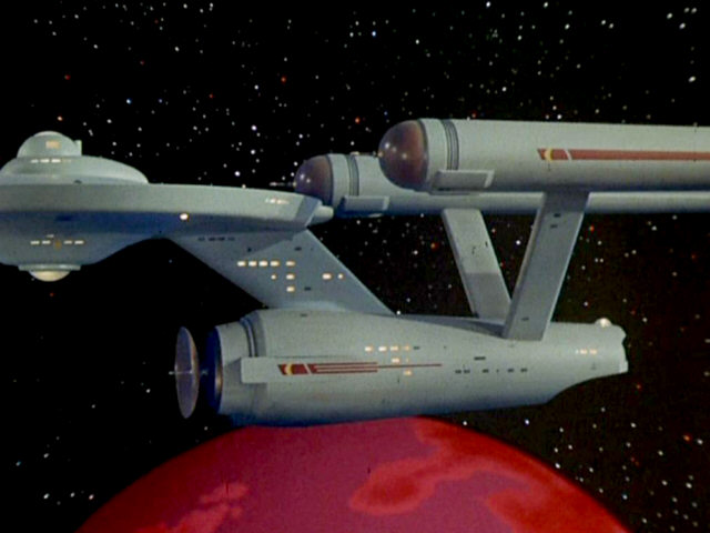
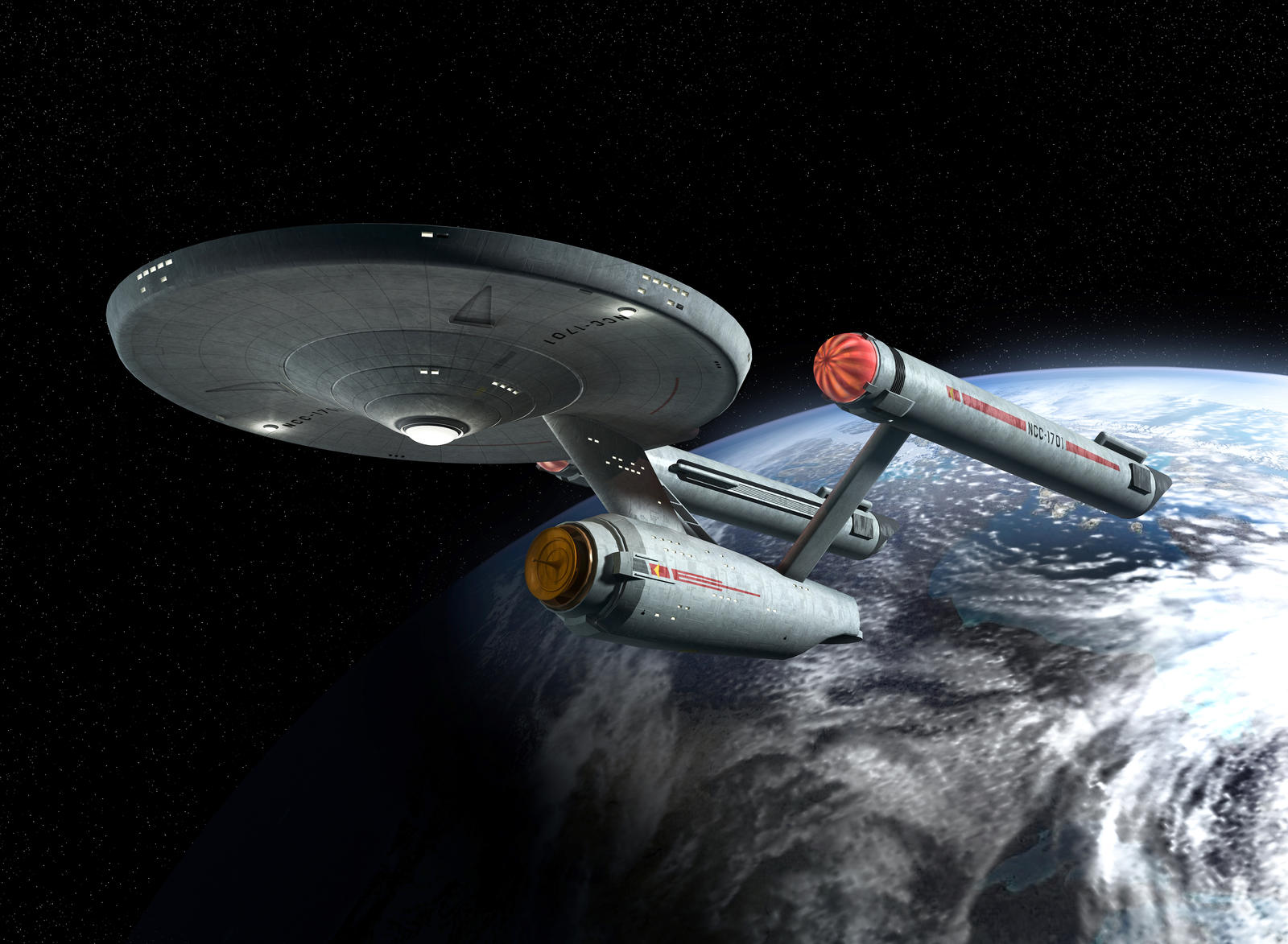
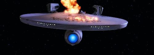
That looks like the kind of image that would have inspired Benny Russell to write about space adventures.
-
Welcome! The TrekBBS is the number one place to chat about Star Trek with like-minded fans.
If you are not already a member then please register an account and join in the discussion!
You are using an out of date browser. It may not display this or other websites correctly.
You should upgrade or use an alternative browser.
You should upgrade or use an alternative browser.
The USS Enterprise NCC-1701/1701-A appreciation thread
- Thread starter TheSubCommander
- Start date


http://data:image/jpeg;base64,/9j/4AAQSkZJRgABAQAAAQABAAD/2wCEAAkGBxQQEBQPDxAUFBQVDw8QEA8PDw8PDw8QFBQWFhQUFRQYHCggGBwlHBQUITEiJSksLy4uFx80ODMsNygtLisBCgoKDg0OFxAPGCwcHBwsLCwsLCwuLCwtLCwsLCwsNywsLCwsLCwsLCwsLCwsLCwsLCwsLCwsLCwsLCwsLCsrLP/AABEIALoBDwMBIgACEQEDEQH/xAAcAAACAgMBAQAAAAAAAAAAAAACAwABBAUGBwj/xABEEAACAQIDAwkDCQUHBQAAAAABAgADEQQSIQUxQQYTIjJRYXGBoQeRwSNCQ1JicoKx0RQzkrLwFURToqPC4SQlY3Oz/8QAGAEBAQEBAQAAAAAAAAAAAAAAAAECAwT/xAAgEQEBAQEAAwEAAwEBAAAAAAAAARECAxIxIUFRYTIT/9oADAMBAAIRAxEAPwD2wGXAlgwLvIZUkCSXkkEKku8kkCSS5RgQySpLyCSpJIEElpJcAbS5ckAbS7S5doFASWhWlgQBAl5YQEK0qByyWhSQKtJLkgSVLkgVaSXJAq0kuSBjySryXkBAy4N5JQUglAyxIq5JV5IFyjJKgS8kgktIJLEksCUQCSFaA9RV6zAeJAgXaXMHEbZpJcFicq5myjRV11JOnAzml9peEDhKiVkBOlRkQoB2kBs3pJepPrU5vXyO0tJaVRqB1DowZWUMrKQQykXBB4iMmmFASWlxVfELTF3YDx3nwHGA2SaPFbe4Ul/E+npOd2ltTF1GKUwuXT5SrUKobjUCmgubd5E53ySLjt62LROs6juJF/dMSptukNxJ+6p+M4P+zaz/AL3GOPs4enTor7zmPrAfk5Sbr1K7d7Yqt+sxfLf4Wcu5PKGn9R/cv6y15Q0uIcfhB/IzisBsSlQbOmcm1unVdwPAE75nkSf+lMdjQ2pSfRagv2NdT6zMnAMJmYDatSjYA5k4ox4fZPCbnk/tMdnJEYLFLVQOh0PvB4g98fOqJJJJAw7ywYEsTIOXeDCvKLlwYUKkuDLkFxVfEJTF6jqo7WYC8021uUq0Syohcpe4uASV3gD03zj8TyrqZ2rCmtNnsM1RgzAAWsttV38Jm9QehJtSmWVQT0r5WKMqNYXNi1r+UbUx1Nd7jy6X5TzCnyuIB55zVfMSCqZQF4DXf4zHqcqnb93RJ7ySfQD4ye1Mem1dsoNyk+JAmFX26eBVfK59Z56mPxNUE3dekAEoYY1nI7dW0j12Hi6v0GLb/wBlVMKp/CB8Y21XWV9rk9ao3gGKj3CYVXayjjOOxlLFU2bD8xkKndzme2gPXNyffN/yb5HVMXQTEVMQEVxcIqM7WDEEEkjs4SSX5C3frHx22L08QgIzMrAeBSw/IieY7U2mar9nDuntlT2cqb2qquhUOKdUuAe41MvpM/Yvs8weHbnGpitU0OesqlQ3aqbh53l9Lfrpx5PWWK9mGBqU9n0mrVKhLpdaT5clKnmYpkFri4IOpPCdXUqBRmYgAbyd0xsdtBaQtva2ij49gnO4rFtVN3Pgo0A8BL13Ofxy+1ssdtk7qQsN3OMN/bYTTVHLG7Ek9pNzGMzNa5JsLC+4CWKc43q9KTlkyxxEWZPU0syjKqNYEncAST3CYxxGdSaTLpvZgxVd99NL7t1xLOTWTeCZpjtNUXnr1KgKZlJanSV132p0yQWJ4aE983CNcA23gGxFiL9olw0wVLKVyjUg5iOkLdhiiIRgwM7k/i+arhSejU6JHAP80/DznYTz7NZlYbw6keIN56DOvjSpJJJOiMCEDAvLBmQYhQLyxKoxJKEuQEJLypcDn9u8lExJL06jUnJuSBnRjxutx6ETW4b2c0d9etUqHusg9bmdmIQkyDRYXkfhKe6jfvZjf0tNnR2XRTq0aY78ik+8zMEuawRRbd6S5JJUef8AKMWxz9hUX7L5RN/yAa+zqPdzw91VxNByp0xx71X+QTdezk/9vQdlXED/AFX/AFnPn/pf4dNNZtTafN9BNW4ngv8AzL2vtDmxkTrkb/qjtmgQm5v62PjHfefCKYkm5NydSTvMgWFaCKyhstxewNuNju/Kcc1ScViSpZEXpBVYM2idIncePVPpOc5QbUOFovVZ2qNfNZb9EmwCi24X48JvtsDOAFqKpF/3hspv3zAw+y6anncS+e2oW2WlmueB1Y6dlvGJLv7F/A7Hx1ZsIlXE9Goy5iN1hvW47bWmdsvGGtTzkahmW43G1tfW3lNNi8Q+Lqc1RGnznPVRe0/pxm2rgYahlS+i2XolyWO9io36knh5TTNYW0KxrVf2emeiNajAZtQdF7uq3mO6bGjSCKFUWA/onzN5jbLw2Vc/SJZRbOQSF4br/meEzCIGp2dh6wXOEoUiWe9MYcqQMxC3dX1uLHdxmzpXsM1r8ct7X7rzX09mUiW/6UAK2Vep8oLDpAX0FyRr2TYUPqhGWwsoIXLYDQXvYbuNpnyeTnie3Xxvnjrr4O0oyA9xHjl+BmnobTqVMY9FEHM00IeqVb97p0Va9jvtbuMe0zU9buNthKeerST61VT+ENc+k7+clyWoZ67VPm01yjszt+gv/EJ1s7eOfjPX1JJJJ0RrYQiwYYMyDBhCADDBgEJYgyCVRQhBEMQLEIQQIYhEEuSXKJJJJA4HliLYxT2oPyt8JkcjMSaezqmUgMMTiEW5tYkg33HcDfdF8uaJOJpMPqAnwu0mxsEaNKxOrVKlUjgC5Fh7gvnOV/KpdSjXJuahN+JdNf8ASkTC1T1m8+df8lVZsiBw9ZJyslUqhhwupJJ0uSSfIXJsNYVfDq46Q8CNGHgYyUTNzPiNbU2a/wAyqbfaXX3gxB2HnPytViPqqMt/PWbm8kesNY+Hwy01y01CgcB+Z7TMHFCnWcU2VyRmGYFkA3E7iL7h6dovtG3ab+F915r8JRFNsrP02HRUuWJVd51A4nXygPy9k0tQ1ErtUrJWZM3yRoFnpqlrWekpzFr3N7Ebt0Zjly18+IV2p9HmWpmoRSYWJDImtyR1teyZuz6juhaquUl3KC2VhTv0MwubNbeJm1S9mGoUzVhYl3Ki2VhTv0MwubNbfMowjBMxaqjMXF18ozaknRFHWJOgt3nQCPxDhVJO4DcLa++O5JYE4mr+2OPkqZIoA/SVBoangNQO+a5m/g6fYOz/ANnoKh6x6dQji7b/ACGgHcBNjJKvPTJjC5IJaDeUa8QhAvCEyDEMQBOa2hyoFNiM6oobLmYXJ1sPfJbg6Zq6rozqPFgIdJw2qsCN11IP5Tz5Nv4ekCecVizkkmktVyzntK3tc2E2eE2nzeYo1s7ZmFlte1tBbQeEnsrs7QwJyY24/wBf8pf9tP8A4h94l9oOttLE41ttVbaML3sRnO7TUaRq7VfjUN+5iZjjzTvcla78d5+uuknG1dqve3OsFUZnIYg+/wAiZxO3eVmJS1RMSyC91QNew4Xve5m73i8eO9/HtExK206Sb6i+RzflPNOTvtKGJoVKGLYCoAAKqqQKtM6NcLubwtv4WkobdwtJQlMhVUWVUpsAAPKL3/TN5y5XUbZqpiKqMhPRFjcb9bw5qtjbUTEE82b5RrcWM24pEgsBoLXPAXmEpcl5RknG1YuSDCESlXJBvITN+yYj7v03zlBhsS3RWoHehXBHPXDWOoKuN6spsQZ1JMGTQJgmOpUGa9hoNSToo8TEzNWBIgVHCi53QMZilpKWcgAC+ptNZszZ1baj36VPCg2apazVbHVUB/rtvoAk2qbs3CPtKrlW64ZG+VqjTnD9RP1/4v6PQpLTQIgCqoCqo0AA3ARWDwqUKa0qShUUWVR/Wp74Zeenjn1ZtMZoGaLapFmpNahxeCXiDUlF40KBhiKENTMhqzntuckExDGpTqGk5uW6IqU2J45SRY+BnQLGLFmjg19ntQf3mmTe9+YZf9xl1ORmMHUr0T484vwnfCGDHrGtebvyX2gu5aTj7NUA+sQ+xseu/CsfuPTb4z1IGEJPQ3/HkrUsYnWwlbypk/lFHHVV69Gov3qbj4T2ES49P9LZ/TxHEbWzc4l7c4hUdxykETz7H16jHI19NNZ9O47YGGrktVw9Nid7FbEnvI3zEwfJDB0iWGGRiTf5UGtl+7nvbyj0rfHk9deW+yfkecS5xOKQmgiZKQbQVam78SqL91yOydbtP2dEgijVSx3B05tgPvKDf0noAUAAAaCwAFgAIU16xi9bXl/J/kvicBVLVEvTZSGqK+cKRqL63A0PvnSlza19L3tfS86l0BBBGhBBHdOTxlI0HyP1Sfk34EcATwPD+tefcyfiJLisSXCNzQUvlOQOSqluFyJytHlPXw5yY/DNv/e0wAD/ALT5Gcs1XXWlzRUuV+Eb6YqexqVX4AiVV5X4Rfpi33adW/qtosyfNJ+t4RKImu2LttMWW5tKgCBenUUKrk36tieybPLNYlBKkq1FTrMBfcDvPgN5mp2ht5Keg39hF2/gG78RU+MYNq9Sw1NlvfU2W/bNHtTb60zzdMF6h0Wmou5PZbh5690vDbIxuOsxvh6X+JU/ekfZXQjyC37TOs2Dybw+CF6SZqlta1TpVDffb6o7hE41fjnti8j6mIYYjaRst8yYRSffUPDw39pG6d0gCKFUBVAAVVACgDcAIDVIlq07SSJpzVIpqkSzxZeA5ngmpEF4BqRofnkLzGNSDzkaMwQxAWGDANYwRQMNTKhghiLBjAYUwGGIsQxKgxLlCXKJJJJAhkkkgSJxWGWqpSooYHgY6SBzOJ5PVE1w9UFf8KsMwH3ToR77DsmBWNamDzuGa3E02Dr5lsonayTF4g84qnCk3fDU78cyYYn+aCmMwtPqUKa96jCr+TXnoz0gesoPiAYv9lpj6NP4F/ST0V5+23wdEUG193OOQPAKB/mmnxfKvgG8lIQHyW7f5xPWiwG7Tw0ngHLihVSvVqc0tNi5bmlFkUndbtB7e098eqzGRjNvsbm9getboA/eI1bzJnLYja1YVA9KsyFWDU2p/JlSNx03+c5zEbeqP1gNL6aix98Bdr9qj3zU5xde0clPayRajtNb7gMZST/60l/mX+ET02hjEqotWk6ujAMlSmwdGB4gjQz5OXagO8et5uuTnLCtgXz4WrYE3ejUBahU8VvoftCxlxnH0s1SJepOO5Le0HD461NiKFc/Q1GBVz/4qmgbw0PdOnZpmhrVYDVZjO8U1SZ1cZRqQDUmIasHnY1WWXlc5MTnJeeNG+EMGLEMTTJgMMRYMMGVDFjFi1hgwpohCLUwxKhglwRClFySSQJJJJAkkkkCSSQSYFkxTvIzRDtIKqPOc5UbJTFUyCBnAOVu0fVPcfSbuo0wcS0zVj5n5W7FOGrNobFjfTcZoCk985fbBGIotUVbsoOYD5w/r4TwutRyMUPA7+0cDNc1cYpSVbvjisErxmkUKhE6PYXLbE4ayrWfL9UsWUfhOn5Gc9Ty36RNvsi5Mqoy8Fb8TD4CTB7Bsn2mZrDEICPr07j3jhOuwG26NcA03BuL5SQD5dvlPnSlTK6klR2cSPCZeH2tUpn5JivqD5GZvC6+iXqxfOTzTkhy2r1ai4etSNQEgc4nWpj6zX+b5/pPQ8052Yp4qRi1JiXhq0g64GMESpjBNsmAxixQjBKhgMYsUIamUNWMEUDGAwoxDBiwYQMqClypJRckkkCSSSQKMWxhmLaShTGIqGOeY7yBFQzFqiZbCKZJmtNZUpXnzpttlGObJYoXanbgULsB6WnrHtI5aLhqb4bDODVIKVKgOlEHeq9tT+XeddJ4lRJzhuwg27LbhNzkOx+CNN/sm9jMAC83VXFs4syi3mJg8x/X/MsRjBLm0yauIUaU0HiACZfNgfHh7zN1sXktiMVY0qWRD9LUuiW7uLeQktg5s02OrH3zpeT/ACPq4izsDTp787DpuPsL8T6zvNh8iKOHs7jnqg1z1B0FP2U3DxNzOlWhMXu/wuNPsfY1PDLlpJYbyd7Me1jxm4WMFOWEmFCBDAkCRirKOnUw1MUpjFM0yaIwRQhrKGrDEWphiUNWGIpYYMIZDEWIQMoMGFBEuBYlypJRcqSSBRi2hmA0BLCKZZkMJjY3ELRpvWqGyIjO7b7KoudJkYuOxVOghq1nWmi9Z3OVR+p7p5Ryy9ozVQ1HAk00NwazdGtUH2R8wf5vCaHlHtDFbVrmqKNZkuRRo00qOlJNw6otmPE/C0HB8gMdV/u4pjtrOiegufSNkaxx9SmGbM5LHh81R4CQLbcAPDf7zPTsD7KWNjiMUB2rQplj/G1v5Z0ezvZ9gqNiaJqn61di9/wiy+knsrxPB4GpWbLRpPUa+6mjOR423ec6vZfs4xNWxrstBewkVKvuU2HvnsdLCKi5UVVUblRQqjyEhpSbRx2yOQ+Fw1mFPnXFjzlaz2Paq9Vfdeb/AJmZ7U4tkmRhGlByTLZIBWBjlJeSOySwsgSEhBY3LLCyjbrGLFJGCaZNEYpi4YlDAYamLWMEIYsMRYjFlBiEIAhiAYliCJYlBSSSSiS5UuBRgmEZRgARFut9I6AZFYj0ok0pmPFGQYxpQCkyjFGQYzJFOkymimkVissWyTIaLaFY5SAUmQYJkCMkrJHSoQsJCyxkggf/2Q==


_at_galactic_barrier.jpg)
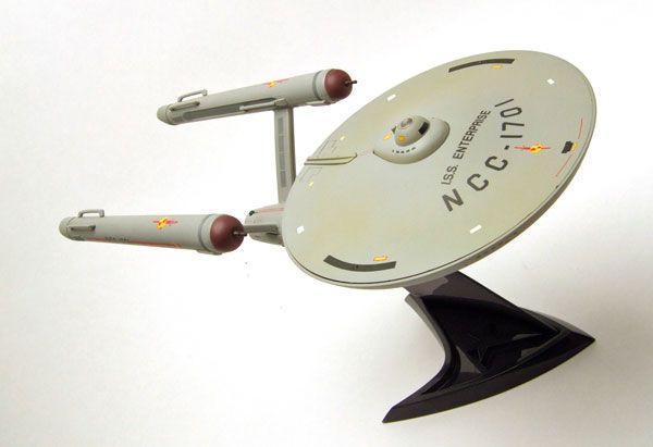
Here's another: a customized AMT model kit shot for the cover (inset) of the 1977 Star Trek Stamp Album--
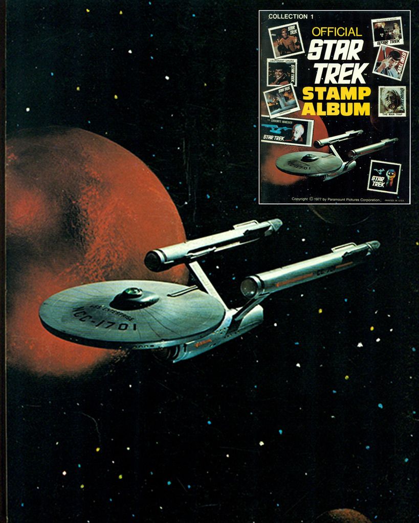
The AMT kit probably never looked so good, as this build was certainly better than the product shot used for the kit box cover--
The AMT kit probably never looked so good, as this build was certainly better than the product shot used for the kit box cover--
Since I first saw this cover way back in 1970 I found it interesting how parts of the model were painted. The intercoolers along with the nacelle end caps were painted silver metallic while the assembly around the nacelle domes and the reactors were painted black.
Where did they get that colour scheme given the ship was never painted that way onscreen at any time?
Man, the nacelle droop is so obvious there.
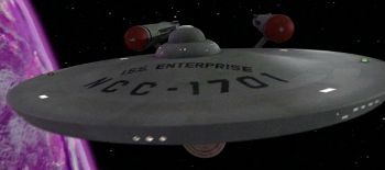
This picture I took of my Round2 1/350 scale Enterprise model always reminds me of that AMT box cover. I was not trying to duplicate the cover when I took the photo, and in fact, my model doesn't even appear blue in person, rather it is a weathered grey. Must be the way the flash on my Iphone hit it.

Homeward Bound

Ah yes, the Original/refit. If I could I would create a montage of them with this song.

You bring the evil one among us - NO SOUP FOR YOU!
Niagara Falls!
Proof the JJprise needn't have been so damn ugly. So much better than what they settled on, imo.
You bring the evil one among us - NO SOUP FOR YOU!


Niagara
Falls!Though I have always loved the Original 1701, I really liked the concept ship USS Metaluna designed by Brad "Judexavier" McClintock. To me, it is like the original design perfected.
Proof the JJprise needn't have been so damn ugly. So much better than what they settled on, imo.
Last edited:
Homeward Bound...
Would be cool to see it coming home the way the refit did in The Search for Spock.
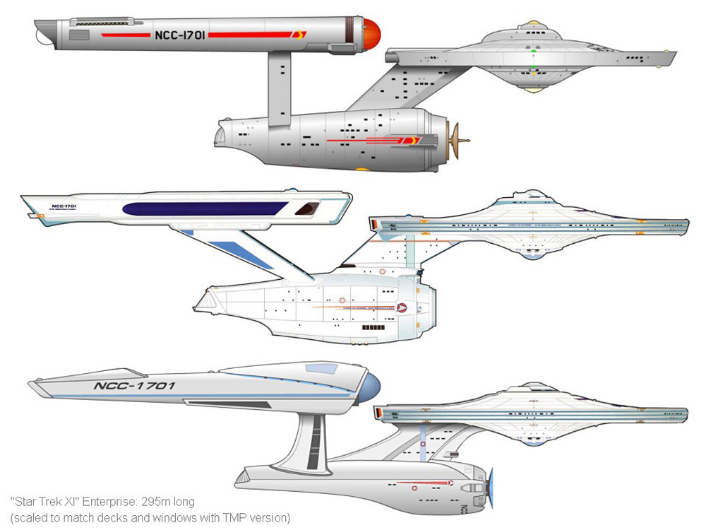
These pictures demonstrate well that the new Enterprise has basically the same configuration and form as the previous ships. Which basically makes fan whining about it amount to nostalgia.
Same configuration and form but not equally pleasant to the eye. How is that so difficult to understand?
One of these things is not like the others,
One of these things just doesn't belong,
Can you tell which thing is not like the others
By the time I finish my song?
Have you ever seen identical twins side by side and thought one of them was more attractive than the other? Same thing.

This song is one of my favorites. Amber is the color of her energy...
Yes, the Refit/A is a beautiful ship, and her fans are legion, but I'll take the original's sexy bussard domes any day!
Last edited:
That's pretty sweet!

Same configuration and form but not equally pleasant to the eye. How is that so difficult to understand?
I like the Abrams Enterprise, but the original from the 60's is simply my first love and nothing could replace it.
Yes, the Refit/A is a beautiful ship, and her fans are legion, but I'll take the original's sexy bussard domes any day!
That's cute, Son. ") jk
jkDomes are sexy but that's only second base. You ain't having truly sexy ship porn until legs are flying up in the air and cargo bay is ready for you to enter, if you see what I mean. ")
TOS or Refit/A has NEVER been an either/or thing for me. I love em both!
Took me a bit to get used to it, but it's grown quite a bit on me. I'm glad they kept the overall and general Jeffries design, as well as elements of the refit.I like the Abrams Enterprise, but the original from the 60's is simply my first love and nothing could replace it.
These pictures demonstrate well that the new Enterprise has basically the same configuration and form as the previous ships. Which basically makes fan whining about it amount to nostalgia.
A Hummer, a Fiat, and a Rolls Royce all have the same configuration of a chassis, a body and four wheels. But there are aesthetic differences that lead certain people to prefer the overall look of one of those instead of the others, depending on their taste. And there's nothing wrong with that.
Kor
Since I first saw this cover way back in 1970 I found it interesting how parts of the model were painted. The intercoolers along with the nacelle end caps were painted silver metallic while the assembly around the nacelle domes and the reactors were painted black.
Where did they get that colour scheme given the ship was never painted that way onscreen at any time?
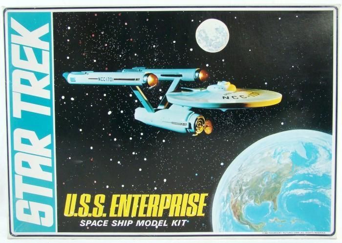
I've never been able to source the AMT employees responsible for constructing and shooting the products, so if I had to take a guess, it seems parts such as the assembly around the nacelle dome/reactors were painted to add a color contrast. It is possible AMT believed the ship--as it appeared on TV--was bland (horrible thought, I know), which is why the domes were red, instead of say, matching the 3-footer's modification colors.
The incorrect coloring did not end there; in widely distributed product shots for print ads, the 1701 was painted silver, so it would stand out in then-common paste-up layouts using a white background. The ship looked like a pendant, more than the original kit.
Man, the nacelle droop is so obvious there.
If you think that's bad, you should see the UK catalog shots--the ship looks like it was constructed with watery paper glue.
Similar threads
- Poll
- Replies
- 26
- Views
- 5K
- Replies
- 209
- Views
- 19K
- Replies
- 6
- Views
- 627
If you are not already a member then please register an account and join in the discussion!