• Welcome! The TrekBBS is the number one place to chat about Star Trek with like-minded fans.
    If you are not already a member then please register an account and join in the discussion!

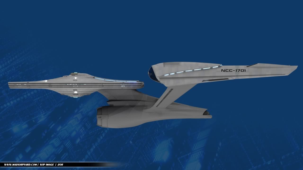
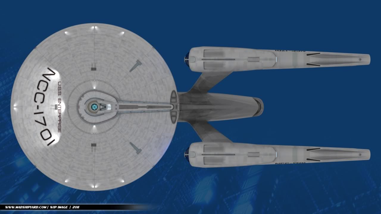
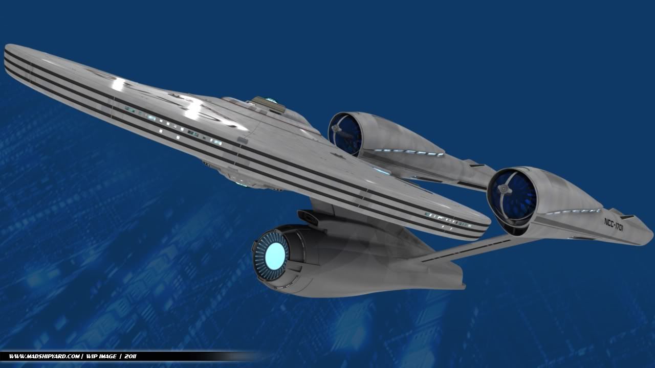
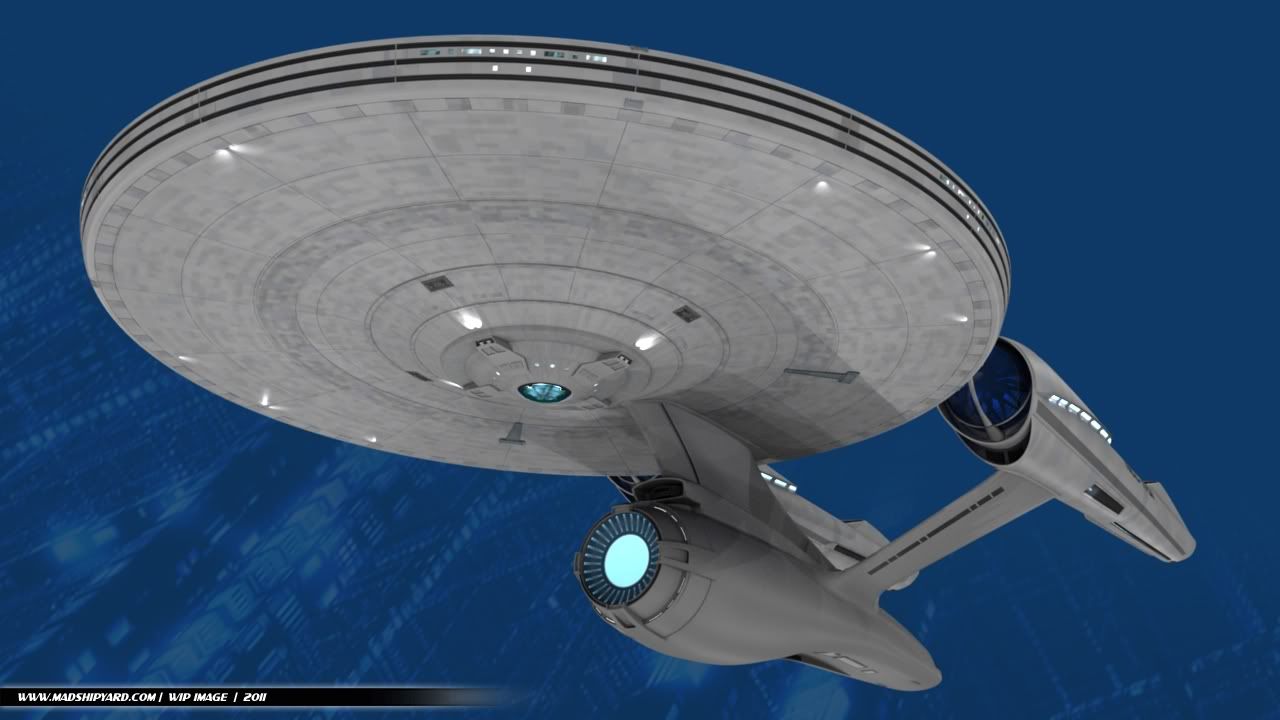
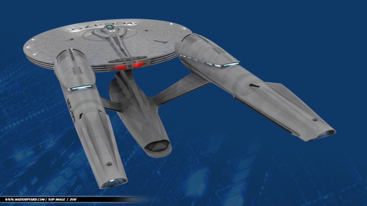
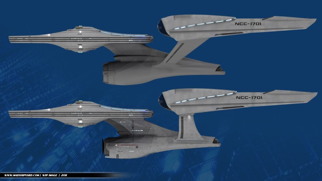
The STXI Enterprise... REFIT!

MadMan1701A

Commodore
Premium Member
Hey everybody... it's been a while again. :)

I started this a couple weeks ago, but haven't had as much time as I wanted to to really get all the major parts in place. It started as an idea while I was reading the thread about changing the Enterprise for the new movie.

The main complaint seemed to be engineering, of course. So, I thought to myself, what if I just re-build the secondary hull, and leave the rest of the ship the same?

I do plan to work on the "guts" behind the nacelle domes up there, too, before I'm done...

Here's what I've got:
WIP014.jpg


WIP017.jpg


WIP013.jpg


WIP015.jpg


WIP016.jpg


So, what do y'all think? I'm sketching out ideas now for the those "guts", but I'm not opposed to ideas, if anyone has any. They probably won't be blue... :)
 
Wonderful rendering, man! Only one thing: PLEASE, please..reduce the size the nacelles in front! (blue caps all the way to those front lights). Just make them proportionate to the rest of the nacelle!

I know that the movie designers made 'em that big to show that the ship has more power, but damn!! God, those look terrible in proportion to the rest of the ship in STXI! They look like the heads of two giant d*cks!

Again, great job! I wish could create something like that.
 
Trim down the undercut a bit and give the nacelle pylons a bit of a curvy flair to blend into the secondary hull better and it'll be great.
 
I really love it. I happen to like the beefy nacelles. My only quibble is that the scale of the secondary hull looks a couple of percentages too small.
 
I like the design of the nacelle struts, but overall it looks worse than the film version - chunkier and more unbalanced. I'd like to see a "skinnier" version of this.
 
I think the nacelle struts need to be moved back a ways – that's what's giving it the "unbalanced" look, IMO.
 
Eh. That's how the ship is in the film, so I'd say leave it. The problem with the pylons is they're still attached near the front of the nacelles, like the movie design, so slanting them like this pushes the attach points on the secondary hull too far forward.
 
A fuller, longer stardrive with the pylons moved back would look better, but other than that she really suits the refit pylons, and the new deflector looks awesome.
 
Thanks for all the comments guys. :) I really got y'all stirred up with this. :D

Wonderful rendering, man! Only one thing: PLEASE, please..reduce the size the nacelles in front! (blue caps all the way to those front lights). Just make them proportionate to the rest of the nacelle!

I know that the movie designers made 'em that big to show that the ship has more power, but damn!! God, those look terrible in proportion to the rest of the ship in STXI! They look like the heads of two giant d*cks!

Again, great job! I wish could create something like that.

Thanks. :) Well, the nacelles shape is going to be staying the same, since I like the design. I did move them quite a bit farther apart from each other, which actually makes them look smaller in the front, to me.

Trim down the undercut a bit and give the nacelle pylons a bit of a curvy flair to blend into the secondary hull better and it'll be great.

:) The secondary hull on this version is already significantly larger than on the movie version, but I was always a fan of the undercut. I'm still thinking about what to do with the connection point of the pylons... I tried several ideas before this, but nothing looked right. I'll probably have some sort of detail there like the large grey band that the original version has...

can we annotate your images?

Sure. :)

This is awesome so far :) :techman:

:)

I really love it. I happen to like the beefy nacelles. My only quibble is that the scale of the secondary hull looks a couple of percentages too small.

Thanks. :) Interesting, since it's actually larger, and longer than the other one. :) I'll have to render up a comparison shot...

Y'know, it's actually a little less hideous this way.

Wow, that's a compliment. :) I don't know what to say. :D

I like the design of the nacelle struts, but overall it looks worse than the film version - chunkier and more unbalanced. I'd like to see a "skinnier" version of this.

Hmm. What parts feel too chunky, to you?

I think the nacelle struts need to be moved back a ways – that's what's giving it the "unbalanced" look, IMO.

Possible, but then they won't sweep back as much, unless I move the connection point farther back on the nacelles, but I'm trying to keep the upper connection point of the pylons on that lower "scoop" part.

I think the nacelle struts need to be moved back a ways – that's what's giving it the "unbalanced" look, IMO.

And the neck moved forward

Well, the part that sticks out in front of the neck is shorter...

Eh. That's how the ship is in the film, so I'd say leave it. The problem with the pylons is they're still attached near the front of the nacelles, like the movie design, so slanting them like this pushes the attach points on the secondary hull too far forward.

Yep, but I don't really think they're really that far forward, compared to the original Refit, though.

A fuller, longer stardrive with the pylons moved back would look better, but other than that she really suits the refit pylons, and the new deflector looks awesome.

Thanks. :) This secondary hull actually is longer, and fuller... got to get that comparison pic up here. :)

More later, first up being a few comparison shots. :)

-Ricky
 
The neck still looks fugly. Change the neck to the original shape of either the TOS E or the TMP E and it will look awesome.
 
Hi Ricky,

It's a brave person who attempts this. When you consider the differences between the TOS 1701 and the TMP 1701, you actually have quite a bit of room for manouvre on where you take it.

To me, the ship looks unbalanced - it's as if the back of the secondary hull is drooping. I think what is bugging me is a lack of horizontal lines.

On the secondary hull, you need to balance the hull around that centre axis. I've quickly painted (very badly) in a different undercut to show what I mean. I think what I'm aiming at is a more teardrop shape.

I've also tweaked the warp nacelles, so the grey stripe is horizontal instead of sloping upwards. I've also slimmed down the front.

Of course please feel free to deposit the ideas in the nearest bin! Afterall it's your ship!

Cheers,
S.O.

wip014edited.jpg

I'd keep the warp engines where they are but move the support pylons back to so that pylon Mid point meets with the mid point of the warp engine I'd sharpen the undercut to give more secondary hull :cool:
 
Yeah, I see what you're saying... but I still like the look of the nacelles too much, to remove the lower "scoop" section.

As far as the horizontal line goes, I was going to have a larger, more traditional pinstripe down the middle.

I still like the severe undercut, though. I don't know why, it just looks "right" to me. :)

Well, here's the comparison...

WIP018.jpg


:)
 
My only beef with the original design is the saucer's lower dome has the surrounding sensor array on it that seems a bit too large. I wonder what a jjprice saucer top above a TMP lower saucer might look like, and vice versa...
 
If you are not already a member then please register an account and join in the discussion!

Sign up / Register


Back
Top