Thanks for all the comments guys.
")
I really got y'all stirred up with this.

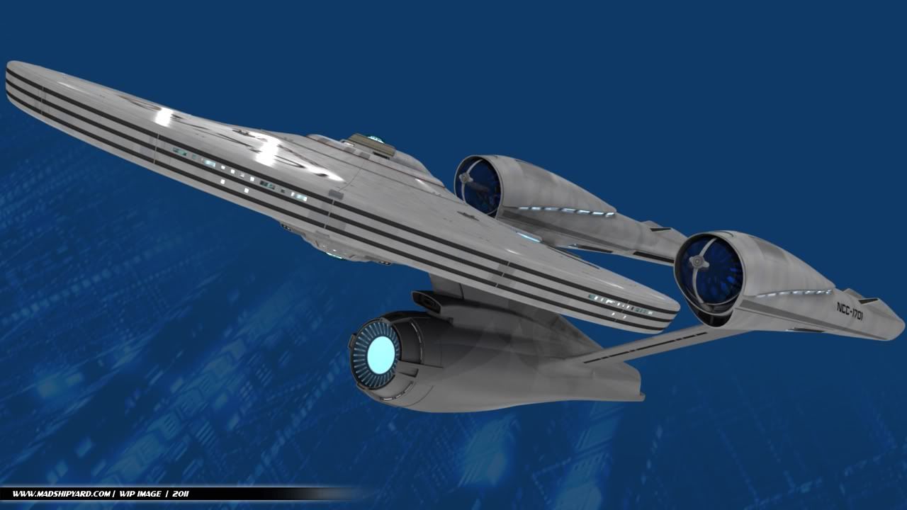
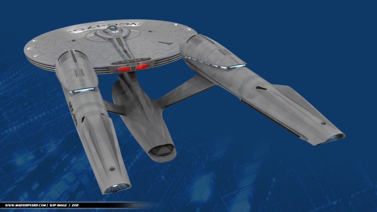
Wonderful rendering, man! Only one thing: PLEASE, please..reduce the size the nacelles in front! (blue caps all the way to those front lights). Just make them proportionate to the rest of the nacelle!
I know that the movie designers made 'em that big to show that the ship has more power, but damn!! God, those look terrible in proportion to the rest of the ship in STXI! They look like the heads of two giant d*cks!
Again, great job! I wish could create something like that.
Thanks.
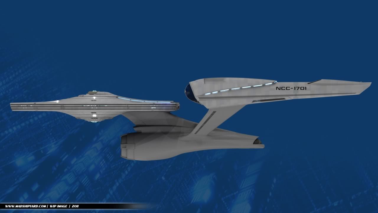
Well, the nacelles shape is going to be staying the same, since I like the design. I did move them quite a bit farther apart from each other, which actually makes them look smaller in the front, to me.
Trim down the undercut a bit and give the nacelle pylons a bit of a curvy flair to blend into the secondary hull better and it'll be great.
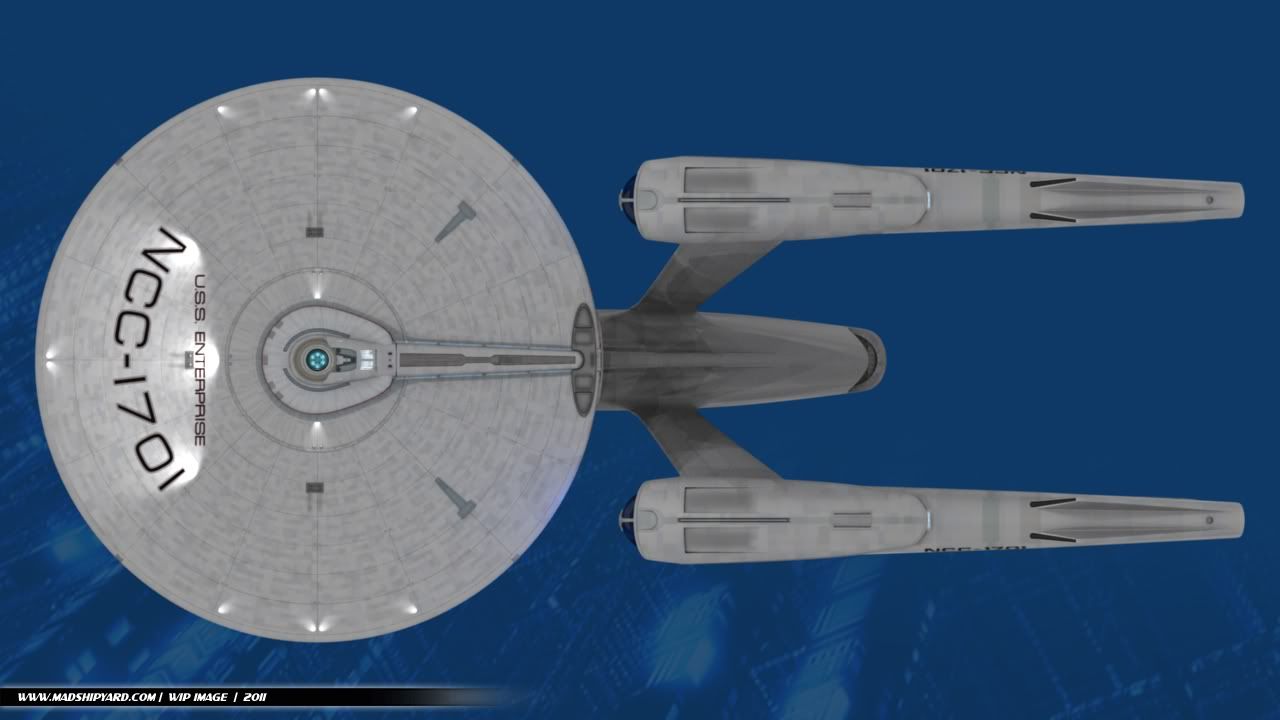
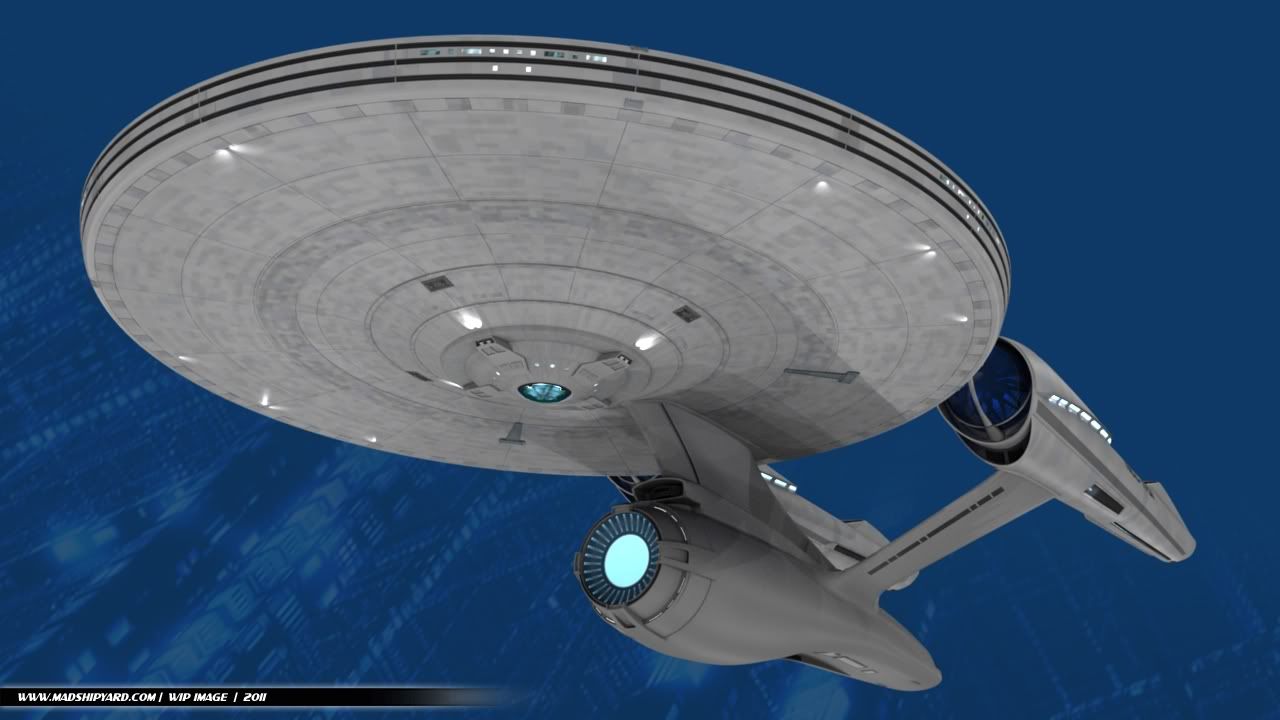
The secondary hull on this version is already significantly larger than on the movie version, but I was always a fan of the undercut. I'm still thinking about what to do with the connection point of the pylons... I tried several ideas before this, but nothing looked right. I'll probably have some sort of detail there like the large grey band that the original version has...
can we annotate your images?
Sure.
This is awesome so far

I really love it. I happen to like the beefy nacelles. My only quibble is that the scale of the secondary hull looks a couple of percentages too small.
Thanks.
Interesting, since it's actually larger, and longer than the other one.
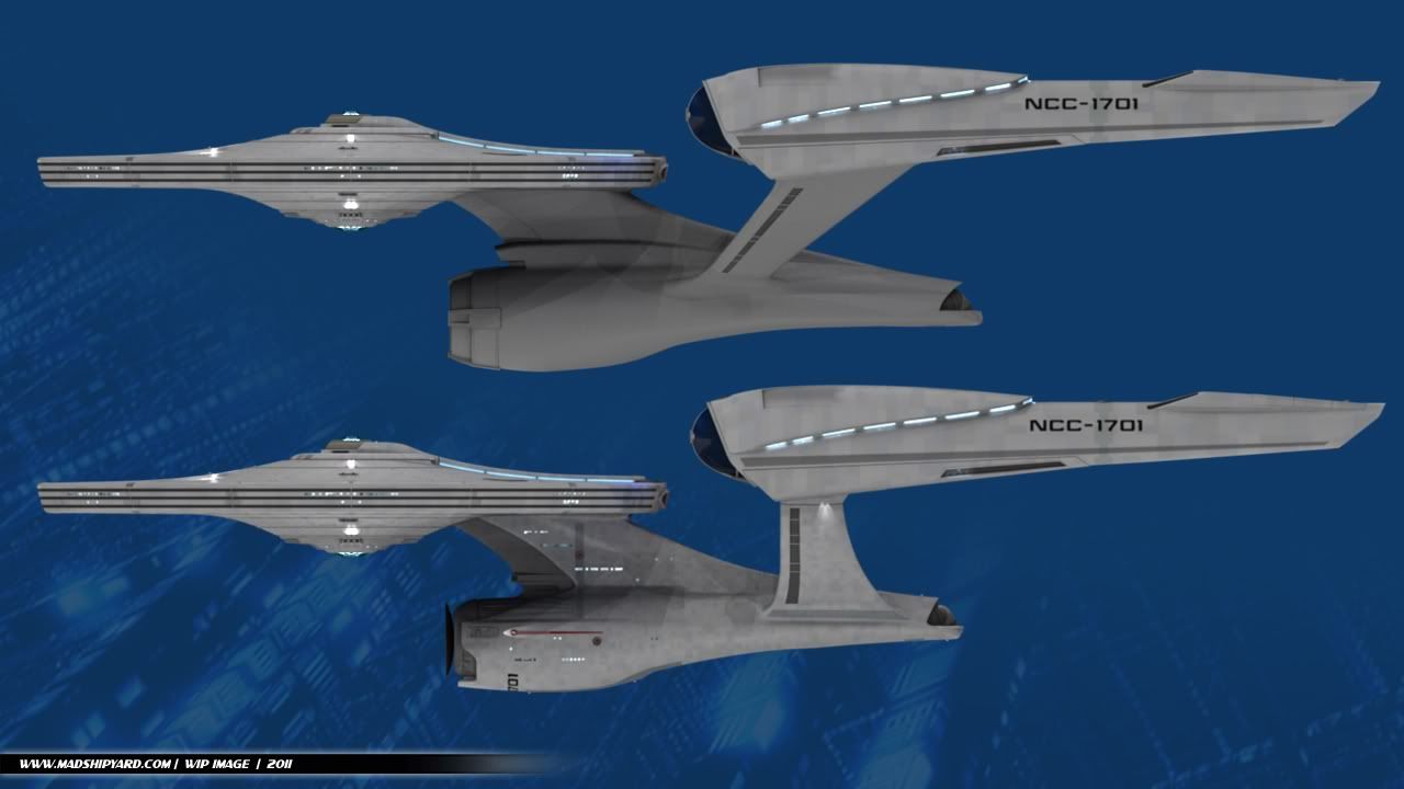
I'll have to render up a comparison shot...
Y'know, it's actually a little less hideous this way.
Wow, that's a compliment.
I don't know what to say.
I like the design of the nacelle struts, but overall it looks worse than the film version - chunkier and more unbalanced. I'd like to see a "skinnier" version of this.
Hmm. What parts feel too chunky, to you?
I think the nacelle struts need to be moved back a ways – that's what's giving it the "unbalanced" look, IMO.
Possible, but then they won't sweep back as much, unless I move the connection point farther back on the nacelles, but I'm trying to keep the upper connection point of the pylons on that lower "scoop" part.
I think the nacelle struts need to be moved back a ways – that's what's giving it the "unbalanced" look, IMO.
And the neck moved forward
Well, the part that sticks out in front of the neck is shorter...
Eh. That's how the ship is in the film, so I'd say leave it. The problem with the pylons is they're still attached near the front of the nacelles, like the movie design, so slanting them like this pushes the attach points on the secondary hull too far forward.
Yep, but I don't really think they're really that far forward, compared to the original Refit, though.
A fuller, longer stardrive with the pylons moved back would look better, but other than that she really suits the refit pylons, and the new deflector looks awesome.
Thanks.
This secondary hull actually is longer, and fuller... got to get that comparison pic up here.
More later, first up being a few comparison shots.
-Ricky