• Welcome! The TrekBBS is the number one place to chat about Star Trek with like-minded fans.
    If you are not already a member then please register an account and join in the discussion!

The new DS9 station-Anyone draw it yet? (SPOILER ALERT)

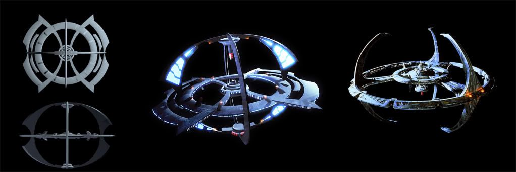
Alright guys, I gave the sketch a quick pass at 3D. Bear in mind this, like the doodle, is an absolute rush hack job, so no knocking the quality :).

Anyways, this is kinda sorta how I'd design the new DS9 if I were tasked with it.

Something with the same sort of grand circularity and majestic sweeping shapes, and that looks good from multiple different angles.

Long live Deep Space Nine!

new_DS9_02.jpg
 
That looks excellent - although it needs a sphere in the middle. Here's the description from Raise the Dawn
Despite the radical design, it shared many characteristics with other Starfleet facilities: the gray-white surface of its hull, the curves and proportions of its components, the familiar lettering along one arc that read UNITED FEDERATION OF PLANETS. The overall, esentially spherical shape of the station, though, reminded Ro of it's predecessor. The new facility would ultimately comprise three rings, oriented at right angles to one another. They would all surround an inner sphere, connecting to it via a half-dozen crossover bridges. The rings would provide docking and cargo services, while the sphere would house work, commercial and residential sections.
 
Agreed. Though I'd like to see more of the standard Federation "tower" assembly underneath the central sphere, ala Spacedock.

EDIT:
Stoopid mobile internet - the last picture I saw before posting was the spacedock from Trek2009... I really like the above concept by Mojomoe though. I would make a few minor changes though:

1) eliminate the spikes from the outer arcs, they detract from the flow.
2) if that's a fusion core ala DS9(1) on top, I'd move it to the bottom and direct the exhaust out away from the core. If not, and they're just red navigation warning lights below an Ops spire? I like it a lot :D
3) the outer curve on the glowing fan blades (what are they, anyway?) I'd continue all the way to the base where they meet the station rings, as right now they look a little too alien, IMO. I'd probably cull the majority of the glow also - maybe replace it with rows and rows of viewports?
4) the interconnecting spokes that are bowed right now, I'd maybe switch them out for straight ones.
5) It may be worth considering making the core MUCH bigger, although not necessarily completely spherical (I also like to think O'Brien would design a central core with a huge internal "open air" recreational/arboretum area in homage to Keiko, or possibly on an upper level with massive viewports)

Aaand I'm spent. Overall I really quite like it - just would apply some tweaks. :)

Of course, personally I'd have preferred DS9(II) to be either a Starfleet/Bajoran collaboration, or solely a Bajoran design built with Federation funding support! :D
 
Last edited:
And the "half-dozen crossover bridges" probably mean there's one connecting to each of the six points where two rings cross. It doesn't make sense having four crossover bridges on the ring in the XY plane and nothing at all for the other two docking rings. It's too inefficient to get from those rings to the station proper. What you've got here makes the XZ and YZ rings look purely decorative.
 
I have some thoughts on addressing that, but I'm worried about prejudicing any artist who might already be commissioned by Pocket Books to do the job. Additionally, my skills are currently more focused on pen and ink than upon CGI.
 
^ I don't see why you'd worry about prejudicing any artist. If they actually read this thread they might welcome the input and feedback.

However, they might also intentionally avoid elements already seen in fan designs to avoid later accusations of plagiarism.
 
If you are not already a member then please register an account and join in the discussion!

Sign up / Register


Back
Top