• Welcome! The TrekBBS is the number one place to chat about Star Trek with like-minded fans.
    If you are not already a member then please register an account and join in the discussion!

The New Artist's Thread (Warning: Large Image Size)

Well I'm starting an art class later this month and I've been dabbling.
A lovely poster was kind enough to volunteer to be a muse.
I would be delighted if anybody recognises him (see I've already ruled out 35% of the board and, no, it's not the meerkat)
Anyway, here goes...

don.jpg
 
That's because she is Summer Glau - the other lady is Jeri Ryan from Dark Skies (I showed it to some friends the other day and they knew who the blonde lady was right away).
Cool. The fact I saw her in there, and that it was meant to be her, means you've done your job right.
You almost got everything right.
What did I get wrong?
Oh, the sentiment I wanted to convey was that it sorta was perfect, but the "almost" was thrown in there because, y'know, nothing in this world is perfect. If I really wanted to go nit-picky, I'd say that the way the left and right side of the hairline on the forehead meet isn't quite right, it just doesn't jell right. Either the left side should go up, or the right side down (right side whether by curving or just spatial lowering doesn't matter). But that said, I really liked this picture. I can see it being painted with color and being a proper finished piece of art, whilst some of your other pieces of work rather seem like sketches. Not always being symmetrical with faces and stuff.
...the other lady is Jeri Ryan from Dark Skies (I showed it to some friends the other day and they knew who the blonde lady was right away).
I must admit I haven't recognized her as Ryan at first, but now that you mention it, I do see her. The reason being you didn't use Seven of Nine as your reference, and also she's not as pretty for not having enough of a symmetrical face features. Your art would be so much better if you took more notice to that part of the creative process.

And that last, it's the Doctor, right? :D (not the women, ofc)
 
Thanks for the feedback; how do you like my tank and airship doodles?

Copied from a Radio Times cover:


A Panzerkampfwagen V "Panther":
 
Well, to be honest, the airships seem a bit crude, like very rough sketches.

As for the tanks, I'm not much into war machines, so I cant tell how much you got them right, but they seem okay. As for the art side of them, this one is my favorite:

I prefer this one because it has depth due to having a proper perspective not just a side view, and it also seems like pretty much the only one with more worked on lightning, so that also adds a better feel to the picture than just the bland side view with no relief visible due to no lightning. You can see how it looks better, in regards to the art side of things, than the one in your last post (which is also one of the better ones) due to proper lightning. The more details, finesse and composition thought in the picture the better the end result.
 
I like your feedback and I like that drawing of a T-34/76 as well.

A bit risque and it looks like I've made the head too big, haven't I?

10073024_9c117e818b_b.jpg
 
K'Ehleyr, what kind of art course are you attending? Are you a participant or the teacher? I like the meerkat next to that Charlie Brooker look-a-like.
 
K'Ehleyr, what kind of art course are you attending? Are you a participant or the teacher? I like the meerkat next to that Charlie Brooker look-a-like.

Maybe I should stick to animals!
You're much better at faces than me ~ I've tried a self portrait and Man asked why I was drawing an alien!

Which is probably why for combined Christmas and B'day pressie he's enlisted me on a 14 week, 3 hour a week course. Covering sketching, charcoal, oils, acrylics, watercolours ~ the whole lot. I start in 2 weeks and am going to bore the lot of you with my work :lol:
I am incredibly excited and get to exhibit in January :D
 
Good luck, K'Ehleyr - I myself is learning all of the time and a lot of my recent drawings I couldn't have done even two years ago.
 
Yeah thanks, I'm looking forward to seeing the rest of you work, K.

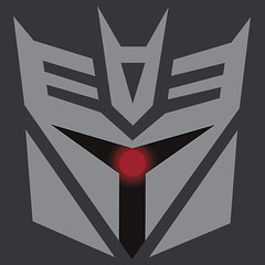
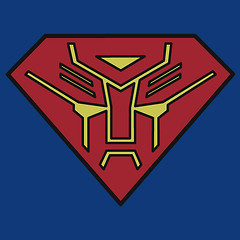
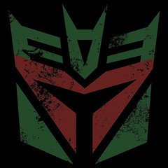
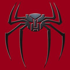
Oh, and trekvik, how rude of me for not commenting on your transformers logos - the top one's a cylon, the second one down is the Superman emblem, the third one down is Boba Fett, and the final one is the Spiderman emblem. Good stuff.
 
If you are not already a member then please register an account and join in the discussion!

Sign up / Register


Back
Top