• Welcome! The TrekBBS is the number one place to chat about Star Trek with like-minded fans.
    If you are not already a member then please register an account and join in the discussion!

The bridge shots (large images)

Re: The bridge shots

One thing that the blow-up makes clear is that the woman standing at the Communications Desk is Uhura.

No military organization today gives its capital ships to men of the age William Shatner played in TOS.

In any event, the bridge looks great. I like the plexiglass displays; I presume that they're the reason people keep referring to "Stargate" and BSG - do fans have no other point of reference for these kind of displays, I wonder?

My understanding, FWIW, is that the bridge is considerably bigger than the TOS bridge, is oval-shaped rather than round, and has a main viewer that dwarfs the one on the TNG version of the ship. There are also several exits to and from the room, not all of them turbolifts.

I notice that the bridge railing, floor and some seat upholstery are all dark red. I like. And Kirk's chair is a pretty nice redesign of the TOS version, ignoring the films and later tv series. Again, all very good. :)
 
Re: The bridge shots

I'm all for updating the designs, because this isn't the '60s anymore, but that bridge just feels far too overtly "2008 contemporary office building meets sci-fi devices."
 
Re: The bridge shots

I'm all for updating the designs, because this isn't the '60s anymore, but that bridge just feels far too overtly "2008 contemporary office building meets sci-fi devices."

So exactly like the original reflected the vision of the future held by people in the 1960's then?
 
Re: The bridge shots

All the photo links are now mysteriously down. :vulcan:

BTW, Kirk looks a lot like Archer in that bridge shot. Coincidence? I think not...... :vulcan:
 
Re: The bridge shots

The only version of "Star Trek" that the bridge reminds me of is TOS - the series itself, not the TOS-based movies.

A big-budget resurrection/reimaging of TOS more than three decades after the fact.

I think it's wonderful. :techman:
I'm not seeing it - to me, that shot looks like a big-budget fan film, like "In the Pirkinning" or something. What we see looks, to me, like someone's house or, unfortunately, basement, especially with all the "makeup mirror" lights. It doesn't even look circular - if anything, it reminds me most of a brightly-lit Daedalus bridge from Stargate Atlantis.

I'll need to see more, but for now, meh. I expected better - not "canon," just better.

EDIT: Okay, I looked at the 'larger' (read "wider") image, and I know what it really reminds me of:

Macy's!

Just stand a few racks in there, and that redskirt could be shopping for lingerie ;)
 
Re: The bridge shots

I'm all for updating the designs, because this isn't the '60s anymore, but that bridge just feels far too overtly "2008 contemporary office building meets sci-fi devices."

So exactly like the original reflected the vision of the future held by people in the 1960's then?

Yeah, pretty much. Kirk's chair was a swivel "television chair" manufactured by Madison, everyone else's were mid-century home furnishings knocked off from Saarinen designs; the overhead displays were round-cornered TV screens in a 3/4 ratio (remarkably, Jefferies abandoned that for the production version of the Main Viewer, which was actually quite nifty and reasonable looking even now). Everything dressed up in black naughahyde with control stations that had the heavy, oversized look of 1960s computer room furniture.

It all looked nicely contemporary, though, eschewing the big dials and gauges and low-budget Deco aethetic that had dominated 1950s scifi.

Oh, and the new bridge isn't round, AFAIK - it's oval, wider than it is deep.
 
Re: The bridge shots

I just hate the skirts and the boots. It doesn't look like a uniform at all, and looks very 60's, which I think is dumb. It just doesn't look like the uniform of a professional at all. It looks like a woman who is subjugated to the role of eye candy.

Man I just can't stand the skirt. The women should wear professional looking uniforms, like everyone else.

But, the other uniforms, and the bridge, look amazing. Actually, they look amazazing. They look like some kind of advanced futuristic uniforms. And the bridge looks optimistic and high-tech, I love it. I'm just so glad it doesn't look anything like the original bridge.
 
Re: The bridge shots

Thanks to JJ for keeping the original uniform design including even the miniskirts (IIRC many predicted this would be one of the first things they'd "have to" redesign)!
I like it not for canon reasons (for me this will never be part of the original continuity), but simply because JJ shows he can see what worked and won't reimagine stuff for the heck of it.

As for the bridge. It looks a bit too detailed and crammed with stuff. Also too bright and I agree with too much plexiglass.
But apart from the redundant-looking Uhura station It's okay and rather close to the original.
JJ is definitely on the right track. Go JJ!
 
Re: The bridge shots

I bet a lot of the expressed beef with the bridge is coming from it's overall design aesthetics, and not necessarily from it's lack of comparison w/ the TOS bridge.

Yup. That's how I feel. I could care less whether it's the TOS bridge. I do care about clean lines and visual focus, which is completely lacking in this picture.
 
Re: The bridge shots

First thing i thought when i saw the pic was that the new bridge just looks tacky. Its like they crammed everything they thought was cool like neon blue displays and clear circuit boards and then thought they had to have some throwback to the original 60's style and shoved curved plastic in for whatever that table thing is. It just doesnt mesh to me. Hopefully it will look better in context when we see the rest of the bridge but so far its yet one more thing that im not keen about when it comes to STXI.
 
Re: The bridge shots

I think that display shows the Romulan time ship, which has been described as squidlike and organic.

As for the bridge, it's a hideous mess.
Abrams, who is a Star WARS fan, said he wanted to make Star Trek more Star Wars.
The ONLY thing Star Wars has over Trek is the visuals, brilliant production design that begins YEARS before the movie comes out.
The visual design of Trek has been seriously lacking since the end of the original and innovative first series. Galaxy Quest was a better looking Trek movie than any of the real Trek movies. The Kirk era movies weren't bad (except the uniforms in the first movie), but TNG was seriously hampered by it's TV budget, and the production design since then has only gone downhill, hitting rock bottom in Nemesis.
It looks like visually this movie is going to be a huge step BACKWARD, and I don't mean in a nostalgic way. I mean they rushed this movie into production and it shows.
 
Re: The bridge shots

First impressions everyone?
Me?
It seems to be very crowded and cluttered, not feelin it right now. Of course I'll have to see later but as of the moment, not a fan

I honestly love it! I think it conjures up an older design, perhaps a little less symetrical than the 1960s show, but still more advanced than what we have now. Its a striking balance.

RAMA

Agreed. The bridge is more or less what I would have hoped for. There are elements in it that I would not have included, but so what?
 
Re: The bridge shots

Lovin the uniforms. Bridge...not so much. I'd have liked to see some attempt at making the bridge more recognizable to TOS.
The chair is cool.

-Rabittooth
 
Re: The bridge shots

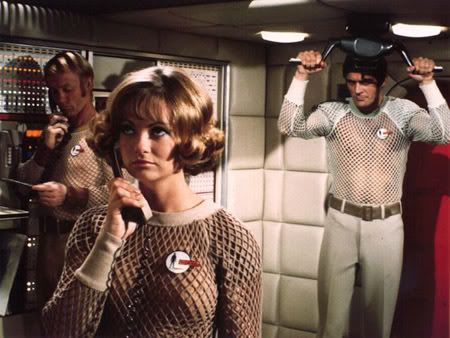
I like the "weave-look" of the uniforms, although Chekov (and the gold uniforms in general) looks like he should be part of the crew of "Skydiver 1" ;):

UFO_skydiverCrew_smaller.jpg
 
Re: The bridge shots

I was expecting more thought in the bridge design to be honest.

More realism, yeah, its a re-design, but the features have been over exagerated somewhat, like the chair arms and the visual displays.

Im not saying i dont like it, its ok, i just expected more, which is part of my disapointment.
 
Re: The bridge shots

I didn't wade through all of the posts, so sorry if this is repetitive, but two things strike me about the bridge. First, it has a "Phase II" feel to it. Second, it's no more white than the bridge of NCC-1701A at the end of TVH.

I'm also sure than with movie lighting and seeing it on film, the bridge will look just fine.

Also, did anyone else notice that Kirk's left hand is bandaged?
Also, also, look at the bottom left corner of the screen on the back wall of the bridge (in the full shot). I can make out "1701," then some letters, "something, someting, N, C." Maybe, "SCNC," not sure.
Also also also, Sulu's gold looks avocado in the bridge shot. Excellent! ;)
 
Re: The bridge shots

It's hard to tell what the overall bridge looks like, but it really looks cluttered and non-functional in that shot. Jeeze, they went just a little overboard with the little spotlights. I don't see any unity at all. Maybe a better angle will reveal some thought or logic in the design.

I do hope the main viewer is bigger, that's a plus at least.
 
Re: The bridge shots

I don't even know if I want to wade in to this.

If this bridge is indeed the Enterprise's bridge, then I am disappointed. I like the look of everything else so far, including Spock's out of context picture... It is too white, and too glassey looking. I would have prefered the overall essence of the original bridge, updated with new readout screens and data input controls on a bacground similar to the original. The lighting, chairs, flooring, and constructions materials could be updated to look more modern (futuristic).

In other words, I like the clean simplistic layout of the original, and would have liked to see that transfered and updated- not unlike how the uniforms were changed. Enough to make them look more dramatic based on our contemporary views, but similar enough to be very easily recognizable.

All and all, I am pleased so far, and will get over the bridge design.
 
If you are not already a member then please register an account and join in the discussion!

Sign up / Register


Back
Top