• Welcome! The TrekBBS is the number one place to chat about Star Trek with like-minded fans.
    If you are not already a member then please register an account and join in the discussion!

STXI - Klingon Cruiser

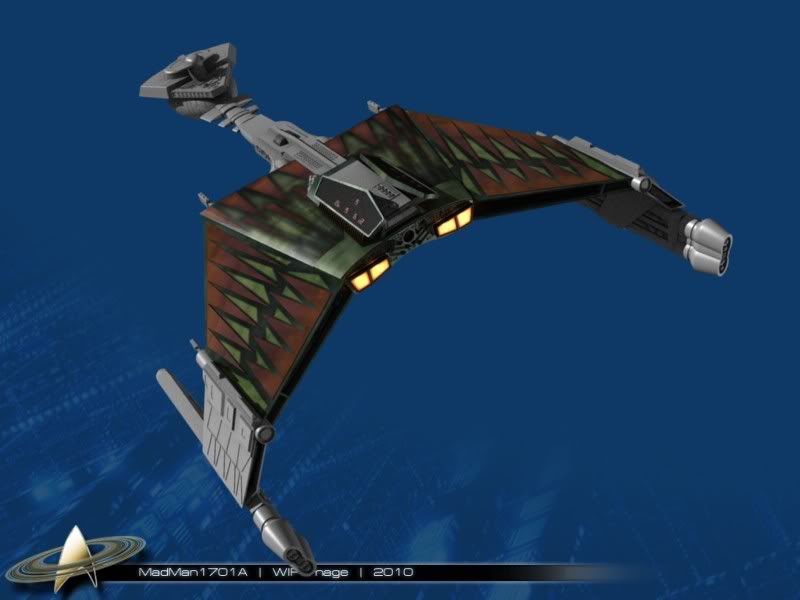
Alright, I need a suggestion. is this too much, should I tone it down some?

STXI_KBC_WIP_028.jpg


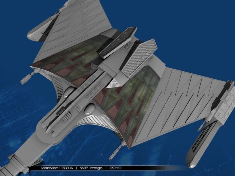
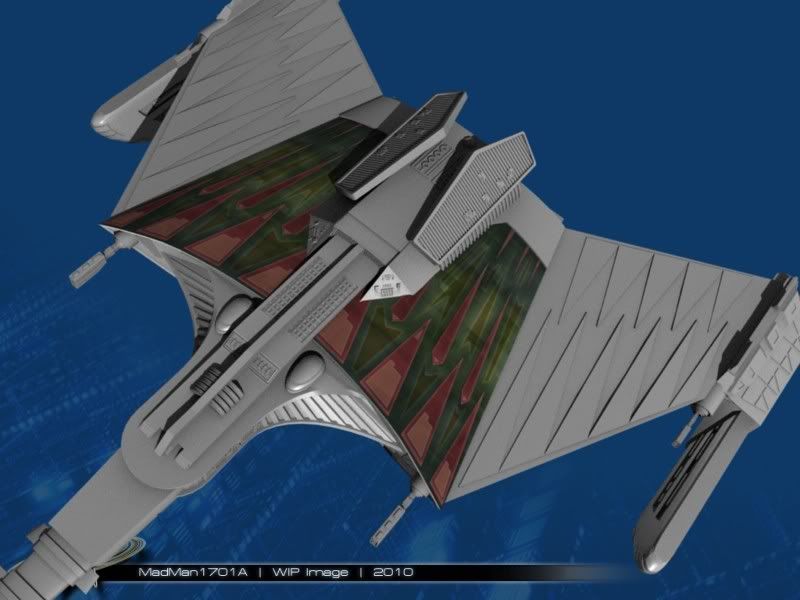
I don't know if I want to keep this look, or go with something more subtle.
 
Consider this a vote for muted, although lighting plays a role, but in that bright, white light, the muted looks best.
 
^^ Me three :)

the toned down version has a natural feel to it. the full contrast one is fine, but looks like the video-game version.

im not sure i put that right, do you get what i mean?
 
yay! the shoulder guns are back! may as well go with the muted paint job, it's all going to be covered in phaser burns and the blood of the defeated soon enough anyway. :klingon:
 
Can I change my vote? I hate to be on the winning side; it makes me look like too much of a yes-man.
 
Definitely muted.

Hey Madman, just one small comment. The waist guns to me look a little too much like hinges holding the wings on. Unless that is the intention?
 
I was thinking that as well... maybe they thought the engines could move? I zoomed in on screengrabs from the Kobyashi Maru scene, and they definitely have a cylinder holding the parts together.

Maybe I'll get some more done today...
 
Alright, been working on this for a few hours.

STXI_KBC_WIP_030.jpg


It sucks. I think I am going to scrap this color scheme altogether, and go back to basics. I think a slightly blue tinged grey, with a cobalt blue detailing might be good....
 
The pattern rocks, it's just the brown with the green that's not working.. Maybe if you made the green areas some kind of blood red? Not sure about the brown areas.
 
I like the pattern (especially the muted version as above, gives the ship that "worked" look, basically), but I think the problem is that there's TOO much of it. Right now it's overkill -- hard on the eyes.

Perhaps only use it sparingly as an accent on the wings & fuselage? Probably differs from the drawing you're using as a basis, but still... Just an idea.

Cheers,
-CM-
 
This


doesn't look like this nicer, more muted version


The top one looks way too cartoony IMO.
You're right... I think I copied over my other source textures when I transferred everything from my portable hard drive. I'll try the more muted colors again, first. :)

I'm still thinking the Grey color might be a good throwback to TOS though...
The muted colors should look better, but I'm thinking the pattern on the wings is another factor: they seem a bit too regular. For example, compare with the K't'inga model:

klingon16.jpg


ex_st_klingon_top_big.jpg


klingon32.jpg


A more complex pattern, with more variation between sections. Doesn't leave those wide swaths of "cartoony look". Even with the vivid colors the center section breaks it up a bit better. (The muted center section does an even better job.) And there's always base gray with muted color highlights on surface details...
 
You're right, they are much too regular. I'm going to re-work the paneling on the body and the wings, to make it more interesting. :)
 
Alright, been working on this for a few hours.

STXI_KBC_WIP_030.jpg


It sucks. I think I am going to scrap this color scheme altogether, and go back to basics. I think a slightly blue tinged grey, with a cobalt blue detailing might be good....

Oh man, I really like that! I think the bold colors and "worn" texture look great.
 
If you are not already a member then please register an account and join in the discussion!

Sign up / Register


Back
Top