I'm now imagining the Paramount TV Executives saying, "Why can't it be a modern color like gold or lime green?"
[shudder]
Bigger! Make it bigger!
"Well, the one weird thing was that she kept twisting my ears."
I'm now imagining the Paramount TV Executives saying, "Why can't it be a modern color like gold or lime green?"
[shudder]
Bigger! Make it bigger!
Funny, but networks don't care about what model spaceships look like. They'd not have given notes on that. The only people who'd've had input on the design would have been the actual production team.I'm now imagining the Paramount TV Executives saying, "Why can't it be a modern color like gold or lime green?"
[shudder]
Thanks.
I'm really averse to adding any detailing that "calls forward" to ST:TMP or anything beyond that.
")

Thanks.
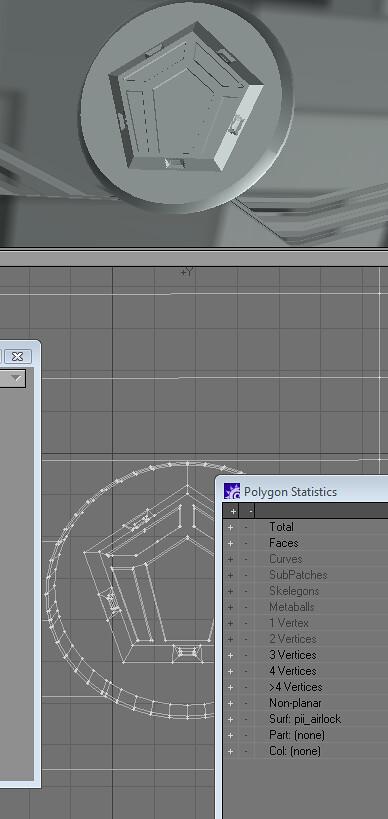
The major exception, right now, to referencing later versions of the ship is the glow on the warp grilles...and I may eliminate that. One of the Loos construction photos looks as if there may have been a reflective Mylar surface applied to them.

We use essential cookies to make this site work, and optional cookies to enhance your experience.

")
