• Welcome! The TrekBBS is the number one place to chat about Star Trek with like-minded fans.
    If you are not already a member then please register an account and join in the discussion!

"Star Trek: Phase II" Enterprise

Here's a quick-and-dirty comparison with the Mike Minor painting. The painting itself was never wholly accurate to either Jefferies' drawings or the model under construction (for example, Minor included the three hollows on the underside of the saucer which were a feature of the earliest AMT model kit):

4766559322_c09fe236d1_b.jpg


None of the contours of the ship are any more congruent with the TOS ship than were those of the TMP refit - in fact, in most respects the lines of the Phase II ship are very close to the TMP version that was based on it. That means, among other things, that the saucer is not shaped like the TOS saucer and is not the same size - in actuality it could no more be a "refit" of the TOS vessel than the TMP ship could have been.
 
Last edited:
Very nice work, I really like what you did with the bussard collectors/nacelle front cap. :cool:
 
Very nice work, I really like what you did with the bussard collectors/nacelle front cap. :cool:

Thanks. I was never satisfied that I understood from the various color renderings done by Mike Minor exactly what was intended for those nacelle caps.

Some versions of his painting suggest that they might be hull-colored. Others render them as black with blue highlights, in a fashion similar to the main deflector dish (another problematic feature).

The model as constructed showed them as opaque.

And the infamous "23rd Century Odyssey Today" movie poster (which I barely used as reference, at all) shows them as black with blue highlights.

Problem there was that the hull-colored version was boring and the blue-black versions fade into the surrounding dark space leaving visual "holes" in the model.

So...I cheated.

Probably the biggest intentional cheat on my version. I just installed the blinky lights from the TOS ship in the nacelle caps, using the dark blue color scheme on the caps to filter the light.

And, through the miracle of CG, there's a rotating "fan blade" effect installed - even though on a physical model built in 1978 the shape of the nacelle caps would have prevented that apparatus from working.

Changed the conditions of the test, so to speak.
 
OMG totally amazing, Dennis. :techman::techman: Is there sopposed to be docking ports on the lower part of the bubble of saucer like in the painting? BTW great work and totally amazing.:techman::techman:
 
Hmm, were those docking ports there? They're placed in the same way as the three "dimples" on the original pressing of the AMT Enterprise model, and Minor also renders the three double-scribed circles that were features of the model in that same area - so I assumed that he was just copying detailing from the kit.

Conclusions come from research, premises and assumptions - and it's obviously the last that will get me into the most trouble. :lol:
 
Very nice work, I really like what you did with the bussard collectors/nacelle front cap. :cool:

Probably the biggest intentional cheat on my version. I just installed the blinky lights from the TOS ship in the nacelle caps, using the dark blue color scheme on the caps to filter the light.

And, through the miracle of CG, there's a rotating "fan blade" effect installed - even though on a physical model built in 1978 the shape of the nacelle caps would have prevented that apparatus from working.

Changed the conditions of the test, so to speak.

Works out very well in any case, its never explained how it actually worked on the TOS E, might be that its all forcefields and plasma which creates the effect. ;)
 
I'm going to approach giving the ship more apparent detail first by weathering and adding some color into the various textures, before I give any thought to adding mesh detail.

4765922195_cc89a5fcf3_b.jpg
 
Dennis, you are doing a fantastic job. :techman::techman: I only mentioned the docking ports on the saucer because I have seen them in some of the paintings done by Mike Minor, but have not seen them on Matt Jefferies schematics of the ship only on the closeup of the secondary hull. The way that you have the ship currently is the most accurate that I have seen to date. I have seen renderings of this vessel and people have their own interpretations of this ship. Once again, yours is the most accurate that I have ever seen. :techman::techman:
 
I've always wondered what this lost Trek ship would have looked like. Quite an impressive take on it, Dennis. Looking forward to what you do next with it!
 
Thanks, all. Fidelity to the available references was my primary goal with this. Still and all, one gets into some guesswork and making choices based on intuition.

One's first inclination is to think of it as a just-relaunched vessel and therefore pristine, like the ST:TMP ship. Starfleet keeps the plastic wrap on their lampshades for twenty years or so.

The TMP ship has a great deal more surface detail, however, than the TOS ship and all of the pre-movie treatments of this ship looked similar in detail to the TOS ship. So more aging and weathering along the lines of the TOS ship is helpful.

The TOS ship also had more windows. Jefferies' drawings were pretty specific about window placement on most of the Phase II ship, however - the exception being the saucer.

Andy Probert has a page of photos of the Phase II vessel under construction:

http://www.probertdesigns.com/Folder_DESIGN/P-2_Enterprise.html
 
Well, Dennis, it looks like Andy Probert's pictures cinch any uncertainty about the nacelle caps. They were obviously intended to be opaque and probably hull-colored. I agree that the result is boring, but if you're shooting for an accurate representation of the original, you'll need to address this.

Still, it's a wonderful job you're doing here. The 'missing Enterprise' deserves some attention, and it'll be interesting to see the ship in motion.
 
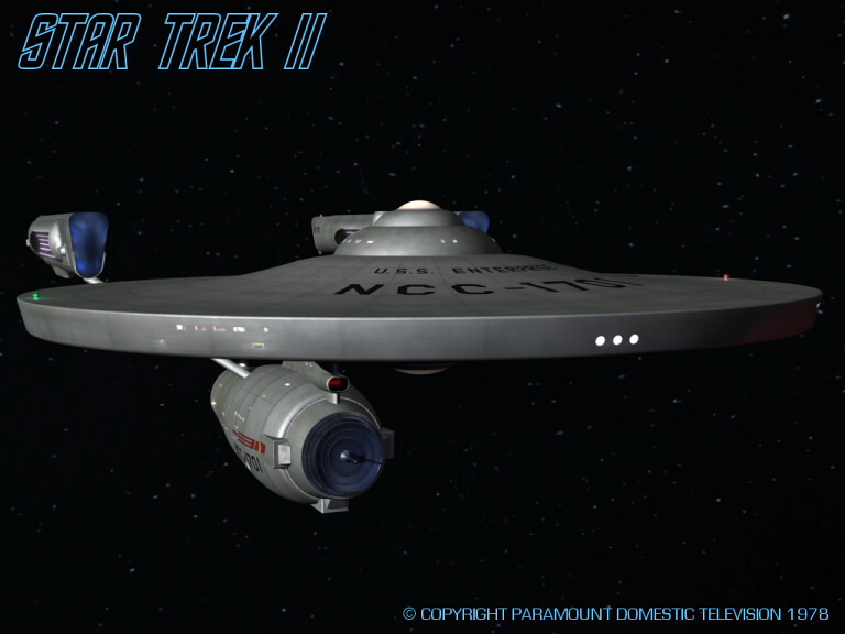
As always, Dennis, your work is outstanding -- I think it serves as a kind of mental putty, filling the gaps between the incomplete ideas in designers' minds in 1978, and what they were thinking at that time.

The thing is, though: If anything characterized the state of the Star Trek franchise in the late '70s, it was uncertainty. One moment they're planning for a new weekly series; another they're considering monthly "movies of the week;" the next they're back to the weekly series; and then doggone it, we're now doing a movie. Let's bring in the guy who did the neon butterfly ad for Levi's Jeans to do the art direction; or hey, I know, let's get the Star Wars guy to do the Enterprise hull stuck on a giant pyramid; nah, on third thought, let's bring back the original guys; or how about, let's get the guy who did Silent Running.

Assuming for the sake of argument -- as your "Copyright 1978" test figures do -- that the Paramount folks were further along with "Phase II" as a TV series, I can't imagine these non-artist supreme executive producers letting this design, as you have masterfully rendered it, pass by unscathed. Of course, there would be some who would make the most unreasonable of requests, like big gun turrets up front, or perhaps some place for "the beaming thingy" that beams people up.

But once the artists emerged from that meeting, I think they'd be tasked with some compromises. The gun-metal deflector dish would go. The purple glow on the nacelles (yes, I know it passed inspection for TMP, but that's cinema) would have been dissed, probably because the U.S.S. Enterprise is an Amuhr-'can ship, dang it (at least that's what "U.S.S." has always stood for, right?), and it wouldn't be glowing no sissy purple color. (Red's an Amuhr-'can color.) And the model makers would probably be asked to attach some new sources of light to make the otherwise drab grey contours more dramatic. This show's in color, I can imagine a Paramount boss saying, so the ship should be in color.

So my suggestion, if you want to take this thought experiment further, would be to make a kind of "Phase II: Phase 2" ship. Imagine how the Paramount bosses would likely have responded to this design, including all the unreasonable suggestions they may have made ("Can we dump the pointy-eared guy already?"), and then come up with a respectable compromise. Think of your ship the way it would probably appear not in the designer's mind, and not in the cinema, but on air. My guess is, the sedate colors and the monotone grey would not make it.

DF "As an Editor, Knows Way Too Much About Unreasonable Suggestions" Scott
 
I'm now imagining the Paramount TV Executives saying, "Why can't it be a modern color like gold or lime green?"
[shudder]
 
If you are not already a member then please register an account and join in the discussion!

Sign up / Register


Back
Top