As for
Dennis' work, it's truly astounding. Indisputably the best model of the
Phase II Enterprise made yet, in my opinion.
That said, I hope a few suggestions for improvements are not out of place, even at this late date. Bear in mind that none of this is crucial, though, as it's already a fine ship.
1) You should probably remove the upper serifs from the numeral
1s on the hull registry decals. Both
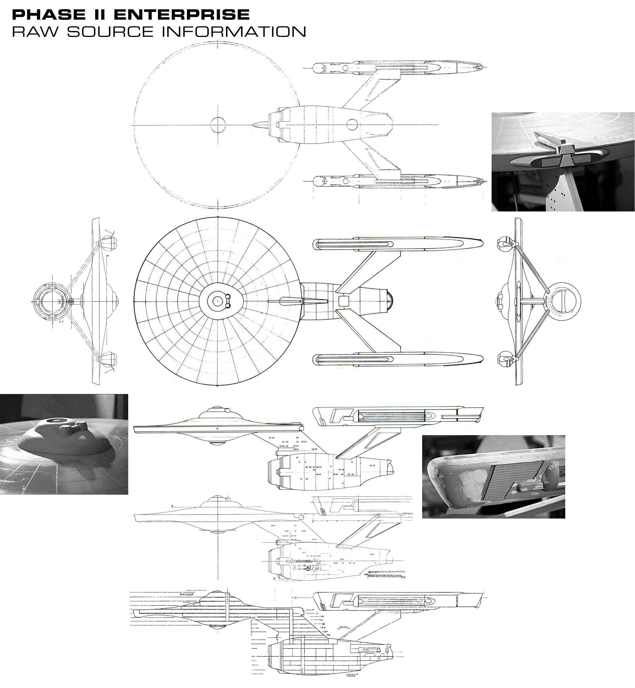
Matt Jefferies' blueprints and
photographs of Phase II models by Andrew Probert show that the decals of the number
1 on the
Phase II E had no serifs, instead being plain vertical lines.
(Incidentally, using serif-less
1s is the registry style Matt Jefferies used for the decals on the TOS pilot
Enterprise in
The Cage and
Where No Man Has Gone Before, as well as in
his writers' guide diagrams of the Enterprise. He must've liked that style and gone back to it for
Phase II.)
2) The two
NCC-1701 decals on the underside of the saucer, as shown in both
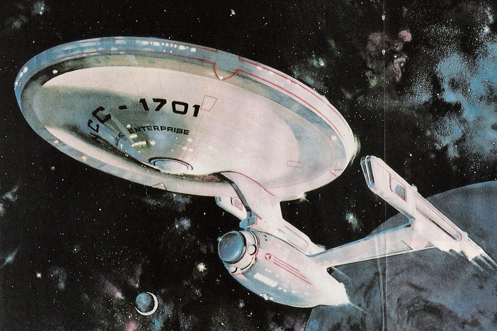
two Mike Minor paintings and
the TMP theatrical poster which used the
Phase II study model as a reference, both face the same way. Specifically, both decals should be legible when the ship is moving towards you--that is, when seen from the bow of the
Enterprise.
I know this is contrary to how the saucer decals were laid out in TOS, and there's certainly no evidence this is actually what Matt Jefferies intended. But the circumstantial evidence indicates there was a departure from the TOS decal placement, if nowhere else than on the
Phase II study model.
As for the upper saucer registry, while the curvature of the
U.S.S. Enterprise marking is different from what we saw in TOS, no painting of the
Phase II E depicts the upper side of the saucer, so there's no reason to change it.
3) The warp nacelles. The hardest part of the ship to get right...
a) The nacelle caps. As you've said, you've "cheated" them by using a glowing blue light there, which swirls like the rotating-fan lights of the original TOS nacelles--something plainly impossible on the original model.
Several of Mike Minor's illustrations, including
this one so far not linked in the thread (plus the aforementioned TMP poster) suggest the nacelle caps were in fact blue, similar to the deflector dish. Of course, having them be the exact same dark gunmetal-blue color would be problematic visually.
I suspect that, as with the registry decal style, Matt Jefferies returned to the pilot design of the
Enterprise for inspiration, and I think you should do the same.
Instead of a dark gunmetal-blue, I suggest using a lighter, bolder blue on the nacelle caps--the
Phase II equivalent of the solid red nacelle caps from
The Cage and
WNMHGB. This would be an artistic liberty, true, yet it's still rather "truer" to what the modelmakers intended.
b) The warp grilles. I personally think that anticipating the TMP glowing grilles is a bit odd. My own design preference would be to sculpt the grilles with actual gleaming metal struts, as seen on
the half-completed Phase II model (and
the molds used in its casting).
Also, what's with that curved area of black space just aft of the glowing purple grilles? It seems too TMP-esque to my mind. I've always interpreted this area as hull-colored, based on how it appears in blueprints, on the molds, and on the model as (half) built. This way, the warp grilles are properly rectangular in outline.
c) The registry on the nacelles. Again, too much of an anticipation of TMP for my taste. My personal thinking has always been that Jefferies
moved the registry decals that were formerly on the nacelles to the secondary hull when he redesigned the ship, so there would be no
NCC-1701 on the nacelles. Also, neither Minor's paintings nor the TMP poster include such a detail.
4) The photon torpedo tube. Specifically, the red glow at its mouth. I think this may be a mistake, as the
Phase II Writers' Guide (quoted in
The Lost Series) indicates this was originally intended as the main phaser array! That's probably why the tube's mouth seems almost to form two intersecting circles--it was made to fit twin phaser beams. Thus, I would remove the red torpedo-room glow, and leave the area a solid black--just as on the Mike Minor paintings.
All this is merely by way of feedback, in an effort to suggest how you could make your model even better. Of course, feel free to disregard any or all of my advice... after all,
you're the guy with the fabulous 3D model.
")
 So lay it on me man