• Welcome! The TrekBBS is the number one place to chat about Star Trek with like-minded fans.
    If you are not already a member then please register an account and join in the discussion!

October Art Contest; Finn

Finn

Bad Batch of TrekBBS
Premium Member
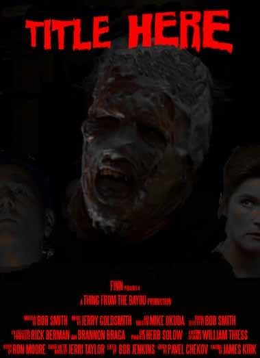
I'm using Phage for this contest. Here's my first draft. I like it, but I might do some changes.

AttackofthePhage.jpg
 
No feedback?

I'm not sure about Neelix as his head seems to stick out a bit
 
No feedback?

I'm not sure about Neelix as his head seems to stick out a bit

I'd get rid of Neelix. Aside from that, it looks pretty good. :techman:

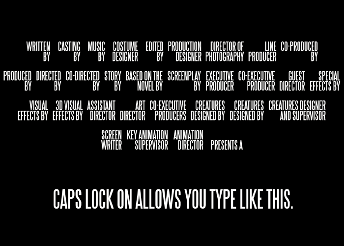
If you're doing a movie poster, you can get some great fonts at Dafont.com for free. Look for one called Steel Tongs....it's a movie poster font for stuff like "Written by" "Directed by" "Produced by" set up at a key stroke. Really helps with movie posters.

Looking forward to updates!
 
I like the image work on the first one better, as it's easier to see IMO. Again, I recommend the Steel Tongs font to help give your poster a boost in the authenticity dept, this is what it looks like:
_SteelTongs.png


The cool thing about this font is that it does the tedious work for you. So if you have caps lock off and press "A", it will type "Written by", pressing "B" will type "Casting By", etc, etc. What you see on this page is the alphabet, in order, plus one or two odd keys.

Pretty much an essential for anyone looking to make authentic looking movie posters. The text on the bottom of a movie poster is ingrained into modern audiences....you could have gibberish there, but as long as it's in this font, and spaced out like a movie poster, it will feel authentic.
Like this:
AttackofthePhage1.jpg


Never underestimate the power of fonts. My entry for last month depended on it.

Don't forget to put the stars name on the poster tho'!


It's not on Dafont (my mistake) but it is here:
http://www.fonts2u.com/steeltongs.font

And some Horror font's:
http://www.dafont.com/theme.php?cat=110

I hope this feedback helps.:)
 
Last edited:
Coming along nicely!:techman: The credits at the bottom look good, the layout a bit different from the normal poster look. Here's a reference for the standard layout in regards to how the names are used with job titles:
_CREDITS.png


There's no real order for these things, but the name is typically to the right of title.
YMMV though:)
 
Things are getting busy so I'm not going to update it. Thank you for your tips, The Lensman.
 
I emailed you two weeks ago. I just checked.

I'll resend it
 
If you are not already a member then please register an account and join in the discussion!

Sign up / Register


Back
Top