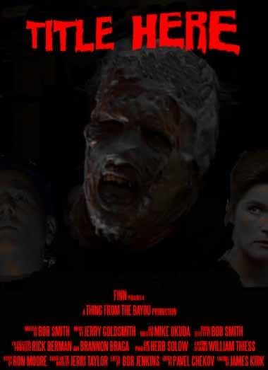
I like the image work on the first one better, as it's easier to see IMO. Again, I recommend the Steel Tongs font to help give your poster a boost in the authenticity dept, this is what it looks like:
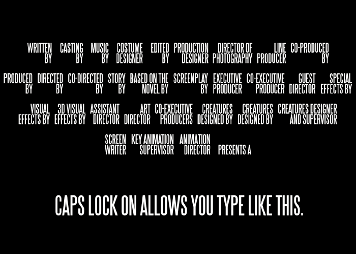
The cool thing about this font is that it does the tedious work for you. So if you have caps lock off and press "A", it will type "Written by", pressing "B" will type "Casting By", etc, etc. What you see on this page is the alphabet, in order, plus one or two odd keys.
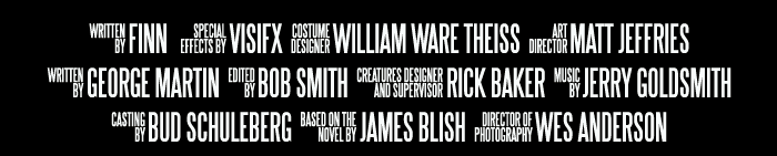
Pretty much an essential for anyone looking to make authentic looking movie posters. The text on the bottom of a movie poster is ingrained into modern audiences....you could have gibberish there, but as long as it's in this font, and spaced out like a movie poster, it will feel authentic.
Like this:
Never underestimate the power of fonts. My entry for last month depended on it.
Don't forget to put the stars name on the poster tho'!
It's not on Dafont (my mistake) but it is here:
http://www.fonts2u.com/steeltongs.font
And some Horror font's:
http://www.dafont.com/theme.php?cat=110
I hope this feedback helps.
")


") ).
).