-
Welcome! The TrekBBS is the number one place to chat about Star Trek with like-minded fans.
If you are not already a member then please register an account and join in the discussion!
You are using an out of date browser. It may not display this or other websites correctly.
You should upgrade or use an alternative browser.
You should upgrade or use an alternative browser.
New Logo
- Thread starter Plumster
- Start date

I would think the Star Wars fanfare would slide into STVI opening theme a little better then TMP. Wonder if anyone can do that, so we can hear it. I like mixing different styles of music, but I don't have the software anymore.Wow. I can hear the music, that original Star Wars fanfare, right into the TMP theme.
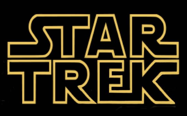
I really hate to disagree, but technically it is a new logo. Old font notwithstanding.Let's get this right this isn't a NEW LOGO it's a font, and it's not new.
reminds me of the Transformers Logo.
I'm sure they're hoping we'll all think it's Transformers, and go see it.
I don't like the font standing straight, but I did like the first version of the logo... slanted, with one word atop the other. If this were tinted gold, it would look better.
Here are samples of two of the Trek fonts that are widely available, and the one created for Exeter:

"Final Frontier Old Style" is one of the more faithful, while IMAO "Federation Classic" is one of the worst - the italic is even uglier than the normal. The kerning is bad on "Exeter V2" - font creation is really somewhat beyond my ken - and we have to compensate for that pretty much word-by-word.
"Final Frontier Old Style" is one of the more faithful, while IMAO "Federation Classic" is one of the worst - the italic is even uglier than the normal. The kerning is bad on "Exeter V2" - font creation is really somewhat beyond my ken - and we have to compensate for that pretty much word-by-word.
I prefer the first version they used with the words stacked on each other. I think it looks better that way for some reason.
I don't understand what was wrong with either logo used in the Trailers, and I don't recall anyone objecting to it. No cries of it being "dated"... In fact, it was cool that it wasn't changed (apart from the metallic finish) from the original.
Now they've gone and erased that bit of TOS as well.
Now they've gone and erased that bit of TOS as well.
I don't understand what was wrong with either logo used in the Trailers, and I don't recall anyone objecting to it. No cries of it being "dated"...
Who apart from Trek fans would have bothered to comment upon it in a public forum, though? Of course no one "objected to it" - no one we notice would have objected to keeping the sets and other designs just the way they used to be, either.
Then arguments in favor of the changed ship, sets, etc. being needed because the originals were unusably dated are invalid. Look, I can accept the changes, but the reasons so far escape me. This Logo change is the icing on the cake though. It worked before, but now, suddenly, it doesn't, and they needed to change it because they can. Nice timing too, they seem to be doling out bits of controversy to keep the buzz going, but ultimately, I'm wondering how much TOS will be left when all is done.
How much TOS will be left? My god, we're talking about the goddamn logo. I think that's hardly what made TOS what it is. Neither are the sets, the actors or the ship. For me, it was always the stories.
It was all of those, imo. If the ship was a bog-standard rocketship design from 50's SF, would it have had the same appeal?
I think so, yes. I mean, I love the original NCC-1701! I really do! (Hence my screen name.How much TOS will be left? My god, we're talking about the goddamn logo. I think that's hardly what made TOS what it is. Neither are the sets, the actors or the ship. For me, it was always the stories.
It was all of those, imo. If the ship was a bog-standard rocketship design from 50's SF, would it have had the same appeal?
") ) But it's not what makes the series so appealing to me. It's the wonderful storytelling!
) But it's not what makes the series so appealing to me. It's the wonderful storytelling!Then arguments in favor of the changed ship, sets, etc. being needed because the originals were unusably dated are invalid.
Nope, because the designs weren't done primarily to satisfy what the studio knows is a largely pre-sold audience (Trek fans).
You know what clearly frustrates the more skeptical fans is not just that Paramount thinks that they can take trekkies for granted but that the skeptics secretly accept that Paramount is absolutely right to think that and will prove it when this movie opens. Hell, every attempt to poll people right here at Treknerd Central shows that at least nine out of ten of us hard-core types will be lining up immediately for this film.
Then the frustrated turn around and try to point to stuff like Nemesis and Enterprise as evidence that the hard core will walk away, when the numbers demonstrate exactly the opposite - there you have millions of people watching things and buying tickets for something simply because they were called Star Trek. The notion that hard-core trekkies can be counted in anything beyond the low seven digits in the U.S. is an unsupported supposition.
I liked that GL kept the original Star Wars title text for the PT. Trek isn't as unified as that, with several variations, but I'd rather they'd kept the classic look for the title rather than turning the title into a 3d effect. Eh, anyway.
Yeah, but again - the Star Wars logo is part of a pretty unified SW look that had been in wide and successful use for twenty years prior to the prequels. The TOS Trek logo has not been used in branding the TV shows or movies since TOS went off the air in 1969. The decision could have gone either way, but there was not as strong an argument for keeping it as there was for the SW logo - especially since so much about the prequel trilogy (music, opening crawl, etc) was intended to communicate unity with the earlier movies whereas part of the marketing angle on this movie is to communicate that it's a departure.
I think it has. I always felt the Starfleet delta was used as some form of logo. (They didn't use it for Enterprise though, as far as I remember.)Yeah, personally I think it's a little crappy that Trek as a "franchise" has no logo.
Ugh, why did they have to use the "hard" E on this thing. It's always bothered me.
I think it looked better without the added texture. I liked the glossy look.
Similar threads
- Replies
- 5
- Views
- 348
- Poll
- Replies
- 543
- Views
- 44K
- Poll
- Replies
- 556
- Views
- 49K
If you are not already a member then please register an account and join in the discussion!