Nice work on the logo.
-
Welcome! The TrekBBS is the number one place to chat about Star Trek with like-minded fans.
If you are not already a member then please register an account and join in the discussion!
You are using an out of date browser. It may not display this or other websites correctly.
You should upgrade or use an alternative browser.
You should upgrade or use an alternative browser.
"MadUniverse" Romulan Battlecruiser
- Thread starter MadMan1701A
- Start date
thanks.Nice work on the logo.
")
About the white color... I really want to differentiate it from the Federation ships. My Klingons have a Rust color, the Feds a Blue/White color. I'm going to try a few things...
About the white color... I really want to differentiate it from the Federation ships. My Klingons have a Rust color, the Feds a Blue/White color. I'm going to try a few things...
maybe light green for the romulan?
how about the color of oxidized copper? Not saying thats what the ships are made of, but maybe that sort of greenish color really old pennys and church steeples turn?About the white color... I really want to differentiate it from the Federation ships. My Klingons have a Rust color, the Feds a Blue/White color. I'm going to try a few things...
maybe light green for the romulan?
I think that's a better idea. Light green, with darker paneling.
Thanks, guys!
Light green, with darker paneling. Thanks, guys!
Alright..... I've been working on this, and I think it's done. Some of you are going to like it, and I know some will hate it. It's different, sure enough.
Here goes...
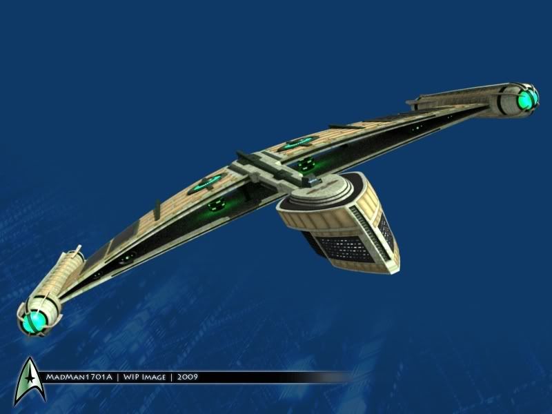
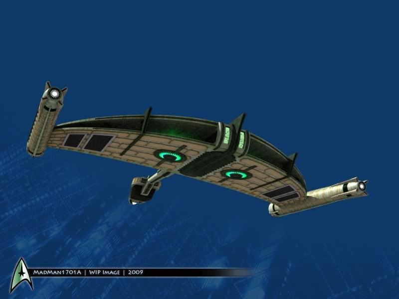
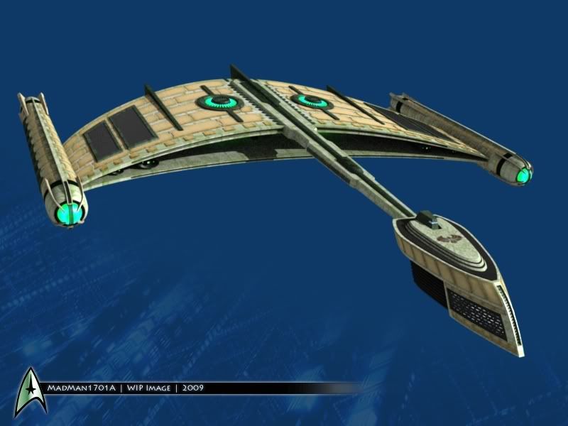
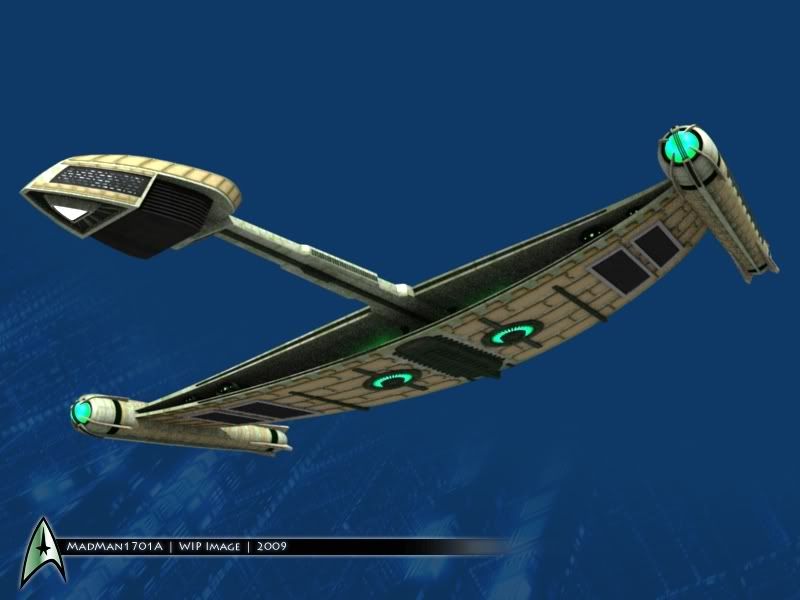
So, what does everyone think?
EDIT: I just realized that the vent covers on the bottom are untextured. I just fixed it.
Here goes...
So, what does everyone think?
EDIT: I just realized that the vent covers on the bottom are untextured. I just fixed it.
Hmm... I think it would be too monochromatic, then. I was trying to make it flashy. Who knows what Cardassian ships look like in this time period, anyway?
Who knows what Cardassian ships look like in this time period, anyway? Can't win them all, I guess.Eh...I don't like it. There is way too much of that copper color, and it still looks like a brick wall.
I like it...
Most of the ship looks wafer-thin, which would make it easy for the Federation to blow them into space dust...
As it should be...
All is right with the universe once again...
Most of the ship looks wafer-thin, which would make it easy for the Federation to blow them into space dust...
As it should be...
All is right with the universe once again...
Can I make a request? If yes could you model it with the with the wings arcing up like a real bird of prey's wing does, or maybe a gentle upward arc? The reason I ask is the TOS Romulan crusier had upward angled nacelle struts. It differentiate more from a Klingon cruiser. I am also getting Cylon toaster kind of vibe from the bridge pod with grills or windows on the sides.
Well, this ship is done, so I won't be messing with it much more... but I am planning on building a Bird of Prey to go along with it. It'll be smaller, and look more like we're used to.Can I make a request? If yes could you model it with the with the wings arcing up like a real bird of prey's wing does, or maybe a gentle upward arc? The reason I ask is the TOS Romulan crusier had upward angled nacelle struts. It differentiate more from a Klingon cruiser. I am also getting Cylon toaster kind of vibe from the bridge pod with grills or windows on the sides.
The cylon thing is totally unintentional... and when I went back to compare, it seems like they aren't as similar as I rememember the shapes being.
Hmm... I think it would be too monochromatic, then. I was trying to make it flashy.
Ok then
Does look cool anyway ^__^ espcailly from the front shot
it loses some of the art-deco promise of the unfinished model, but what do you expect from the romulans? cheap thieving knock-off bastards...
While I'm not that much of a hater of the copper, I'd say tone it down a little, maybe thin the strips/string a little? So it's not too overbearing on the main hull colour. Maybe it's just my perception of how the colours come out, but it looks like the copper overwhelms it when it doesn't seem like it's intended to do so.
However, structurally and arrangement wise, I say you've nailed a very sweet design Come to think of it, the copper doesn't seem to look bad at all on the underside, but it might look weird having one facing have more copper than the other.
However, structurally and arrangement wise, I say you've nailed a very sweet design
Come to think of it, the copper doesn't seem to look bad at all on the underside, but it might look weird having one facing have more copper than the other.Similar threads
- Replies
- 2
- Views
- 4K
- Replies
- 0
- Views
- 2K
- Replies
- 34
- Views
- 3K
If you are not already a member then please register an account and join in the discussion!