Me too! They look futuristic and comfortable (but in reality weren't)I think they are fantastic looking costumes, but completely inappropriate for Star Trek. I don't know why you need a wool coat over a turtleneck when you work aboard a climate controlled starship.
But I'm also one of those weirdos who loves the uniforms from The Motion Picture, so what do I know?
-
Welcome! The TrekBBS is the number one place to chat about Star Trek with like-minded fans.
If you are not already a member then please register an account and join in the discussion!
You are using an out of date browser. It may not display this or other websites correctly.
You should upgrade or use an alternative browser.
You should upgrade or use an alternative browser.
Is it just me who doesn't like the WTOK and later TOS movie uniforms?
- Thread starter Astrostars2025
- Start date
A very 70s idea of the future.Me too! They look futuristic and comfortable (but in reality weren't)
Ah yes, the "Dudley Do-Right unijforms."
Nicholas Meyer was going for a "Hornblower in space" look to match the 19th-century naval feel of the whole thing. Also, Robert Fletcher said that Meyer wanted him to make the uniforms look like something out of "The Prisoner of Zenda."
Here's visual reference for the 1937 version of The Prisoner of Zenda:
And here's a trailer for the 1952 version for comparison:
The TWOK uniforms are actually rather subdued in design, compared to all the ornamentation on the 1952 costumes!
Kor
I suppose we should thank Rod for small miracles.Ah yes, the "Dudley Do-Right unijforms."
Nicholas Meyer was going for a "Hornblower in space" look to match the 19th-century naval feel of the whole thing. Also, Robert Fletcher said that Meyer wanted him to make the uniforms look like something out of "The Prisoner of Zenda."
Here's visual reference for the 1937 version of The Prisoner of Zenda:
And here's a trailer for the 1952 version for comparison:
The TWOK uniforms are actually rather subdued in design, compared to all the ornamentation on the 1952 costumes!
Kor
")
The Monster Maroons are my favorite uniforms, but they don't seem half as over-layered as the Dominion War era uniforms. At one point, Sisko is seen wearing four layers - the long-sleeve black and grey jacket, the black and grey vest, the long-sleeve red turtleneck, and then the purple tanktop beneath that. On a desert planet.I think they are fantastic looking costumes, but completely inappropriate for Star Trek. I don't know why you need a wool coat over a turtleneck when you work aboard a climate controlled starship.
But I'm also one of those weirdos who loves the uniforms from The Motion Picture, so what do I know?
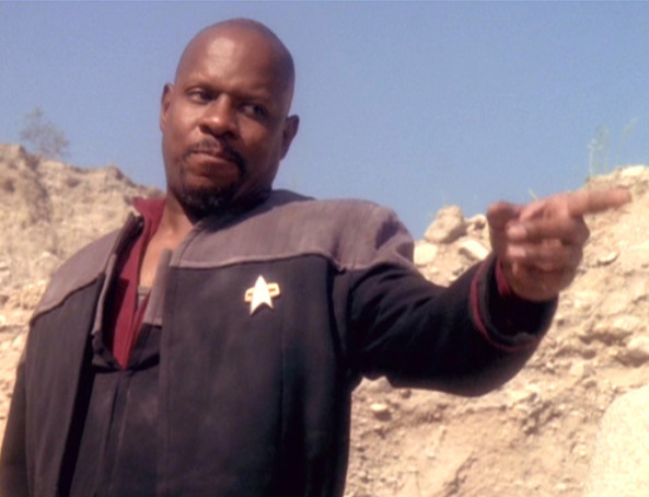
Fair. This is another "looks real sharp and I kinda hate what it says about the future" uniforms for me.The Monster Maroons are my favorite uniforms, but they don't seem half as over-layered as the Dominion War era uniforms. At one point, Sisko is seen wearing four layers - the long-sleeve black and grey jacket, the black and grey vest, the long-sleeve red turtleneck, and then the purple tanktop beneath that. On a desert planet.
Comparatively, a turtleneck with a double-breasted uniform jacket doesn't seem so bad.
I know the monster maroons wouldn't be practical as a day-to-day duty uniform in a real life military, but I just don't care. They are still, to my mind, the best looking piece of costume design Trek has ever done. I'd put TNG's season 3-7 uniforms as second and the First Contact/DS9 era uniforms as third. The rest are all pretty "meh" IMHO.
Deserts get cold at night.On a desert planet.
Some deserts are cold around the clock.Deserts get cold at night.
Penguin, is that you?Some deserts are cold around the clock.
I also like the "bomber jacket" version that Kirk and Scotty sometimes wore.
Likely the Potemkin fan series.i THINK i remember a fan film doing something similar with the style but i can't place the details. probably a pointless post lol.
Star Trek and uniforms has always been a bit of a mixed bag for me, but then again, I'm me - but I'll try to adumbrate:
The "monster maroons" looks great... on the big screen. Especially after the "Studio 54 tight pajama party" outfits that 1979's "The Motion Picture" put out, which also happened to be and by far the most revealing of any Trek uniform design. Not that there's anything wrong with that, but TWOK does restore a certain look that means "we mean business, even if we need several retakes because we've sweat so much into them that everyone else trying to breathe is gagging from the stench."
And yet, I could have opened this novella with "Considering how TOS didn't always obey (but more often did) its own colors on occasion as means of department or division, was made when color TV was new, and if you're a Security guard then you don't want to look like an easily visible target. Bright bold red would be the dumbest color for humans to use, since most species on Earth that aren't colorblind will recognize red in one of two significant ways (that of "must be dangerous", or that of "readily visible, easy pickin's target practice"). Since the galaxy was full of unknowns, it actually makes more sense to dress 'em all in red because they're dangerous. Sadly, in TOS, used to show how big and bad the baddie is, red ends up more for the easy pickin's target practice instead, hence all the dumb red shirts jokes.
By 1987 and we're all used to the big expansive uniform style, now we see TNG in 80s angles versions of the 1960s originals, but as tight as the 1979 spandex jammies were. And yet, color TV was no longer new by any measure and the use of these hues seemed corny at the time, as well as a step back from the imposing fare that the movies brought out. No worries, TNG's color designations grew on some of us detractors and some of us have come to accept that the red/blue/yellow style is simply iconic to Star Trek. Case in point is when Scotty appears in "Relics", juxtaposing movie style uniform (with TOS transporter noise?) opposite the TNG crews' pajamas.
Then came 1996...
...all black with gray quilted tops and a collar indicating division. It seemed unimpressive at the time, but in some ways is actually very practical. Maybe the most practical, but they still looked silly in a way. Silly, if not too generic. Possibly because the producers knew that the TV shows would have the same style creeping into their shows.
Where am I going with all this I no longer remember, except that I really liked TWOK's outfits at the time, even if they weren't always practical. After all, the security folk and some engineering folk had tidied-up TMP uniforms and were clearly a lot more usable for what they had to do.
Oh, the colorized tunics of the STIV cast photo don't do much for me either, apart from reminding how the red/green/blue thing was a relic of 1960s "shiny new color".
 alternate-timelines.com
Actually, the recolored TMP one looks surprisingly good overall. Except Kirk's head is floating due to the slightly mismatched hues combined as a pasted layer on top of the blue coloring for McCoy/Chapel/Spock... crap, now I wish TMP was filmed like that because the color scheme truly is iconic and thus proving your point 100%, and even was when the show was just doing it as a gimmick to sell color TVs. So why can't that TMP colorized photo there be backlit in 8 zillion colors like the lovely cast photo from season 2 TOS (at the end of "I, Mudd") because TOS's use of color may have been 60s, but it still looks sumptuous to this day?
 memory-alpha.fandom.com
The "monster maroons" looks great... on the big screen. Especially after the "Studio 54 tight pajama party" outfits that 1979's "The Motion Picture" put out, which also happened to be and by far the most revealing of any Trek uniform design. Not that there's anything wrong with that, but TWOK does restore a certain look that means "we mean business, even if we need several retakes because we've sweat so much into them that everyone else trying to breathe is gagging from the stench."
And yet, I could have opened this novella with "Considering how TOS didn't always obey (but more often did) its own colors on occasion as means of department or division, was made when color TV was new, and if you're a Security guard then you don't want to look like an easily visible target. Bright bold red would be the dumbest color for humans to use, since most species on Earth that aren't colorblind will recognize red in one of two significant ways (that of "must be dangerous", or that of "readily visible, easy pickin's target practice"). Since the galaxy was full of unknowns, it actually makes more sense to dress 'em all in red because they're dangerous. Sadly, in TOS, used to show how big and bad the baddie is, red ends up more for the easy pickin's target practice instead, hence all the dumb red shirts jokes.
By 1987 and we're all used to the big expansive uniform style, now we see TNG in 80s angles versions of the 1960s originals, but as tight as the 1979 spandex jammies were. And yet, color TV was no longer new by any measure and the use of these hues seemed corny at the time, as well as a step back from the imposing fare that the movies brought out. No worries, TNG's color designations grew on some of us detractors and some of us have come to accept that the red/blue/yellow style is simply iconic to Star Trek. Case in point is when Scotty appears in "Relics", juxtaposing movie style uniform (with TOS transporter noise?) opposite the TNG crews' pajamas.
Then came 1996...
...all black with gray quilted tops and a collar indicating division. It seemed unimpressive at the time, but in some ways is actually very practical. Maybe the most practical, but they still looked silly in a way. Silly, if not too generic. Possibly because the producers knew that the TV shows would have the same style creeping into their shows.
Where am I going with all this I no longer remember, except that I really liked TWOK's outfits at the time, even if they weren't always practical. After all, the security folk and some engineering folk had tidied-up TMP uniforms and were clearly a lot more usable for what they had to do.
Oh, the colorized tunics of the STIV cast photo don't do much for me either, apart from reminding how the red/green/blue thing was a relic of 1960s "shiny new color".
Star Trek - News and Discussion | alternate-timelines.com
This is what I had in mind: Star Trek The Motion Picture:
alternate-timelines.com
Actually, the recolored TMP one looks surprisingly good overall. Except Kirk's head is floating due to the slightly mismatched hues combined as a pasted layer on top of the blue coloring for McCoy/Chapel/Spock... crap, now I wish TMP was filmed like that because the color scheme truly is iconic and thus proving your point 100%, and even was when the show was just doing it as a gimmick to sell color TVs. So why can't that TMP colorized photo there be backlit in 8 zillion colors like the lovely cast photo from season 2 TOS (at the end of "I, Mudd") because TOS's use of color may have been 60s, but it still looks sumptuous to this day?
I, Mudd (episode)
A takeover leads Kirk to his old nemesis, Harry Mudd. Spock and Dr. McCoy are walking through the corridors of the USS Enterprise, where they encounter Crewman Norman, who joined the Enterprise crew only 72 hours before. McCoy mentions that Norman is odd and unemotional; for some reason, Spock...
memory-alpha.fandom.com
I think they are fantastic looking costumes, but completely inappropriate for Star Trek. I don't know why you need a wool coat over a turtleneck when you work aboard a climate controlled starship.
One of the things I like about the Monster Maroons is how grounded they are in Star Trek's three previous styles. The ensemble is basically:
- "The Cage"/"Where No Man Has Gone Before" shirts (unisex)
- "The Cage" jackets in red (with fancy devices and closures)
- TOS trousers (with piping)
- TMP division colors (with two changes to coordinate with the red jackets, one of which was an alternate color in TMP)

Last edited:
The red jackets and difficult rank insignia are my only real objections.
The blue-grey is nice
Way better than discos unis and blue.The blue-grey is nice
Possibly create a blue-gray like off of the Cage jackets, or the Starfleet blue from TMP for the jacket.The blue-grey is nice
I still think rank stripes would be better too on the jacket.
The earlier versions with the belts and turtlenecks look good, but don't make a ton of sense unless Starfleet ships and bases got very cold for some reason.
The later design, the bulky jackets with no undershirts, just look uncomfortable and awkward. I found those awkward uniforms distracting all through "Yesterday's Enterprise." Garret and her crew would've looked great with the full WoK uniforms, dunno why they changed it.
Isn't it also weird that Starfleet didn't change its uniforms for 40 years, then suddenly started introducing a new uniform style every eight years or so?
New members added.Isn't it also weird that Starfleet didn't change its uniforms for 40 years, then suddenly started introducing a new uniform style every eight years or so?
Similar threads
- Replies
- 23
- Views
- 3K
- Replies
- 87
- Views
- 20K
- Replies
- 3
- Views
- 620
- Replies
- 82
- Views
- 17K
- Replies
- 1
- Views
- 208
If you are not already a member then please register an account and join in the discussion!