JJ Abrams design is way too cluttered. It has too many elements that seem to look associated with present day apple electronic devices. The bridge has become too large in scale, and whats with the wanna-be Battlestar Gallactica clear plastic panels? The design team just didn't want to put in the effort and give us a modern update of the original. Other than perhaps the new screen element everything else just does not work in creating a TOS era ship. This is an extremely poor attempt at any type design that would pay homage to the original series. The reason the new movie uniforms work is beacuse they are the only visual element that seem to have the correct modern update of the traditional TOS costumes.
-
Welcome! The TrekBBS is the number one place to chat about Star Trek with like-minded fans.
If you are not already a member then please register an account and join in the discussion!
You are using an out of date browser. It may not display this or other websites correctly.
You should upgrade or use an alternative browser.
You should upgrade or use an alternative browser.
For those of us who don't hate the Nu Enterprise but don't love it
- Thread starter sunburn800
- Start date
- Status
- Not open for further replies.
whats with the wanna-be Battlestar Gallactica clear plastic panels?
From a design standpoint, I really think that's been overdone. That may be my biggest complaint about the thing.
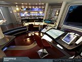
The one thing I really miss that I always liked is the proportion of the wall console upper monitor/middle monitor/control panel from TOS. Matt Jefferies actually measured those out so theoretically you could reach everything on the console comfortably. These wall consoles don't seem to maintain that.
A minor nitpick, I know, but it's always been a thing I've liked about it.
I also sort of wish they would have tried to keep the original flickering back-projected screen look from 'The Cage' but update it to be a single screen, and each smaller screen would be reconfigurable pop-ups. (Then again, they may have done that and I just haven't seen it yet.)
I'd better stop now, before I destroy it with nits and let myself get distracted by it. It was their prerogative to do what they want with it. It's a different timeline.
darkwing_duck1
Vice Admiral
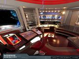
Of those two, the JJPrise bridge is clearly superior in design and a great deal more believable.
The basic design is pretty much the same on both
The unnecessary stylistic elements (the plexi panels, the "hostess lights") and general "clutter", however, detract from the impression of a clean, efficient work environment.
By the way, Dennis, weren't you the one saying that cheap bar chairs were "cheesy" looking on the 60's bridge?
Take a look at the sub-station chairs on JJ's bridge, chummer...
darkwing_duck1
Vice Admiral
The new 'white bridge' is nothing new in terms of a colour choice, I just think the new bridge is a terrible design. Compare the recent bridge photo to the one from Star Trek 4. I still prefer the bridge design created over 23 years ago to what JJ Abrams and company have come up with today.

You wouldn't happen to have the rest of the panorama and closeups as stills would you?
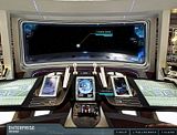
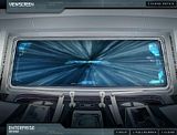
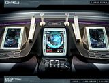
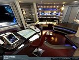
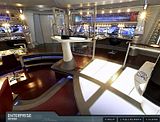
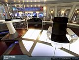
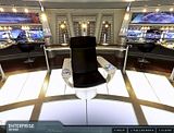
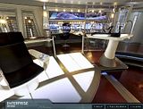
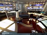
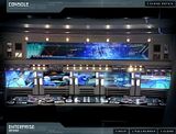
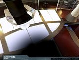
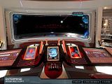
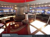
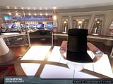
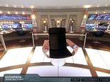
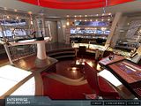
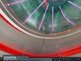
Pictures from the bridge panoramas. Click to get the larger image.

Red Alert


Red Alert


The design team just didn't want to put in the effort and give us a modern update of the original.
They did a design version based off of the original; it bored them.
This design, like the exterior, retains the essence of the original. Honestly they might have done better to just start Trek over from scratch - even being constructed on a very limited budget from relatively simple materials, the CIC on Galactica is a much more plausible command center than Trek bridges are. But the Trek folks felt some responsibility to be loyal to what had come before, for better or worse.
darkwing_duck1
Vice Admiral
Pictures from the bridge panoramas. Click to get the larger image.
*pics snipped for space*
Thanks for posting those!
Over all design still gets an A/A- from me.
The detailing though...what in the name of the Great Bird IS some of that? On the helm/nav console I had to stare at it for a few minutes just to get some idea of what is supposed to be controls and what is just "decoration".
And what is up with those above the station screens? It looks like they took the idea of the old screens, condensed them into one big screen and played all the images simultaneously and at different scales.
The "colored blinkies" may have been enigmatic, but at least they represented discrete and theoretically readable instrumentation.
darkwing_duck1
Vice Admiral
...even being constructed on a very limited budget from relatively simple materials, the CIC on Galactica is a much more plausible command center than Trek bridges are.
Says you. The new Galactica CnC was just a Trek bridge with an annex, a couple of banks of "riser" stations, no place for the CO to sit, and a podium mounted viewscreen.
Erect dog penis.
That is all.
That is all.
...even being constructed on a very limited budget from relatively simple materials, the CIC on Galactica is a much more plausible command center than Trek bridges are.
Says you.
Yes.
Next.
darkwing_duck1
Vice Admiral
Erect dog penis.
That is all.
Care to submit an actual crit, or just gonna do a "drive by..."?
Erect dog penis.
...gonna do a "drive by..."?
This suggests an animated GIF I definitely shouldn't make...

darkwing_duck1
Vice Admiral
...even being constructed on a very limited budget from relatively simple materials, the CIC on Galactica is a much more plausible command center than Trek bridges are.
Says you.
Yes.
Next.
And of course you completely ignored the substance of my rebuttal...
Yeah, they really thought the cake was too plain and ended up with about 40 layers of frosting on this one. What a mess.
There are plenty of good design parts in the new bridge, but they really overworked it until it just looks silly. This bridge most closely resembles the ENT-E bridge, which was also pretty bad, with its random stair placement, beams sticking down through it, and the hostess things.
There are plenty of good design parts in the new bridge, but they really overworked it until it just looks silly. This bridge most closely resembles the ENT-E bridge, which was also pretty bad, with its random stair placement, beams sticking down through it, and the hostess things.
Sorry, but the layout of this set makes as much practical sense as any other Star Trek bridge, and so did the ENT-E bridge. Pretty or not - and we obviously disagree - all of these sets beginning with the TOS bridge are laid out in essentially the same way, and there's no actual structural randomness on any of them - stairs and elevator doors included.
Randomness in set decoration - ala barcode scanners - is a different matter.
Randomness in set decoration - ala barcode scanners - is a different matter.
Depends on what they were intended to represent. Remember the Rule: don't stop to "sweat the details". Characters don't need to spend five pages of dialoge explaining HOW their instruments work. It's enough that they DO work.Whirling moire patterns as instrument displays look cheesy...
No more or less so than any other type of suitable chair. They didn't need to serve as "acceleration couches", after all.Fiberglass pedestal dinette chairs as station seating look cheesy...
some of the stuff i agree with you but sorry on the last two they were cheesy and the chairs especially made no sense.
they tipped over way to easy to ever been a believable bridge chair.
they may not have need to serve as acceleration couches but considering it appears on the ship almost every time they went into battle the inertial dampners or what ever couldnt handle the stress and started flinging people
about.
image tos bridge
there are some things on the new bridge i dont like such as the waitress stations but a lot of the screens , controls .. i like those better in the new movie.
Last edited by a moderator:
I feel about the new ship the samew way I feel about the Watchmen movie: the only things I like about are those things that were carried over from the source material.
Erect dog penis.
That is all.
Care to submit an actual crit, or just gonna do a "drive by..."?
Touchy.
- Status
- Not open for further replies.
Similar threads
- Replies
- 43
- Views
- 11K
- Replies
- 66
- Views
- 9K
- Replies
- 5
- Views
- 362
- Replies
- 82
- Views
- 17K
If you are not already a member then please register an account and join in the discussion!