• Welcome! The TrekBBS is the number one place to chat about Star Trek with like-minded fans.
    If you are not already a member then please register an account and join in the discussion!

FAULTY - the two worst TOS remastering mistakes

Personally I detest the TOS-R effects for the slingshot because the Sun looks like a glowy planet instead of a brilliant light source. It's seriously pathetic. Star Trek IV did it better, even thought hat has its flaws as well.
 
Someone once said that it's a matter of comparing one set of fake looking f/x with another more contemporary set of fake looking f/x. And it is. Neither the original nor the cgi f/x look truly realistic, but what really matters is what an individual finds more convincing.

For me the original f/x, flawed as they are in some respects, are more convincing in conveying the ship's size and sense of majesty. I find the new f/x, while quite interesting in many respects, generally fail in conveying the ship's sense of size and majesty.

The original f/x were state-of-the-art for television at the time but not for feature film. However, it wasn't a huge gap since the main difference was time and money. Given sufficient time and money TOS' f/x could have been on the level of 2001: A Space Odyssey and Forbidden Planet and Planet Of The Apes. Films like Alien and Star Trek - The Motion Picture aren't that far removed from what was being done a decade or so earlier. But then it wouldn't have been possible because a TV series production doesn't have the luxury of a feature film's time and money and resources.

The situation is still pretty much the same today. In any era really you can lavish a feature film with awesome f/x because you're making only one picture. You simply can't afford to do that with series television.

The TOS-R f/x suffer from the same issue of not enough time and money available. It really comes down to time = money and the TOS-R guys simply didn't have enough time to do better.

That said I still think a bigger issue I have with TOS-R is the aesthetic of the new f/x. To me they don't look like what could have been done under the best of conditions back when Star Trek was in production. If I were to approach enhancing the original f/x I wouldn't be asking, "What can we do that they couldn't with today's resources?" I'd be asking, "What could they have done if they had had access (and sufficient time allotted) to the best resources available at the time?"

The difference is you're now trying to put yourself into the minds and perspective of the f/x artists of the time and seeing it through their eyes rather than a perspective coloured by forty years of advances in visual f/x. The end result means your new enhanced f/x should look more aesthetically consistent with the remaining live-action footage.

This is where I think TOS-R generally blew it.
 
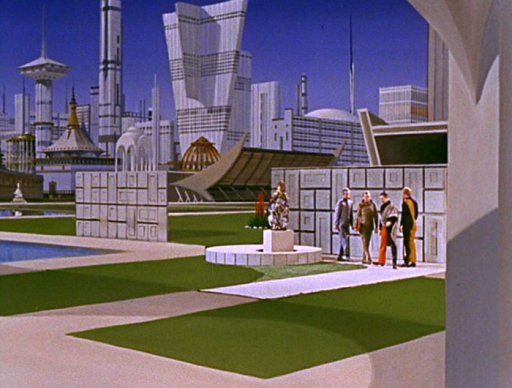
This is how the shot appeared in the original episode;

ARM00_zps08288fac.jpg


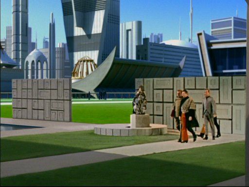
And this is how appears in the Remastered version. They've zoomed in substantially, and the pretty decent matte-painting has been given a bit of an (unnecessary, IMO) CGI makeover, adding a monotrain and extra people milling around in the background.

ARM01_zps95950694.jpg

Although I don't want to beat a dead horse, I would like to add that the original matte painting was much wider than what we saw in both versions, where already the TOS frame was just one third of a wider picture! (Allan Asherman's Star Trek Compendium had a b&w shot of the matte painting revealing the "missing" two thirds to the left).

Had the TOS-R producers been aware of that we might have seen more of the "authentic" Eminiar VII skyline, possibly during the skyline beauty shot after Kirk's landing party had been disarmed.

Bob
 
I really don't mind the new effects but they certainly don't render the original effects redundant.

I've not seen all TOS yet, would you recommend I watch the old effects first?
 
@ Thete

If this is your first time TOS experience I'd suggest to watch it in its original context first, which is the one that kept the series popular for 40 years.

I think this might help to better appreciate the improvements of TOS-R (i.e. enhanced matte paintings of planet surfaces) once you watch it a second time.

Bob
 
Last edited:
I watched roughly half of season one of TOS-R, but now the Blu Ray has given me the opportunity to see it as it was, so I'll take that advice!
 
Many of you probably know of Scott Gammans' efforts to create his own nuFX for "The Doomsday Machine," begun before Paramount released their own version. YouTuber SpockBoy edited together a collection of shots from Scott's work. Take note of the specular detail in the hull plating, especially in the shot starting at 21 seconds—it is very similar to the "overexposed" shot discussed earlier in this thread:

http://www.youtube.com/watch?v=2tO7cl6bmOs

[yt]http://www.youtube.com/watch?v=2tO7cl6bmOs[/yt]
Interesting he's used music from the Bond film Moonraker I believe.
Yup, my friend Paul Sibbald (a.k.a. "Spockboy") was the one who put together that video from various test clips I posted online back in the mid 2000's. The model I built underwent several revisions before I put the project on indefinite (infinite?) hiatus; the final version can be seen from 0:21 to 0:32 in that clip.

FWIW, I enjoyed TOS-R. Do I wish that they had more time to do a more thorough job? Yes. Do I think they did a great job given the time constraints they were under. I do!
 
The biggest flaw of the remastering was the depictions of the Enterprise (and other starships). Somehow they always came off looking like, well, phoney. The placement and font* of the names and registry numbers... the 'stacked shuttle main engines'-like warp nacelles... the awkwardly drawn phasers... all of them screamed (borrowing a DS9 quote) "IT'S A FAAAAAAAAAAAAAAAAAAAAAAAAKE!!!!!!!!!!!!!!!!!!!"

It's shocking to compare the CBS remastered Enterprise with the Defiant from the ENT episode "In A Mirror, Darkly." The Defiant looked as good or better than the TOS Enterprise 11-footer. Why was it so hard to duplicate that effort for the remasters?

On the flip side, a number of the planet shots, such as Starbase 11, Scalos, etc... were very well done.

But the subpar rendering on the Enterprise... ruins the whole effort for me. And it's hard to say that considering the Okudas were involved and I have a world of respect for them.

*Examples: the 'giant font' of the nameplates for the Exeter and Intrepid.... the different fonts for "U.S.S." and adjacent "CONSTELLATION"
 
Could they have been trying to make the ships more compatable with animated Star Trek? It does seem to resemble the Filmation Enterprise and they were obviously infulenced by the animated show.

I'm going to get hit with dead fish and rubber chickens for posting this, but I'd like it if they did the "remaster" to the animated and use the same models for the cartoon and use cg animation, like Toy Story or Shrek, for the character parts, keep the dialogue (and the orignial cast) and redo the sound track. Maybe the could redo M'Ress with an actress, I mean new actress, and maybe not leave 80% of the voices by James Doohan, not that he did too bad with it.

I watched Immunity Syndrome yesterday, and they certainly do put the wrong space field on the screen, they show the dark anomaly before it's supposed to be visible. The timing of the reactions, Spock says, that, then they show it again, the only way it could work with the error is NO ONE was looking for several seconds, which is silly.
 
If you are not already a member then please register an account and join in the discussion!

Sign up / Register


Back
Top