• Welcome! The TrekBBS is the number one place to chat about Star Trek with like-minded fans.
    If you are not already a member then please register an account and join in the discussion!

FAULTY - the two worst TOS remastering mistakes

Now, can these large CGI displays of the Enterprise please stop? My stomach feels very upset again.

In other words, the CGI Enterprise needs yet another modification—namely a bulwark for you to heave over—while the original model was just fine without one.

Curious. Would the hurl go into orbit around the ship's artificial gravity field, or continue off into the void? Better duck, just in case. Wouldn't want to splash yourself on the back of the head.
 
Curious. Would the hurl go into orbit around the ship's artificial gravity field, or continue off into the void? Better duck, just in case. Wouldn't want to splash yourself on the back of the head.

:lol: 
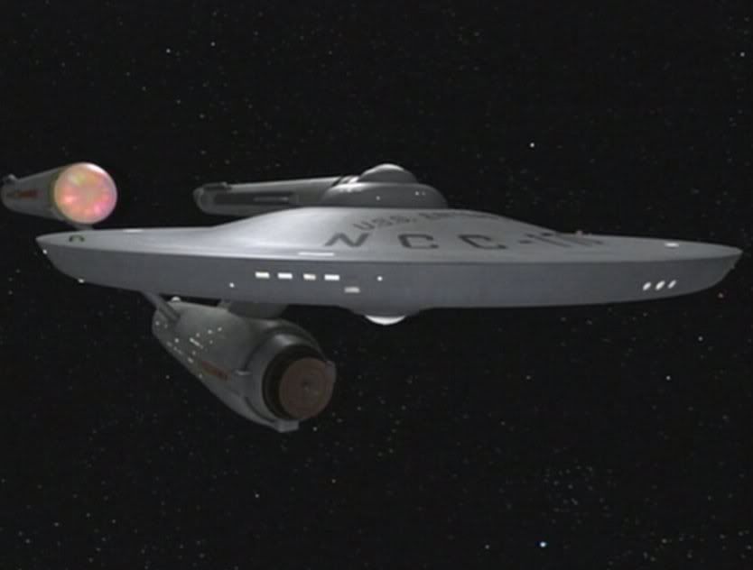
Another riddle of the CGI Enterprise solved. Now we know where all these weathering stains come from...

Bob
 
This is about the time RAMA should be popping in here to tell us how wrong we all are and that the cgi model in TOS-R is vastly superior in every way. :lol:
 
This is about the time RAMA should be popping in here to tell us how wrong we all are and that the cgi model in TOS-R is vastly superior in every way. :lol:

Looks like a debate I missed, but I think I have some ideas.

One argument is probably that all windows are illuminated and that by the 23rd Century you don't need to feel concerned about saving room light energy any more.

But then, try to have an unobstructed view of the stars and galaxies from within one of these rooms. :rolleyes:

And the mix of lit and unlit windows on the original VFX Enterprise added a sense of believability to a 20th Century viewer - again, "less" would have been "more".

Bob
 
Many of you probably know of Scott Gammans' efforts to create his own nuFX for "The Doomsday Machine," begun before Paramount released their own version. YouTuber SpockBoy edited together a collection of shots from Scott's work. Take note of the specular detail in the hull plating, especially in the shot starting at 21 seconds—it is very similar to the "overexposed" shot discussed earlier in this thread:

http://www.youtube.com/watch?v=2tO7cl6bmOs

[yt]http://www.youtube.com/watch?v=2tO7cl6bmOs[/yt]
 
Hull plating. ;)

Homer%2520drooling.jpg
 
Many of you probably know of Scott Gammans' efforts to create his own nuFX for "The Doomsday Machine," begun before Paramount released their own version. YouTuber SpockBoy edited together a collection of shots from Scott's work. Take note of the specular detail in the hull plating, especially in the shot starting at 21 seconds—it is very similar to the "overexposed" shot discussed earlier in this thread:

http://www.youtube.com/watch?v=2tO7cl6bmOs

[yt]http://www.youtube.com/watch?v=2tO7cl6bmOs[/yt]
Interesting he's used music from the Bond film Moonraker I believe.
 
This was the angle I was thinking of. I couldn't find it at Memory Alpha as they seem to be replacing a lot of the original studio model shots with remastered versions.

bth_ussenterprise11ft_zpsac626cc4.jpg

This is a case where the original is tough to compete with. They should have taken another pass at it.

ETnew_tosr057_10.jpg

You know what?

The lighting on the CGI version is brighter (and looks to be from multiple sources) as opposed to the "original" footage, where the image is darker. This comparison is in contrast to other comparisons I've noted, where the TOS-R Enterprise is darker than the "original".

It seems whenever the lighting on the TOS-R spacecraft gets brighter and more thorough (more sources), it ruins the CGI image.
 
Another example of the timing being off for the new effects was in Mudd's Women. After they beam Mudd aboard, but just before they snag the chicks, Mudd's ship is hit by an asteroid. In the original, Farrell cries out "there she goes" By the time Kirk turns around, he see what we see: the ship exploding. Not the impact itself, but the result.

In the TOS-R version, Farrell cries out "there she goes," Kirk turns from Spock's scanner, looks at the screen and the asteroid STILL hasn't hit the ship yet, it strikes a second or two later so the audience can see a "cool" visual. However, when Farrell cried out, the asteroid was still a ways off from hitting the ship, so yelling out "there she goes" makes little sense. Yes, I guess he could be anticipating and making sure Kirk doesn't miss it, but that is another excuse for bad effects judgment.

I guess it's just me, but the new ship explosions never looked quite right. Far too quickly done and very Babylon 5 like (their ship detonations were pretty phony looking even for the time). I found the Klingon ship explosion in Day of the Dove to be very unsatisfying; we see the ship for a split second, not long enough to process the image. Too short to even justify drawing it.

However, some of the new effects are stunning. The Rigel 7 fortress, the Enterprise in Tomorrow is Yesterday and so on. But being complimentary is boring. LOL
 
the worst mistake is the enbarassing modelnof the D7 and the amatuer texturing job done on them in enterprise incident jiminey cricket that looked like they werent even trying
 
However, some of the new effects are stunning. The Rigel 7 fortress, the Enterprise in Tomorrow is Yesterday and so on. But being complimentary is boring. LOL

More great TOS-R fx:

The view out Pike's hospital window on Starbase 11 as the camera swings around, replacing an in-camera diarama.

The cityscape on Scalos, replacing an in-camera cyclorama painting.

The cloud city Stratos, replacing a miniature that sits on a cotton cloud.

The supernova and destruction of Sarpiedon.
 
One original artifact that I didn't really notice until watching the color enhanced Remastered "The Immunity Syndrome" was the color offset during the "vibration" opticals:

Immunity-colors.jpg

The red-blue split makes the images look like anaglyphic 3D. The screen cap above was pulled from the original DVD version, although I did amp up the color a bit to highlight the color offset. (I could not pull a cap from the TOS-R HD version, as I do not have it in my library. I could probably pull a cap from streamed Netflix, but I think everyone gets the idea.)

I'm guessing the "vibration" effect could have been done without the color offset, but someone might have thought it looked better.
 
Yes, every time they do a 'shake' on TOS there was a drop in color. Just like dissolves and fade ins/outs.
 
I'm surprised no one has mentioned the missing shuttle craft in Galileo 7.

"Galileo 7" is the number on the shuttlecraft, while "Galileo Seven" is the name of the episode, referring to the crew on board. I have not seen the TOS-R version. Is there a remastering mistake?
 
"Galileo 7" is the number on the shuttlecraft, while "Galileo Seven" is the name of the episode, referring to the crew on board. I have not seen the TOS-R version. Is there a remastering mistake?

We do see the launch of shuttlecraft Columbus in TOS-R, but indeed the whole scene looks like a remastering mistake (notice the futuristic patchwork paneling of the Enterprise, how the starboard running light - or is it the ion pod - has gone missing, how the text sign "tail pipe socket" below the starboard nacelle pylon has become a window and how this long panoramic window at the flight deck level has been split into two). :rolleyes:

Bob
 
Last edited:
"Galileo 7" is the number on the shuttlecraft ...
7 is the number on the shuttlecraft, Galileo is the name of the shuttlecraft.

thegalileosevenscotty91.jpg


Spock:

"Captain, I regret to inform you that two crewmen under my command were killed horribly."

:cool:
 
If you are not already a member then please register an account and join in the discussion!

Sign up / Register


Back
Top