Give me a break - that's a patently false statement. You have completely neglected to mention DS9 and Voyager, both "spinoffs" and following entirely in TNG's 24th century aesthetic. And even though some people don't consider TAS as canon (I am not one of them) it, too, followed directly in the footsteps of TOS. NONE of those shows are "visual reboots", so what are YOU talking about?Of course they were visual reboots.
TNG did the same, and did return. ENT did the same, and did return. So, what are you talking about?
Timo Salomiemi
-
Welcome! The TrekBBS is the number one place to chat about Star Trek with like-minded fans.
If you are not already a member then please register an account and join in the discussion!
You are using an out of date browser. It may not display this or other websites correctly.
You should upgrade or use an alternative browser.
You should upgrade or use an alternative browser.
Discovery starship discussion [SPOILERS]
- Thread starter Cpt. Kyle Amasov
- Start date
Give me a break - that's a patently false statement. You have completely neglected to mention DS9 and Voyager, both "spinoffs" and following entirely in TNG's 24th century aesthetic. And even though some people don't consider TAS as canon (I am not one of them) it, too, followed directly in the footsteps of TOS. NONE of those shows are "visual reboots", so what are YOU talking about?
You obviously didn't read his full retort, but yes he is correct about those two shows doing visual reboots in the Trek Universe, however they were in a different time frame. Here's the thing, TMP was basically three years from TOS and that movie fully rebooted the visuals and technology from TOS. I don't see how its any different from DSC to TOS except half a century separates the production history and while there should be visual cues to keep the two shows in the same universe, the majority of the fans and future fans would been turned off by the 60s visual from TOS in today's standards. The fan films such as Continues and Phase II are very narrow niche in the fandom.
The first post cited specifically said:You obviously didn't read his full retort, but yes he is correct about those two shows doing visual reboots in the Trek Universe, however they were in a different time frame. Here's the thing, TMP was basically three years from TOS and that movie fully rebooted the visuals and technology from TOS. I don't see how its any different from DSC to TOS except half a century separates the production history and while there should be visual cues to keep the two shows in the same universe, the majority of the fans and future fans would been turned off by the 60s visual from TOS in today's standards. The fan films such as Continues and Phase II are very narrow niche in the fandom.
No qualifying statement made based on era or timeframe. This is a false statement and indicates a greater desire to be a serial contrarian than holding a viable conversation about production aesthetics.Every Trek spinoff started out as a visual reboot
I admittedly quoted the wrong post, but my challenge still stands.
True.The Disco-prise is no more set in stone than the original version was (or, if you want to get technical, the Cage, WNMHGB, Series, T&T, IAMD, and both remastered versions were). There's nothing to stop them from showing a more faithful version of the TOS ship at any point in the future.
They still WON'T.
I would be amazed if that's even a thing.Hell, if whoever has been pushing for a more retro look behind the scenes...
No they weren't.Of course they were visual reboots.
Which is why Discovery used the original TOS theme in its season finale ending title. But Star Trek, its characters, sets and designs, are not BASED on nostalgia, and never has been.Trek without the nostalgia just cannot survive.
TMP left itself open to interpretation that the TOS version of the ship had existed at some point, Discovery has now eliminated that interpretation with a retcon.How is DSC any different from TMP there?
No, they did not.TNG did the same, and did return. ENT did the same, and did return.
Quoted for truth. I sometimes forget that about engaging with Timo.The first post cited specifically said:
No qualifying statement made based on era or timeframe. This is a false statement and indicates a greater desire to be a serial contrarian than holding a viable conversation about production aesthetics.

There are times I wish I don't, but sometimes when something is so horribly untrue, I gotta say something.
No qualifying statement made based on era or timeframe. This is a false statement and indicates a greater desire to be a serial contrarian than holding a viable conversation about production aesthetics.
I've got to say I agree with where Timo is coming from on this one. What, did the DS9 crew wear different uniforms because it was a logical development in the Trek universe that starbase-specific jumpsuits would be rolled out exactly when the Cardassians abandoned Bajor? That new commbadges and starship pennants just happen to be phased in right before a random starship goes missing?
Every show, to some extent or another, dicked around with the established look of things to have their own visual identity, and was perfectly willing to ignore their sibling productions when convenient. The fact that there was as much carry-over as there was has as much to do with the unbroken production chain stretching from TMP through to ENT as it does with any desire to be faithful to earlier (or concurrent) productions as a matter of dramaturgical integrity. Hell, early TNG was about as afraid of TOS's lore as early DSC has been afraid of TOS's look.
True.
They still WON'T.
Why in the name of hell would you expect this TOS redesign to be different from all other TOS redesigns and actually have staying power? It's not like it was that great, some mindblowing execution that'll be the platonic ideal of the Enterprise for the next fifty-some years. It'll demonstrate unusual commitment on the part of DSC's visual designers for it to be the platonic ideal for the Enterprise in the next episode.
And when the next revamp of the TOS Enterprise happens, whenever it happens, they won't be going back and just tweaking the "Take My Hand" model to be suitable for VR holograms or whatever, they're going to go back to the original first, and dick around with that.
I would be amazed if that's even a thing.
Look closer.
There are other indications, both on-screen and behind the scenes, which I'd be happy to kill some time and assemble if it's that important to you, but the apparent conclusion is that someone important on the production team wants way more TOS shit in DSC, and someone slightly more important wants way less, and they haven't figured out an accord between those viewpoints yet. Maybe it's the same people who can't decide if DSC should have a grounded, realistic style to the VFX, or be a candy-colored blacklight-poster Guardians-of-the-Galaxy wonderland.
To David cgc: Not to worry. I won't "@" you.
Also, not to insult Thomas Lai's work on Amarillo USAF, but Charles Casimiro's Airborne has the added advantage of including glyphs for Greek, Cyrillic and Hebrew. So if your ship design fantasies involve multilingualism on the ship hulls? Go with Casimiro.
Also, not to insult Thomas Lai's work on Amarillo USAF, but Charles Casimiro's Airborne has the added advantage of including glyphs for Greek, Cyrillic and Hebrew. So if your ship design fantasies involve multilingualism on the ship hulls? Go with Casimiro.
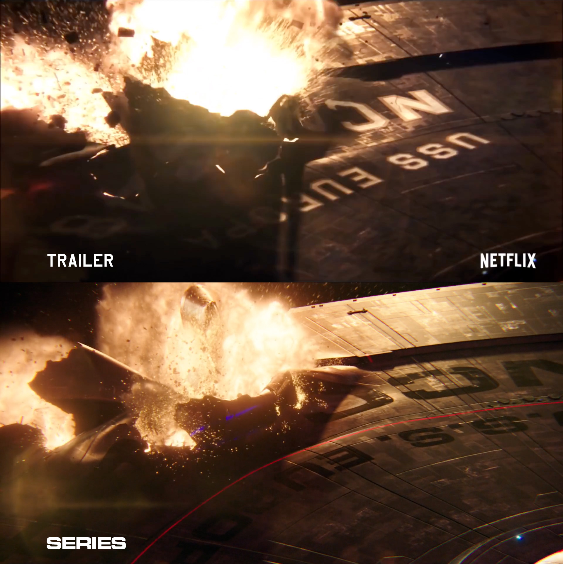
And as for the comparisons of trailer/episode footage of the death of the USS Europa NCC-1648...I do wish they'd stuck with the classic hull lettering. If they explain it away with "arguments at the Starfleet Regulatory Agency" (which I would recommend that newcomers to Trek and this forum should check the Sternbach/Okuda tech manuals for evidence of SFRA's existence), that should help.
We're not talking about Star Trek having production changes where they sometimes design new costumes or new props and for some reason those props remain consistent across multiple iterations. We're talking about the spinoffs being a "visual reboot" of Star Trek in general.I've got to say I agree with where Timo is coming from on this one. What, did the DS9 crew wear different uniforms because it was a logical development in the Trek universe that starbase-specific jumpsuits would be rolled out exactly when the Cardassians abandoned Bajor? That new commbadges and starship pennants just happen to be phased in right before a random starship goes missing?
They're not.
Because:
... is NOT the same thing as a "visual reboot." It's not even clear that term actually means anything in the context of modern day filmmaking; the only thing it could really refer to is a situation where the basic story elements and character progression of previous productions are left intact as part of story canon, but the appearance of those elements is changed for some reason. The closest thing we have to that in Star Trek is Saavik changing actors between movies, and also the bridge sets of the Klingon Bird of Prey and the Enterprise-A between films.Every show, to some extent or another, dicked around with the established look of things to have their own visual identity
The TNG spinoffs? Not even close.
Because none of the other production changes were "redesigns," they were totally NEW designs that deliberately and explicitly replaced the old. The only exception to this is the TMP Enterprise... which, if you notice, didn't get replaced by the TOS version of the Enterprise either in retcons or in any of the sequels.Why in the name of hell would you expect this TOS redesign to be different from all other TOS redesigns and actually have staying power?
Obviously. The thing is, they'll probably also take the Discovery model and the TMP version as points of inspiration too. As it stands, it seems like the Discoprize appears (at least to me) to be partially inspired by the "Exeter" class starships of STO, which itself is basically a 24th century refit of the Constitution class. But that might just be another example of John Eaves being John Eaves...And when the next revamp of the TOS Enterprise happens, whenever it happens, they won't be going back and just tweaking the "Take My Hand" model to be suitable for VR holograms or whatever, they're going to go back to the original first, and dick around with that.
The type font on the hull of a starship being vaguely reminiscent of the type font used in TOS before being replaced by something more complex in the final shot... if the rest of your evidence is of a similar nature, I'd say this conclusion is probably wishful thinking on your part.There are other indications, both on-screen and behind the scenes, which I'd be happy to kill some time and assemble if it's that important to you, but the apparent conclusion is that someone important on the production team wants way more TOS shit in DSC
If they explain it away with "arguments at the Starfleet Regulatory Agency" (which I would recommend that newcomers to Trek and this forum should check the Sternbach/Okuda tech manuals for evidence of SFRA's existence), that should help.

I have a malfunction in my sarcasm detector... please confirm that you are joking?
Will the discoprise evolve closer to the TOS version as time passes?
That's what the producers are allegedly promising. Dunno how they'll manage it, aside from a starting with a switch in the LCARS colors to a red and orange palette, which has apparently been suggested.
Mark
Mark
Doesn't make any sense, since we're already 2 years past "The Cage". The only way this Enterprise makes sense is as a replacement for the one in TOS, not as an earlier version of it.Will the discoprise evolve closer to the TOS version as time passes?
Still time to transition the external look to that of circa 2265.Doesn't make any sense, since we're already 2 years past "The Cage". The only way this Enterprise makes sense is as a replacement for the one in TOS, not as an earlier version of it.
The type font on the hull of a starship being vaguely reminiscent of the type font used in TOS before being replaced by something more complex in the final shot... if the rest of your evidence is of a similar nature, I'd say this conclusion is probably wishful thinking on your part.
It's just a font, neither is particularly more technically advanced than the other. If anything, the TOS-ified version is "more complex" because of the added outline, while the final version uses an off-the-shelf font, rather than the bespoke Trek version with pinstripes and the "1" that doesn't look like a "7," which was made for TMP and used through Nemesis (with occasional lapses). Even the JJ movies, using off-the-shelf Eurostile/Microgramma, fixed the "1."
Even then, I'd be happy to concede that I'm probably deluded, if it'd been a one-off thing. The comic-con teaser used Microgramma. So did the leaked test footage from the first VFX team. Concept art used both the TOS-style and Microgramma, ping-ponging back-and-forth or, perhaps, being revised for consistency after the fact. For instance, the black-and-white drawings of the random starships all use MG, but most of the colored drawings use TOS-style. Discovery and Shenzhou are notable exceptions, except there's production and promotional art of them using the old-style markings, too.
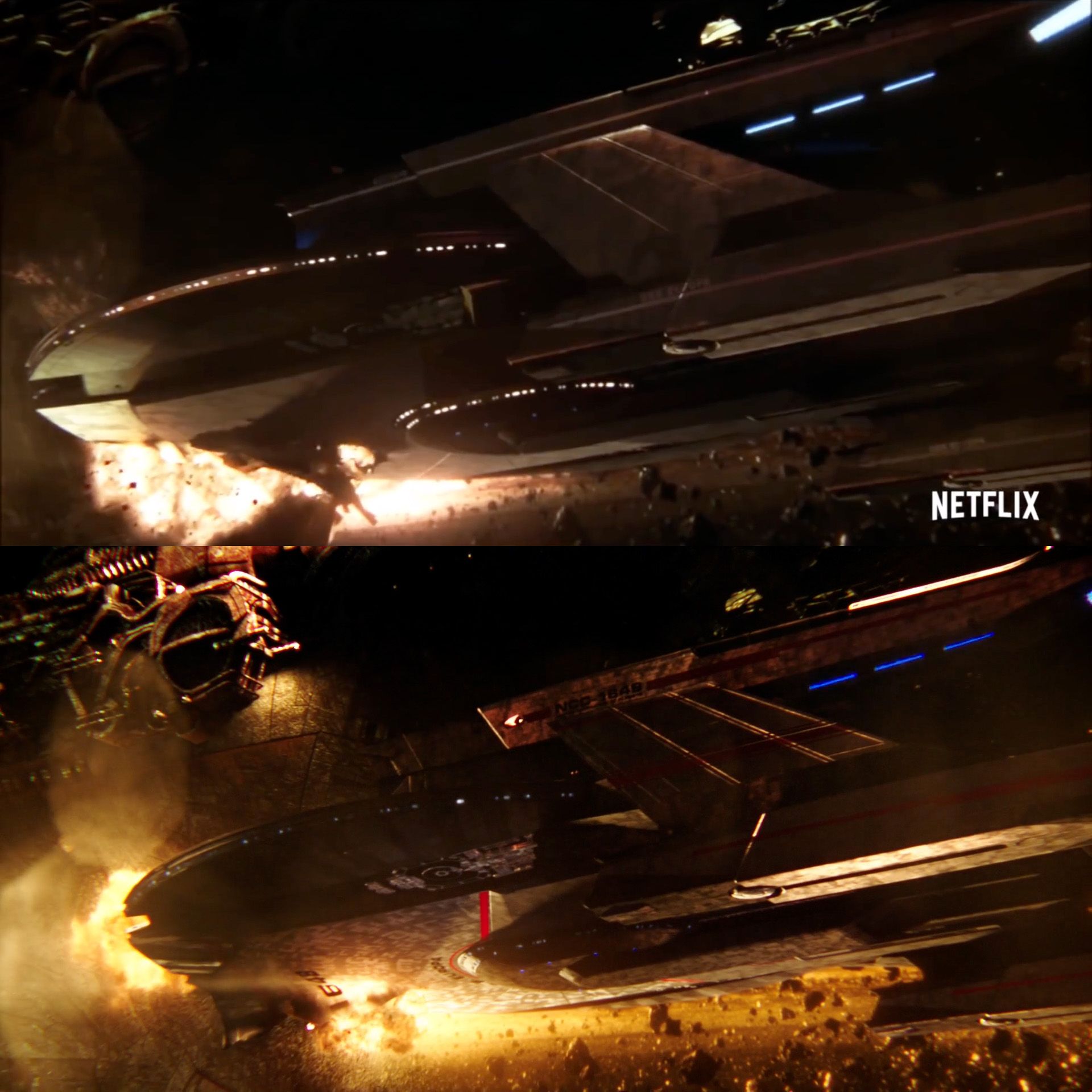
So that means they switched back and forth, possibly more than once. And look closer at that shot. The lines of the ship are the same. The little nurnies. Even the pattern of the hull plating texture and some of the tears in the hull. The shot was the next thing to finaled. This was a change of mind, late enough in production that VFX shots were already being locked for the pilot.
As for the rest, the short version is that vintage Trek design keeps sneaking in at the margins. The Starfleet props are incredibly derivative of what's gone before (the communicator uses the TWOK grill. The rifle has the cowl from the Phase Pistol. Who'd even want that to be referenced visually?), but the Klingon... everything... is totally different (excepting the language, logo, one weapon, one and a half ships, and one guy's outfit). The computer screens are all modern post-Iron Man glowy lines on black... except for the movie-era alert indicators. The nacelle caps were going to be red... until they were blue (except on non-hero ships). The soundscapes are a random hodge-podge of TOS, TNG-era, and new sound effects, thrown together so haphazardly that it was genuinely surprising that when Burnham hacked the communications in "Prologue" there was both a TOS-ish computer screen along with exclusively TOS sound effects. The ships, as aired, tended to draw on the TMP-era design language, but when we saw the Enterprise, it had TOS versions of detailing DSC had already established a TMP-preference for (pennants and such).
There's no unity to Discovery's design philosophy. It doesn't know what it wants to be, so it's trying to be everything. Is it a reboot or is it a prequel? Where on the spectrum does established production design fit between "vague inspiration" and "gospel truth"? The final episodes of the season, and especially the final minutes of the finale, showed that this isn't just a visual problem. They have no theme, no guiding light. Things are just happening, with no thought to what they mean, or what they commit the series to. DSC uses a generic, modern style for its computer screens, and then has a TOS-throwback display. Lorca is a manipulative spy whose a master at getting what he wants from people, until he's unmasked and suddenly just acts like an asshole rather than continuing to try and win people over to get what he wants. They go to painstaking extremes to cut off every possibility for peace with, or even victory over, the Klingons to build tension past the breaking point, so when it inevitably happens, it takes the form of a wildly convenient ass-pull rather than something that develops naturally from the characters and situation. They close the season with the less-than-mindblowing revelation that they're a Star Trek show, and give no indication of what they intend to do beyond cashing in on the fact that they have access to a pop-culture legend.
The logical reason for all of that is that people behind the scenes disagree on what the show should be, dramatically and visually, possibly on a subtle-enough level they don't even realize the dispute themselves. The biggest, albeit petty, public evidence of conflicting creative visions is the vacillating on how TOS-y the ships look.
I did take a second look at that trailer, and I did find a couple of other interesting things, ship-marking-wise. First, another angle on the Europa, again showing the switch from TOS to TMP-ish markings (the red circle around the arrowhead seems to be being eaten by the specularity of the hull, but I'm pretty sure it's there based on other shots). The Europa in the trailer also looks noticeably rougher than it is in the other shots, but I'm not sure if that's the texturing and modeling or the rendering quality being set to a "preview" level.
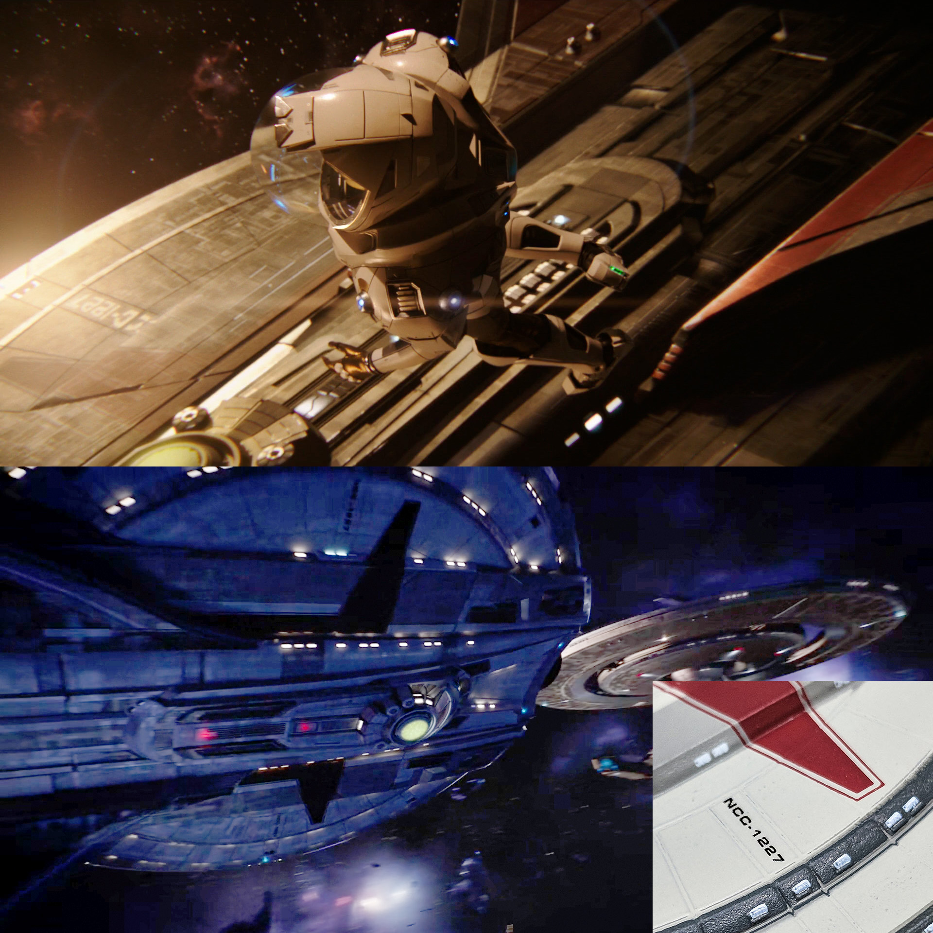
Way more interesting, though, is this image, from the aired version of the pilot, where some TOS-fonted markings on the bottom of the saucer slipped through in a shot of the Shenzhou. It was tricky to find a shot where you could see what was supposed to replace it, so I added an insert showing the same marking on the Eaglemoss model for clarity.
They did a 100% makeover in from the TOS to TMP looks in the story space of 18 months. Ships, uniforms, transporter effects, Klingons, even Scotty's waistline.
We accepted all of that, we'll (eventually) accept all of this.
Mark
We accepted all of that, we'll (eventually) accept all of this.
Mark
Of course they were visual reboots. TMP looked nothing like TOS. The Makers just didn't have the guts to follow through, and added the TOS ship. Wrath looked nothing like TMP. The Makers just couldn't afford not to recycle effects and sets. TNG looked nothing like either TOS or the movies. The Makers just backtracked, and benefited later on as they could more freely use movie sets and props. And atop all that came the nostalgia episodes, which is fitting for a pure nostalgia franchise.
Which is what all the shows and neo-movies did, sooner or later. Because Trek without the nostalgia just cannot survive. So far, DSC if anything is a greater offender in the nostalgia department than the others, having started with the "Easter eggs" right off the bat.
How is DSC any different from TMP there?
TNG did the same, and did return. ENT did the same, and did return. So, what are you talking about?
Timo Salomiemi
Time, it’s not often I agree with you so thoroughly. People got really spoiled because TNG established a design ethos that spanned three concurrent series—21 years worth of visual sameness. After TMP, there were 6 movies worth of visual continuity.
People get used to it. They bristled with Enterprise reinterpreted some designs without really straying very far from what had come before.
They bristled when the Kelvin movies reinterpreted it more though, really, not all that far from the TOS movies.
Discovery is the first time since TMP and TNG that contemporaneous events have been reinterpreted so thoroughly but held in the same universe.
The 1701 refit might as well be a completely different ship. The movie uniforms are a complete departure from what was seen on TV. The Klingons unrecognizable at first glance.
I thnk a lot of the early acceptance we saw with TMP was due to two major factors:
1) The internet didn't exist in 1979 to allow fans to debate and ruin TMP down to the quantum level. It is both a blessing and a curse to the franchise.
2) Prior to TMP, the only Trek was TOS and TAS. We were all hungry for anything that even vaguely resembled Trek, easily allowing for all the changes we saw, even the most fantastical, including the Klingons. Back then the different look could have easily been explained by any or all of the myriad things that were put forward in fan and semi-canon publications. There was fun in not knowing.
Now, with literally a half-century of canon they need to contend with, the fandom is a lot more particular about what is seen, and with sites like Memory Alpha and others, the fandom collectively knows more about Trek than the official writers do. They've kind of painted themselves in a corner and it gets them in trouble with the fans, although much of it is their own damn fault for not Googling simple plot points that don't make sense within the established history. Abrams tried smartly to mitigate this problem by working in an alternate timeline but wound up walking into a completely different kind of mine field. Battlestar Galactica ran into similar issues when RDM rebooted it.
I'm not sure there is a good answer any more. Maybe it's finally time to retire Trek for good. Give Tarantino his movie, make it the final hurrah and move on. Something can be said for starting something completely new. Babylon Five was pretty leading edge for its time, though horribly dated now. Other modern shows like Expanse are doing fairly well and have a lot more maneuvering room without the need to pay lip service to decades of history carved in stone.
If you are not already a member then please register an account and join in the discussion!