• Welcome! The TrekBBS is the number one place to chat about Star Trek with like-minded fans.
    If you are not already a member then please register an account and join in the discussion!

Disco's version of TOS/TAS: Differences

The TOS, s a tube, two flat beams, a couple of simplistic tubes and a pie dish.
I could argue (just for the sake of argument haha!) that the zumwalt is several triangles, a rectangle and a rhombus... the future tends towards simplicity it seems (unless you’re ENT and you’re trying to do retro future...!)

Non-trek fans will not even see your argument that its "smooth because its high tech", the ST09 looks smooth and Iphone high tech, the TOS design looks smooth its a primitive Model T high tech. The forums are simply too simplistic and primitive.
I tend to agree with you (thanks Star Wars) and it probably has something to do with the iconic association of the prime enterprise with the 1960s TV show sadly.

Non non-fan is ever gonna think the TOS design is newer than the NX.
TPTB obviously agree with you (or are too constricted in their thinking to consider otherwise). Which says more about the design of the NX (which I like) but she should have been a Daedalus class starship or that NCC-1000 design from ships of the line.
 
I could argue (just for the sake of argument haha!) that the zumwalt is several triangles, a rectangle and a rhombus... the future tends towards simplicity it seems (unless you’re ENT and you’re trying to do retro future...!)

Yes, but it still does not look as simplistic. Now, you could make it look primitive with the right textures, but really, just look at the TOS shapes man. The way its assembled goes a long way to making those shapes look super primitive.

I tend to agree with you (thanks Star Wars) and it probably has something to do with the iconic association of the prime enterprise with the 1960s TV show sadly.

While star wars might play a role, really its art style. The TOS design and the ships of TOS are all in a style known as "space age or atomic age". We can not unseen it, as our culture is so ingrained with media and art styling.You see it and it screams that style, good or bad. It puts people's minds to the 1950's and 1960's and retro styling from the get go. It is a product of its time and it simply shows.

TPTB obviously agree with you (or are too constricted in their thinking to consider otherwise). Which says more about the design of the NX (which I like) but she should have been a Daedalus class starship or that NCC-1000 design from ships of the line.

No one but a very select group of die hards would have watched a sci-fi show that looked like the 1930's. Which is what you have to do to make the 1960's look super advanced.

TOS is really the oddball of trek look wise. They totally tossed the look in 79( Ok beat it, lit t on fire and buried it deep in the woods) and it was not until relics when some one wanted to do a homage it showed back up. It should have stayed dead as it does not fit or make sense.
 
the ships of TOS are all in a style known as "space age or atomic age".
I broadly agree with what you’re saying here but on this particular point I associate the space/atomic age with the 1950s (fins, rockets, etc.) which are not present on the Enterprise. To me she looks ahead of her time (especially in light of the Zumwalt) but everyone’s mileage varies!

TOS is really the oddball of trek look wise.
True - which is down to the production values, of course, but much of TOS still seems more “real” to me than anything that followed it. Maybe cos it was built out of wood and tubes on the circuit boards...!

Ok beat it, lit t on fire and buried it deep in the woods
Hahaha :lol: yeah that’s true!

It should have stayed dead as it does not fit or make sense.
Or... ENT should have looked more like TOS - at least on the outside of the ship. They had a perfectly good design in the Daedalus sat around on Sisko’s desk for years - that looked like a precursor to the TOS era.

Were it not for ENT we might not be having this discussion to the same extent.

Also DSC is still beating the smouldering embers of the TOS visual aesthetic while masquerading as a reboot... but I’ll not open that can of worms again here! :guffaw:
 
Could you please explain these novel only terms, not everyone here reads them and it can be confusing.
But it's a Klingon word. I thought everyone who watched Disco had to be fluent in Klingon?
We can disagree, but let me explain what I mean. The shapes and design Lagrange is simply primitive, simple, very, very simple, like Model -T style simple. Put it next the the TMP design or the Phase II design and its clear cut its just too simplistic. The NX design, ignoring textures , just the base form, is far, far, far, more complex. Its leaps and bounds more detailed.
And yet, the TOS Enterprise is still considered by many to be among the best spaceship designs in all science fiction. Among those who have said so, Neil DeGrasse Tyson. That's man's all about retcons, he retconned away Pluto's status as a planet, so I imagine that's right up your alley. But even he respects the original Constitution.
 
We can disagree, but let me explain what I mean. The shapes and design Lagrange is simply primitive, simple, very, very simple, like Model -T style simple. Put it next the the TMP design or the Phase II design and its clear cut its just too simplistic. The NX design, ignoring textures , just the base form, is far, far, far, more complex. Its leaps and bounds more detailed.
I just don't see it.
 
I broadly agree with what you’re saying here but on this particular point I associate the space/atomic age with the 1950s (fins, rockets, etc.) which are not present on the Enterprise. To me she looks ahead of her time (especially in light of the Zumwalt) but everyone’s mileage varies!

It does not have fins, but it screams "atomic age design" with a massive neon sign. Once more, to non-fans, she is gonna look super dated as those design ques are there.

True - which is down to the production values, of course, but much of TOS still seems more “real” to me than anything that followed it. Maybe cos it was built out of wood and tubes on the circuit boards...!

Its not simply production, but the entire atomic age look and feel. This was removed with TMP


Or... ENT should have looked more like TOS - at least on the outside of the ship. They had a perfectly good design in the Daedalus sat around on Sisko’s desk for years - that looked like a precursor to the TOS era.

Were it not for ENT we might not be having this discussion to the same extent.


Making it looks old and cheap was always a no go. It was never gonna happen, its just will not sell. You would only have had a handful of die hards watch it. The TOS looks should have stayed dead

And yet, the TOS Enterprise is still considered by many to be among the best spaceship designs in all science fiction. Among those who have said so, Neil DeGrasse Tyson. .

Its a horrid design. The shape is not realistic at all.


I just don't see it.

I can't make you see what is clear to non fans man.
 
Actually the shape really isn't realistic. A sphere makes far more logical sense than a saucer. But then all Starfleet ships have this, not just the TOS Enterprise.
 
Actually the shape really isn't realistic. A sphere makes far more logical sense than a saucer. But then all Starfleet ships have this, not just the TOS Enterprise.

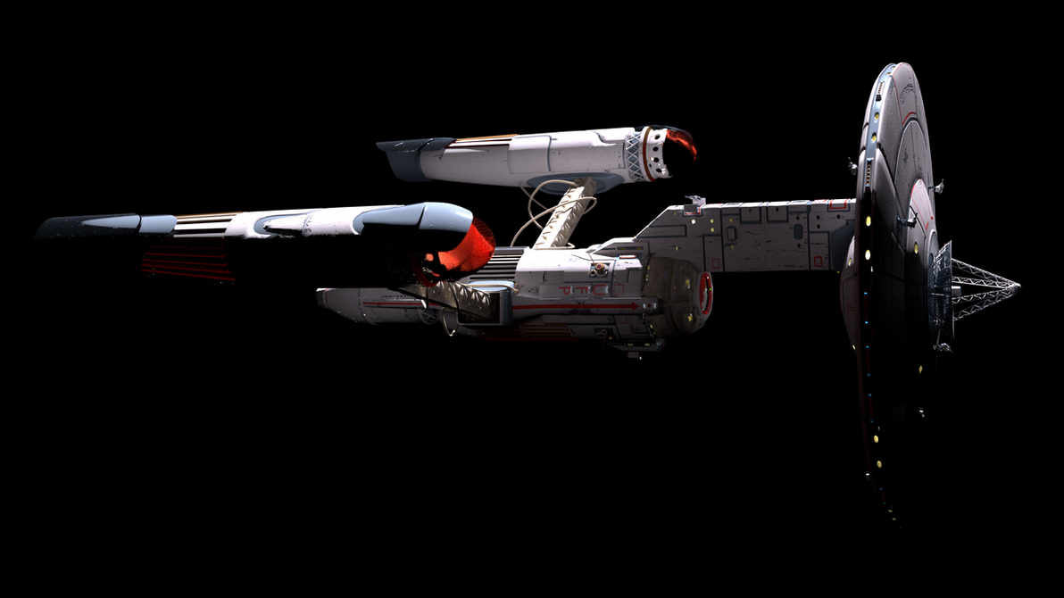
This one is fun
toboldlygo_by_markusglanzer-darfp33.png
 
If you are not already a member then please register an account and join in the discussion!

Sign up / Register


Back
Top