• Welcome! The TrekBBS is the number one place to chat about Star Trek with like-minded fans.
    If you are not already a member then please register an account and join in the discussion!

Design the Next Enterprise

^I didn't say it was interesting. Just pointing out that it pertained to the topic.

Your point's valid...I've just seen too many of these arguments run amok. Thought I'd suggest an alternative, but it's just my opinion, after all.


~Belisarius
 
So, I just have to ask...

To those of you like DFScott and a few others who disliked the deflector treatment on my Ent-F design, the so-called "waddle" or "guppy mouth," do you find the new version to be an improvement?
 
So, I just have to ask...

To those of you like DFScott and a few others who disliked the deflector treatment on my Ent-F design, the so-called "waddle" or "guppy mouth," do you find the new version to be an improvement?


I for one like it the way it now, it feels more like a deflector to me know. I think may be the added detailing. Either way your design is really impressive even with the four nacelles.

4 nacelle ship are hard to design and make them look attractive. You accomplished it here with this design. Win or loose great design it was an honor to be in competition with this design.
 
^Too be fair, I think the change is too subtle to make a noticeable difference. Also, I never had an issue with it, so no problem to me which one you use.
 
Yeah, I had to open a pair of tabs, each with one of the versions, before I could see the difference. I have to admit that I like the added details, but I feel that the deflector also looses a little bit of it's sleekness in the process.
 
In the interest of fairness, I've been questioning my own rationale behind my preference for starship shapes. In the past, I've said that Matt Jefferies' original design evokes a kind of balance, a feeling that you could place the very center of the ship (wherever that is) on the head of a pin and, in the absence of any other force besides pure gravity, it would be perfectly buoyant. I think it's a fair enough question to ask: Is it really because my mind has been trained to prefer the proportions of the vessel I used to draw on the back of my book covers in grade school?

What didn't I like about Andrew Probert's 1701-D? That it looked squashed in the back, as if by an elephant -- that's exactly what I said on the old Delphi network the evening of TNG's premiere. What was the solution? Pick the nacelles back up and even their center lines with the top of the primary hull...just like the old ship. Why did I like Rick Sternbach's Voyager? That it told a different story, I said, that it's a "little boy" of a ship, or a "boy scout." It had angles and flexed its muscles and looked more like a workhorse. What would I have said if it were dubbed "Enterprise?"

In short, would my arguments have been as stupid as saying, "That's not canon!?"

Leonard Nimoy said something interesting in an interview the other day. He said he appreciated the "alternate reality" plot device introduced in the Trek XI movie because it enabled the writers to do something, anything new without too many fans complaining. Had the device not existed, he posited, folks would have complained to the extent that anything was different at all. ("That's not how a bridge should look!. . . Why is there a waddle underneath the nacelles? . . James Kirk doesn't have blue eyes!")

If the Enterprise is a character in the show, then perhaps a completely new design has every right to play this character just as Chris Pine has the right to bring his shiny blue eyes to the captain's chair. You need to do something new, otherwise, why bother? (How the Romulan incursion into the prime timeline forced Kirk's eye color to change. . . is an exercise for the viewer to resolve.) Consider as an extreme example the intentionally ugly 26th century Starship Enterprise created for the unrealized animated series "Final Frontier." You'd hardly know it was part of the same design lineage, but that's mostly the point.

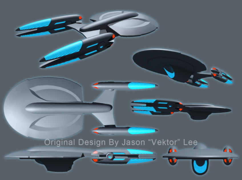
Vektor, I see what you're going for with your design revision; you're trying to take away some of the lines that make it look like your new forward secondary hull isn't weighing down on the "skin" of the primary hull like. . . well, like my adam's apple. You're taking away the appearance of hanging, and that's good. So if you've worked so hard to take the "waddle" appearance out of your model, can I be so good as to characterize my opinion of it without invoking the same analogy?

Here's the deal: 1701-E used some design tricks to make it look as if the "head" of the ship was pulling the body behind it, as though it wanted to leap forward head first into warp drive.

http://culttvman.com/main/wp-content/uploads/2011/01/bshannonentE-003.jpg

If you stare at 1701-E for awhile and then direct your gaze immediately to Vektor's 1701-F, you feel the reverse effect. It's as if the ship wants to slam on the brakes, and the weight of what's behind it catches up with it from behind. This "F" feels like it's pushing against a barrier rather than already breaking one.

There, I did that entire paragraph without saying "waddle" once.

What I've tried to do here in the interest of fairness was deny any preconceived notion of what the ship "should be" based on past history or personal preference, and address the simple issue of why I feel the way I do about it; and I would invite others here to try it too.

DF "Not Even Turtleneck Sweaters Can Hide His Own Waddle Anymore" Scott
 
I think there are two issues at work with my design. One was the way the secondary hull was integrated into the primary hull, which I have corrected pretty much to my satisfaction. The other has to do with the front-loaded secondary hull, which I think is where your "slam on the breaks" impression is coming from, DF.

The latter was an attempt on my part to do something different with the usual configuration and the way the parts relate to each other. It's true that the pushed forward engineering hull gives the ship a different sense of "momentum" from the Enterprise-E, perhaps even an opposite one, but I also think it lends a certain "muscularity" that the Ent-E lacks. The word "pugnaceous" even comes to mind, which, admittedly, is not a word normally associated with ships named Enterprise.

I'm of two minds on the subject. On the one hand, I like the uniqueness of this configuration. On the other hand, I look back at my Option C configuration with the engineering hull further back in its more traditional location and it does seem rather more Enterprise-ey.

I may have to try another version of the underside 3/4 view, just to put the speculation to rest. I have no idea whether such adjustments to the design I entered in the contest are still possible, but I don't see that it can hurt anything.
 
You and I both share a theme Vektor, and it's one we picked up from the Enterprise D. It's all about the saucer. The rest is tertiary.

The Excelsior (Ent B) is the opposite. It's a giant engine in space, and oh yeah, I suppose we ought to add a little a saucer there too.

Neither approach is inherently superior, but they indicate different priorities.

As to her posture, your Ent F is a shield rather than a sword. Again, neither appearance is superior. They just communicate different themes.

Based simply on how she "feels" I'd say your Ent F is a command ship. She would look best at the heart of a great fleet, with an Admiral in command rather than a mere captain. She doesn't feel like a lone wolf. She feels like a guardian.

[edit]
As to the question of adjustments, if you read the fine print, they may actually require revisions were we to win. At the very least I expect they'll ask for all the orthographic angles, like the Eve Online contest did.
 
Last edited:
I would love to see just a 3/4 sketch of the "Option C" version, because I sincerely believe it's the most balanced approach in terms of distribution of mass. I believe I could see this as a workhorse Enterprise, a ship that moves stuff to the front fast.

Picking up on Fuzzy Modem's point: I've read that the design inspiration for Excelsior (Ent. B) was an aircraft carrier, with its long, flat plank as a carrier for long, flat engines. And as the Excelsior -- the ship that chased the Enterprise in Trek III -- I see that more utilitarian vision for its character. As the Enterprise-B, though, I can't help but see it as missing a big part of its body.

There are two ways to do utilitarian. One is the Excelsior method: dry, flat, planar, like a Buick Park Avenue station wagon. Or small and sophisticated like a Caterpillar -- and with those cool quad nacelles and that spider-like stalking prance from above, Vektor's Ent-F is absolutely killer. I think if it had a more balanced profile from the side, like the "Option C" concept sketch, this would be a fabulous candidate in my view. (Not that I didn't vote it up in the contest; I actually did.)

DF "Captain's Log, USS Toilet Plunger, Hikaru Sulu Commanding..." Scott
 
Frankly, I'll be excited to just see some results. I'm pretty sure my design (#613) is totally outta luck, but this waiting is starting to get painful.


~Belisarius
 
Okay, rather than go back and try to modify my earlier drawings, I decided to do a whole new illustration showing "Option C" with the engineering hull pushed further back. I've got about 5 hours worth of work into this and it's not even close to finished, but I'm pretty happy with the results so far.

STO_Ent-F_Beauty01_wip01.jpg


Even unfinished, I definitely have to say that this is the better option. If my design gets used in the game at all, either as the Enterprise or some other class of ship, I hope I get the opportunity to make this change.

Another reason I'm really pleased with this illustration is because it's something I've never done before. I normally start everything with a sketch, do lots of careful linework and detailing, then add shading, color, highlights, etc. This time, I just began with a black background and started slapping down broad brush strokes. I couldn't have been more surprised at what came out of it.

Maybe an old dog really can learn new tricks. ;)

P.S. Any similarity to the style of Chris Madden's entry in the contest was purely unintentional, but looking at it now, I can't help wondering if I had it somewhere in the back of my mind as I was working on this.

P.P.S. If anyone wants to repost or link this over on the STO forums, feel free. I tried to sign up there myself a while back but it refused to let me, I presume because I'm not a registered STO player.
 
Last edited:
I think it works better with the nacelles being higher or even with the base of the struts, but looks good. Nice style you stumbled upon as well.
 
Vektor, I've always preferred your option C to the others, but I gotta say your final design grew on me. I knocked up a very rough CG model of it though and while it is a great design, it always reminded me of Voyager. And I think that is really apparent in your side view of C that wasn't so visible in B. If you had 2 nacelles instead of 4, I reckon you could legitimately call it an Intrepid Class refit, and while I do love that design and yours, it still doesn't scream Enterprise to me.

I know that's a really petty nitpick, but It still doesn't sit right with me in my gut. If it were any other ship, it'd be a winner for sure.
 
Yeah, well, the primary hull came out a bit undersized in this latest illustration. Normally I would fine-tune the proportions in the rough sketch but I didn't do one this time around. On the other hand, correcting the problem should be fairly easy since I don't have any linework to worry about or tons of aligned layers to mess with. Getting the saucer up to size should help reduce the Voyager similarities.

EDIT - After mulling it over, it's not just the size of the saucer, it's the angle. It's tilted downward a little too much at the front, making it seem more tapered (like Voyager) than it is. Should still be fairly easy to correct.
 
Last edited:
To paraphrase the ever-eloquent Emeril Lagasse: Bam!

That's your ship. Tucked back at that location, the lower compartment (not really a "hull" any more) is not so much of a waddle as it is a "pocket," and the mind accepts it as such.

Several years ago, Vektor, when you designed the Vanguard NCC-147 (which, for those who may not have been here, grew out of speculation over "What Should Enterprise NX-01 Look Like If Done Right?"), you came up with the idea of a supplemental pod bolted onto the ship as an add-on. It looked like an add-on, and some folks didn't like it for that reason, but I loved it for that reason because that's the story the ship was telling. It looked like something these guys discovered they needed two years into the voyage. So it protruded a bit, but that was part of the ship's character.

When Doug Drexler last year designed a refit module for NX-01 (a design I otherwise have always liked), I'd have to say it missed that same opportunity. From an intellectual perspective, it tries too hard to hybridize itself with the 1701 without really good reasons. ( 1: The hint of an angular neck connecting the saucer with the new deflector dish - why? 2: A hangar bay-style protrusion to protect something that's quite obviously not a hangar bay - why? 3: The relocation of that thing - an engine power pod - to a location further away from the engines just to justify the extension of the wing struts - why? ) But from an aesthetic perspective, I always thought there was something ever-so-slightly wrong about it: It's not balanced. It shifts the weight of the ship too far toward the front. Had the lower extension been shaped differently, not so bulbous toward the dish, it would have made all the difference.

So Vektor, you've done with your Ent-F what Drexler should have done with the NX-01 refit: you balanced it. Now the pocket isn't an appendage but a flowing part of this streamlined, single hull container. Now I can concentrate on what I love about this shape from every angle, not just the top. The tall deck on top presents a profile that's a nice homage to the original NX-01. And the quad engines suggest a sense of action and sprightliness that the bigger, bulkier predecessors never had. You can believe this vessel tacks on a considerable number of "9's" to its maximum warp speed (9.9999....).

And this ship can tell a different story now, a 25th century epic. What do the explorers of this century do differently? Maybe they're more resourceful, they can do more with less. What if shuttlecraft, for example, could be manufactured on the fly and reabsorbed when not in use? You wouldn't need a huge hangar bay. What if its new weapons could manipulate space, projecting massive minefields in the way of oncoming intruders? Who needs to shoot a torpedo when you can conjure one in the vicinity of your enemy? What if these tremendous quad warp engines could extend the warp field around any other object, enabling them to "punt" that object on a one-way journey to another point in space without it needing a warp sled? What if instead of beaming down a landing party protected by phasers and luck, the ship can beam down a piece of itself with the crewmembers inside? That way you're on the bridge, you establish orbit, you open the cabin doors and there's the planet, and you walk out onto the surface.

If you work all these things into the backstory (which I don't think you can do with STO, I guess) then you can imagine all the justifications for a leaner, meaner Enterprise.

From Vektor:

Another reason I'm really pleased with this illustration is because it's something I've never done before. I normally start everything with a sketch, do lots of careful linework and detailing, then add shading, color, highlights, etc. This time, I just began with a black background and started slapping down broad brush strokes. I couldn't have been more surprised at what came out of it.
I think you're trusting yourself more as an artist now. When I first started drawing people, I'd spend hours slaving over the geometry, over the precise angle of the nose, the correct droop of the ear lobes. There came a point when I started slapping down some bold shades and I realized, for heaven's sake, half the work's already done. You're relying on your 3D geometry less and less, you're taking down the safety net, and you're more confident that you can lay down the shape you want with the first stroke.

DF "This is the Captain of the USS Enterprise. I Wouldn't Sit Down in That Chair If I Were You" Scott
 
Vektor -

Wow, man, that's a helluva ship! And a beautiful painting to boot. Any I wouldn't worry about my scribble, I was ripping off Ryan Church's JJPrise concept myself pretty hard :). (Sorry, Ryan...)

As a concept artist in trade, what you're describing is my ideal concept design process. It's what I did with my Dedication class -F anyway, just start slapping blobs on the screen with no real idea as to what I was making, I just knew 'long and sleek.' Very rarely do I do a sketch before hand, and often I find as much use out of erasing away sections of blobs to make shapes as to making positive shapes first. I also paint in black and white first, then colorize (overlay, color, etc.) afterwards. From the look of this you're laying pure hue down first, which is commendable, many artists I know in the industry can't do that well. Very, very nice piece. Using a Cintiq, or an Intuos?

Do you use textural overlays at all? I'm curious. I always avoided them at first, but lately (last 2-3 years) I've come to recognize really low-opacity textural overlays as extremely helpful, sometimes just in Color mode to get some hue noise.

Nice stuff, man. Class A work.

Cheers!
-Moe.

-EDIT- I was gonna ask, are you in the industry? Your stuff is top notch. Just curious.
 
Last edited:
If anyone is mildly interested, here's a quick shot of that rough Vektorprise mesh I made, although i've spent some time cleaning it up :P

Screenshot2011-04-14at182357.png
 
If you are not already a member then please register an account and join in the discussion!

Sign up / Register


Back
Top