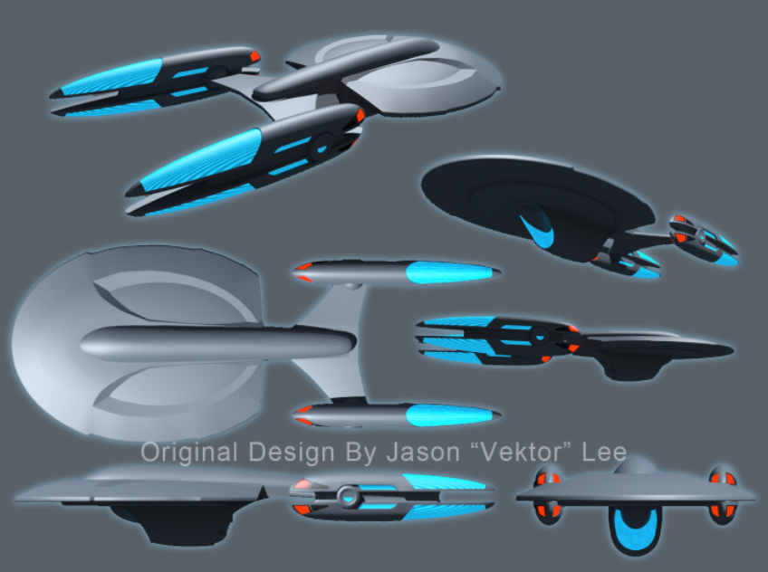
In the interest of fairness, I've been questioning my own rationale behind my preference for starship shapes. In the past, I've said that Matt Jefferies' original design evokes a kind of balance, a feeling that you could place the very center of the ship (wherever that is) on the head of a pin and, in the absence of any other force besides pure gravity, it would be perfectly buoyant. I think it's a fair enough question to ask: Is it really because my mind has been trained to prefer the proportions of the vessel I used to draw on the back of my book covers in grade school?
What
didn't I like about Andrew Probert's 1701-D? That it looked squashed in the back, as if by an elephant -- that's exactly what I said on the old Delphi network the evening of TNG's premiere. What was the solution? Pick the nacelles back up and even their center lines with the top of the primary hull...just like the old ship. Why
did I like Rick Sternbach's Voyager? That it told a
different story, I said, that it's a "little boy" of a ship, or a "boy scout." It had angles and flexed its muscles and looked more like a workhorse. What would I have said if it were dubbed "Enterprise?"
In short, would my arguments have been as stupid as saying, "That's not canon!?"
Leonard Nimoy said something interesting in an interview the other day. He said he appreciated the "alternate reality" plot device introduced in the Trek XI movie because it enabled the writers to do something,
anything new without too many fans complaining. Had the device not existed, he posited, folks would have complained to the extent that anything was different at all. ("That's not how a bridge should look!. . . Why is there a waddle underneath the nacelles? . . James Kirk doesn't have blue eyes!")
If the
Enterprise is a character in the show, then perhaps a completely new design has every right to play this character just as Chris Pine has the right to bring his shiny blue eyes to the captain's chair. You need to do
something new, otherwise, why bother? (How the Romulan incursion into the prime timeline forced Kirk's eye color to change. . . is an exercise for the viewer to resolve.) Consider as an extreme example
the intentionally ugly 26th century Starship Enterprise created for the unrealized animated series "Final Frontier." You'd hardly know it was part of the same design lineage, but that's mostly the point.
Vektor, I see what you're going for with your design revision; you're trying to take away some of the lines that make it look like your new forward secondary hull isn't weighing down on the "skin" of the primary hull like. . . well, like my adam's apple. You're taking away the appearance of hanging, and that's good. So if you've worked so hard to take the "waddle" appearance out of your model, can I be so good as to characterize my opinion of it without invoking the same analogy?
Here's the deal: 1701-E used some design tricks to make it look as if the "head" of the ship was pulling the body behind it, as though it wanted to leap forward head first into warp drive.
http://culttvman.com/main/wp-content/uploads/2011/01/bshannonentE-003.jpg
If you stare at 1701-E for awhile and then direct your gaze immediately to Vektor's 1701-F, you feel the reverse effect. It's as if the ship wants to slam on the brakes, and the weight of what's behind it catches up with it from behind. This "F" feels like it's pushing against a barrier rather than already breaking one.
There, I did that entire paragraph without saying "waddle" once.
What I've tried to do here in the interest of fairness was deny any preconceived notion of what the ship "should be" based on past history or personal preference, and address the simple issue of
why I feel the way I do about it; and I would invite others here to try it too.
DF "Not Even Turtleneck Sweaters Can Hide His Own Waddle Anymore" Scott


 . (Sorry, Ryan...)