My entry was purely 2D, hand drawn on my Cintiq tablet in PhotoShop, but I'm flattered you were that convinced it was actually a 3D model. I must be getting better at linework and shading.")
Oh, yer good, alright!
(Don't get cocky, kid!)
My entry was purely 2D, hand drawn on my Cintiq tablet in PhotoShop, but I'm flattered you were that convinced it was actually a 3D model. I must be getting better at linework and shading.
 How did you establish that perfect perspective without splines or vectors? It can't have been done freehand.
  Did you use Photoshop's vanishing point tools in some way? Or maybe a radial blur set to zoom on a random noise field or something? Can we see some wips pretty please?
 Somehow I think if I had a rough idea how you got it to look so exact (shadows too, good god!) maybe I could learn how too, given enough time and practice, but right now I'd have no idea where I'd start!
")
Damn you, sir/ma'am, DAMN you! I just peed my pants looking at that striking, graceful, stunning beauty. And I'm at work right now. Pretty damned inconsiderate of you.
My apologies, I didn't plan for any unexpected urination. I'll send you the money for some new pants
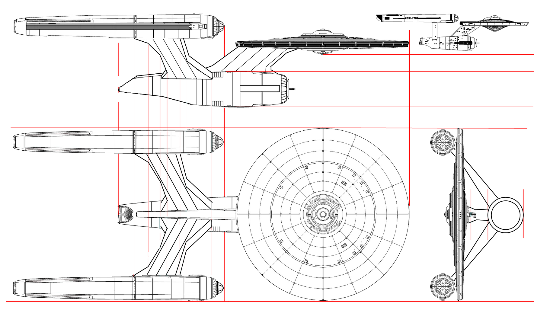
Thanks, though! I wanted a cross between the Sovereign and refit Constitution. ...Funny story, I was so tired when I finished painting it that I wrote "Dedication Class" instead of "DECLARATION Class," like I was planning. D'oh!
...And I realized I can link straight to it, for those that wish to see it without searching:
http://www.startrekonline.com/enterprise/gallery?share=869
Cheers,
-Moe!
I much prefer John Eaves' Somewhat-MVAM-Capable Sovy refit.
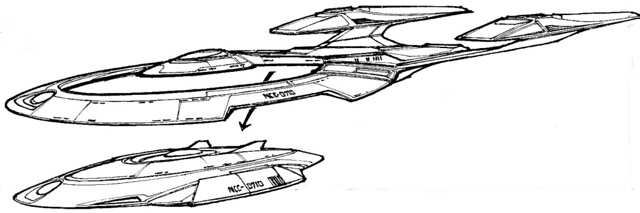
Here's the idea I'm playing around with...
What can I say, I'm a traditionalist.
Hm,, it looks like you're stuck in a creative rut. It looks like the same combination of elements we've seen for 40+ years.
Not only is it 2D but it's pixel painted!?!
People with your level of skill really ought to be working for ILM, or teaching classes, depending on your sense of altruism
At the very least, you should have info on your site concerning your availability for contract work, assuming you aren't already working as an artist full-time. Some employment info or a resume is sorely lacking from your site. At least I haven't been able to find it, so if it's there it should be more obvious.

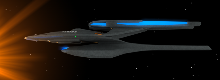
FTW!!!I've REALLY been liking this one, though some may say it's too TMP.

Can't top that one.
I know that's^ a lot of questions. If I could eat your brain and absorb your skill I would 
Pretty sure I remember Vektor saying he worked in Architecture. Doing 3-d models of buildings?
Other mistakes I've made:
The texture is very "The Motion Picture" those subtle variations in hull panel specularity are my favorite style, but were abandoned after the Enterprise B in favor of much higher contrast variations in color without any difference in specularity. This, in combination with a few other elements, makes my ship look too retro. It almost looks like a step back from the D, rather than a step forwards from the E.
If you could imagine yourself touching this ship, your mind will do things with your design that your software isn't allowing you to try just yet.
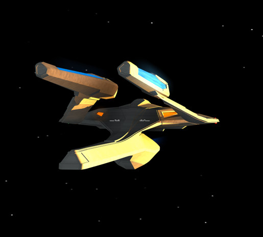
Proportions are a bit off, but she's a first draft.
I'm happy with the nacelles, but I should have found something more "futurey" for the hull texture. I like how Vektor's looks like stainless steel in places, and his color variation has a sense of purpose, while I just sort of stuck stuff here and there to fill the negative space.That's not a mistake. And neither are the nacelles (which rock, by the way).
I'd say the deflector's improved, but it doesn't necessarily jump out at me as one of the ship's stand-out features. It kind of looks like it's an ornament bolted to the front of the engineering hull, rather than an integrated component.
We use essential cookies to make this site work, and optional cookies to enhance your experience.