• Welcome! The TrekBBS is the number one place to chat about Star Trek with like-minded fans.
    If you are not already a member then please register an account and join in the discussion!

Design the Next Enterprise

If I'm not mistaken, bobafett's design is this one:

STO_DTNE_3rd_place_news.jpg


Forgive the bad joke, but I think bobafett could take a lesson from his name sake and add some verticality to his spaceship. At the moment its flatter than The E-J imo.

I don't think it looks too flat IMO, especially given the scale that I image it must be. I suppose it might look a little flat from the front, but I kind of prefer my saucers flatter as opposed to being taller. I think it makes them look sleeker.


Here's the winners page: http://www.startrekonline.com/node/2415


I would say its intentionally flattened like the J, and the saucer details are J-ish too. It looks quite like an amalgamation of E and J elements, which somewhat made sense given the contest, and a lot of those that placed were nods to the J, much to my chagrin.

I think my main complaint about it would be the pointy tail.. it seems a bit vestigial if its that shape, which is fine if it looks good, but it doesn't as far as my personal taste go.

But overall a success in looking like a possible future Starfleet ship, and you placed, so good work :)

Yeah, the tail does look maybe a little out of place. I suspect that is why bobafett made the pylons sweep forward; to complement the pointy tail-end. In spite of people saying this makes her look like a chicken in a frying pan, I just can't seem to see it, which might be why I don't mind forward-swept wings/pylons.
 
HI yes the design above was the orignial design but like a few people here, I too didnt entirely like it. So I took some elements and made it into this new designhttp://www.scifi-meshes.com/forums/attachment.php?attachmentid=90024&d=1303690180
and here is a close up http://www.scifi-meshes.com/forums/attachment.php?attachmentid=90250&d=1304823516
There are similarities to the saucer except I made the usual placement for the impulse engines into the shuttlebays which gives them more clearance as well as extra protection to the new impulse engines at the far end of the saucer. The secondary hull 'ribs' also house shuttlebays so to give them clearance of the nacelle struts. The vertical deflector allows room on either side as well as access from the rear cargo bay. I tried to make the struts and nacelles look like one piece and taper them to a point to avoid the chicken wing look. Since its a drawing there are of course a few issues with perspective but at least you get the idea.
 
Last edited:
Ah yes now I understand...

Yeah I basically like all of that one, except something about the overall shape of the nacelle/struts. I can guess how that separates and bet it looks cool.

I think the big outside curve on the nacelle keeps them looking a bit too wingish, especially with the red collectors looking like talons, but I definitely like them being a solid molded piece. It's probably the angle, as well.
 
I took some elements and made it into this new designhttp://www.scifi-meshes.com/forums/attachment.php?attachmentid=90024&d=1303690180

I made the usual placement for the impulse engines into the shuttlebays which gives them more clearance as well as extra protection to the new impulse engines at the far end of the saucer. The secondary hull 'ribs' also house shuttlebays so to give them clearance of the nacelle struts.
A lot of your ship seems to be devoted to four separate shuttlebays, according to their distance apart. The design looks like it provides nice areas for center-line bays in each hull resulting in (in my opinion) a cleaner layout. That would also provide on-axis landing & launch corridors verses their current off-angled attitude... a little tricky to navigate.

Beyond that, and a few other details, you have a good entry and easy to understand why it 'placed'.
 
Maybe it would be good to add a new category (Starships or Space Hardware) to your menu 'cause some of us may not be able to find the new stuff.

I'd also note that

are all (as of yet) unregistered.

(I would not recommend visiting enterprise-f.com.)

You have something of a golden ticket here, but the buzz around the contest is already dying down. It will spike again when Cryptic releases shots of the wip model, and again when it's added to the game.

It would be advantageous to have a dedicated site for related material before then.

Just a thought ;)
 
Thanks to you all for the great feedback. And many thanks Mr Probert for your advice I will be sure to make the changes requested and hope it lives up to your expectations.
 
Thanks to you all for the great feedback. And many thanks Mr Probert for your advice I will be sure to make the changes requested and hope it lives up to your expectations.
Just a few observations,... but, you're welcome. The important thing here is to have a lot of fun with it,... do a lot of 'what-ifing' while keeping practical operational issues in mind.

Andrew-
 
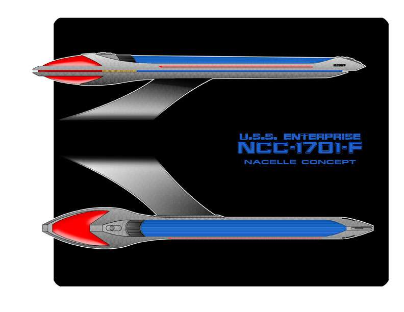
Hey all quick render of an idea for the nacelles I am working on.
nacellesconcept.jpg


Make the warp grille area wider, or at least put in a longer/shallower gradient. It just looks way too off balance at the moment, and although the E-J had the similar bulb up front and sprout out the back approach, this is still a fair few ships away from the J.

The side view looks good though.
 
It just looks way too off balance at the moment, and although the E-J had the similar bulb up front and sprout out the back approach, this is still a fair few ships away from the J.

I disagree. I think you can massage the lines a little bit, but the premise is sound. It looks slightly snake like, and that appeals to me. :bolian:

There is a triangle shape above and directly behind the bussard collectors. It could use a little smoothing. I'd experiment by trying the lines concave and then convex and comparing the two.

[edit] If you're worried about balance, you can always make them slightly longer.
 
Ok this idea is gone, it's to similar to others and as I look at it to simplistic, mind you I did in a rush last night before bed.
 
Ok this idea is gone, it's to similar to others and as I look at it to simplistic, mind you I did in a rush last night before bed.


Don't take my words too harshly man. Sorry If I came across as such. Personally I think you've got a neat core of a warp nacelle, I just think it needs some bits built on to the sides to make it more distinguished.
 
I like how the tiny fins come out of the body work of the back end of the nacelle, and I like the cut of that nose cone. Not to sure about the blue glowy grill bit, but I'm personally none too fond of the way it was done on the Ent-E, so defer to other opinions.
 
If you are not already a member then please register an account and join in the discussion!

Sign up / Register


Back
Top