-
Welcome! The TrekBBS is the number one place to chat about Star Trek with like-minded fans.
If you are not already a member then please register an account and join in the discussion!
You are using an out of date browser. It may not display this or other websites correctly.
You should upgrade or use an alternative browser.
You should upgrade or use an alternative browser.
DC Cinematic Universe ( The James Gunn era)
- Thread starter Samurai8472
- Start date
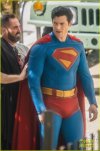
Ask and ye shall receive, and it's a biggie: the first clear, full look at Corenswet in costume:

I ... mostly like it. The piping is unnecessary, I don't love the way the cape attaches, and I'd prefer a more traditional "S." But I'm so glad Gunn gave modernists the finger with the trunks and the big yellow belt. The suit's fabric doesn't appear overly textured in this shot, either. I also really like how bright the colors are; I hope Gunn doesn't feel the inexplicable need to dull and darken them in post.
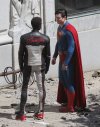
Also, if anyone cares (I don't, much), here's Mr. Terrific also. Looks nicely comics-accurate, at least:

Still waiting for the really important reveal: Rachel Brosnahan as Lois.

I ... mostly like it. The piping is unnecessary, I don't love the way the cape attaches, and I'd prefer a more traditional "S." But I'm so glad Gunn gave modernists the finger with the trunks and the big yellow belt. The suit's fabric doesn't appear overly textured in this shot, either. I also really like how bright the colors are; I hope Gunn doesn't feel the inexplicable need to dull and darken them in post.
Also, if anyone cares (I don't, much), here's Mr. Terrific also. Looks nicely comics-accurate, at least:

Still waiting for the really important reveal: Rachel Brosnahan as Lois.
Last edited:
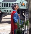
A couple more shots. Another plus: the cape has the "S"!


The cape attachment and blue remind me of New 52. Which I didn't care for, but, unnecessary linework is the name of the game anymore. Otherwise, love it!
And I never understood Mr Terrific's face mask? Makeup?
And I never understood Mr Terrific's face mask? Makeup?
Guess I spoilered my posts for no reason? Or maybe Serveaux has me on "Ignore."
Anyway, these images don't get old. I like the suit better the more I see it.
These look so much better than that official reveal shot. What exactly was Gunn thinking with that?
If it doesn't get drabbed down in post, I'd say this is, on balance, the best screen Supersuit this century.
If it doesn't get drabbed down in post, I'd say this is, on balance, the best screen Supersuit this century.
The cape attachment and blue remind me of New 52. Which I didn't care for, but, unnecessary linework is the name of the game anymore. Otherwise, love it!
And I never understood Mr Terrific's face mask? Makeup?
In the comics the mask is made of nanobots, and its connected to his ability to be "invisible" to almost all forms of electronic detection.
Pleasantly surprised at how faithful the Mr. Terrific costume is. I could've easily pictured someone deciding the whole "FAIR PLAY" thing was too cheesy for modern audiences.
I think it's supposed to be some hi-tech nano adhesive thing? IIRC, it materializes on his face.
And I never understood Mr Terrific's face mask? Makeup?
I think it's supposed to be some hi-tech nano adhesive thing? IIRC, it materializes on his face.
What I'm getting it as that most of that 97% non-urbanized land wouldn't work for the DC cities because it's either located where it wouldn't make sense for a Metropolis or Gotham to exist or it's already populated by towns or rural communities or whatever.But the conversation isn't about real vs. fictional cities -- it's about the size of the planet. Remember, the thing that started this was the mention of the DC/Marvel crossover comic which claimed Earth needed to be physically bigger to accommodate DC's fictional cities alongside the real ones. My point is simply that that's an idiotic notion, not only because urbanization covers only 3% of Earth's land surface currently, but because we keep adding more urban area at a rate of nearly 10,000 square kilometers per year. Going by the graph in the linked article, we probably have more than twice as much urbanized land on Earth now as we had 40 years ago, and the planet is still the same size it was then.
I can't say I'm a fan of the new Supersuit. Why do superhero costumes always have to be these elaborately textured things? He's Superman. His body is invulnerable, and his costume is something he wears under his street clothes. It makes no sense for it to be anything but thin, close-fitting fabric. I'm also not a fan of the symbol barely being recognizable as an S. No doubt they're going for the conceit that it's a Kryptonian symbol that only coincidentally resembles an S, but I think this is taking it too far.
The approach here seems similar to the Arrowverse Mister Terrific, a mix of mask and makeup that's intended to represent a high-tech skin-adhering mask.
And I never understood Mr Terrific's face mask? Makeup?
The approach here seems similar to the Arrowverse Mister Terrific, a mix of mask and makeup that's intended to represent a high-tech skin-adhering mask.
The less Gunn decides this, the better off we'll be.I could've easily pictured someone deciding the whole "FAIR PLAY" thing was too cheesy for modern audiences.
You're accentuating the negative, IMO. There's a lot more to like than dislike about this suit.I can't say I'm a fan of the new Supersuit. Why do superhero costumes always have to be these elaborately textured things? He's Superman. His body is invulnerable, and his costume is something he wears under his street clothes. It makes no sense for it to be anything but thin, close-fitting fabric. I'm also not a fan of the symbol barely being recognizable as an S. No doubt they're going for the conceit that it's a Kryptonian symbol that only coincidentally resembles an S, but I think this is taking it too far.
What I'm getting it as that most of that 97% non-urbanized land wouldn't work for the DC cities because it's either located where it wouldn't make sense for a Metropolis or Gotham to exist or because it's already populated by towns or rural communities or whatever.
First, I disagree, because there's no reason to assume that every real-life city or town necessarily exists in the DC universe just because some of them do. Second, again, the point is not about comparing DC's Earth to ours, but to Marvel's. The premise that the only possible way for DC's Earth to have more cities on it than Marvel's Earth is to be a physically larger planet is simply idiotic. It could simply be a more urbanized planet, in the same way that 2024 Earth is at least twice as urbanized as 1984 Earth was, without the size of the planet needing to increase. Comparisons to the real world are beside the point, because we're talking about a comparison between two fictional worlds, both of which contain a mixture of real and fictitious elements, just to differing degrees.
The Kingdom Come-esque "S" I'm not a huge fan of but no big deal, same for the texturing. The trunks... blegh, those could have stayed in the past.
Tha out of the way, the vibrant colors and the big yellow belt look great. Likewise the 'S' on the cape, glad to see that.
Mr. Terrific looks great too. Always happy to see him get an appearance, and so comics-accurate.
Tha out of the way, the vibrant colors and the big yellow belt look great. Likewise the 'S' on the cape, glad to see that.
Mr. Terrific looks great too. Always happy to see him get an appearance, and so comics-accurate.
Superman without trunks is like the Enterprise without a deflector dish. It's part of the iconic design.
I love how in My Adventures with Superman, the Kryptonian ship gave Clark a blue bodysuit of high-tech armor, and Martha took one look at it and decided she needed to add red trunks to it.
I love how in My Adventures with Superman, the Kryptonian ship gave Clark a blue bodysuit of high-tech armor, and Martha took one look at it and decided she needed to add red trunks to it.
Absolutely hate the trunks. Always have.
And "iconic" is now officially the most overused English-language synonym for "this is familiar and we like it."
Past time to retire it. When everything is "iconic," nothing is.
Anyway, the suit will certainly evolve as the movies go on...perhaps even in the course of the first one.
And "iconic" is now officially the most overused English-language synonym for "this is familiar and we like it."
Past time to retire it. When everything is "iconic," nothing is.
Anyway, the suit will certainly evolve as the movies go on...perhaps even in the course of the first one.
But.
His suit literally is iconic.
He sorta started the whole comic book superhero thing.
His suit literally is iconic.
He sorta started the whole comic book superhero thing.
Not everything is iconic, but Superman most certainly is. He's been around for 86 years, and had the trunks consistently for the first 73 of them. They returned in the comics after a short and ill-advised absence, and now they're back on the big screen, too. It's the single best choice Gunn made with this suit, along with the overall brighter color scheme.
Ladies and germs, I give you Lois Lane ( 

 ) and Perry White:
 Wish the photo weren't so small, but I imagine higher res will be forthcoming.


 ) and Perry White:
Similar threads
- Replies
- 47
- Views
- 17K
- Replies
- 6
- Views
- 4K
- Replies
- 0
- Views
- 3K
- Replies
- 18
- Views
- 660
If you are not already a member then please register an account and join in the discussion!


