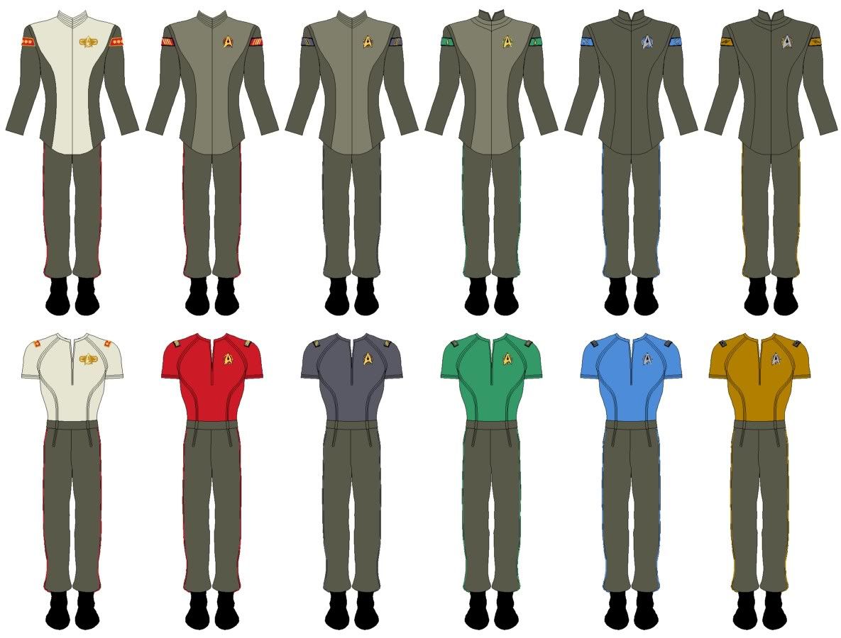
I like Blue Squadron's designs, but find the over use the Starfleet arrowhead to be distracting, especially on the enlisted uniforms.
Thanks - and interesting you should say that...
The Starfleet insignia is only present as a feature on the "belt buckles" (not that there are any real belts per se...) as this was suggested in the description waaaaaay back in the thread that inspired all of this. Personally, I could quite happily ditch the whole belt buckle thing from ALL the versions of this uniform.
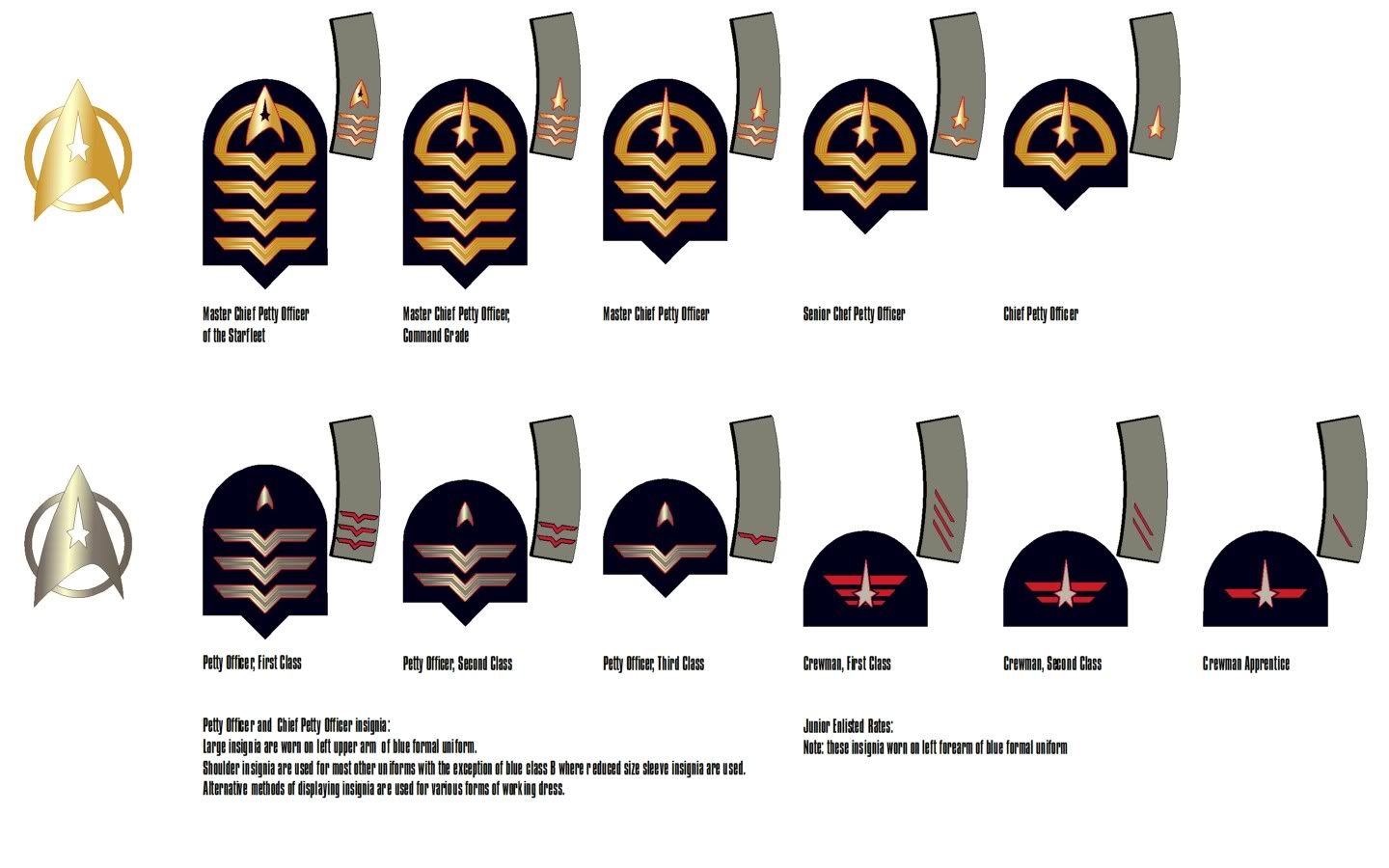
As to the NCO insignia, my original intention was to have some form of unique identifying emblem for each CPO grade, which would appear on their sleeve insignia and then also be used as a stand-alone rank marking for the shoulder-strap insignia (thus avoiding the need to have USN-type insignia with a sequential progression of further additional stars). Using the Starfleet insignia (or variations thereof) seemed to be the obvious choice and eliminated the need to add in yet another feature.
What I posted above sort of achieved this objective but I wasn't entirely happy with the way it looked. With insignia, I always feel that the simpler you can make them the better they look - less is very much more and these were just a bit too fussy for my liking. Follwing my update of the shoulder insignia a few posts back, I went back and had another look at the whole scheme for NCOs. Instead of an emblem for each grade, we now have a simple design that indicates "CPO" and simply add chevrons to show seniority. The only exception to this is MCPOSF who
does get the Starfleet insignia - but this seems reasonably appropriate for his unique role (and also reflects the similar use of the Starfleet insignia within the rank marking for ADMSF).
Anyway, this is what I came up with - I think it now works better as a standardised sequence but still retains some of the "look" of the original. Any thoughts...?
")