Aside from how flat it is, I like the Discoprise. It's not as good as the original or the 2009 version, but I prefer it to the refit and the Beyond Enterprise-A.
-
Welcome! The TrekBBS is the number one place to chat about Star Trek with like-minded fans.
If you are not already a member then please register an account and join in the discussion!
You are using an out of date browser. It may not display this or other websites correctly.
You should upgrade or use an alternative browser.
You should upgrade or use an alternative browser.
Best photos yet of the new Discoprise - Studio Model
- Thread starter wayoung
- Start date
I'm not seeing any resemblance.the more it looks like the that Uss Kelvin kitbash thats out there thats made up to look like the enterprise with a neck and pylons
I prefer the TOS Enterprise in general but the DSC Enterprise looks like it fits in on the show, the TOS Enterprise doesn't.
I like the Abramsverse version far more than what we have with Discovery. The Abramsverse version retains the optimistic look of the future. Lighter colors for the ships, better lighting.
It is a shame that overall Discovery has really missed the point of Star Trek's look. An optimistic view of the future that actually looks optimistic. They have fallen in the trap of things looking dark and gritty, and it simply doesn't match up with the rest of the franchise
.
See, where some see bright = optimistic, I see the bright JJ version as stark, bland, sterile, clinical, cold.
I’m not a fan of over dark ships, but the reboot was too bright.


The refit is actually... white... with pearlesent blue, green, red, and gold aztecing all over her.
Seeing a comparison of the two from the front is really telling. I hate how squished the Discoprise looks. Those farther out nacelles and darker hull color make it look like a TOS version of the USS Vengeance.
Yeah, the TOS Connie wasn't that bright. It's a light grey.


The Kelvin Constitution is closer to the Refit colouring.

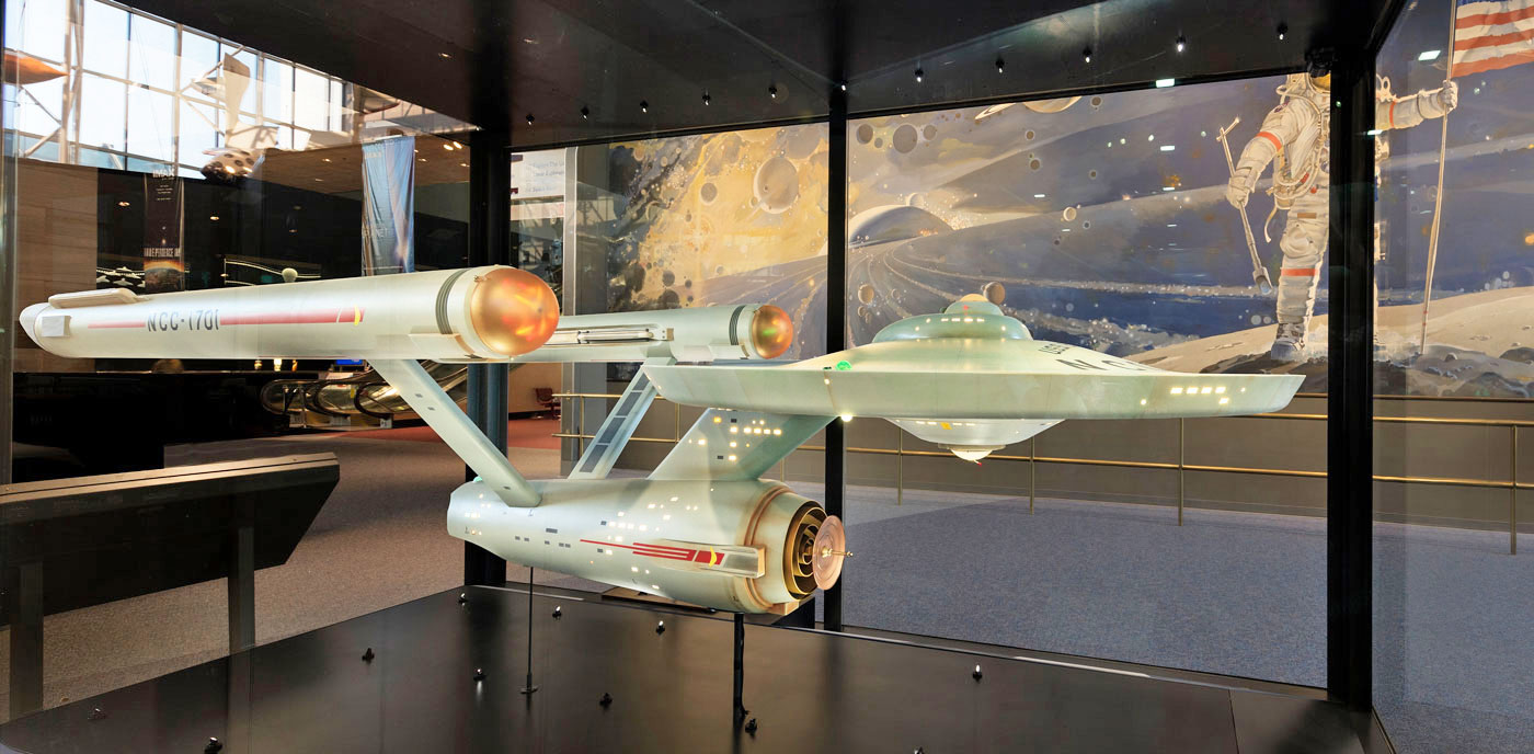
The TOS Enterprise hull is light grey with a greenish hue.
The base color on the Abrams Enterprise CG model hull texture is RGB 220,220,220. Effectively light gray.
The refit Enterprise was painted flat white with red, gold, green, and blue interference paints for aztecing.

Did.... did they flatten the saucer?
Because it looks as it the Enterprise here has only one deck on the saucer!
Wheras the original Enterprise clearly has two(!) decks on the saucer section:
In any case, the windows sizes don't match up on the Discoprise. While the original has one window size for the whole ship, on the Discoprise the windows on the saucer section look laughably overblown compared to the ones on the secondary hull.
Heh...I just realized what the Discoprise reminds me of. The old Franklin Mint pewter Enterprises, with their 24k deflector dishes:

It's like I'm watching season 2!

Thanks to the passage of time, some of them even have modernized nacelles:

Would look perfectly at home next to Discovery.
I have two of those.
Both stored in the original packaging so that the nacelles don't sag.

Look, this might just be my personal gripe based in a design background, but it's hard to believe that, if the DSC version were the original and the TOS ship were the update, we wouldn't be having this exact same conversation. I've yet to see any reasonable evidence that the original adheres to some kind of golden ratio of design or elegance of form that isn't influenced by sixty years of familiarity, nostalgia, and reflection. I've seen people map out the original's dimensions to demonstrate its mathematical elegance, and it's always according a naturally subjective and selective perception of forms based on design rules that frankly aren't the end all of design.
It seems to me that we're never going to be able to adequately judge or evaluate the goodness of the original or any reimaginings thereof because we can't turn off decades of personal perception and immersion in Star Trek.
It seems to me that we're never going to be able to adequately judge or evaluate the goodness of the original or any reimaginings thereof because we can't turn off decades of personal perception and immersion in Star Trek.
I still think the dish does not look like it fits this ship, but over all I like it.

It DEFINITELY looks like Bridge window behind some semi-transparent material. Transparent trilithium alloy perhaps?
Well at least now I can discount the CGI model from that Online Card Game. I could swear there was more to the bridge when Enterprise showed up on Discovery, but looking at the games model, it had me thinking I was mistaken or going blind. Now I have vindication!
Not going to lie. I think spikes would like nice on the nacelles. Not just because of "The Cage" but spikes fit Disco.
Indeed, I would have gone further and made the bussards opaque red, taking out the spinning bits. It would have made the ship more industrial looking, which seems the be look for Starfleet ships in Discovery.
Would look perfectly at home next to Discovery.
Ya know, some Viagra could help that situation out.
")
Look, this might just be my personal gripe based in a design background, but it's hard to believe that, if the DSC version were the original and the TOS ship were the update, we wouldn't be having this exact same conversation. I've yet to see any reasonable evidence that the original adheres to some kind of golden ratio of design or elegance of form that isn't influenced by sixty years of familiarity, nostalgia, and reflection. I've seen people map out the original's dimensions to demonstrate its mathematical elegance, and it's always according a naturally subjective and selective perception of forms based on design rules that frankly aren't the end all of design.
It seems to me that we're never going to be able to adequately judge or evaluate the goodness of the original or any reimaginings thereof because we can't turn off decades of personal perception and immersion in Star Trek.
Actually, yes. There ARE some universal designing rules, one of the key ones is balance. And the original one is an almost perfectly balanced design. You can read up a bit more on the basic principles here:
https://www.smashingmagazine.com/2015/06/design-principles-compositional-balance-symmetry-asymmetry/
One of these ships is better balanced than the other. Guess which one:


Looks like Kelvin Enterprise.Thanks to the passage of time, some of them even have modernized nacelles:
Similar threads
- Replies
- 2
- Views
- 3K
If you are not already a member then please register an account and join in the discussion!