It kind of looks like it's being bent under its own weight. I'm thinking it was a rush job so they could show it off.
The saucer does look bent down, from more than one angle.
It kind of looks like it's being bent under its own weight. I'm thinking it was a rush job so they could show it off.
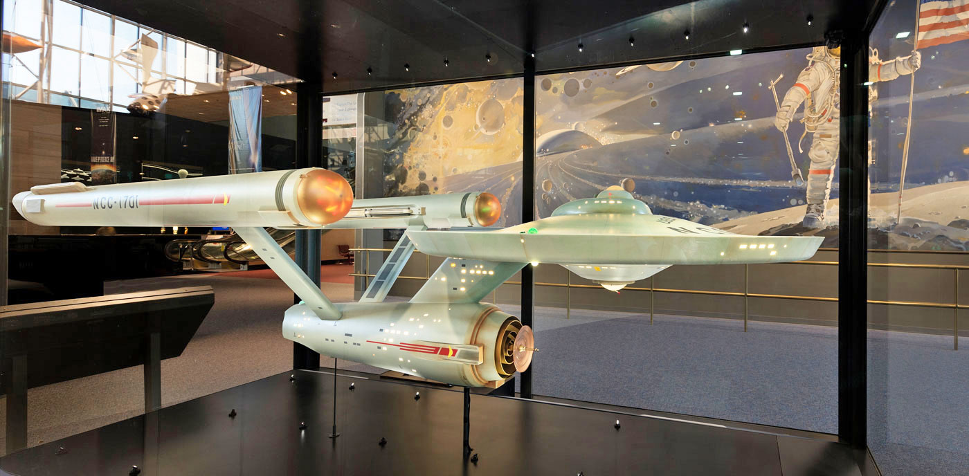
Look how wide deck one is here, those could easily be corridors around the outside of the main bridge

The saucer does look bent down, from more than one angle.
Gentleman, the next evolution of Starship design... two windows.
It DEFINITELY looks like Bridge window behind some semi-transparent material. Transparent trilithium alloy perhaps?

It must have been just got uploaded there, it would have been spotted by now if it was there.


I want to like the Discoprise, I really want to. But... it's just doesn't work. It's like that scene in Mad Men:
Compare that to original:
"It's not Ann-Margret"
I get that, the original will always be special because it was the first and for us who grew up with it it has nostalgia attached as well.
Yeah, but the original just flat looks better to my eye. It looks like something a futuristic society might build. Eaves takes the basic shape and tries to turn it into a Star Wars ship. How much of the product that is his responsibility is anyone's guess? But the Discovery version has a lot of similar features to other stuff he's done.
Maybe when I'm an old man and my vision is completely gone, I'll be able to enjoy the look of Discovery.
")
I think a big reason I'm a fan of the Discoprise is because of how much I dislike the Kelvinverse E and think that this model is a much better updated version compares to it. I feel it maintains a lot more elements of the original E while updating it.
Windows for the elusive bathrooms.Discovery has similar windows around the outside of its bridge sphere, as did the Shenzhou, but there were no visable windows from the inside of the bridge.
I like the Abramsverse version far more than what we have with Discovery. The Abramsverse version retains the optimistic look of the future. Lighter colors for the ships, better lighting.
It is a shame that overall Discovery has really missed the point of Star Trek's look. An optimistic view of the future that actually looks optimistic. They have fallen in the trap of things looking dark and gritty, and it simply doesn't match up with the rest of the franchise.
What do you think of the TMP/TWOK ship lighting then? Because, to me, Disco is reminiscent of it, with ships being in the Darkness of space and lit by exterior lights vs. the glowing ship in space of the other series/movies.


Fair enough.I'm not a fan of the refit, at all.
I’m not seeing that at all.Eaves takes the basic shape and tries to turn it into a Star Wars ship.
Thanks to the passage of time, some of them even have refit nacelles:
Would look perfectly at home next to Discovery.

We use essential cookies to make this site work, and optional cookies to enhance your experience.

